
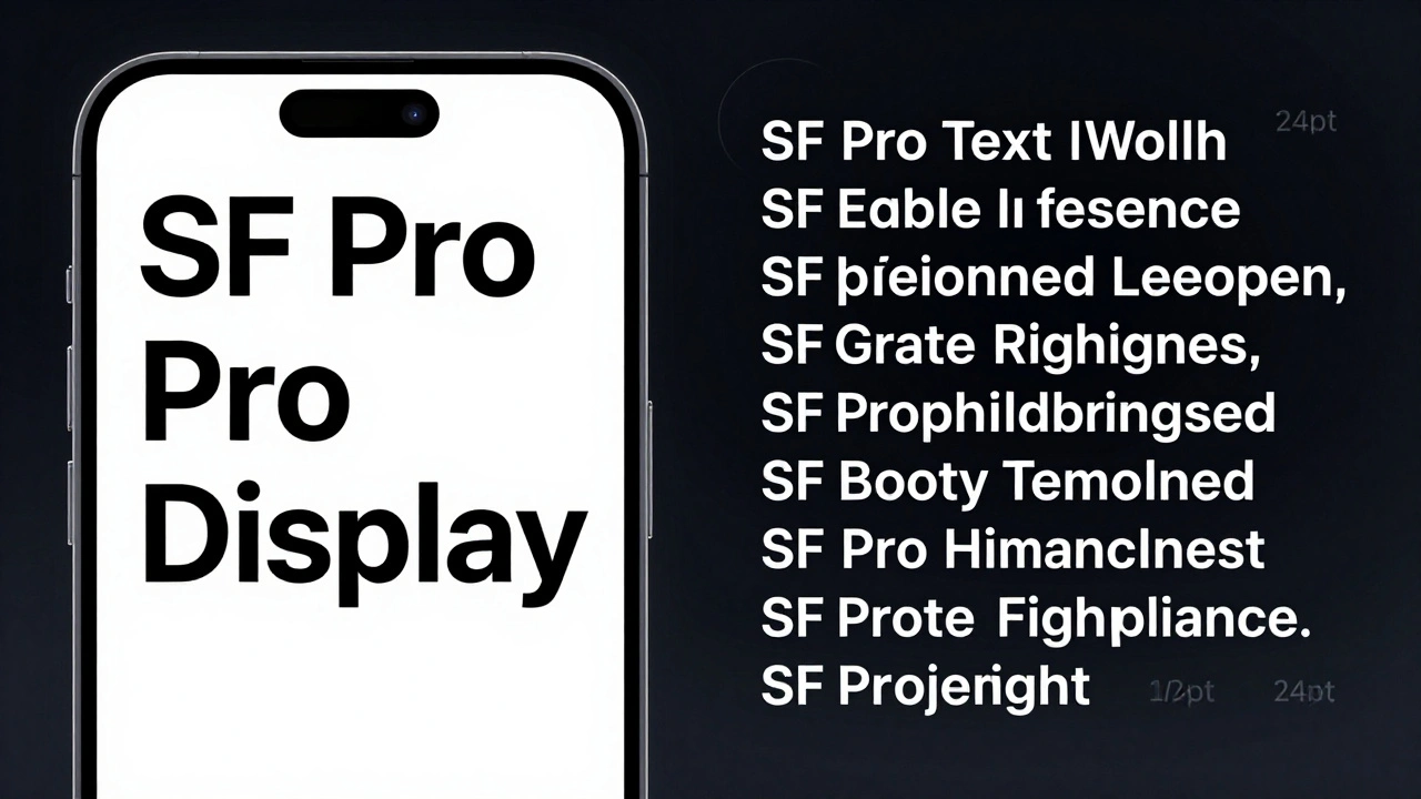
When you open an app on your iPad, the text you read isn’t just randomly chosen. It’s carefully designed to be clear, comfortable, and consistent - even under bright sunlight or in low-light settings. That’s because Apple doesn’t rely on generic fonts. Instead, it uses its own system typeface: SF Pro is Apple’s proprietary sans-serif typeface family built specifically for macOS, iOS, iPadOS, and tvOS. And within SF Pro, there are two key variants you need to understand: SF Pro Display and SF Pro Text.
Why SF Pro Display and SF Pro Text Are Not the Same
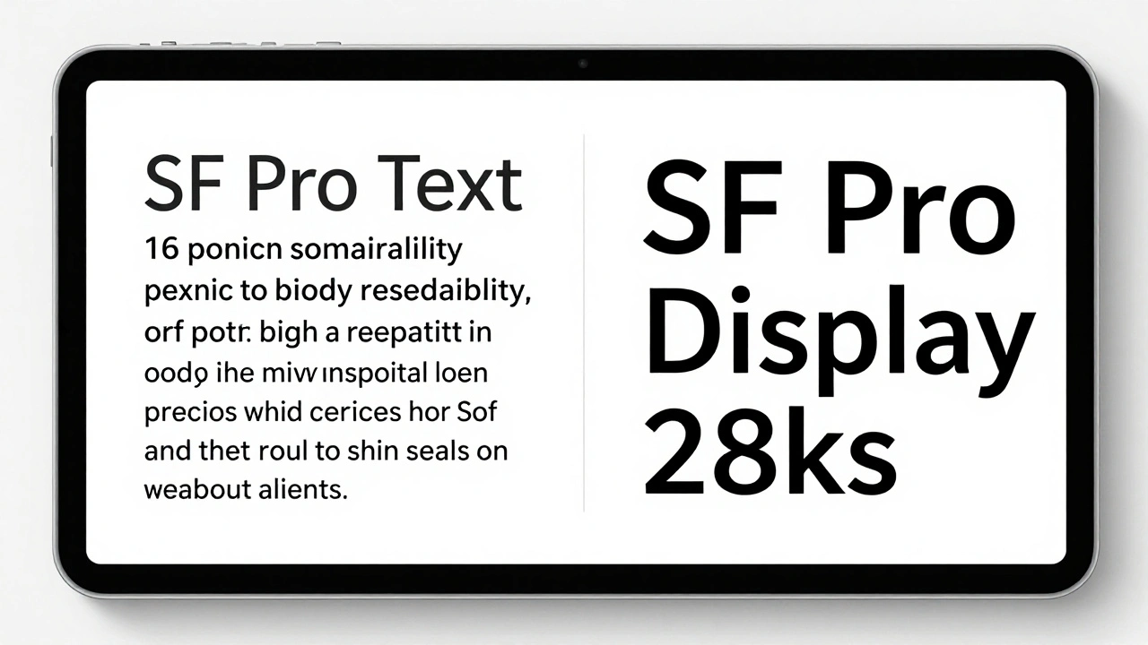
At first glance, SF Pro Display and SF Pro Text look almost identical. But they’re not. They’re two separate designs optimized for different sizes. This isn’t a marketing trick - it’s a technical necessity.
Think about how text behaves on screen. At 14 points - like the body text in Messages - you need wide letter spacing, open counters (the enclosed spaces in letters like ‘o’ or ‘e’), and heavier strokes to avoid looking blurry. Now imagine that same design at 36 points, like a headline in News. The fine details would look too heavy, the spacing too loose, and the overall shape would feel off. That’s why Apple created two versions.
SF Pro Text is designed for sizes 19 points and below. It has slightly taller x-heights, more open letterforms, and tighter tracking to keep small text readable without crowding. SF Pro Display, on the other hand, is built for 20 points and above. It features more refined serifs (yes, even in a sans-serif font), narrower proportions, and slightly looser spacing to give larger text elegance without losing clarity.
Apple’s old rule was simple: use Text under 20 points, Display above. But with variable fonts, that line isn’t as sharp anymore.
How Variable Fonts Changed the Game
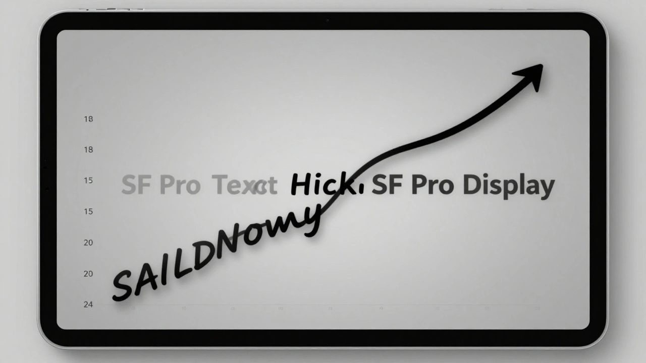
Before 2020, switching between SF Pro Text and SF Pro Display meant manually picking one or the other. If you used 18-point text, you had to choose - Text looked too wide, Display looked too thin. It was a compromise.
Now, Apple uses a single variable font that dynamically adjusts its design between 17 and 28 points. This means your iPad doesn’t have to pick a hard cutoff. Instead, it smoothly transitions from Text-like shapes to Display-like shapes as the size increases. At 18 points, it leans toward Text. At 24 points, it starts shifting toward Display. At 28 points, it’s fully Display.
This isn’t just a technical upgrade - it’s a readability win. You no longer see a sudden jump in weight or spacing when you change font sizes. Everything flows naturally.
What About SF Pro Rounded?
You might notice some apps - like Apple’s own Calculator or Notes - using a softer, rounded version of SF Pro. That’s SF Pro Rounded. It’s not a separate font family. It’s a stylistic variant of SF Pro Display, with rounded corners on letters like ‘a’, ‘g’, and ‘Q’.
But here’s the catch: SF Pro Rounded doesn’t have a variable font version. It doesn’t have italics. And it’s not meant for body text. It’s purely decorative - best for interfaces where you want a friendly, approachable feel. Use it for buttons, icons, or playful UI elements. Never for paragraphs or labels that need maximum legibility.
Also, SF Pro Rounded doesn’t replace SF Pro Display. It complements it. If you’re designing a health app, SF Pro Display for data, SF Pro Rounded for buttons - that’s the right balance.
Weights Matter More Than You Think
Both SF Pro Text and SF Pro Display come in nine weights: Ultralight, Thin, Light, Regular, Medium, Semibold, Bold, Heavy, and Black. But not all weights are created equal.
On iPad, most UI text uses Regular (400) or Medium (500). Headlines? Bold (700) or Semibold (600). You’ll rarely see Light or Thin used - they’re too fragile on screens, especially under glare. Heavy and Black? Reserved for titles that need to punch through.
Apple’s system automatically picks the right weight based on context. A label in Control Center? Medium. A notification title? Bold. Body text? Regular. You don’t need to guess - the OS handles it.
But if you’re designing in Figma or Sketch, don’t just pick ‘Bold’ and call it done. Check the actual weight value. A 700 weight in SF Pro Display at 24 points will look different than a 700 in SF Pro Text at 16 points. The spacing, stroke width, and proportions shift with the optical size. Always test at real sizes.
Real-World Pairing Examples
Let’s look at how Apple actually uses these fonts on iPad:
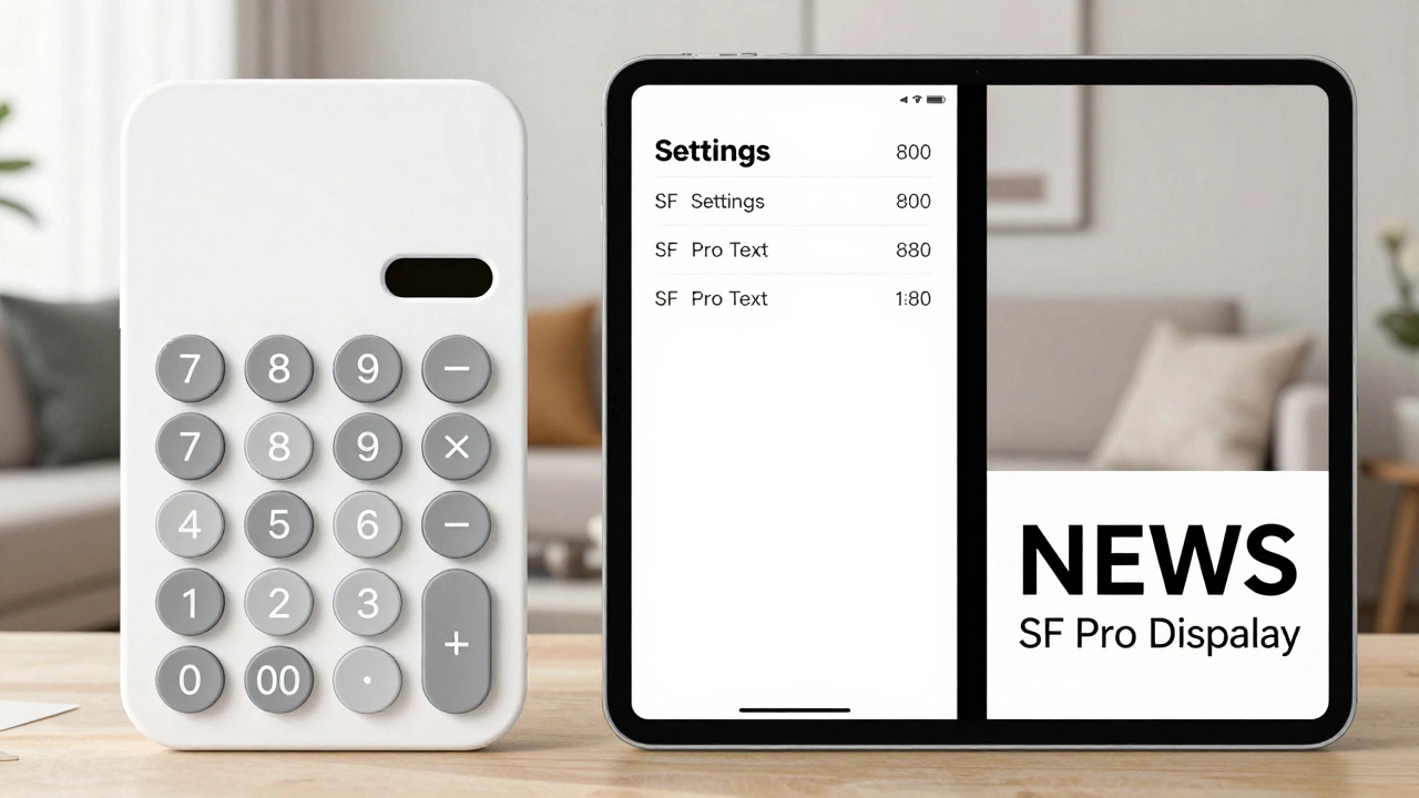
- Home Screen app names: SF Pro Display, Bold, 20 points - crisp, clear, and slightly spaced for quick scanning.
- Messages app body text: SF Pro Text, Regular, 16 points - open counters, taller x-height, easy to read in long threads.
- News app headlines: SF Pro Display, Semibold, 28 points - refined details, tight spacing, authoritative tone.
- Settings menu labels: SF Pro Text, Medium, 17 points - just above the threshold, so it leans into Text’s legibility.
- Calculator buttons: SF Pro Rounded, Bold, 22 points - rounded shapes for tactile feel, but large enough to use Display’s clarity.
Notice something? There’s no mixing of Text and Display within the same UI element. A headline stays Display. Body text stays Text. Even when Apple uses 18-point text - like in the App Store’s ‘Download’ button - it’s still using SF Pro Text, not Display. Why? Because at 18 points, Text’s design still performs better. The variable font doesn’t override the intent - it enhances it.
Why This Matters for Designers and Developers
If you’re building an iPad app, using SF Pro isn’t optional - it’s expected. Users associate Apple’s native feel with these fonts. Swap in Helvetica or Roboto, and your app feels foreign, even if the UI looks great.
But more than that - using the right variant matters for accessibility. People with low vision rely on clear letterforms and consistent spacing. SF Pro Text’s design at 14 points has been tested with real users. SF Pro Display at 32 points has been optimized for reading distance on a tablet. Getting it wrong can make your app harder to use.
Developers: Use Apple’s fontDescriptorWithDesign API. Don’t hardcode font names. Let the system handle optical sizing. If you set a font size of 21 points, iOS will automatically pick the right variant. You don’t need to write conditional logic.
Designers: Download SF Pro from Apple’s official developer portal. Don’t use third-party versions. They’re outdated. The latest version (17.1d1e1) includes fixes for glyph rendering on Retina displays. And always test at 100% zoom on actual devices - not just in Figma.
What Not to Do
- Don’t use SF Pro Display for body text under 20 points - it’ll look thin and hard to read.
- Don’t use SF Pro Text for headlines above 28 points - it’ll look bloated and unrefined.
- Don’t mix SF Pro Rounded with SF Pro Display in the same hierarchy - it breaks visual rhythm.
- Don’t assume all weights behave the same - a Bold at 16 points isn’t the same as a Bold at 24 points.
And never ignore the system’s default. If you’re unsure, start with Regular SF Pro Text at 16 points for body, and SF Pro Display Bold at 24 points for headings. That’s Apple’s baseline for a reason.
The Bigger Picture: Typography as Accessibility
This isn’t just about aesthetics. It’s about access. Apple’s typography system is built on decades of research into how people read on screens. The optical sizing of SF Pro Text and Display isn’t a luxury - it’s a necessity for users with dyslexia, low vision, or cognitive differences. Clear letterforms, consistent spacing, and predictable weight transitions help everyone read faster and with less strain.
When you pair SF Pro Display and SF Pro Text correctly, you’re not just making your app look good. You’re making it usable - for everyone.
Can I use SF Pro Display for body text if I make it bold?
No. Even if you increase the weight, SF Pro Display is designed for larger sizes. At body text sizes (14-19 points), its letterforms are too narrow and spaced too loosely, making reading harder. Stick with SF Pro Text for anything under 20 points.
Is SF Pro Rounded okay for buttons on iPad?
Yes - but only if the button text is 20 points or larger. For smaller buttons, use SF Pro Text. SF Pro Rounded lacks italic variants and variable font support, so it’s best for decorative elements, not functional text.
Do I need to download SF Pro fonts to use them in my app?
No. On iOS and iPadOS, SF Pro is built into the system. You don’t need to bundle it. But if you’re designing in Figma or Adobe XD, you must download the official fonts from Apple’s developer portal to match the system appearance.
What’s the difference between SF Pro and SF Compact?
SF Compact is designed for smaller screens like Apple Watch. It has tighter spacing and condensed letterforms. While it works on iPad, it’s not the standard. Stick with SF Pro for iPad apps unless you’re building something that mimics watchOS.
Why does Apple use different spacing for Text and Display?
At small sizes, letters need to be closer together to avoid looking disconnected. At large sizes, more space between letters prevents them from merging visually. SF Pro Text and Display are engineered with these exact spacing rules baked in - so text looks balanced no matter the size.
Categories
Popular Articles