
Have you ever walked into an Apple Store and felt like you were stepping into the website? Or opened Apple.com and instantly recognized the same calm, clean space you saw in person? That’s not an accident. Apple doesn’t treat its website and retail stores as separate channels. They’re two sides of the same experience. And that’s what makes cross-channel design at Apple so powerful.
One Design Language, Two Worlds
In 2015, Apple overhauled its retail stores. Gone were the heavy signs, cluttered displays, and corporate branding. In their place: white surfaces, glass tables, open spaces, and products arranged like art. No pushy salespeople. No flashing discounts. Just quiet, confident simplicity. That same year, Apple began quietly reshaping Apple.com. The homepage got more breathing room. Product images grew larger. Text became sparse. Navigation turned into a smooth glide, not a menu hunt. This wasn’t just a visual update. It was a philosophy. Apple decided that whether you’re touching an iPhone on a table in Tokyo or scrolling through its specs on a laptop in Kansas, the feeling should be the same. Calm. Clear. Confident.How Apple.com Mirrors the Store
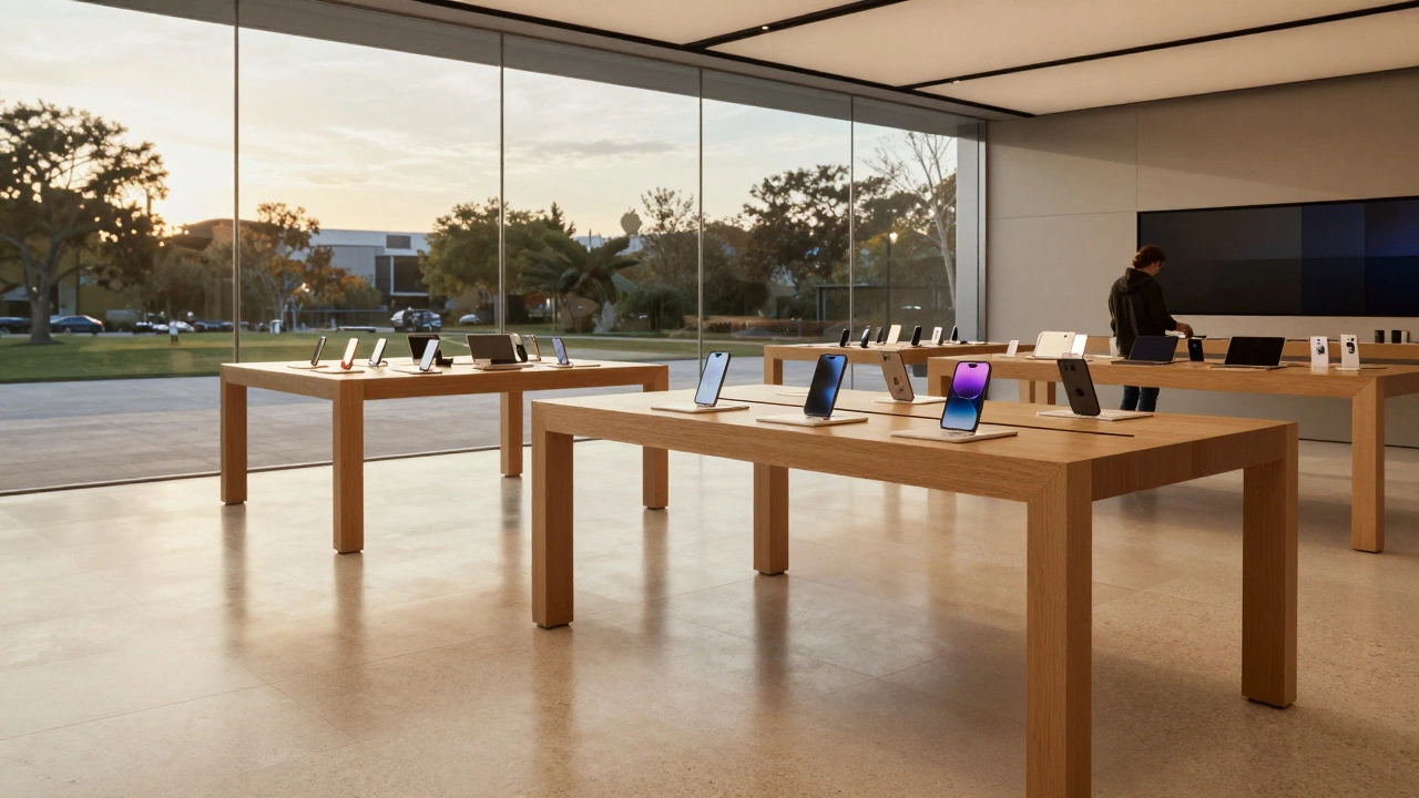
Apple.com doesn’t feel like a typical e-commerce site. It doesn’t bombard you with deals, upsells, or pop-ups. Instead, it gives you space to breathe. The homepage shows one product at a time - usually the newest iPhone or MacBook - large, centered, and glowing. Scroll down, and you’re gently guided through features, not forced to click through layers of menus. The navigation bar at the top? It’s simple: Mac, iPad, iPhone, Watch, AirPods, Services. No submenus. No hidden options. Just the essentials. Click on iPhone, and you land on a clean page with high-res videos, a side-by-side comparison tool, and a clear path to buy. No clutter. No distractions. And here’s the kicker: this layout was directly inspired by how products are arranged in Apple Stores. In-store, iPhones sit on glass tables, each with a small sign listing key specs. Online, the same info appears in a clean table below the video. You don’t need to ask a staff member what the difference is between an iPhone 15 and 15 Pro - the website shows it to you, just like the store does.The Store That Feels Like the Website
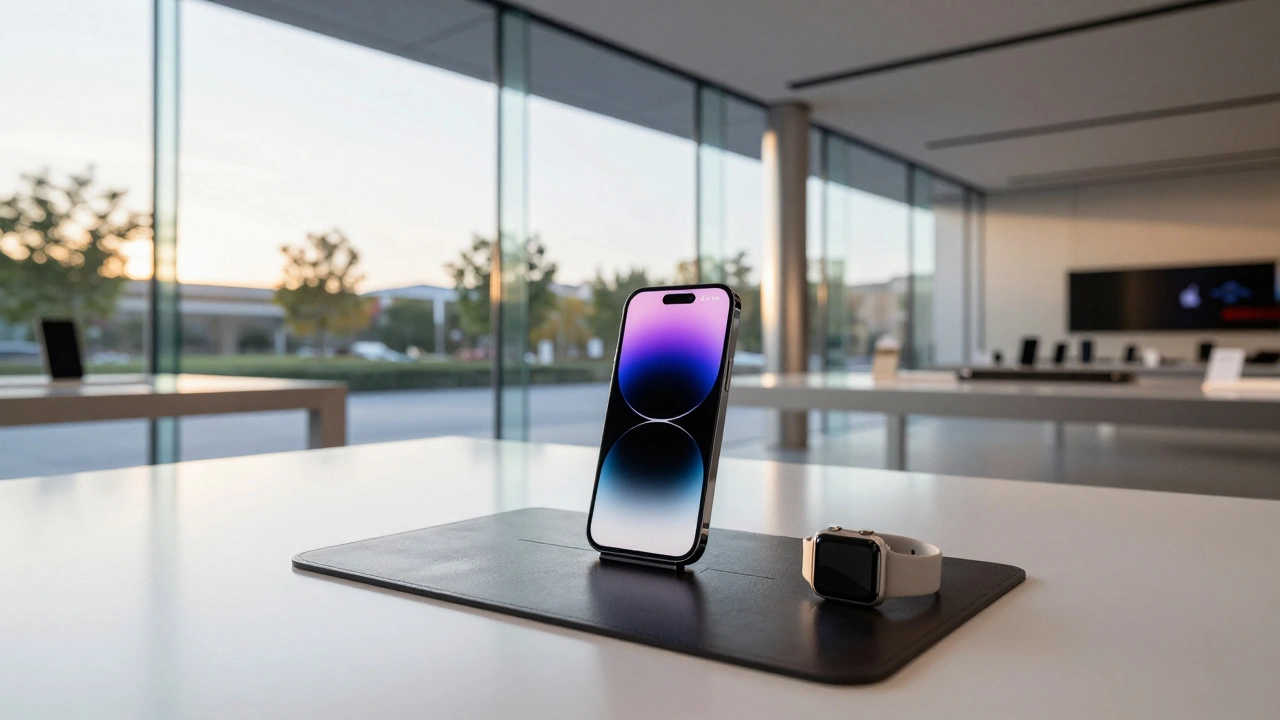
Walk into any Apple Store today, and you’ll notice the same principles. Products aren’t locked behind glass. You can pick up an Apple Watch, twist the band, and try different colors. The display tables aren’t just for looking - they’re for doing. A leather mat under the watch bands lets you feel the texture. Raised stands let you grab the watch without asking for help. In 2024, Apple started testing new signage at stores in San Francisco, Coquitlam, and Michigan Avenue. Instead of small, subtle labels, they now use bold, minimalist cards that group similar models - iPhone XS, XS Max, XR - with pricing and specs listed right on the table. No more asking a staff member to explain the difference. The answer is there, before you even touch the device. Even checkout changed. At many locations, you’ll now see a clear sign for Express Checkout - a zone for buying cases, chargers, or AirPods without waiting in line. This wasn’t pulled from a marketing deck. It was copied from the Apple Store app’s scan-and-buy feature. The same function, now visible in the physical world.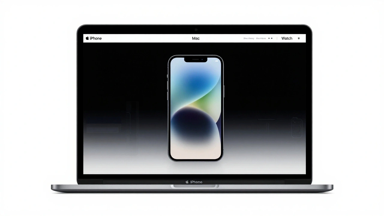
From Digital to Physical: The App Store’s Influence
The App Store didn’t escape this cross-channel thinking. Before 2020, it was a grid of icons - hundreds of them, all the same size, all fighting for attention. Then Apple redesigned it. They made it feel like a magazine. The "Today" tab now updates daily, not weekly. You’ll find stories about developers, tutorials, curated lists of apps for productivity or creativity. It’s not just a place to download. It’s a place to discover. That shift didn’t happen in a vacuum. Apple’s retail teams were already using storytelling in-store: showing customers how to use the Camera app on a new iPhone, or how to set up a HomePod with voice commands. The App Store redesign brought that same energy online. Now, whether you’re browsing apps on your phone or watching a demo in a store, the experience feels connected.Why This Works: Less Is More, But Only If It’s Clear
Apple’s design isn’t about removing everything. It’s about removing the noise so the right thing stands out. In the store, that’s the product. Online, it’s the video or comparison chart. Both use white space like a tool, not a decoration. Here’s what most companies get wrong: they think more info = better experience. Apple knows better. Too many options paralyze people. That’s why Apple.com only lets you compare three iPhone models at once. Why? Because three is the number your brain can handle without stress. The same logic applies in-store: grouping models by family, not by year, makes choices easier. And the results? People don’t just buy from Apple. They stay. They hang out. They ask questions. They play with devices. A 2023 survey found that 68% of Apple Store visitors didn’t come in to buy - they came to learn, explore, or just be in the space. That’s the power of design that doesn’t sell. It invites.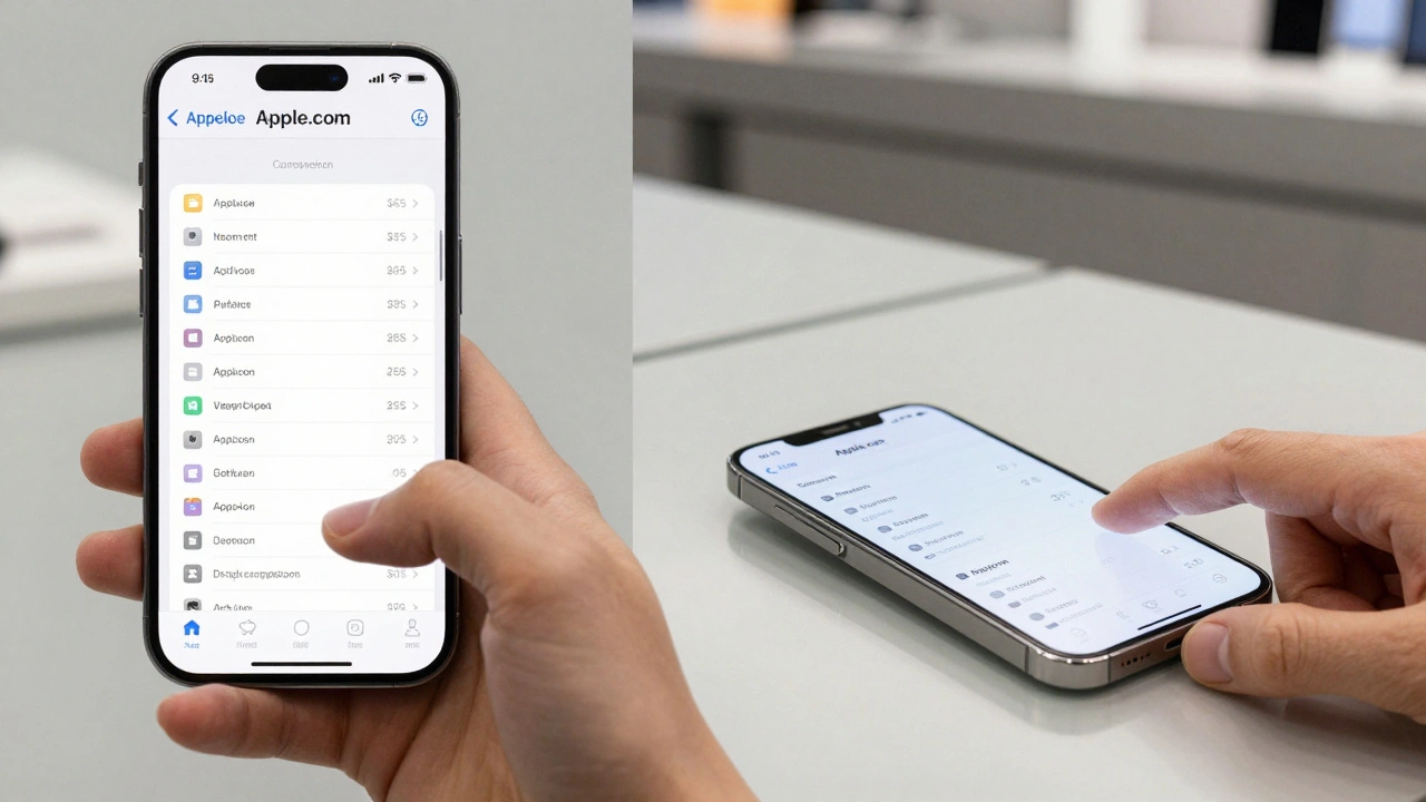
The Hidden Rule: Every Touchpoint Tells the Same Story
Apple doesn’t design websites, stores, or apps in isolation. They design journeys. Whether you start on your laptop, move to the store, and finish with the Apple Store app - the experience flows. No jarring transitions. No reset buttons. No "where do I go now?" moments. That’s why the same color palette, font, and spacing show up everywhere. Why the "Try it" button on Apple.com mirrors the physical demo unit in the store. Why the "Today" tab on the App Store feels like the curated product demo in the Genius Bar. It’s not coincidence. It’s repetition. Consistency. Reinforcement.What Happens When It Doesn’t Align?
Think about other brands. You browse a website, click "Buy Now," then walk into a store and find the product arranged differently, with different info, different pricing. You feel confused. Disoriented. Like you’ve entered a parallel universe. That’s what Apple avoids. Their stores don’t just sell products. They reinforce the story the website tells. And the website doesn’t just list features - it shows you what it feels like to own the product.What’s Next?
Apple keeps tweaking. New signs. New layouts. New ways to display accessories. The company doesn’t wait for feedback to roll in. They test changes in real stores, watch how people move, and adjust. The glass-topped cabinets at Apple Park? Replaced with open pedestals so you can pick up the watch. That change came from watching customers hesitate, unsure if they were allowed to touch. The future of cross-channel design isn’t about syncing pixels and shelves. It’s about syncing emotion. Apple’s goal isn’t to make your online experience look like the store. It’s to make you feel the same way in both places. That’s why, whether you’re on your phone or standing in a store, you don’t think about the design. You just feel like you belong there.Why does Apple’s website feel so different from other online stores?
Apple’s website avoids the clutter of typical e-commerce sites - no pop-ups, no countdown timers, no upsells. Instead, it uses white space, large visuals, and minimal text to guide you gently. It’s designed like a museum exhibit: one product at a time, with clear context. This mirrors how products are displayed in Apple Stores - not buried under promotions, but presented as objects worth exploring.
How does Apple use physical store changes to improve its website?
When Apple notices how customers interact with products in-store - like how they naturally reach for watch bands or pause at comparison signs - they bring those insights online. For example, the in-store practice of grouping similar iPhone models with side-by-side specs led directly to the improved comparison tool on Apple.com. The store isn’t just a sales location - it’s a lab for digital design.
Do Apple Stores really help people decide what to buy?
Yes - and not because of salespeople. The design itself guides decisions. By letting you touch, try, and compare products without pressure, Apple reduces decision fatigue. A 2023 study found that customers who spent more than 10 minutes interacting with devices in-store were 42% more likely to make a purchase than those who just asked for pricing. The environment, not the pitch, closes the sale.
Why does Apple update its App Store daily instead of weekly?
Daily updates turn the App Store into a living space - not a static catalog. This mirrors how Apple Stores refresh their displays weekly with new product demos or curated accessories. The goal isn’t just to sell apps - it’s to keep people coming back for discovery. The "Today" tab, with its stories and tutorials, makes the App Store feel like a magazine you want to read, not just a store you visit.
Is Apple’s cross-channel design only for high-end products?
No. The principles apply to any product that requires trust or understanding. Apple uses the same clean layout for AirPods as it does for MacBooks. The difference isn’t price - it’s clarity. Even low-cost accessories like charging cables are displayed with the same care, because the experience matters as much as the product. This is why people buy $19 silicone cases without hesitation - they’ve already trusted the experience.