
Have you ever opened an app on your iPhone and just felt where to tap-even before you thought about it? That’s not luck. It’s Apple’s design system at work, quietly using motion and depth to guide your eyes and hands without saying a word. Apple doesn’t rely on bright buttons or flashy icons to tell you what’s important. Instead, it uses physics-like rules: things that are closer feel more real, things that move with you feel connected, and things that fade into the background aren’t meant to distract. This isn’t decoration. It’s communication.
Depth Isn’t Just Visual-It’s Spatial
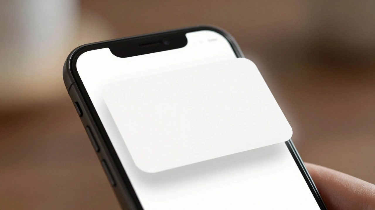
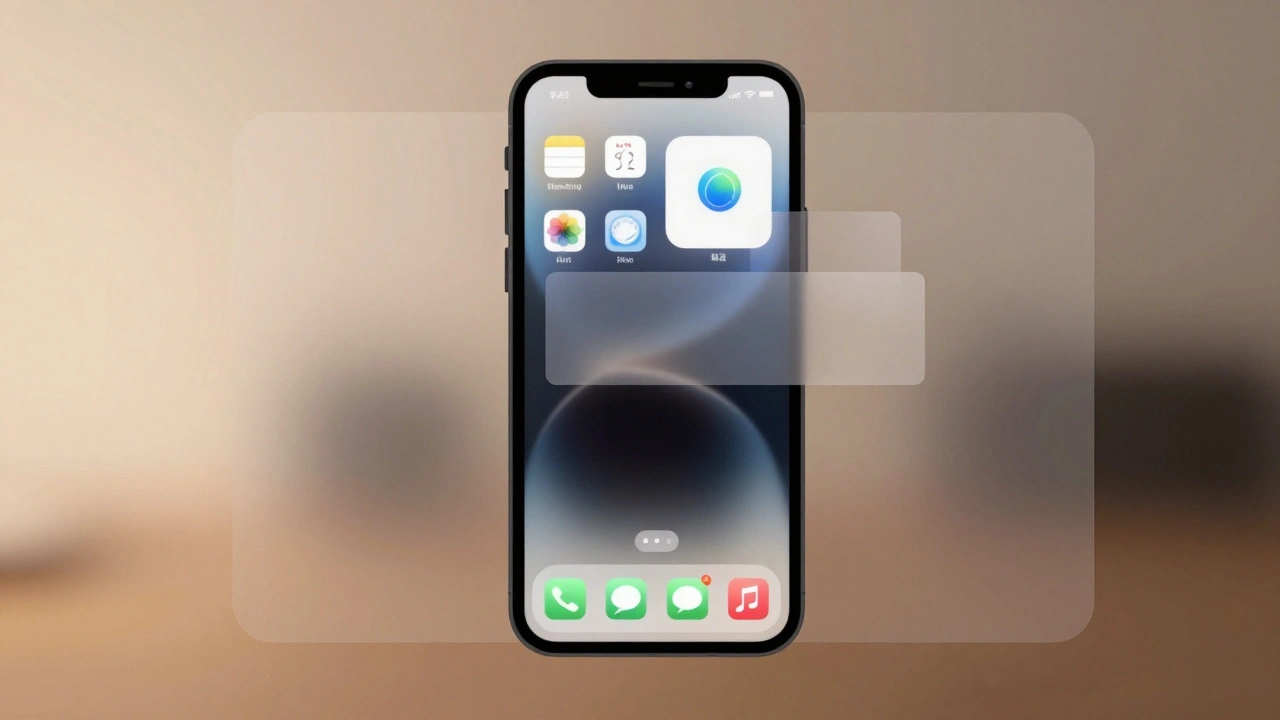
Apple’s interface depth isn’t about making things look 3D for the sake of style. It’s about creating real spatial relationships. Think of your screen as a stack of transparent sheets. The content you care about-like your photo, a message, or a song-is on the top sheet. Controls, menus, and temporary overlays sit slightly behind it. You don’t see the layers as separate panels. You feel them. A notification card lifts just enough to show it’s temporary. The Control Center slides up from below, but its edges blur softly, so it doesn’t feel like it’s blocking what’s underneath. This isn’t magic. It’s careful use of shadows, translucency, and layer positioning.
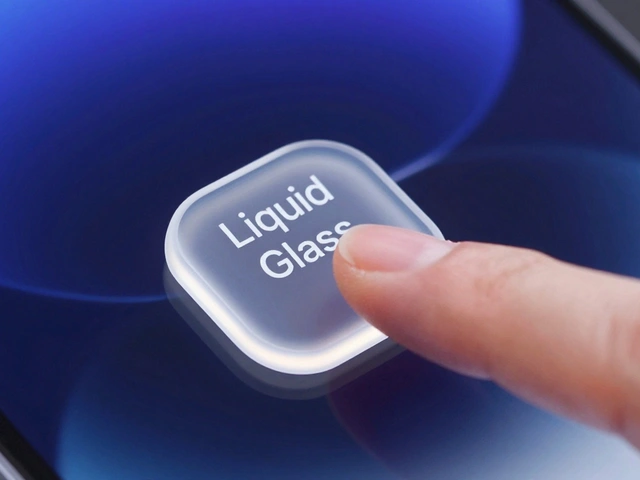
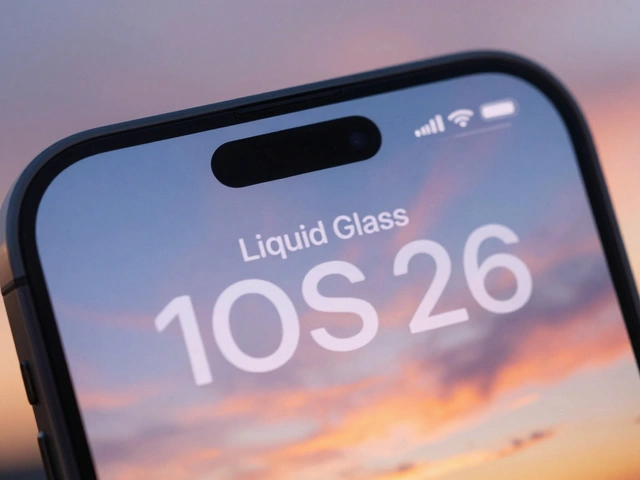
In iOS 26, Apple calls this the Liquid Glass design system. The name says it all: materials now blend like frosted glass, softening edges and letting light pass through. But the goal hasn’t changed. Depth still answers one question: What matters right now? The most important thing is always closest. Everything else recedes, not because it’s less important, but because it’s not needed yet. Apple limits depth to three levels max. Too many layers, and the interface feels cluttered. Too few, and users get lost. Three is enough to show hierarchy without confusion.
Motion Connects the Dots
Motion in Apple’s interfaces doesn’t just look smooth. It tells a story. When you tap an app icon, it doesn’t just appear. It grows from its spot on the home screen, expanding into the full app window. Your brain doesn’t have to relearn where the app went-it follows the path. That’s continuity. That’s motion as a guide.
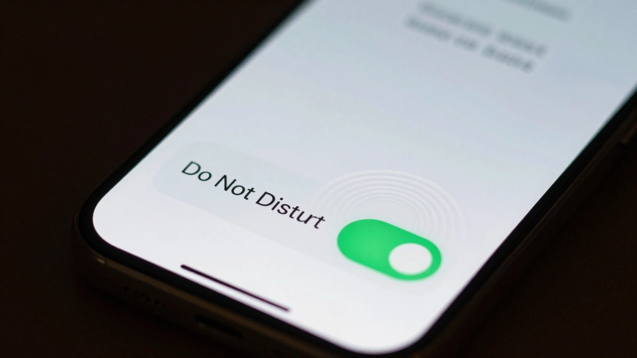
When you pull down a notification, its shadow deepens. That’s not an accident. The shadow tells you: This is now the most important thing on screen. When you scroll through a list and hit the end, it bounces gently-not to annoy you, but to say, You’ve reached the limit. These aren’t animations for fun. They’re feedback loops that match your expectations. Apple calls this effort matching result. A tiny swipe adjusts volume. A big drag changes brightness. The motion matches the action’s importance.
Even small details matter. The way a menu slides in from the side doesn’t just move-it slides with momentum. It doesn’t stop abruptly. It slows naturally, like a real object in motion. This isn’t borrowed from physics textbooks. It’s borrowed from how humans experience the real world. Apple’s designers watch people use their devices. They notice when users hesitate, when they overshoot, when they get confused. Then they tweak the motion to fix it.
Translucency and the Art of Subtlety
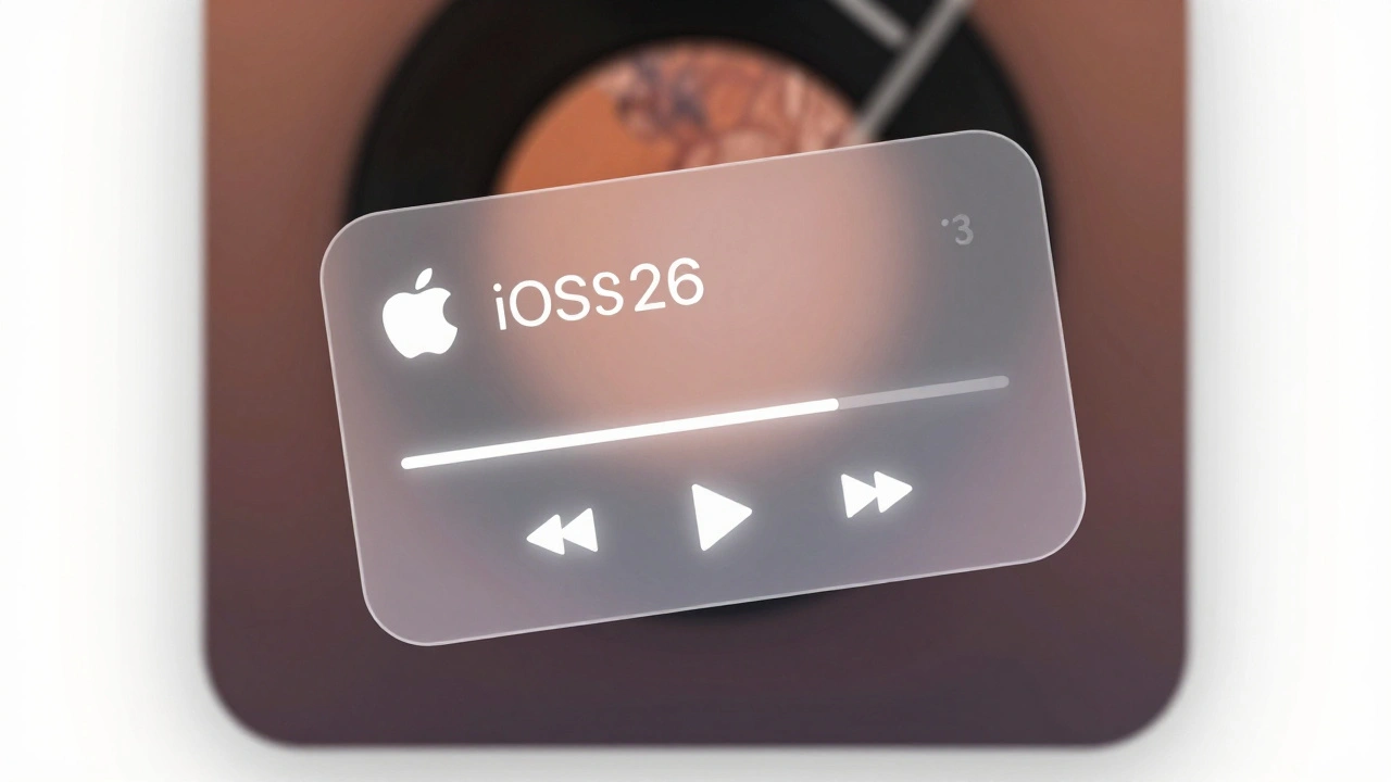
Look at Apple Music’s Now Playing screen. The album art fills the whole view. It’s bold, bright, and dominant. The playback controls? They’re there, but they’re soft. A faint white glow, a hint of blur, a thin border. They don’t compete. They don’t shout. They wait. That’s deference-the principle Apple uses to let content breathe.
Translucency is key here. It’s not about making things see-through. It’s about making them feel present but not intrusive. A translucent button doesn’t disappear. It just lowers its visual weight. It says, I’m here if you need me, but I’m not the star. This is how Apple avoids visual noise. Instead of coloring everything in high contrast, they let depth and transparency do the work. The result? Interfaces that feel calm, even when full of information.
Compare this to apps that use bold borders, bright outlines, and heavy shadows everywhere. Those designs scream for attention. Apple’s designs whisper. And because they whisper, you listen.
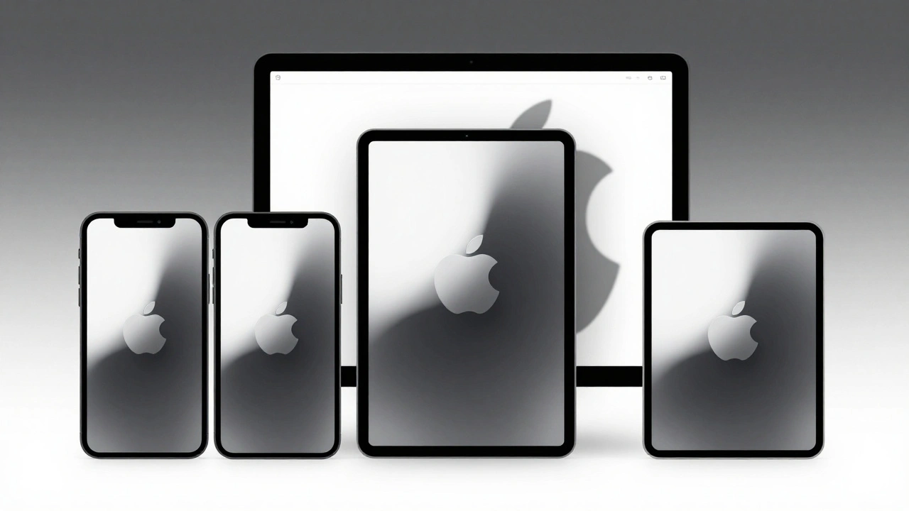
Consistency Across Devices
Apple doesn’t design for one screen. It designs for all of them. Your iPhone, iPad, and Mac all use the same motion and depth language. Open a file on your Mac-it slides in from the right. Open the same file on your iPad-it slides in the same way. The motion doesn’t change. The depth relationship doesn’t change. The way a menu lifts off the screen? Same on every device.
This consistency isn’t about making everything look identical. It’s about making everything feel familiar. If you’ve used an iPhone for years, you don’t need to relearn how to navigate a Mac. The logic is the same. Apple calls this continuity. It’s the invisible thread that ties every product together. When you switch devices, you don’t pause. You just keep going.
Even the way apps adapt matters. On iPhone, a list is vertical. On iPad, it can be split. On Mac, it can be a full window with sidebars. But the motion between those states? It’s smooth. The depth stays consistent. The controls don’t jump around. They follow predictable paths. That’s what builds trust.
Designing for Hierarchy, Not Screens
Apple’s designers don’t think in pages. They think in systems. A button isn’t designed for one screen. It’s designed to behave the same way whether it’s on an iPhone, Apple Watch, or Vision Pro. The same rules apply: size, motion, depth, and spacing all adjust based on context, not fixed pixels.
For example, a button might be larger on a watch because your finger is smaller. But the way it lifts when pressed? Same. The shadow it casts? Same. The way it snaps back? Same. That’s consistency through adaptation, not repetition. It’s not about copying. It’s about applying principles.
This is why Apple’s interfaces feel so natural. You’re not learning a new system every time you open a new app. You’re applying what you already know. The hierarchy is always clear because the rules never change. Content is always front and center. Controls are always accessible. Motion always connects. Depth always guides.
Why This Matters
Most apps try to grab attention. Apple tries to reduce it. That’s counterintuitive. But it works. When you’re not fighting visual noise, you focus on what matters: your photos, your messages, your music, your work.
Apple’s approach proves that hierarchy doesn’t need bold colors or giant buttons. It needs thoughtful movement. It needs quiet depth. It needs materials that feel real, not artificial. It needs motion that feels like physics, not animation.
And that’s why, after years of updates, Apple’s interfaces still feel fresh. Not because they’re flashy. But because they’re quiet. Because they don’t distract. Because they let you move through them without thinking.
Why doesn’t Apple use more colors to show hierarchy?
Apple avoids using color as the main signal for hierarchy because color can be inconsistent across devices, lighting conditions, and user preferences (like dark mode). Instead, Apple uses depth, motion, and spacing-things that remain predictable no matter the context. A button that lifts slightly and casts a soft shadow will always feel more important than one that’s flat, regardless of its color.
How many levels of depth does Apple allow in its interfaces?
Apple recommends no more than three levels of depth. The first level is the main content. The second is controls or menus. The third is temporary overlays like notifications or alerts. More than three levels create visual clutter and confuse users about what’s important. This limit keeps interfaces clean and easy to navigate.
Does Apple use motion for aesthetics or function?
Motion in Apple’s design is always functional. While it looks smooth, its purpose is to guide, connect, and inform. For example, when an app opens, it grows from its icon to show spatial continuity. When a list bounces at the end, it tells you you’ve hit a boundary. These aren’t decorative effects-they’re feedback mechanisms that reduce cognitive load and improve usability.
What’s the difference between iOS 18 and iOS 26 in terms of hierarchy?
iOS 18 focused on minimalism-removing visual clutter to let content shine. iOS 26 introduced the Liquid Glass system, which shifted from fixed UI patterns to dynamic, context-aware hierarchy. Now, elements don’t just appear; they adapt. Controls fade in or out based on your actions. Content resizes and repositions based on what you’re doing. The hierarchy isn’t static-it responds to you.
How does Apple ensure motion feels natural across devices?
Apple uses consistent timing, easing curves, and spatial logic across all devices. Whether you’re using an iPhone or a Mac, a button always takes 200 milliseconds to lift and 150 to settle. The physics of motion-acceleration, deceleration, bounce-are identical. This predictability means users don’t have to relearn how things work when switching devices. It’s not about matching pixels-it’s about matching behavior.