Wolf and Hare

Tag: iOS hierarchy

How Apple Uses Motion and Depth to Show Interface Hierarchy

How Apple Uses Motion and Depth to Show Interface Hierarchy
  • Elias Voss
  • Elias Voss

28/01
0

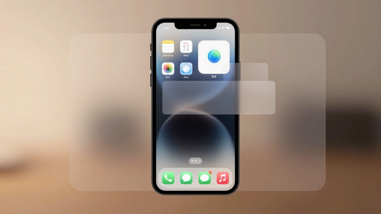
Apple uses motion and depth-not color or size-to silently guide users through interfaces. By blending subtle shadows, fluid transitions, and translucent layers, Apple makes hierarchy feel intuitive, not forced. This approach reduces clutter and keeps focus on content.

Read More...

Categories

  • Design & Technology (184)
  • Retail Design (8)
  • Design Tools (6)
  • Design & Development (6)
  • Technology (3)

Popular Articles

Search Across Apple: Consistent Patterns from Spotlight to In-App

Apr 29 2026

Bondi Blue to Neutrals: How Apple’s Color Choices Shape Product Personality

Dec 29 2025

Liquid Glass vs. Skeuomorphism and Flat Design: Apple’s New Material Middle Ground

Jan 15 2026

MacBook Air’s Thinness Goal: Designing for Ultra-Portable Productivity

Jan 15 2026

Haptic Alternatives on Apple: Non-Visual Feedback That Communicates

Feb 4 2026

Tags

  • Liquid Glass
  • Apple design
  • Apple typography
  • Apple ecosystem
  • inclusive design
  • Apple Human Interface Guidelines
  • Apple Intelligence
  • user experience
  • Apple design philosophy
  • unboxing experience
  • Apple packaging
  • iOS 26
  • San Francisco font
  • Apple accessibility
  • Apple industrial design
  • Jony Ive
  • industrial design
  • Apple retail design
  • Dynamic Type
  • Apple interface design
Wolf and Hare

© 2026. All rights reserved.