
When you open an app on your iPad, how do you find your way around? The answer isn’t just about buttons or icons-it’s about navigation. And on iPad, choosing between a sidebar and a tab bar isn’t a design whim. It’s a decision that shapes how users move through your app, how fast they find what they need, and whether they even stick around.
Apple’s iPadOS 18 changed everything. It didn’t just tweak the old system. It merged two navigation styles into one fluid, adaptive system that shifts based on screen size, orientation, and even user preference. You no longer pick one and stick with it. You build something that can be both-a tab bar that turns into a sidebar, and back again, without breaking a sweat.
What’s the Difference Between Sidebars and Tab Bars?
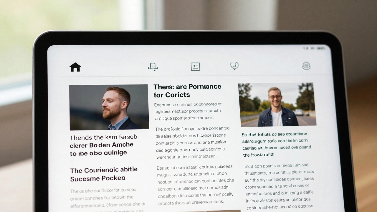
Let’s cut through the jargon. A tab bar is what you see at the bottom of an iPhone app: a row of icons or labels that let you jump between major sections. On iPad, Apple moved it to the top in iPadOS 18. Why? So it’s closer to your thumb when holding the tablet in landscape, and it frees up screen space below for content.
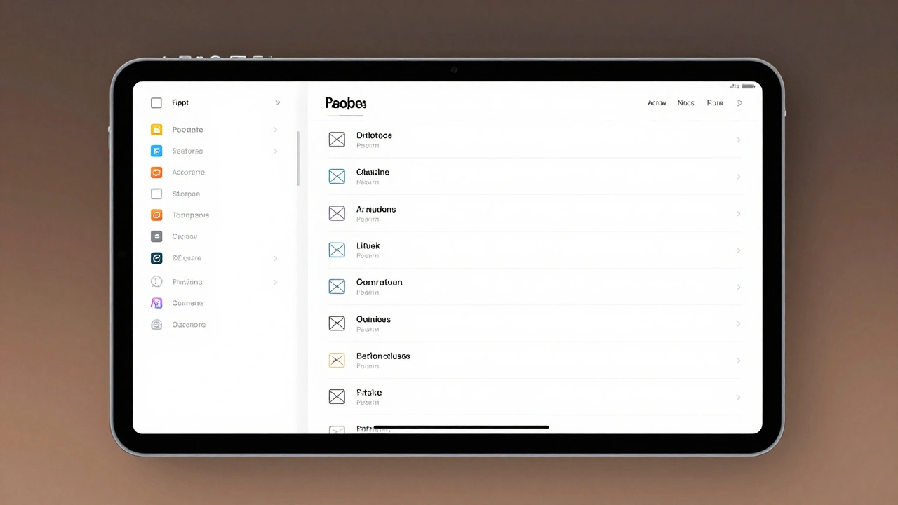
A sidebar is a vertical panel, usually on the left side of the screen. It shows a list of destinations-like folders, playlists, accounts, or categories. Think of Apple Mail: left side, all your inboxes and accounts lined up. No tapping through layers. Just one tap to jump from Gmail to iCloud to a shared folder.
The key difference? Tab bars are for mutually exclusive views. You’re in Mail, or in Calendar, or in Notes. Sidebars are for hierarchical navigation. You’re still in Mail, but now you’re drilling into sub-folders within your inbox. Sidebars flatten deep structures. Tab bars keep things flat.
When Should You Use a Sidebar?
Use a sidebar when your app has more than five major destinations or when content is nested. If your users need to jump between sections that aren’t equal in importance-like playlists, albums, artists, and recently played in a music app-a sidebar gives them a map.
Apple’s Music app on iPad is a perfect example. The sidebar shows Library, Playlists, Albums, Artists, and more. Tap one, and you’re there. But if you rotate your iPad to portrait mode, that same sidebar morphs into a tab bar. No loss of function. Just a smarter fit for the screen.
Mail is another winner. Without a sidebar, you’d have to tap through Accounts > Inbox > Sent > Drafts. With it? All visible at once. That’s not convenience-it’s efficiency. And on a 12.9-inch iPad Pro, that horizontal space is wasted if you don’t use it.
Sidebars also shine when users need to compare content. Imagine a document app where you’re switching between Projects, Templates, and Shared Folders. A sidebar lets you keep one open while browsing another. Tab bars? You lose context with every tap.
When Should You Use a Tab Bar?
Start with a tab bar if you’re unsure. Apple’s own advice is simple: begin with a tab bar. Why? It’s compact. It’s familiar. And it scales.
Tab bars are ideal when you have three to five core sections that users switch between often. Think of a news app: Home, Trends, Saved, Notifications, Settings. Each is a standalone view. No hierarchy. No nesting. Just quick access.
And here’s the kicker: tab bars are better for content immersion. When you’re reading an article or watching a video, you don’t want a big vertical panel eating up 25% of your screen. A thin top bar? It fades into the background. The content takes center stage.
Also, tab bars work better on smaller screens. If your app runs on iPhone too, a tab bar ensures consistency. Users don’t have to relearn navigation when they switch devices. Sidebars can get cramped on iPhone. Tab bars? They’re built for it.
The Magic of Morphing: iPadOS 18’s Big Leap
This is where things get exciting. iPadOS 18 doesn’t force you to choose. It lets your app adapt.
When you rotate your iPad from landscape to portrait, the sidebar doesn’t vanish. It transforms into a tab bar. Tap a tab, and if the app supports it, the tab bar can expand back into a sidebar. The transition is smooth, animated, and-most importantly-intuitive.
Take the Music app again. The top bar looks like a tab bar. Tap the Library icon. Suddenly, the full sidebar slides in. Tap it again? It snaps back. No extra menus. No confusing settings. Just a natural flow.
This isn’t just a visual trick. It’s a structural shift. Developers now use a single navigation system that renders as a tab bar or sidebar based on screen width. In SwiftUI, you set tabViewStyle(.sidebarAdaptable). In UIKit, you set tabBarController.mode = .tabSidebar. Behind the scenes, the system handles the rest.
And it’s not just about rotation. If you shrink your iPad app into a floating window, the sidebar automatically collapses into a tab bar. Resize it back? It expands again. Your app adapts to every possible size-without you writing a single line of conditional code.
Customization Is Key
Users don’t want a one-size-fits-all navigation. They want control.
In iPadOS 18, users can drag tabs in and out of the tab bar. They can hide less-used sections. They can rearrange the order. And those changes? They’re saved. Next time they open the app, it’s exactly how they left it.
As a developer, you decide what’s customizable. Use customizationBehavior in SwiftUI or the equivalent in UIKit to lock down critical tabs-like Search or Home-that should always be visible. Use defaultVisibility to hide less important ones by default, letting users add them back if needed.
Think of it like a toolbelt. You don’t need all 20 tools hanging on your belt all the time. Just the ones you use daily. The rest? Keep them in the drawer. Users can pull them out when they need them.
What About the Menu Bar?
Don’t forget the menu bar at the top of the screen. In iPadOS 18, it’s not just for File and Edit anymore. It’s now a navigation hub.
Populate the View menu with options like “Show Sidebar,” “Hide Sidebar,” or “Switch to Tab Bar.” This gives power users an alternate way to control navigation without touching the interface. It’s subtle, but it matters. People who use iPads for work expect this level of control.
And here’s a hard rule: never hide menu items based on context. If a user can toggle the sidebar, the option must always be visible. Consistency builds trust.
Design Rules to Live By
- Start with a tab bar. It’s simpler, more portable, and easier to scale into a sidebar later.
- Use sidebars for depth. If your content has folders, categories, or accounts that nest, the sidebar is your friend.
- Keep tab titles short. “Library” works. “My Music Library and Playlists” doesn’t.
- Don’t mix actions with navigation. Tabs should take you places, not trigger buttons. Save actions for toolbars or context menus.
- Test on all sizes. Portrait, landscape, floating window, split view. If your navigation breaks at 800px wide, it’s not adaptive.
- Make it persistent. Users expect their custom layouts to stay. Save their choices. Don’t reset them.
Real-World Examples
Mail: Sidebar only. Why? You’re dealing with dozens of accounts, folders, and labels. A tab bar would be useless here.
Music: Morphing system. Tab bar by default, sidebar on demand. Perfect balance of simplicity and power.
Files: Sidebar for folders, tab bar for recent, tags, and locations. Uses both, intelligently.
Notes: Tab bar for main sections (All Notes, Folders, Tags), sidebar for quick access to shared notebooks. Clean, efficient.
Notice a pattern? The apps that feel the most natural aren’t the ones with the fanciest UI. They’re the ones that match the task. Mail needs structure. Music needs speed. Notes needs flexibility. Your app should too.
What to Avoid
- Don’t use a sidebar on iPhone unless you have a compelling reason. It eats up too much width.
- Don’t overload a tab bar with more than five items. Users won’t find what they need.
- Don’t make users tap twice to get to a section. If it’s important, make it one tap.
- Don’t hide the navigation when scrolling. It should always be reachable.
- Don’t assume users know what your icons mean. Always pair icons with text labels.
Final Takeaway
There’s no single answer. No perfect choice. The best navigation on iPad isn’t a sidebar or a tab bar-it’s the one that changes when it needs to.
Build for adaptivity. Start simple. Let users shape the experience. And remember: your goal isn’t to show off a cool animation. It’s to help people find what they need-fast, without thinking about how they got there.
That’s the real win.