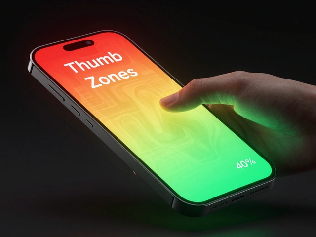

Have you ever tapped a button on your iPhone and felt sure it worked-even before you saw the result? That’s not luck. It’s design. Apple doesn’t just make things look clean. They make them feel right. And the secret isn’t in big features or flashy animations. It’s in the tiny moments: the slight vibration when you turn on Do Not Disturb, the way a toggle slides just a little too smoothly, or how a deleted email fades out like it’s dissolving into air. These are micro-interactions. And they’re the quiet engine behind Apple’s reputation for confidence-building interfaces.
What Exactly Are Micro-Interactions?
A micro-interaction is a single, focused moment where a user does something and the system responds. No more, no less. It’s not a whole feature. It’s the little piece of feedback that says, "I saw you. I got it. I’m working on it."
Think about unlocking your phone with Face ID. You lift it. The screen lights up. A subtle glow pulses around the edges. Then-click. The lock icon disappears. No sound. No pop-up. Just a quiet, immediate shift. That’s a micro-interaction. It doesn’t add functionality. But it removes doubt. You don’t wonder if your face was recognized. You just know.
Apple’s design team doesn’t treat these as afterthoughts. They’re engineered. Every pixel of animation, every millisecond of delay, every tone of vibration is tested. Not for looks. For feel.
How Micro-Interactions Reduce Cognitive Load
Cognitive load is the mental effort your brain spends figuring out what’s happening. If you tap a button and nothing changes, your brain starts asking questions: Did I tap hard enough? Is it broken? Did I miss something? That’s cognitive load. And it’s exhausting.
Apple cuts that load by giving instant, clear feedback. No guessing. No waiting. Just confirmation.
Take the Reminders app. Drag a task from one list to another. As you move it, the target list glows faintly. When you let go, the item slides in with a soft bounce. No confirmation pop-up. No "Task moved" message. Just motion. That motion tells your brain: "It’s done." You don’t need to read text. You just see it happened.
Research from Umea University found that users feel apps are faster when they use animated placeholders-even if the actual load time hasn’t changed. Google’s Material Design team confirmed that loading feedback reduces perceived wait times by nearly 20%. Apple uses the same principle. A spinning circle isn’t just decorative. It’s a silent promise: "I’m working. Just wait a second."
Even small things like hover states on Mac apps matter. When you move your cursor over a button, it doesn’t just change color. It lifts slightly. It gets a soft shadow. That’s not decoration. It’s a visual cue that says, "This is clickable. And here’s what will happen." Microsoft’s research showed clear hover states improve usability by up to 15% in complex interfaces. Apple doesn’t just follow that rule-they perfected it.
The Power of Haptic Feedback
Most companies rely on visuals. Apple adds touch.
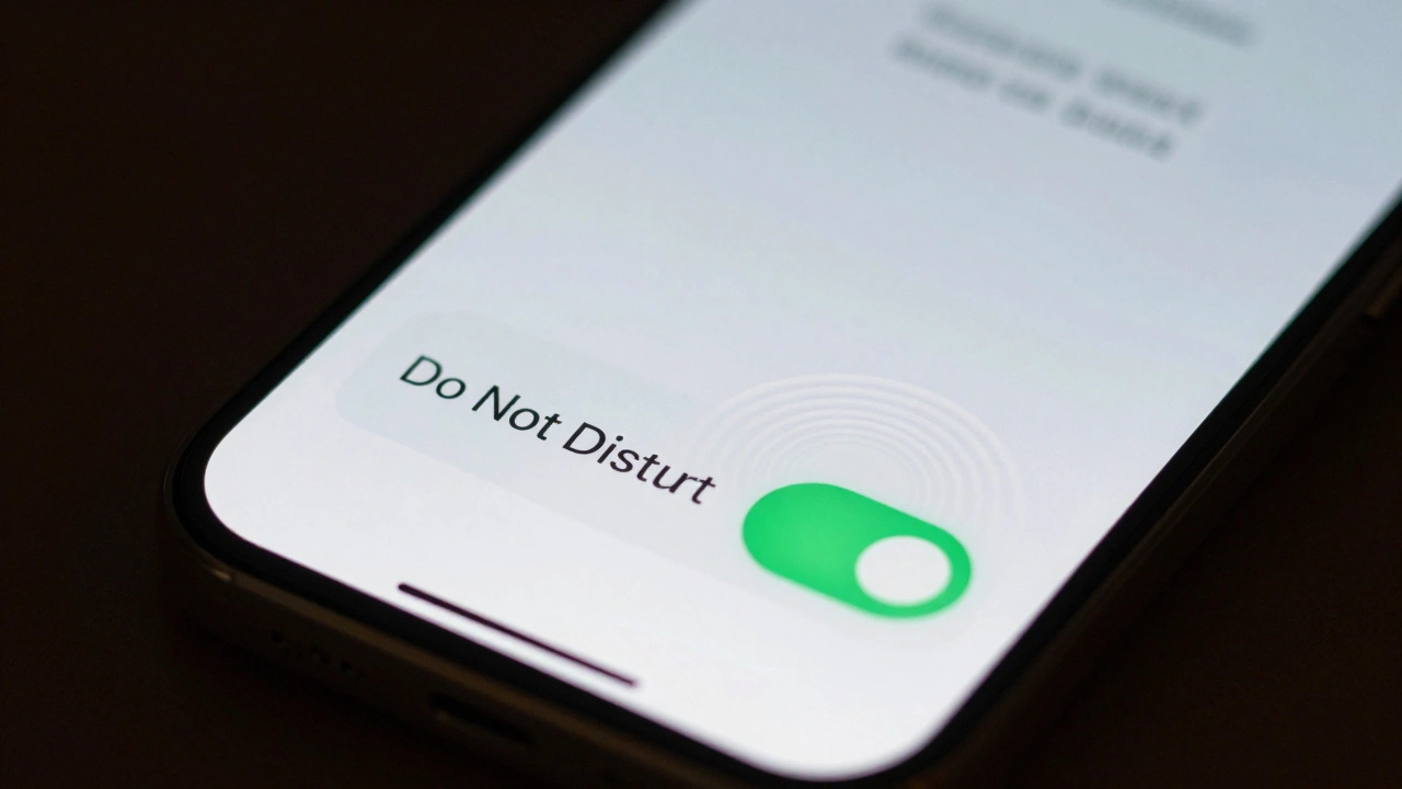
When you flip the Do Not Disturb switch, your phone doesn’t just show a green light. It vibrates-just once, softly. Not loud. Not annoying. Just enough to register in your finger. That’s haptic feedback. And it’s one of Apple’s most powerful tools.
Why? Because touch is direct. Your eyes can miss a color change. Your ears might not catch a sound. But your skin? It feels it. And that feeling creates trust. You don’t need to look at the screen to know the switch is on. You feel it.
This isn’t magic. It’s science. Cognitive Load Theory shows that combining multiple feedback types-visual + haptic-strengthens understanding without overloading the brain. Apple doesn’t just give you one signal. They give you two. And together, they’re stronger than either alone.
Even in apps like Notes, when you scribble with the Apple Pencil, the ink doesn’t just appear. It draws with a slight delay that mimics real pen on paper. It’s not about realism. It’s about reassurance. You feel like you’re writing. So you trust the tool.
Delight Isn’t Optional-It’s Functional
People think Apple’s animations are just pretty. They’re not. They’re strategic.
When you close an app on iOS, it doesn’t just disappear. It shrinks, tucks into the dock, and fades out like a leaf settling. That’s not a bonus. It’s a mental anchor. It tells your brain: "The app is still there. It’s safe. You can find it again."
That same logic applies to notifications. When a message arrives, it doesn’t just pop up. It slides in from the top, gently, with a faint shimmer. It doesn’t shout. It invites. That subtle motion reduces stress. You don’t feel interrupted. You feel acknowledged.
Studies show interfaces with micro-interactions are rated as more "interesting," "likeable," and "pleasant"-even when overall usability scores don’t change dramatically. Why? Because delight builds emotional connection. And emotional connection builds loyalty. You don’t just use Apple products. You enjoy them. And that’s why people keep coming back.
Why Small Details Matter More Than You Think
A 2021 ConversionXL study tested dozens of small UI tweaks. Button animations. Confirmation messages. Inline success icons. The results? Conversion rates jumped 6-10% just from these tiny changes.
Apple doesn’t need to boost conversions. But they do need to keep users engaged. And they do it by polishing the invisible stuff.
Take the Music app. When you tap "Play," the play button doesn’t just change color. It pulses gently, like a heartbeat. The album art doesn’t just zoom in. It rotates slightly as it expands. These aren’t flashy. They’re quiet. But they tell your brain: "This is alive. This is responsive. This is made for you."
That’s the difference between a tool and a companion. A tool does the job. A companion makes you feel good while doing it.

Accessibility Isn’t an Add-On
Some designers think micro-interactions are just for sighted users. Apple knows better.
Every animation, every vibration, every sound is designed with accessibility in mind. Screen readers can still announce actions. Haptic feedback works without vision. Animations can be reduced or turned off entirely in Settings. And the core feedback remains: if you tap, you get a response. That’s the rule.
Apple doesn’t treat accessibility as a checkbox. They treat it as a design principle. Because if a micro-interaction doesn’t work for everyone, it doesn’t work at all.
The Future: Smarter, More Personal
What’s next? AI.
Apple is already testing micro-interactions that adapt. If you always open Messages at 8 a.m., your lock screen might gently pulse with a notification preview-just for you. If you’re typing fast, the keyboard might anticipate your next word and highlight it before you finish. These aren’t predictions. They’re intuitive nudges.
Future haptic tech will let you feel textures through the screen. A button might vibrate like it’s made of metal, or ripple like fabric. That’s not sci-fi. It’s the next step in making digital interactions feel real.
But the goal stays the same: reduce thinking. Increase trust. Make every tap feel like it matters.
What You Can Learn From Apple
You don’t need to be Apple to use these ideas. Here’s what actually works:
- Every interaction needs feedback. No exceptions.
- Use motion to show change, not just decoration.
- Haptic feedback is powerful. Use it to confirm actions, not just alert.
- Animations should be fast, smooth, and subtle. If it draws attention to itself, it’s too loud.
- Test with real users. Watch where they hesitate. That’s where you need a micro-interaction.
- Accessibility first. If someone can’t feel or see it, it’s not a feature. It’s a flaw.
Great design doesn’t shout. It whispers. And those whispers? They build confidence.
Why do micro-interactions matter if they’re so small?
Because they’re not about size-they’re about certainty. A single micro-interaction removes doubt. When users don’t have to wonder if their action worked, their brain stops working overtime. That’s cognitive load reduction. And over hundreds of interactions per day, that adds up to a feeling of control, ease, and trust.
Can micro-interactions make an app feel faster?
Yes-even if it’s not actually faster. Research shows that animated feedback, like skeleton screens or progress indicators, can reduce perceived wait times by up to 20%. That’s because the brain interprets motion as progress. If something moves, it feels like it’s doing something. No motion? It feels broken or stuck.
Do micro-interactions improve usability scores?
Not always in overall scores, but in key areas. Studies found users rated interfaces with micro-interactions higher in learnability, perceived integration, and reduced cumbersomeness. The emotional response was stronger too-users found them more pleasant and engaging. That’s why people stick with apps that feel good, even if they’re not "better" in a technical sense.
Is haptic feedback just for iPhones?
No. Apple uses it across all devices. On Macs, trackpad haptics simulate clicks. On Apple Watch, taps give confirmation without looking. Even the Magic Keyboard uses subtle feedback to simulate key presses. Haptics aren’t tied to one device-they’re a core part of Apple’s system-wide design language.
Can too many micro-interactions hurt the experience?
Absolutely. If every tap has a bounce, a sound, a vibration, and a color shift, it becomes noise-not feedback. Apple’s rule is: one clear signal per action. Less is more. The goal isn’t to entertain. It’s to reassure. Overdo it, and you create cognitive load instead of reducing it.
Categories
Popular Articles