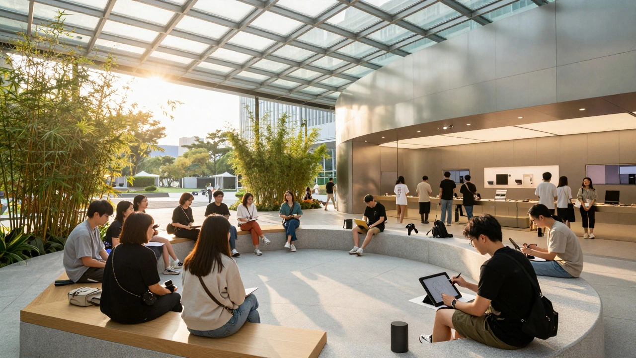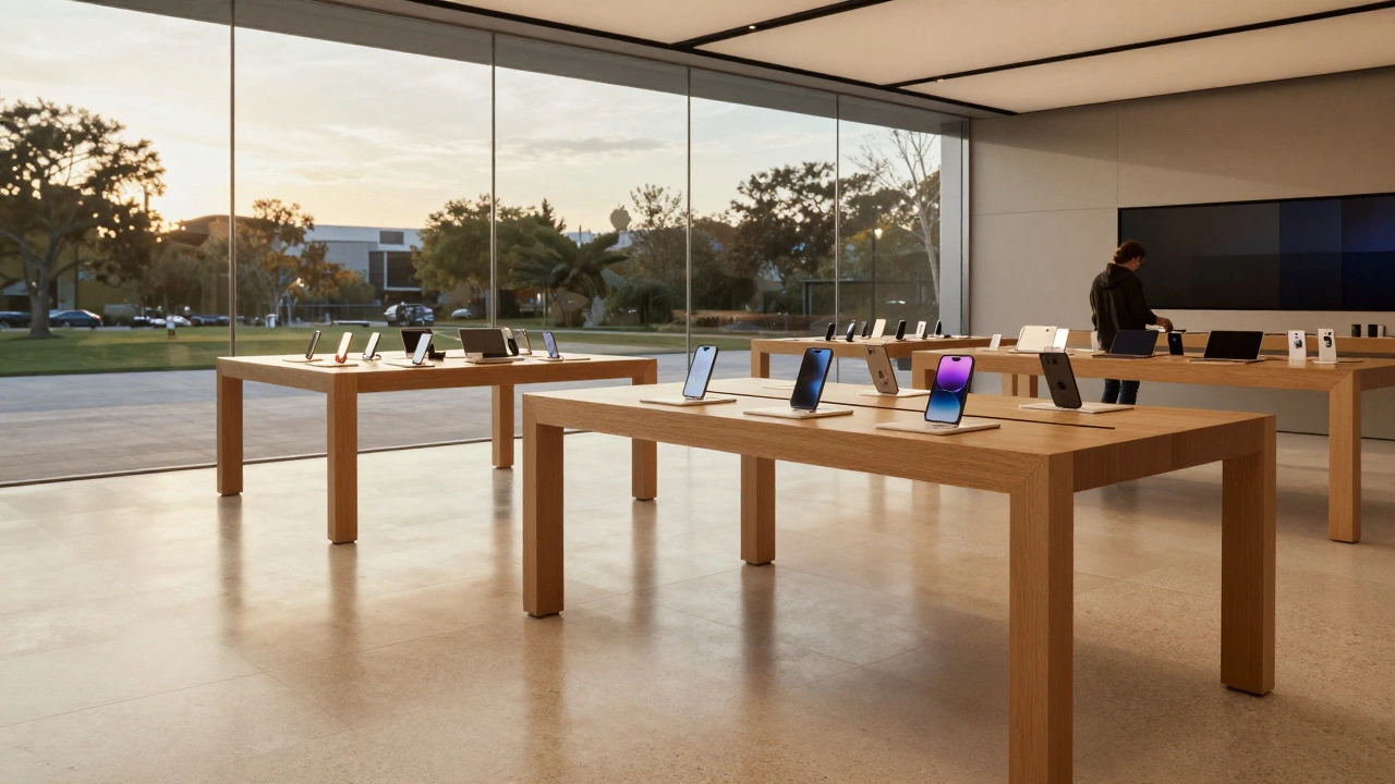

Apple doesn’t sell products in its stores. Not really. You won’t find pushy clerks, flashing discount signs, or crowded aisles. Instead, you walk into a space that feels like a quiet library meets a modern art gallery. The floors are smooth stone. Tables are made of warm, light wood. Light filters through glass walls like morning sun on a MacBook screen. There’s no pressure. No noise. Just space - and products, arranged like museum pieces, waiting to be touched.
The Quiet Power of Simplicity
Apple’s retail stores don’t look like other stores. That’s intentional. While competitors cram shelves with products and blast music to create urgency, Apple removes everything that distracts. No logos on the walls. No bright banners. No price tags in your face. Just clean lines, natural materials, and open space. The design isn’t decorative - it’s a message. It says: Apple believes in clarity. In calm. In letting the product speak for itself. This approach didn’t come from a marketing meeting. It came from Steve Jobs’ obsession with simplicity. After returning to Apple in 1997, he stripped away complexity from both products and experiences. The "Think Different" campaign wasn’t just about ads - it was about redefining what Apple stood for. And that philosophy found its physical form in retail.Materials That Feel Like the Products
Walk into any Apple store and your hands will notice something before your eyes do: the wood. Not painted wood. Not veneer. Real, unfinished wood - usually ash or maple - sanded smooth and left to show its grain. It’s the same warmth you feel when you hold an iPhone or MacBook. The stone underfoot? Often polished basalt or travertine, cool to the touch, grounded and quiet. These aren’t just aesthetic choices. They’re emotional ones. Think about it: Apple’s products are made of aluminum, glass, and silicone. But the retail space uses wood and stone. Why? Because those materials carry something digital can’t: history, texture, calm. They make technology feel human. They say, "This isn’t cold machinery. It’s something that belongs in your life, not just your hand."Open Plans That Invite, Not Force
There are no barriers in an Apple store. No ropes. No glass cases you have to beg to open. Products sit on tables. You can pick them up. Try them. Play with them. No permission needed. This open layout isn’t about saving space - it’s about trust. Apple trusts you to explore. It trusts you to learn. It trusts you to decide. Compare this to a Best Buy or Walmart. There, the goal is to move you through quickly, to push you toward a purchase. Apple’s goal is to slow you down. To let you linger. To make you feel like you’re not shopping - you’re discovering. The layout is simple: a central open area for hands-on use, surrounded by smaller zones for support - the Genius Bar, the Today at Apple area, the accessories corner. No confusing turns. No dead ends. You can walk in, wander, and find your way without ever needing a map.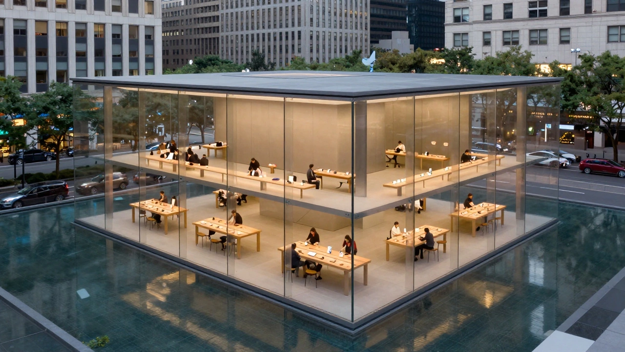
Architecture as Brand Identity
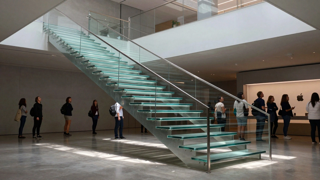
Apple’s flagship stores aren’t just buildings - they’re landmarks. The glass cube on Fifth Avenue in New York? It’s become a photo stop. Tourists stand in front of it. Locals sit on the steps. It’s not a store. It’s a public square with Wi-Fi. The spherical store in Singapore? A floating glass dome surrounded by water, with shading fins that block the sun like eyelashes. It’s not just beautiful - it’s smart. It responds to its environment. That’s Apple’s philosophy in architecture: design that adapts, doesn’t just decorate. These aren’t exceptions. They’re the rule. Every store, from Tokyo to Sydney, follows the same principles. Even smaller locations - like the one in a strip mall in Boise - use the same wood tables, the same lighting, the same quiet. Consistency isn’t about control. It’s about trust. When you see that design in a new city, you know what to expect. And that familiarity builds loyalty.Signage That Disappears
Look closely at Apple’s signage. You won’t find bold, blocky fonts or neon signs. The logo glows softly on the storefront - the same way it glows on the back of a MacBook. Inside, product names are printed in thin, clean type on matte panels. Even the "Today at Apple" event boards are subtle, almost like art installations. This isn’t minimalism for minimalism’s sake. It’s about reducing visual noise so your attention stays on the product. You don’t need a sign that says "iPhone 15." You just need to see it, pick it up, and feel it. Apple even controls how its products appear in third-party stores. At Best Buy, the Apple section uses the same wood tables, the same lighting, the same layout. It’s not an accident. It’s a system. Apple doesn’t just design its own stores - it designs how its products are presented everywhere.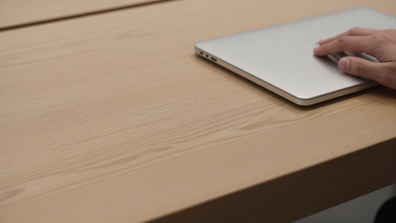
Why Other Brands Fail to Copy It
You’ve seen it. Nike stores with Apple-style tables. McDonald’s with glass walls and minimalist furniture. Tesla stores that look like Apple’s. But none of them feel the same. Why? Because they’re copying the shape, not the soul. Apple’s design works because it’s not about aesthetics. It’s about alignment. Every choice - from the type of wood to the height of the tables - reflects a deeper belief: that technology should be simple, calm, and human-centered. If your brand is loud, chaotic, or transactional, you can’t just paint your walls white and call it minimalist. You’ll just look like you’re trying too hard. Retail designer Sergio Mannino put it plainly: "Apple’s stores succeed because they’re a perfect expression of what Apple stands for. That’s why they can’t be copied."The Bigger Picture: Retail as a Public Space
Apple stores aren’t just places to buy. They’re places to learn. To create. To gather. The Genius Bar isn’t a repair desk - it’s a quiet room where someone helps you understand your device. The "Today at Apple" sessions aren’t sales pitches - they’re workshops on photography, music, coding. The plazas and forums are designed for events, not checkout lines. This turns retail into community. It turns customers into participants. And that’s what makes people come back - not because they need a new iPad, but because they feel something here. Something calm. Something real.It’s Not Just Design. It’s Philosophy.
Minimalism in Apple retail isn’t about removing things. It’s about adding meaning. Every piece of wood, every square foot of stone, every beam of light - it’s chosen to say something. To create a feeling. To make technology feel like part of life, not separate from it. That’s why no other brand has fully replicated it. You can copy the furniture. You can copy the lighting. But you can’t copy the belief system behind it. Apple’s stores don’t sell products. They sell peace. They sell clarity. They sell the quiet confidence that comes from knowing something is designed well - not just to work, but to belong.Why does Apple use wood and stone instead of metal or plastic?
Apple uses wood and stone because those materials feel warm, natural, and human. While Apple’s products are made of metal and glass, the retail space needs to soften the tech. Wood and stone create a tactile, calming contrast that makes devices feel more approachable. They signal that Apple’s technology isn’t cold or distant - it’s designed to fit into real life.
Do Apple stores make money?
Yes, but not the way traditional stores do. Apple stores don’t push sales or use aggressive tactics. Instead, they build trust. Customers who visit Apple stores are more likely to buy - and spend more - because they feel understood, not pressured. Studies show Apple stores generate more revenue per square foot than any other retailer in the world, not because they’re packed with products, but because they create loyal customers.
Why don’t Apple stores have price tags?
Apple removes price tags to avoid early judgment. If you see a price right away, you might decide not to engage. Without it, you’re free to explore. The price is available if you ask - but the experience comes first. This shifts focus from cost to value, from transaction to connection.
How do Apple stores differ from Tesla’s retail stores?
Tesla copied Apple’s layout - open space, clean lines, no salespeople - but missed the emotional core. Apple’s stores feel calm and welcoming. Tesla’s feel clinical and corporate. Apple uses wood, soft lighting, and human interaction to create warmth. Tesla relies on glass and steel, which can feel cold. The difference isn’t in the design - it’s in the intent. Apple wants you to feel at home. Tesla wants you to feel impressed.
Can other retailers use Apple’s design model?
They can borrow elements - like open layouts or natural materials - but they can’t copy the whole system. Apple’s design works because it’s tied to its brand identity: simplicity, calm, innovation. A fast-food chain or discount retailer can’t just paint their walls white and expect the same results. Without the underlying philosophy, the design feels fake. It’s like putting a Ferrari engine in a truck - the parts might look right, but the soul is missing.