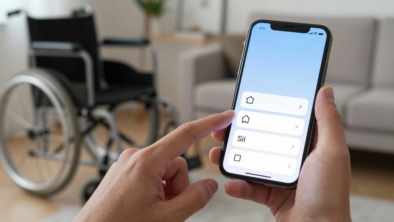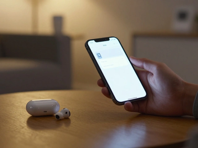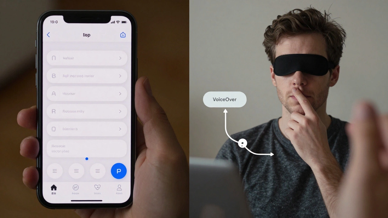

When you open an app on your iPhone, do you ever think about whether someone using VoiceOver can actually complete the same task? For most people, tapping a button or reading a label is effortless. But for users with visual or motor impairments, that same action might be impossible - not because the app is broken, but because accessibility was never measured properly during development.
Apple has built some of the most advanced accessibility tools in the industry: VoiceOver, Switch Control, Zoom, and Dynamic Type. But having tools isn’t enough. What matters is whether developers are using them - and whether users can actually get things done. The real question isn’t whether Apple offers accessibility features. It’s whether apps on the App Store let people use them.
Most Apps Fail Basic Accessibility Checks
A landmark Apple study analyzed 77,637 screens from over 4,000 iPhone apps. The results were startling. Over 94% of those apps had at least one screen with a serious accessibility issue. That’s not a handful of bad apps - it’s nearly every app you’ve ever downloaded.
One of the biggest problems? Missing or incorrect accessibility labels. About 59% of screens had UI elements that were either unlabeled or labeled with something like "Button" or "Image" - useless for someone relying on VoiceOver. Imagine trying to navigate a map app where every pin is called "Circle," or a shopping app where every product image says "Photo." You wouldn’t know what to tap. You’d give up.
Even worse, many buttons were too small. Apple’s Human Interface Guidelines say tappable areas must be at least 44×44 points. But in practice, developers often shrink buttons to fit more content on screen. For someone using Switch Control or a large-touch interface, a 30-point button might as well not exist.
How Apple Measures Accessibility - And Where It Falls Short
Apple didn’t just point fingers. They built a machine learning model to detect accessibility problems automatically. Using a dataset of over 5,000 screenshots, they trained a system to recognize UI elements - text, buttons, icons, checkboxes - and check whether they were properly labeled and sized.
The model achieved a 71.3% accuracy rate using standard detection rules. But here’s the twist: when they adjusted the rules to match how screen reader users actually interact with apps, accuracy jumped to 75.4%. Why? Because real users don’t care about pixel-perfect boundaries. They care about whether the screen reader says the right thing when they tap.
Some elements were easy to detect. Text had an 87.5% accuracy rate. Icons? 79.7%. But selected checkboxes? Only 27.4%. That’s because the visual state of a checked box doesn’t always match its accessibility label. A user might hear "Checkbox, selected" while seeing an unchecked box - or vice versa. That kind of mismatch doesn’t just confuse users. It breaks trust.
Apple’s model also learned to group related elements. Instead of reading a label, then a text field, then a button separately, it learned to treat them as one unit: "Name, enter your name, save." That cut down navigation time by up to 40% for screen reader users. That’s not a feature. It’s a lifeline.
Task Completion Is the Only Metric That Matters
It’s easy to check if an app passes a checklist: "Did you label the button? Yes." "Is the contrast above 4.5:1? Yes." But none of that matters if a user can’t complete their goal.
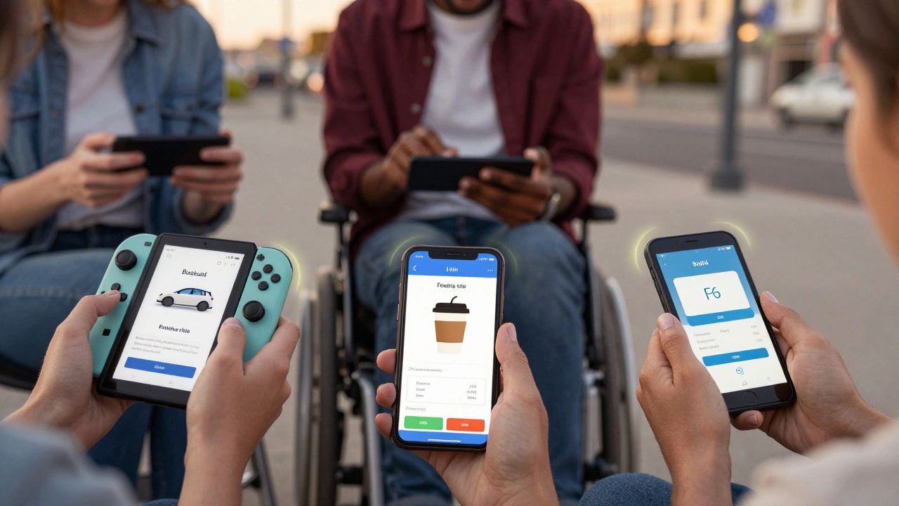
Apple worked with three blind QA engineers and two senior accessibility experts over five months. They didn’t just test code. They watched people try to:
- Book a ride using Uber
- Order coffee from Starbucks
- Pay a bill using Chase Mobile
What they found was brutal. Even apps with "perfect" accessibility labels failed in real use. Why? Because labels weren’t meaningful. "Pay now" isn’t helpful if the user doesn’t know what they’re paying for. "Continue" doesn’t tell you if you’re about to delete your account.
Task completion success wasn’t measured by how many errors were fixed. It was measured by: Did the user finish the task without help? In one test, 68% of users couldn’t complete a payment flow in a major banking app - not because it crashed, but because the confirmation step had no spoken feedback. They tapped blindly. They failed.
What’s Being Done - And What’s Missing
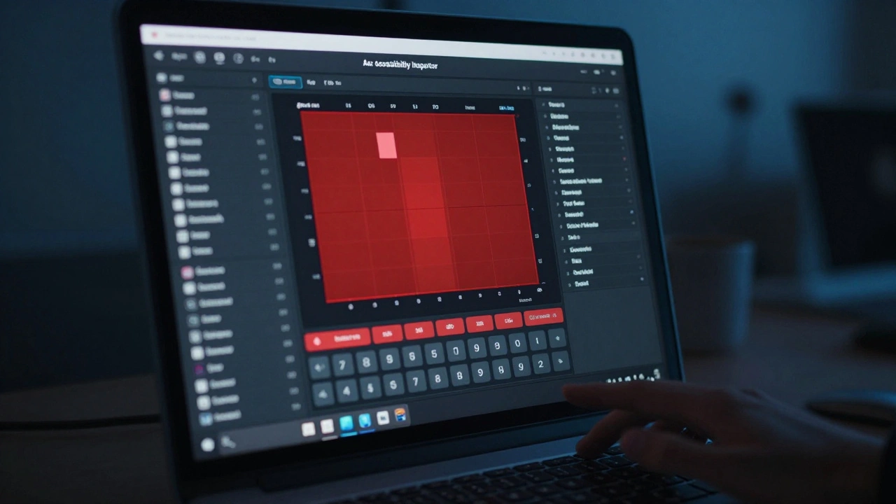
Apple’s tools are powerful. Accessibility Inspector lets developers see exactly what VoiceOver hears. XCTest lets teams run automated checks in CI/CD pipelines. You can now build a test that fails if a button is smaller than 44 points or if a label is missing.
But adoption? Still low. Fewer than one-third of apps on the App Store fully support VoiceOver. Why? Because most teams treat accessibility as a final step - something to fix before launch. Not as part of design.
The companies that get it right build accessibility into their Definition of Done. For them, a feature isn’t done until:
- Every tappable element is at least 44×44 points
- Every image has a descriptive label
- Text has at least 4.5:1 contrast against its background
- Screen reader navigation flows logically from start to finish
And they test it with real users - not just engineers. One fintech startup in Portland hires people with low vision to test every new screen. They don’t just report bugs. They say: "I can’t tell if this button sends money or deletes my account." That feedback changes code.
The Future: AI That Sees What Humans Miss
Apple’s AI model runs on-device, using just 60 MB of memory and completing a scan in 20 milliseconds. That means it could one day run inside the App Store - scanning every new app submission for accessibility issues before it goes live.
Tools are already emerging that use computer vision to:
- Check contrast ratios automatically
- Verify touch target sizes
- Generate accurate accessibility labels from visual content
Imagine a developer dragging a new screen into a testing tool - and instantly seeing: "Your "Submit" button has no label. Your form field is 32 points wide. Your text contrast is 3.8:1." No manual inspection. No waiting for QA. Just instant feedback.
That’s not science fiction. It’s happening now. And it’s the only way we’ll fix the 94% failure rate.
What You Can Do Today
If you’re building for Apple:
- Run Accessibility Inspector on every screen before you ship.
- Test with VoiceOver turned on - not just for 5 minutes, but while trying to complete a real task.
- Use XCTest to automate checks for minimum touch size and contrast ratios.
- Ask someone with a disability to use your app - and pay them for their time.
If you’re a product manager: Add accessibility criteria to your Definition of Done. Make it non-negotiable.
If you’re a user: Report accessibility issues. Apple listens. Every report matters.
Accessibility isn’t about compliance. It’s about control. It’s about whether someone can tap a button and know they’re doing the right thing. If your app can’t deliver that - it doesn’t matter how beautiful it looks. It’s broken.
How do I check if my iOS app is accessible?
Use Apple’s Accessibility Inspector in Xcode to review every screen. Turn on VoiceOver and try to complete key tasks like signing in, making a purchase, or sending a message. Run automated tests with XCTest to check for minimum touch target sizes (44×44 points), proper labeling, and color contrast (at least 4.5:1). Don’t rely on automated tools alone - test with real users who use assistive technologies daily.
Why do so many apps fail accessibility tests?
Most teams treat accessibility as an afterthought. Developers focus on visual design and functionality, assuming that if it looks right, it works. But accessibility isn’t about appearance - it’s about meaning. If a button says "Button" instead of "Add to cart," or if a form field has no label, screen reader users can’t understand what to do. Without user testing and automated checks built into the development workflow, these issues stay hidden until launch - or worse, until users abandon the app.
What’s the minimum contrast ratio for text on iOS?
Apple follows WCAG 2.1 guidelines, requiring a minimum contrast ratio of 4.5:1 for normal text (under 18.5pt) and 3:1 for large text (18.5pt or larger, or bold 14pt or larger). Tools like Accessibility Inspector and third-party plugins can scan your app’s colors and flag violations. Many apps fail because they use light gray text on white backgrounds - which may look fine to sighted users but is unreadable for people with low vision.
Can automated tools fully replace manual accessibility testing?
No. Automated tools can catch technical issues like missing labels, small touch targets, or poor contrast. But they can’t judge whether a label makes sense. "Submit" isn’t helpful if the user doesn’t know what they’re submitting. "Image" doesn’t tell someone if it’s a photo of their dog or a payment confirmation. Only real users - especially those who rely on assistive tech - can determine if a task is truly completable. Automation finds the bugs. Human testing finds the broken experiences.
Is VoiceOver adoption improving on the App Store?
Slowly, but not fast enough. Apple’s research shows that over 94% of apps still have at least one accessibility issue. Fewer than one-third of apps fully support VoiceOver. While larger companies and well-funded startups are improving - thanks to better tools and stricter internal policies - small developers often lack the resources or awareness to prioritize accessibility. Until accessibility becomes a core part of the release checklist - not a checkbox at the end - adoption will remain patchy.