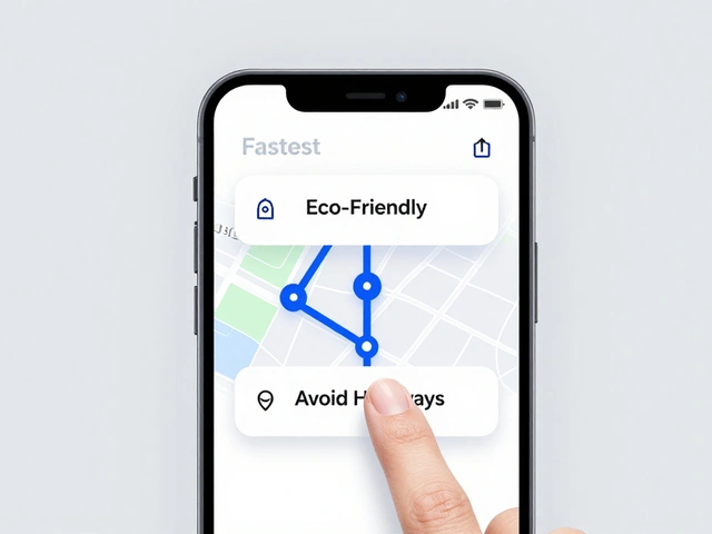
Apple just changed how app icons are made. At WWDC25 in 2025, they introduced Icon Composer is a built-in tool in Xcode 26 that lets designers and developers create dynamic, multi-layered app icons with Liquid Glass effects for iPhone, iPad, macOS, and Apple Watch. Also known as Icon Composer Tool, it replaces the old method of manually exporting dozens of static icon sizes for each platform and appearance mode.
Before Icon Composer, you had to design separate icons for light mode, dark mode, mono mode, and each device. That meant five or six different versions of the same icon, all hand-tuned. If you changed one color, you had to update every file. It was slow. It was error-prone. And it made consistency across platforms nearly impossible. Now, with Icon Composer, you build one layered file-and it auto-generates everything else.
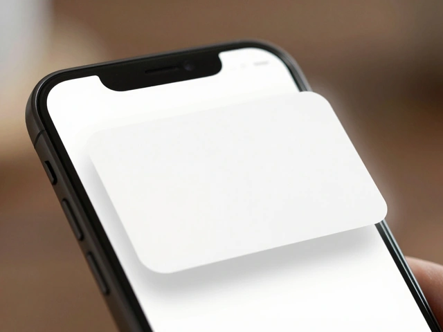
How Icon Composer Works: Layers, Groups, and Depth
Icon Composer doesn’t just stack images. It builds depth. Think of your icon as a stack of transparent glass sheets, each with its own lighting behavior. The tool lets you organize up to four groups, and each group can hold multiple layers. The bottom group is your background. The next one sits on top, then the next, and so on. Each layer you add increases the perceived depth.
When you drag an SVG or PNG into the left sidebar, Icon Composer automatically assigns it to a new layer. If you drag a folder, it becomes a group-with each file inside acting as a layer. SVGs need special care: since they don’t preserve fonts, you must convert all text to outlines before importing. Otherwise, the text disappears or renders as a placeholder.
The order matters. Layers render from back to front. So if you want a highlight to appear on top of a shadow, make sure the highlight layer is higher in the stack. You can drag groups and layers up or down in the sidebar to reorder them. Double-click any name to rename it. The tool sorts everything alphabetically by default, but you’re free to rearrange it however makes sense for your design.
Liquid Glass: The Magic Behind the Effect
Apple’s new Liquid Glass is a dynamic material system that gives app icons depth, transparency, and real-time lighting response based on system conditions. It’s not just a filter-it’s a physics-based rendering engine built into the icon itself.
When you import artwork, Icon Composer automatically applies Liquid Glass to every group. You can tweak it in the right-side inspector. There are two modes: Individual and Combined. In Individual mode, each layer gets its own glass effect-so a top layer might shimmer differently than the one below it. In Combined mode, the whole group acts like one piece of glass. The Home app uses all four groups with Individual mode, giving each layer unique depth and reflection. The Messages app uses just two groups in Combined mode for a cleaner, unified look.
You can adjust the intensity of the glass effect, the highlight angle, and even how much it responds to ambient light. The preview canvas simulates lighting conditions in real time. Move your mouse over the preview, and the icon reacts like it’s sitting on a real device under a lamp. This isn’t a static mockup. It’s a live simulation.
Color, Fill, and Appearance Variants
Icon Composer doesn’t just handle lighting-it handles color too. Each layer has its own fill settings. The default is Automatic, which pulls the original color from your SVG or PNG. But you can override that. Choose None to make a layer transparent, Solid to lock in a single color, or Gradient to blend two colors.
Gradients are easy: click the color well, pick your start and end colors, and adjust the angle. You can even set different gradients for light and dark modes. That’s where the real power kicks in. Take the Translate app icon: the speech bubbles are split into two layers. The outer bubble is a light blue in light mode, but switches to a soft gray in dark mode. The inner bubble stays white. By separating them, you don’t have to rework the whole icon-you just change one layer’s fill.
The Appearance inspector lets you define how each group behaves across light, dark, and mono modes. Mono mode strips all color and uses grayscale. You can choose to let the system auto-generate it, or manually define how each layer should appear. This gives you full control over accessibility and contrast without needing separate files.
Positioning and Layout: Precision Over Guesswork
Dragging graphics around the canvas works fine for rough placement. But for pixel-perfect alignment, use the Layout section in the inspector. Here, you can type exact x and y coordinates, and set scale percentages. Want the foreground element to sit exactly 8 pixels from the top and 12 pixels from the left? Just type it in. No more zooming in, squinting, and guessing.
When you select a group, dragging a layer moves the entire group. When you select a single layer, only that layer moves. This lets you fine-tune relationships between elements without accidentally shifting everything else. It’s especially useful when you’re aligning text with shapes or creating subtle overlaps.
Previewing Across Platforms
At the bottom of the canvas, you’ll see buttons for iPhone, iPad, macOS, and Apple Watch. Click any one, and the icon instantly scales and crops to match that device’s icon shape. Tap the light/dark/mono toggle, and it switches appearance modes in real time. No need to export, open in Simulator, or guess how it’ll look.
The top toolbar lets you toggle grid overlays and simulate device bezels. You can see how the icon sits inside the rounded corners of an iPhone or the square frame of a Mac app menu. This level of preview used to require a dozen different tools. Now it’s all in one place.
Exporting: One File, Infinite Uses
When you’re done, you don’t export a PNG or SVG. You export a single .iconcomposer file. Drop it into your Xcode 26 project, and it automatically generates all the required icon variants for every platform and appearance mode. Xcode handles the rest-no more 1024x1024, 512x512, 180x180, 100x100, 32x32, 20x20 files. You just get one file that works everywhere.
Need a static version for your App Store listing or marketing materials? Icon Composer has a one-click option to export a flattened PNG. It’s not interactive, but it looks identical to the live icon. This means your marketing team can use the exact same visual as your users see in the app.
Real-World Examples: What Works
The Messages app uses just two layers: a background shape and a foreground message bubble. That’s it. Simple, clean, and effective. The Home app uses all four groups: a base layer for the house outline, a second for the roof, a third for the window glow, and a fourth for the floating light particles. Each has its own Liquid Glass behavior, creating a rich, animated feel without animation files.
Apple’s own design team says the key is separation. Don’t combine colors into one layer. Split them. If your icon has red and blue elements, make them two layers. That way, you can change just the red in dark mode without touching the blue. It saves hours. It prevents mistakes. And it makes your icon feel alive.
Who Should Use Icon Composer?
It’s not just for designers. It’s not just for developers. It’s for both. If you’re building an app for Apple platforms, this tool belongs in your workflow. Designers get precise control over visual hierarchy. Developers get a single file that works everywhere. No more back-and-forth. No more mismatched icons. Just one source of truth.
And because it’s built into Xcode 26, there’s no extra cost. No separate download. No license. If you have Xcode, you have Icon Composer. It runs only on macOS, so Windows users won’t have access-but that’s fine. Apple’s ecosystem is macOS-first for design tools anyway.
What’s Next?
Icon Composer is brand new. In 2026, we’re just starting to see apps adopt it. You’ll notice more icons with subtle depth, glowing edges, and lighting that shifts as you tilt your device. This isn’t just a tool update-it’s a design language shift. Apple is moving from flat, static icons to interactive, responsive ones.
Start small. Try it with one app. Split your main icon into two layers. See how the Liquid Glass reacts. Export it. Put it in Xcode. Test it on a real device. You’ll see the difference immediately. And once you do, you’ll never go back to the old way.
Do I need to be a designer to use Icon Composer?
No. While it’s built for designers, Icon Composer’s interface is simple enough for developers to use. You don’t need to know Adobe Illustrator or Figma. Just drag in your PNG or SVG files, adjust the layers, and export. Apple designed it for cross-discipline teams, so if you’re comfortable with Xcode, you can handle Icon Composer.
Can I use Icon Composer with older versions of Xcode?
No. Icon Composer is only available in Xcode 26 and later, released in 2025. If you’re using Xcode 25 or earlier, you’ll need to stick with the old method of exporting multiple icon sizes manually. Upgrading to Xcode 26 is required to use the tool.
What file formats does Icon Composer support?
Icon Composer accepts SVG and PNG files. SVG is preferred for scalability, but you must convert all text to outlines before importing, since SVG doesn’t embed fonts. PNG works fine for rasterized graphics, but won’t scale as cleanly if you need to resize later.
How many layers can I use in one icon?
You can have up to four groups, and each group can contain multiple layers. Apple recommends keeping it under four groups total, as more complexity doesn’t improve the user experience. The system was designed with "the right bounds for how much visual complexity an icon should have," according to Apple’s WWDC25 session.
Can I export my icon for non-Apple platforms?
The .iconcomposer file is Apple-only and can’t be used outside Xcode. But you can export a flattened PNG version that works anywhere-App Store, websites, social media. That’s the static version you’d use for marketing. The interactive, layered version stays inside your app.