
Apple’s app icons aren’t just small images-they’re the first thing users see, the fastest way to recognize your app, and a critical part of your brand’s visual identity. With iOS 26 and the Liquid Glass design system launched in September 2025, Apple has raised the bar again. If you’re designing an app icon today, you’re not just picking colors and shapes. You’re building a dynamic, responsive, and deeply consistent visual anchor across iPhone, iPad, Mac, Apple Watch, and Vision Pro. And it’s harder than ever to get right.
Start with One Clear Shape
Forget trying to fit your whole app into a 1024×1024 pixel canvas. Apple’s guidelines are clear: your icon should communicate its purpose in under a second. That means one strong shape, maybe two. Think of the Notes app-just a yellow rectangle with a folded corner. Or the Calculator app-clean numbers in a simple grid. No clutter. No extra buttons. No tiny text that vanishes at 29 pixels.
When you design, ask yourself: If I saw this icon on a dim screen, 10 feet away, would I know what it does? If the answer is no, simplify. Remove anything that doesn’t directly answer that question. A photo of a person? Too detailed. A screenshot of your app’s interface? Too messy. A stylized icon of a camera, a calendar, or a music note? That’s the sweet spot.
Color Rules: Less Is More
Apple doesn’t want rainbows. They want clarity. Stick to two or three main colors max. Why? Because your icon will be shown on dark backgrounds, light backgrounds, and everything in between. If your icon uses a light blue on a white background, it might disappear. If it uses a dark green on a black background, it’ll vanish too.
Test your colors on both light and dark modes. Use a subtle gradient from top to bottom-light at the top, slightly darker at the bottom-to help the icon pop against the Liquid Glass background. But don’t overdo it. A gradient should enhance, not distract. Your brand colors should stay consistent across all icon sizes. If your logo is red on the website, it should be red on the iPhone, Mac, and Watch. No exceptions.
And avoid gradients that mimic real-world lighting. Apple’s system now applies dynamic lighting based on device motion. If your icon already has a fake shadow or highlight, it’ll clash. Keep your color layers flat, clean, and intentional.
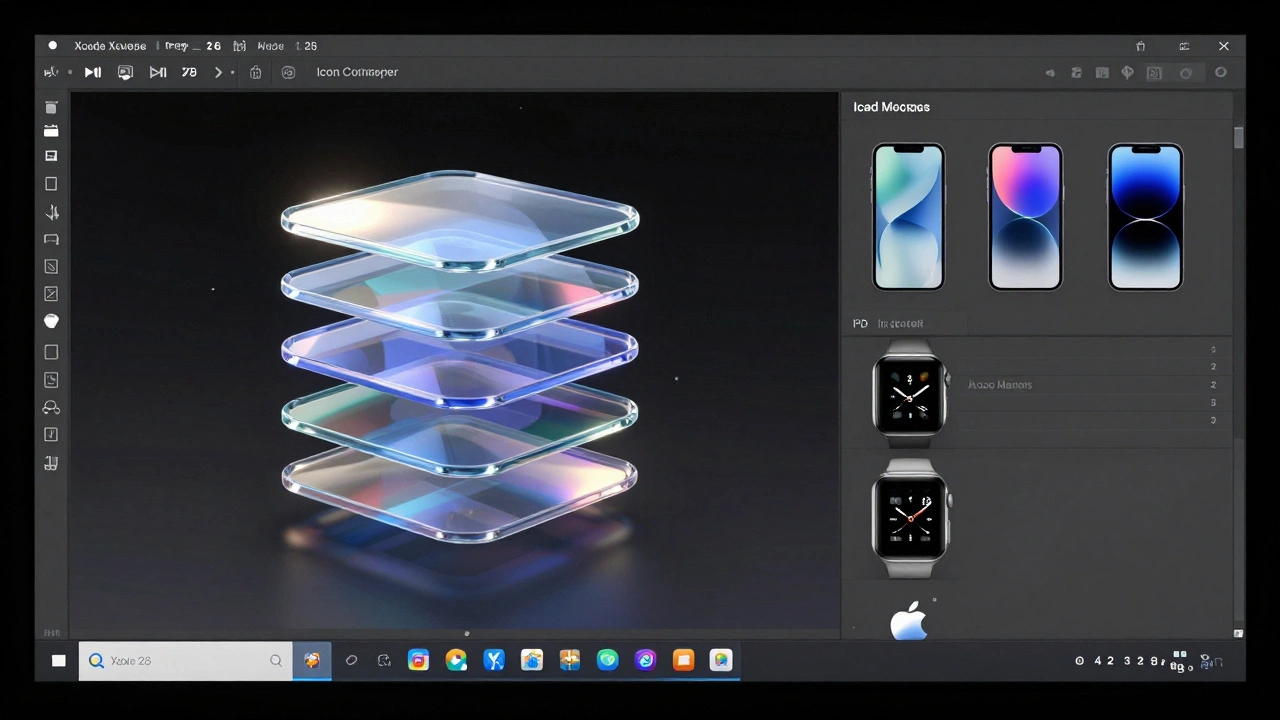
Layered Depth: The Liquid Glass Effect
The biggest change in iOS 26 isn’t just the shape-it’s how the icon behaves. Liquid Glass isn’t a filter. It’s a system. It adds subtle translucency, edge highlights, and motion-reactive blur to icons. That means your design must be built to work with this layer, not against it.
Your icon’s foreground element-the main shape or symbol-must be fully opaque. No transparency allowed. Apple’s system will handle the glassy background automatically. So if you try to add a glassy effect yourself, it’ll look double-layered and confusing. Instead, focus on making your foreground element bold, simple, and well-defined.
For example, if your app is a weather tracker, don’t draw a cloudy sky with raindrops. Draw a single, stylized sun or cloud with a clean outline. Let the Liquid Glass system add the depth around it. The system will even adjust the blur and shine based on how you tilt your phone. If your icon has too many details, those effects will turn into visual noise.
Brand Consistency Across Devices
Your icon on the iPhone shouldn’t be a different version than the one on the Mac. Apple now renders icons identically across iOS, iPadOS, and macOS-all using the same squircle shape with slightly rounded corners. Even Apple Watch and Vision Pro use the same core design, just cropped into a circle.
This means you can’t redesign your icon for each device. You design once. Then you scale it. That’s why the master file is always 1024×1024 pixels. Everything else is generated from that one image. So if you tweak the size of your logo on the iPad version, you’re breaking consistency. Users will notice. They’ll wonder if it’s a different app.
Keep the same center point. Keep the same proportions. Keep the same colors. If your icon has text, make sure it’s legible at 29 pixels. If it’s not, remove it. Apple’s system will not scale text well. Better to use a symbol that stands alone.
Positioning and Safe Zones
Your icon isn’t a canvas. It’s a frame. Apple’s system crops icons to fit different shapes, but it doesn’t crop randomly. There’s a safe zone. Your main element must stay centered and at least 10% away from the edges. If your logo touches the edge, it’ll get cut off on some devices.
Think of it like a target. The center is your bullseye. Everything important-your logo, your symbol, your key shape-lives there. Backgrounds can extend out, but they shouldn’t carry critical information. A background texture? Fine. A tiny copyright notice in the corner? Not fine. It’ll disappear on the Watch.
Also, avoid thin lines. Lines thinner than 2 pixels will vanish on smaller screens. Shadows? Skip them. Apple’s system adds its own. You don’t need to. Stick to solid shapes. Clean edges. No gradients inside your main symbol. Let the Liquid Glass do the work.
Tools That Work
You can design your icon in Figma, Sketch, Illustrator, or even Procreate-but you must export it as a clean 1024×1024 PNG with no transparency. No SVGs. No layers. One flat image. That’s the only format Apple’s system accepts as the master.
Start in a vector tool. Build your shape. Then export it at 1024×1024. Use the asset catalog in Xcode to generate all sizes automatically. Don’t manually resize icons for each device. The system will handle it. If you manually resize, you’ll introduce blurriness or distortion. Trust the process.
Test your icon early. Put it on a real iPhone. Put it next to other apps. Does it stand out? Does it look like it belongs? If it blends in too much, it’s not memorable. If it looks too flashy, it’s distracting. Find the middle.
Evolving Your Icon
Apps change. Features get added. Branding evolves. But your icon shouldn’t change every time you update the app. That confuses users. Instead, evolve slowly. Instagram didn’t redesign its logo every year. It refined it-keeping the camera shape, adjusting the gradient, sharpening the edges. Each change felt like an upgrade, not a replacement.
When you update your icon, keep the core identity. If your app is a fitness tracker, don’t switch from a heart to a dumbbell. That’s not evolution. That’s a pivot. If you’re adding a new feature, like AI coaching, you can add a subtle glow or a small icon inside the main shape. But don’t overhaul it.
Apple’s system now supports dark and light variants automatically. But if your icon looks completely different in dark mode, you’ve gone too far. The colors should shift, not the shape. The symbol should stay the same. Consistency builds trust.
Why This Matters
App Store browsing is fast. Users scroll. They tap. They decide in seconds. Your icon is your first impression. If it’s unclear, your app won’t get downloaded. If it’s inconsistent, users won’t recognize it across devices. If it’s cluttered, it’ll feel outdated.
Apple’s ecosystem is no longer just about hardware. It’s about visual harmony. The same icon on your phone, your watch, your Mac, and your Vision Pro. That’s the goal. And when you get it right, users don’t just recognize your app-they feel like they know it.
Can I use photos in my app icon?
No. Apple strictly prohibits using photos or screenshots in app icons. Photos don’t scale well and become blurry or unrecognizable at small sizes. Instead, use simplified, stylized shapes that represent your app’s function. A photo of a person, a landscape, or a UI screen will be rejected during App Store review.
Do I need to design separate icons for each Apple device?
No. Apple now generates all icon sizes automatically from a single 1024×1024 pixel master image. You only need to provide one high-resolution file. The system scales it for iPhone, iPad, Mac, Watch, and Vision Pro. You don’t need to create individual versions unless you’re adding platform-specific enhancements, which is rare and not recommended for most apps.
What happens if my icon has transparency?
Apple’s system requires all pixels in your icon to be fully opaque. If your file has transparency-even a single transparent pixel-it will be rejected during App Store submission. Always export your icon as a PNG with a solid background. The system adds its own background effects, so you don’t need to.
How many colors should I use in my app icon?
Stick to two or three colors maximum. More than that creates visual noise and makes the icon harder to recognize. Choose colors that contrast well on both light and dark backgrounds. Use one dominant color for the main shape, one for accents, and optionally a third for subtle gradients. Avoid neon or overly bright combinations that clash with system UI.
Can I include text in my app icon?
Text is strongly discouraged. At sizes like 29×29 pixels, even large text becomes unreadable. If you must include text, use only one or two uppercase letters-like "A" or "FB"-and make them bold and simple. Better yet, use a symbol that represents your brand name. Most successful icons (like Twitter’s bird or Spotify’s green circle) don’t use text at all.