Wolf and Hare

Tag: iOS app icon guidelines

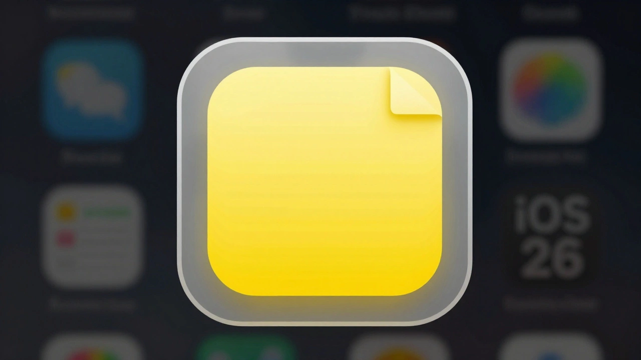
Designing App Icons for Apple Ecosystem: Layered Depth and Brand Consistency
Designing App Icons for Apple Ecosystem: Layered Depth and Brand Consistency
  • Elias Voss
  • Elias Voss

22/01
0

Learn how to design Apple app icons that work across iPhone, Mac, and Watch with Liquid Glass effects, brand consistency, and strict technical rules. Avoid common mistakes and build icons users recognize instantly.


Read More...

Categories

  • Design & Technology (184)
  • Retail Design (8)
  • Design Tools (6)
  • Design & Development (6)
  • Technology (3)

Popular Articles

Haptics on Apple Watch: Silent Feedback for Private, On-Wrist Communication

Feb 1 2026

Bondi Blue to Neutrals: How Apple’s Color Choices Shape Product Personality

Dec 29 2025

Ecosystem Onboarding: How Apple Makes Device Pairing Feel Like Magic

Jan 6 2026

Consistency Across Apple Product Lines: How Packaging Builds an Ecosystem Signal

Dec 31 2025

Typography in watchOS: How Compact Scales and Tap-Target Alignment Shape Usability

Dec 20 2025

Tags

  • Liquid Glass
  • Apple design
  • Apple typography
  • Apple ecosystem
  • inclusive design
  • Apple Human Interface Guidelines
  • Apple Intelligence
  • user experience
  • Apple design philosophy
  • unboxing experience
  • Apple packaging
  • iOS 26
  • San Francisco font
  • Apple accessibility
  • Apple industrial design
  • Jony Ive
  • industrial design
  • Apple retail design
  • Dynamic Type
  • Apple interface design
Wolf and Hare

© 2026. All rights reserved.