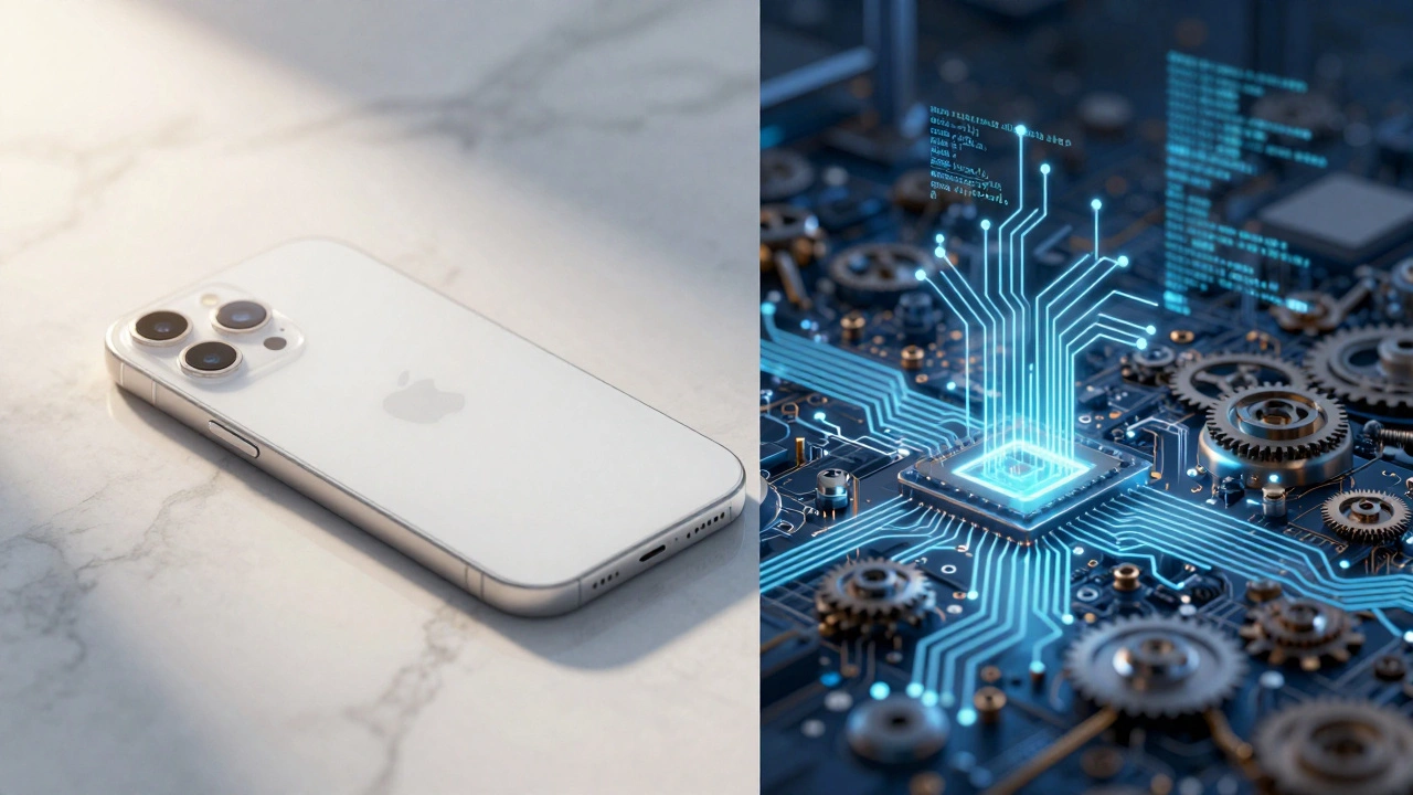

Have you ever picked up an iPhone and just *known* how to use it? You don’t read a manual. You don’t hunt for settings menus. It just works. That feeling is not an accident. It is the result of billions of dollars in research, engineering, and ruthless decision-making designed to hide a mountain of technical complexity from your eyes.
We often mistake simplicity for ease of creation. We assume that because something looks clean and uncluttered, it must have been simple to build. In reality, the opposite is true. Achieving genuine simplicity requires immense effort, expensive resources, and a willingness to say "no" to features that could make money but complicate the user experience. This is the core of Apple’s design philosophy, which relies on absorbing internal chaos to deliver external calm.
The Paradox of Simplicity
In the world of technology, complexity is the default state. Code accumulates bugs, hardware adds components, and software bloats with unused features over time. This phenomenon, known as complexity creep, happens naturally unless someone fights against it constantly. Most companies let this happen because adding features is easier than removing them. It is also easier to market. A spec sheet with twenty bullet points looks more valuable to a buyer than one with three.
Apple operates under a different rule. Former advertising creative director Ken Segall, who worked closely with Steve Jobs during the company’s resurgence in the late 1990s and early 2000s, describes this approach in his books Insanely Simple and Think Simple. Segall argues that simplicity is not a byproduct; it is the primary ingredient of success. The paradox he highlights is stark: in computing, achieving greater simplicity for the user requires ever-increasing complexity behind the scenes.
Think about it like a magic trick. The audience sees a card vanish effortlessly. They do not see the hours of practice, the specific lighting conditions, or the mechanical devices hidden in the magician’s sleeve. If the mechanism were visible, the wonder would disappear. Apple invests heavily in building those invisible mechanisms so that you never have to think about how they work.
The Engineering Price Tag
Hiding complexity is expensive. It requires custom hardware, proprietary software, and tight integration between the two. When Apple decided to move away off-the-shelf processors to its own silicon, it was making a bet on this very principle. The transition to Apple Silicon, starting with the M1 chip in 2020 and continuing through the M-series, exemplifies this strategy.
By designing their own chips, Apple integrates the CPU, GPU, neural engines, and media blocks onto a single die. This allows for features like Face ID, real-time photo processing, and on-device machine learning to feel instantaneous and effortless. To the user, unlocking the phone is a glance. To the engineers, it involves coordinating sensors, secure enclaves, and low-level power management in milliseconds. If Apple used generic components, this seamless experience would be impossible. The cost of developing these chips runs into the billions, but the payoff is a product that feels magical rather than mechanical.
This level of control extends to software as well. Operating systems tend to become bloated as third-party developers add layers of abstraction. By controlling both the hardware and the operating system, Apple can optimize performance at a granular level. This means fewer background processes, longer battery life, and smoother animations. But it also means Apple bears the full burden of maintaining that infrastructure. They cannot blame a supplier when things go wrong; they have to fix it themselves.
| Feature | Apple’s Approach (Simplicity) | Traditional Tech Approach (Complexity) |
|---|---|---|
| Product Line | Focused, few variants | Broad, many configurations |
| Decision Making | Centralized, fast | Decentralized, committee-based |
| Marketing Message | Single, clear benefit | List of specifications |
| User Cognitive Load | Low (intuitive) | High (requires learning) |
| Internal R&D Cost | Very High | Moderate (distributed risk) |
Saying No: The Opportunity Cost
The most painful part of simplicity is what you leave out. Segall emphasizes that Apple’s culture revolves around saying "no" far more often than "yes." Every feature added is a line of code that needs debugging, a button that needs testing, and a potential point of confusion for the user. Therefore, every feature removed is a gain in clarity.
This discipline has significant opportunity costs. When competitors release phones with styluses, expandable storage, or headphone jacks, Apple often declines. Critics argue this limits consumer choice. Proponents argue it preserves the integrity of the design. For example, removing the headphone jack allowed for thinner designs and better water resistance, but it forced users to adapt to wireless audio. Apple accepted the backlash because they believed the long-term vision of a wireless ecosystem outweighed the short-term convenience of a port.
Segall notes that keeping products focused prevents dilution of brand identity. If Apple made ten different types of laptops, each with slightly different keyboards and ports, customers would struggle to choose. By offering a streamlined lineup, Apple reduces decision fatigue. You know exactly what you are getting. This focus requires resisting the pressure to chase every market segment. It means accepting lost revenue from niche users who demand granular control, in exchange for dominating the mainstream market with ease of use.

Organizational Discipline
Simplicity is not just a product feature; it is a management philosophy. Segall describes how Apple structured its internal processes to protect this goal. Meetings were kept small, essential people only. The ultimate decision-maker was always present. This avoided the drift that occurs when decisions are passed down through layers of middle management, where messages get distorted and compromises accumulate.
Working like a small company while being a giant corporation is difficult. It places a heavy demand on top executives’ time. Steve Jobs was known for micromanaging details, from the color of the circuit boards to the wording of advertisements. This intensity ensures coherence but creates a bottleneck. Not every organization can replicate this structure. Many companies try to copy Apple’s aesthetic-minimalist logos, white boxes-but fail because they lack the organizational discipline to back it up. Their products look simple but feel complex underneath because the internal teams are still fighting over priorities.
Segall’s rules for simplicity include simplifying communications as much as possible. In advertising, this meant avoiding multi-feature pitches. Instead of listing ten reasons to buy a computer, Apple ads often focused on one emotional benefit or a single visual metaphor. This clarity builds an emotional bond with customers. When you understand a product instantly, you trust it more. But achieving that clarity requires hard editorial choices. Teams must refine language and visuals repeatedly until everything non-essential is stripped away.
The Trade-offs and Criticisms
No strategy is without downsides. The cost of simplicity is borne not just by Apple, but by certain groups of users. Power users, developers, and repair advocates often criticize Apple’s approach. Technically sophisticated users may find the platform constraining. They want access to file systems, customizable interfaces, and modular hardware. Apple’s walled garden restricts these freedoms to maintain security and consistency.
The right-to-repair movement highlights another side effect. Tightly integrated designs, where batteries are glued in and screens are sealed with adhesive, make devices harder to service. This is a direct consequence of prioritizing thinness, durability, and water resistance over modularity. Independent technicians argue that this locks consumers into expensive official repair channels. While Apple has expanded its self-service repair program in recent years, the fundamental tension remains: easy to use does not always mean easy to fix.
Furthermore, the assumption that simplicity equals value is not universal. In some markets, buyers equate long feature lists with higher quality. A laptop with fifteen ports might sell better than one with four, even if the latter is faster and more reliable. Apple consciously resists this tendency, betting that brand loyalty and ecosystem stickiness will outweigh the appeal of raw specification counts. This gamble has paid off financially, contributing to Apple’s multi-trillion-dollar valuation, but it requires constant vigilance. As soon as competitors offer a simpler alternative, Apple’s advantage erodes.

Future Challenges: AI and Mixed Reality
As technology evolves, the cost of maintaining simplicity is likely to rise. The next frontier includes artificial intelligence, mixed reality, and interconnected services. These technologies are inherently complex. An AI assistant that understands context, tone, and intent requires massive computational power and sophisticated algorithms. Presenting this capability as a simple chat interface hides enormous technical debt.
AppStorey discussions and industry podcasts note that as apps add capabilities, they must introduce more sophisticated internal structures to keep the user experience straightforward. For Apple, expanding into areas like spatial computing with the Vision Pro headset presents a new challenge. How do you make interacting with virtual objects feel natural and intuitive? The answer lies in further investment in eye-tracking, hand gestures, and voice recognition-all technologies that are incredibly difficult to engineer reliably.
The irony is that as products become smarter, they must become simpler to use. Otherwise, users will abandon them due to frustration. Apple’s historical willingness to absorb internal complexity suggests they will continue to double down on this strategy. They will likely invest even more in custom silicon for AI processing and refined software abstractions to prevent user-facing complexity from exploding. The goal remains the same: make the complicated invisible.
Conclusion
The simplicity you enjoy on your Apple device is a luxury paid for by engineers, designers, and executives who handle the messiness for you. It is not free. It requires rejecting easy shortcuts, spending billions on custom hardware, and enforcing strict organizational discipline. For many users, this trade-off is worth it. They value their time and mental energy more than they value having every possible option available. Apple’s success proves that in a world drowning in information and options, clarity is the most valuable currency.
Understanding this dynamic changes how we view technology. We should stop asking why products are so simple and start recognizing the effort required to achieve that simplicity. It is a deliberate act of curation, filtering out noise to reveal signal. Whether you agree with Apple’s methods or not, their commitment to hiding complexity sets a high bar for the entire industry. It reminds us that good design is not just about how things look, but about how little you have to think about them.
Why is simplicity considered expensive in technology?
Simplicity is expensive because it requires hiding vast amounts of technical complexity. Companies must invest heavily in custom hardware, proprietary software, and rigorous testing to ensure that advanced features appear effortless to the user. This involves high R&D costs, specialized engineering teams, and disciplined decision-making to remove unnecessary features.
What role did Ken Segall play in Apple's design philosophy?
Ken Segall was a former advertising creative director at Apple who worked closely with Steve Jobs. He helped coin the name "iMac" and authored books like "Insanely Simple" and "Think Simple," detailing how Apple operationalizes simplicity. He argues that simplicity is a strategic choice driven by leadership discipline and a focus on reducing user cognitive load.
How does Apple Silicon contribute to user simplicity?
Apple Silicon, such as the M-series chips, integrates multiple processing units (CPU, GPU, neural engine) onto a single die. This tight integration allows for optimized performance, longer battery life, and seamless features like Face ID and real-time photo processing. By controlling the hardware, Apple ensures that complex tasks run smoothly without user intervention.
What are the criticisms of Apple's focus on simplicity?
Critics argue that Apple’s simplicity comes at the cost of customization, repairability, and choice. Power users often find the platform restrictive, lacking granular control over settings. Additionally, tightly integrated designs make devices harder to repair independently, leading to debates over the right-to-repair movement and environmental sustainability.
Does simplicity mean fewer features?
Not necessarily. Simplicity means presenting features in an intuitive way. However, it often involves saying "no" to features that add complexity or confuse the user. Apple focuses on refining a few core functions rather than adding numerous options. The goal is to reduce cognitive load, so users can accomplish tasks quickly without navigating complex menus.
How does Apple maintain simplicity in marketing?
Apple’s marketing favors single, clear messages over lists of specifications. Campaigns like "Think Different" focused on emotional benefits rather than technical details. This approach requires rigorous editing to remove non-essential elements, ensuring that the customer understands the product’s value immediately without wading through jargon.
Why is it hard for other companies to copy Apple's simplicity?
Many companies mimic Apple’s aesthetic but lack the organizational discipline to support it. True simplicity requires centralized decision-making, cross-functional coordination, and a willingness to reject profitable but complex features. Without this holistic commitment, products may look simple but remain complicated to use internally and externally.
What is "complexity creep"?
Complexity creep is the natural tendency of software and systems to accumulate unnecessary features, bugs, and architectural debt over time. As products grow, they become harder to manage and use. Countering this requires continuous refactoring and a deliberate strategy to simplify interfaces, which consumes significant engineering resources.