
Key Takeaways
- Intentional Simplicity: Minimalism isn't about being plain; it's about precise engineering and intentional choices.
- The Ritual: The "slow-slide" opening of an Apple box is a calculated move to build anticipation.
- Materiality: Using molded fiber and high-grade whiteboard signals quality and environmental consciousness.
- Brand Coherence: The packaging mirrors the industrial design of the device itself, creating a unified experience.
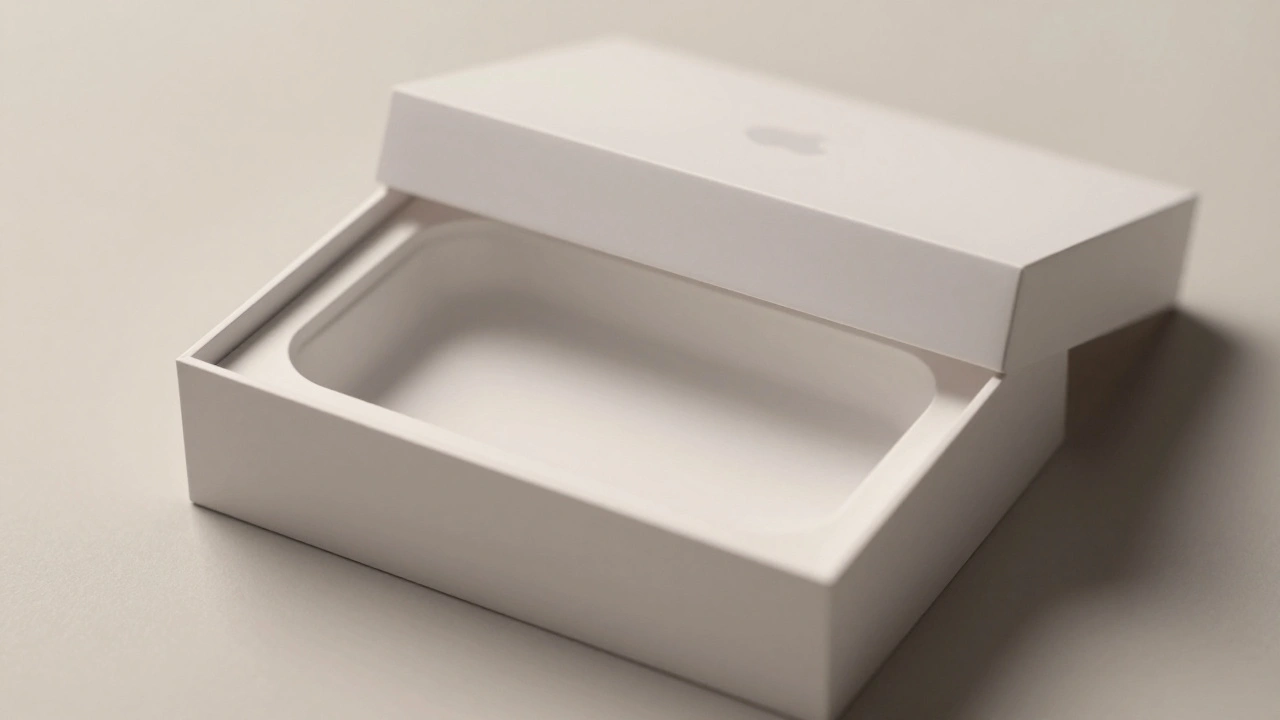
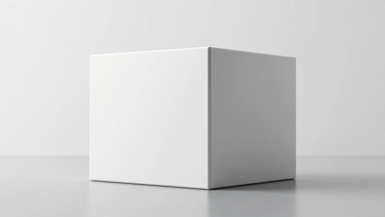
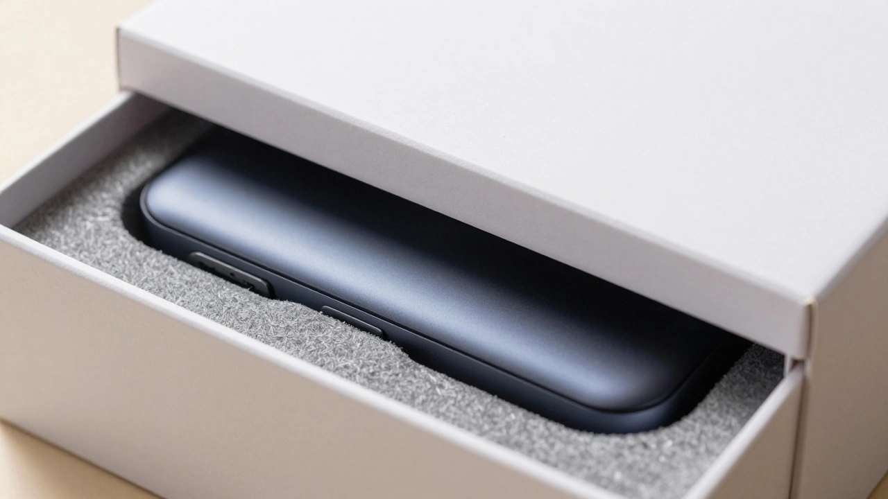
The Engineering Behind the "Slow Slide"
Have you ever noticed how an iPhone box doesn't just fall open? It glides. That isn't an accident. Apple engineers the air pressure between the lid and the base to create a measured, slow-motion reveal. This is a core part of the unboxing experience, turning a simple act of opening a package into a ceremony. When the lid resists just enough to create tension, it builds a sense of value before you even see the device.
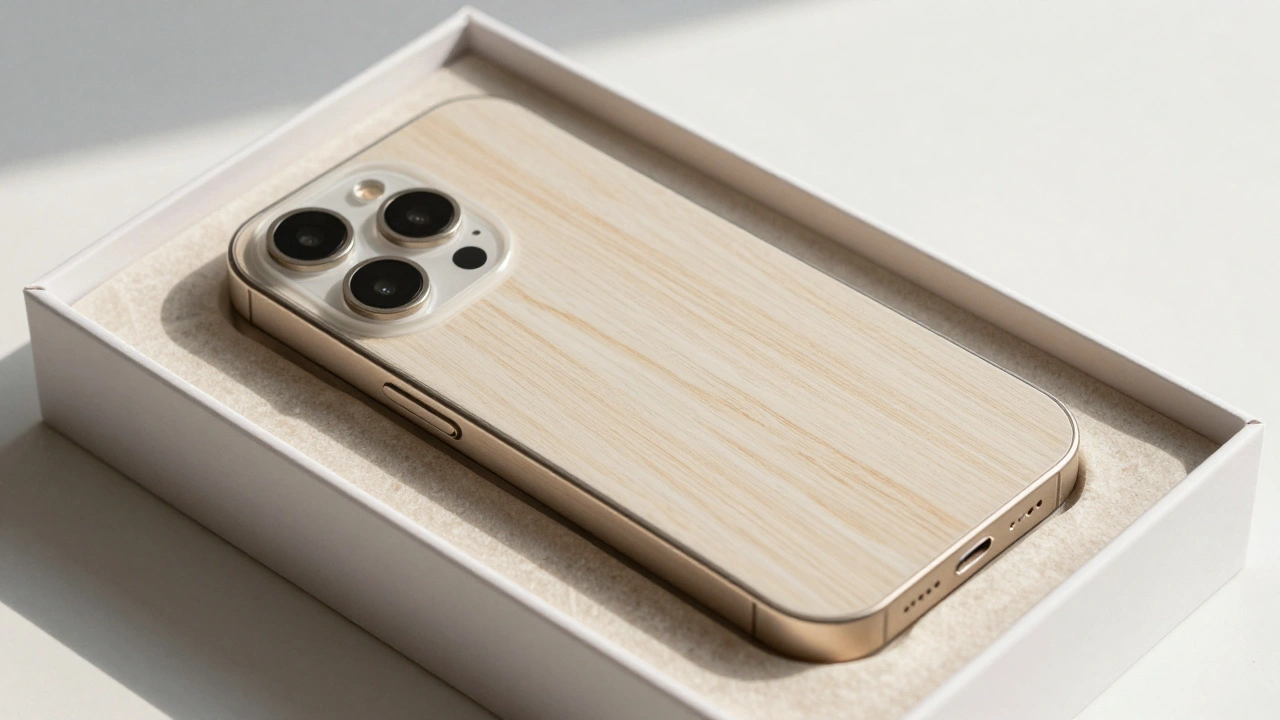
Inside, the precision continues. They use molded pulp and fiber inlays that are laser-cut to fit the device's exact dimensions. This prevents the product from shifting during shipping, but more importantly, it creates a clean, architectural look. There are no clumsy Styrofoam peanuts or oversized plastic wraps. Everything has a dedicated home, mirroring the organized nature of the software running on the device.
Why Minimalism Feels Expensive
There is a common misconception that luxury requires opulence. In reality, modern luxury is defined by confidence. When a brand uses a limited color palette-mostly pure white with sharp black accents-they are signaling that they don't need to shout for attention. This approach uses negative space as a design element, which directs the eye exactly where it needs to go: the product.
This strategy creates a perceived value that goes beyond the hardware. When you hold a sturdy, matte-finish box with perfectly aligned corners, your brain registers "quality." It's the same reason a high-end gallery puts one painting in a huge white room; the space around the object elevates the object itself. For Apple, the minimalist packaging design acts as the gallery, and the gadget is the masterpiece.
Comparing Luxury Approaches
Apple isn't the only brand playing with minimalism, but they apply it differently than fashion houses or skincare brands. While a brand like Hermès uses minimalism to maintain exclusivity, Apple uses it to scale luxury across millions of units. They've managed to make a mass-produced item feel like a boutique purchase.
| Brand | Core Material | Primary Aesthetic | Key Goal |
|---|---|---|---|
| Apple | Whiteboard & Molded Fiber | Clinical, Precise, White | Technical Excellence |
| Aesop | Amber Glass & Heavy Paper | Apothecary, Earthy | Artisanal Luxury |
| Tesla | Recycled Polymers/Cardboard | Futuristic, Sustainable | Innovation & Efficiency |
| Glossier | Soft-touch Plastics/Paper | Pastel, Playful | Social Media Shareability |
The Shift Toward Sustainable Luxury
For years, the "premium" feel came from using as much material as possible. But consumer tastes have shifted. Today, waste is seen as a design failure. Apple has pivoted by integrating sustainability into its minimalism. By moving away from plastic wraps and toward fiber-based packaging, they've aligned their luxury image with environmental responsibility. This isn't just about being "green"; it's about a new definition of sophistication where efficiency is the ultimate luxury.
The global minimalist packaging market, now valued at over $35 billion, proves that people aren't missing the glitter and gold. They want authenticity. When a company chooses a recycled, high-texture paper over a glossy plastic coating, it tells the customer that the brand is confident enough to let the material speak for itself. It replaces superficial decoration with genuine quality.
How to Apply These Principles to Your Own Design
You don't have to be a trillion-dollar company to use these tactics. Whether you're shipping a handmade candle or a software box, the lesson is the same: focus on the friction and the flow. If you want a product to feel premium, look at where you can remove things. Ask yourself, "Does this piece of plastic actually protect the item, or is it just there because that's how it's always been done?"
Start with the tactile experience. Use a matte finish instead of a glossy one-it's less prone to fingerprints and feels softer to the touch. Focus on the "reveal." Instead of throwing everything into a bag, create a sequence. First the outer shell, then a protective layer, then the product. This sequence creates a narrative of discovery that makes the customer feel like they are uncovering a prize.
Consistency Across the Ecosystem
The real magic of Apple's approach is that the box doesn't feel like a separate entity from the phone. The sharp corners of the iPhone box mirror the precise edges of the device. The white space on the packaging mirrors the clean interface of iOS. This creates a seamless loop of brand coherence. By the time you've finished unboxing and turned the device on, you've already experienced the brand's entire philosophy: precision, clarity, and simplicity.
Does minimal packaging actually increase sales?
While it's hard to isolate one variable, data shows that consumers associate minimalist design with higher product quality and brand authenticity. It creates a "halo effect" where the simplicity of the packaging suggests a high level of confidence in the product itself, making it more attractive to luxury buyers.
Is minimalist packaging always more sustainable?
Not necessarily. Simplicity in looks doesn't always mean simplicity in materials. However, a true minimalist approach-like Apple's move toward molded fiber and the removal of plastic films-usually reduces the total carbon footprint by using fewer types of materials that are easier to recycle.
Why is the unboxing experience so important for tech brands?
For many tech products, the packaging is the first physical touchpoint a customer has with the brand. A well-engineered unboxing ritual triggers a dopamine release and creates a positive emotional connection, which increases customer loyalty and encourages organic social media sharing.
Can small businesses implement this luxury minimalism?
Absolutely. The key is focusing on a few high-quality elements rather than many mediocre ones. Using a single high-gsm textured paper and a consistent, limited color palette can create a premium feel without needing a massive corporate budget.
What is the 'psychology of restraint' in design?
The psychology of restraint is the idea that by intentionally limiting the visual information provided, a brand communicates power and confidence. It suggests that the brand is so established that it no longer needs to use flashy tactics to prove its value.
Next Steps for Your Brand
If you're looking to upgrade your packaging, start by auditing your current materials. Identify the "noise"-the unnecessary inserts, the overly complex logos, or the excessive plastic. Try a prototype using a single-color scheme and a high-quality matte material. Test the "reveal" process: does it feel rushed, or does it create a moment of anticipation? By focusing on the a few critical touchpoints, you can shift your brand from looking like a commodity to feeling like a luxury experience.