
When Apple launched the iMac G3 in 1998, it didn’t just introduce a new computer-it introduced a Bondi Blue revolution. At a time when every PC looked like a beige brick, Apple dropped a translucent, egg-shaped machine that looked like it had been dipped in ocean water. People didn’t just buy it. They celebrated it. They posed with it. They matched their desk lamps and stationery to it. Why? Because color wasn’t an afterthought. It was the personality.
The iMac That Broke the Mold
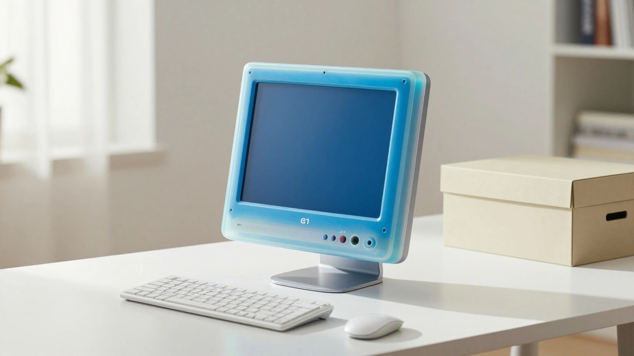
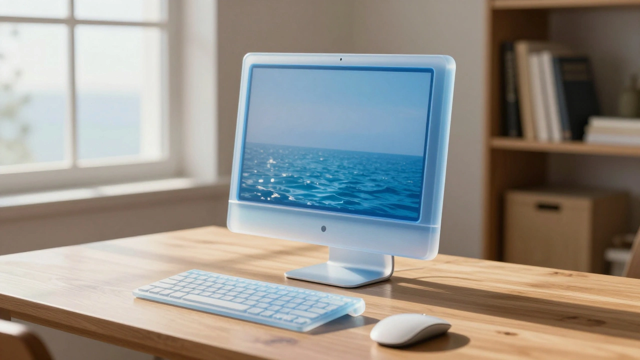
Before the iMac, computers were designed to disappear. They were meant to blend into offices, not stand out in living rooms. Apple’s competitors stuck to beige, gray, and dark plastic. It was safe. It was boring. And it said one thing: this is a tool, not a companion. Then came Bondi Blue. Not just any blue. A soft, slightly greenish hue named after Bondi Beach in Sydney, where one of Apple’s designers swam. It wasn’t chosen for marketing hype. It was chosen because it felt alive. The plastic wasn’t opaque-it was translucent, letting light pass through like stained glass. The keyboard, mouse, and even the power cord matched. Everything looked like it belonged together, like a single object sculpted from one piece of the sea. This wasn’t just about looks. It was about trust. Museums Victoria noted that the transparency made users feel like Apple was being honest. No hidden boxes. No mystery. You could see the guts of the machine, and it didn’t look intimidating. It looked friendly. That’s how Apple turned a computer into a friend.From Color Explosion to Quiet Confidence
The original Bondi Blue iMac had a short life-discontinued in January 1999 after just a few months. But Apple didn’t stop. It doubled down. Over the next two years, the iMac G3 came in fruit colors: strawberry red, lime green, blueberry, tangerine, and even a translucent grape. Each one felt like a different mood. Red was bold. Green was playful. Purple was mysterious. For a while, Apple let color do the talking. The iPod came in bright whites, blacks, and later, rainbow-colored shells. The iPhone 5C? A plastic body in five vivid shades. These weren’t just products. They were statements. People bought them because they matched their style, their mood, their identity. But around 2015, something shifted. The iMac went matte. The MacBook Pro lost its colorful edges. The iPhone moved to space gray, silver, and gold. Apple stopped offering pastels. Why? Because the message changed. When Apple was fighting for attention, color was the weapon. Now, it’s fighting for trust. Neutral tones-black, white, silver, space gray-don’t shout. They whisper. They say: this is timeless. This is professional. This is built to last. You don’t need a rainbow to prove it’s premium. You just need a flawless surface, a seamless edge, and a quiet confidence.Color as a Mirror of User Identity
Apple’s color choices aren’t random. They’re psychological. Bondi Blue in 1998 told users: "You’re not a technician. You’re someone who loves life." The fruit-colored iMacs said: "Your computer can be fun." The white iPhone 5C said: "You’re young. You’re expressive. You’re not afraid to stand out." But today’s space gray MacBook? It says: "You’re focused. You’re serious. You don’t need noise to prove your worth." This isn’t just about aesthetics. It’s about how users see themselves. A teenager in 2003 wanted their laptop to look like a piece of art. A professional in 2026 wants their laptop to look like a tool they can rely on-day after day, meeting after meeting. Apple’s shift from color to neutrality reflects a deeper truth: as technology becomes more embedded in daily life, it stops being a novelty. It becomes a quiet partner. And quiet partners don’t wear loud shirts.
The Power of a Single Hue
There’s a reason Apple still uses white as a base color for AirPods, HomePods, and Magic Keyboards. White isn’t neutral. It’s pure. It’s clean. It’s a blank canvas. It lets the product’s form speak louder than its color. Compare that to the Bondi Blue iMac. Its color wasn’t just a surface finish-it was the entire personality. The translucent shell made the device feel like a living thing. You could see the internal components glowing faintly. It wasn’t hiding its mechanics. It was showing them off. Today’s aluminum unibody MacBooks hide everything. No visible screws. No seams. No color distractions. That’s intentional. Apple wants you to focus on the experience, not the object. The color doesn’t distract. It doesn’t define. It simply supports.Why Neutral Doesn’t Mean Boring
Some people think Apple went boring. That it gave up creativity. But look closer. The space gray MacBook isn’t just gray. It’s a deep, metallic tone with a matte finish that catches light differently depending on the angle. The gold iPhone isn’t gold-it’s a warm, rose-tinted bronze that changes under natural light. Even the black iPhone has subtle gradients, not flat paint. Apple’s neutral colors are engineered. They’re not picked from a paint chart. They’re developed in labs. They’re tested under dozens of lighting conditions. They’re matched across materials-glass, aluminum, ceramic, silicone-to ensure consistency. This isn’t simplicity. It’s sophistication. Think about it: if you’re designing a car, you don’t paint it neon green and call it luxury. You use polished metal, deep black, and soft leather. The same logic applies here. Apple’s neutral palette says: "We didn’t cut corners. We refined them."What Color Choices Reveal About Apple’s Strategy
Apple’s color evolution tells a story of maturity:- 1998-2003: Color as rebellion. Breaking the beige mold to attract attention.
- 2004-2010: Color as identity. Letting users express themselves through their devices.
- 2011-2017: Color as refinement. Introducing metallics and subtle gradients that felt premium.
- 2018-present: Color as silence. Neutral tones that don’t compete with the experience.
The Hidden Cost of Color
There’s a reason Apple doesn’t offer 10 colors for every product anymore. It’s not just about design. It’s about logistics. Every color variant requires:- Different manufacturing lines
- Separate inventory tracking
- Unique packaging
- Specialized quality control
- More waste if a color doesn’t sell
What’s Next? The Return of Color?
Will Apple ever go back to bright colors? Maybe. But not like before. If color returns, it won’t be about variety. It’ll be about meaning. Think of the Apple Watch Ultra 2’s deep ocean blue. It’s not just a color. It’s a statement. It says: "This device is built for extreme environments. It’s not for fashion. It’s for function." Or consider the rumored future HomePod with a matte ceramic finish in deep charcoal. That’s not a color. It’s a texture. A feeling. Apple’s future color strategy won’t be about choice. It’ll be about context. Each hue will serve a specific purpose: durability, emotion, usability, or identity.Final Thought: Color Is Never Just Color
Bondi Blue didn’t sell because it was pretty. It sold because it made people feel something. It made them think: "This computer is different. This company gets me." Today’s space gray MacBook doesn’t make you feel excited. It makes you feel calm. Confident. Ready. Apple’s genius isn’t in picking colors. It’s in understanding how colors make people feel-and changing those feelings as the world changes. The next time you pick up an Apple product, don’t just look at it. Ask: what does this color say about me? And why did they choose it for me?Why did Apple stop using bright colors on its products?
Apple stopped using bright colors because its audience changed. In the late 1990s and early 2000s, users wanted to express themselves through their devices. Bright colors made tech feel fun and personal. By the mid-2010s, Apple’s users were professionals, creatives, and everyday people who wanted devices that blended into their lives-not stand out from them. Neutral tones like space gray, silver, and black signal quality, reliability, and timelessness. They also simplify manufacturing and reduce inventory costs, making production more efficient.
Was Bondi Blue the first colored Apple product?
No, but it was the first to make a cultural impact. Earlier Apple products like the Apple II and Macintosh had beige cases. The iMac G3 Bondi Blue was the first time Apple used a bold, non-traditional color as the centerpiece of its entire product line. It was also the first to use translucent plastic across the entire system-including peripherals-making the color feel like part of the product’s soul, not just a coating.
Do neutral colors make Apple products more expensive?
Not directly. Neutral colors themselves don’t raise the price. But achieving a flawless matte finish on aluminum or a consistent titanium hue requires advanced manufacturing processes, tighter quality control, and more testing under different lighting conditions. That precision adds cost-but it also justifies the premium. You’re paying for consistency, not color.
How does Apple choose its color names?
Apple’s color names are carefully chosen to evoke emotion, not describe pigment. "Bondi Blue" connects to a place and a feeling. "Space Gray" suggests depth and modernity. "Product Red" ties to a cause. "Gold" isn’t just a metal-it’s a symbol of warmth and luxury. Apple avoids technical names like "Pantone 294C." Instead, it uses names that tell a story, making the color feel personal and intentional.
Will Apple ever bring back colorful products?
Not in the same way as the 1990s. But Apple has shown it still uses color strategically. The iPhone 15 Pro’s Deep Blue, the Apple Watch Ultra’s Ocean Blue, and the AirPods Pro’s limited-edition pastels prove Apple hasn’t abandoned color-it just uses it with purpose. Future colorful products will likely be tied to specific models, causes, or experiences, not offered as standard options across the lineup.