
Apple doesn’t design products. It designs behaviors. Every button press, every swipe, every transition across an iPhone, Mac, Apple Watch, or HomePod feels like it was made by the same hand. Not because they’re identical - but because they’re coherent. That’s the real trick: keeping taste alive at scale. When you’re shipping 20 new products in a single year, how do you stop things from feeling chaotic? How do you keep the soul of the brand intact when the engineering teams are spread across three continents?
The answer isn’t a style guide. It’s not a design system document locked in a Figma file. It’s a living, breathing pattern language - one that’s enforced not by rules, but by shared understanding. Apple calls it cohesion. The rest of us call it magic. But it’s not magic. It’s repetition. Refinement. And ruthless prioritization.
One Material, Many Forms
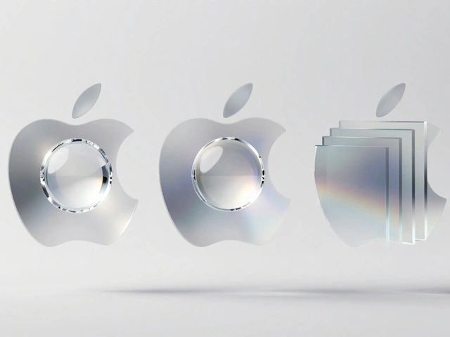
In 2025, Apple introduced something quietly revolutionary: Liquid Glass is a new visual material that dynamically adapts to content, context, and device form across iOS 26, iPadOS 26, macOS Tahoe 26, watchOS 26, and tvOS 26. It’s not a color. Not a shape. Not even a texture. It’s a behavior.
Think of it like this: when you scroll in iOS 26, the tab bar doesn’t just hide - it thins, becoming translucent and slightly blurred, letting the content behind it breathe while still keeping navigation within reach. On macOS Tahoe 26, the sidebar doesn’t just sit there - it reflects your wallpaper and the window content behind it, creating a sense of depth that feels alive. On the Apple Watch, the same material makes complications glow softly in low light, then sharpen into focus when you raise your wrist.
This isn’t cosmetic. It’s psychological. Liquid Glass isn’t just about looking good. It’s about reducing cognitive load. Your brain doesn’t have to relearn how to interact with each device because the visual language doesn’t change - it evolves contextually. That’s how Apple defends taste: by making consistency feel natural, not forced.
The Hardware-Software Feedback Loop
Most companies build software to fit hardware. Apple does the opposite. They design hardware to serve software.
Take the iPhone 16 Pro in 2026. The new rounded corners aren’t just for aesthetics - they’re engineered to align perfectly with the new tab bar radius in iOS 26. The display’s edge-to-edge curve matches the system UI’s corner radius exactly. No compromises. No workarounds. If the software needs a 12-pixel radius, the hardware gets a 12-pixel radius. Not 11. Not 13. Twelve.
This tight coupling shows up everywhere. The new Mac Studio’s cooling vents are shaped to match the iconography in macOS Tahoe 26. The Apple Watch Ultra 3’s digital crown doesn’t just rotate - it resists slightly at each tick, matching the haptic feedback in watchOS 26’s scroll controls. These aren’t accidents. They’re deliberate echoes.
When software changes, hardware follows. When hardware changes, software anticipates. That’s the feedback loop. And it’s why Apple can launch a new iPad Pro, a new HomePod, and a new Vision Pro all in the same quarter - and still feel like they belong to the same family.
Services as the Glue
Apple doesn’t sell devices. It sells experiences. And those experiences are stitched together by services.
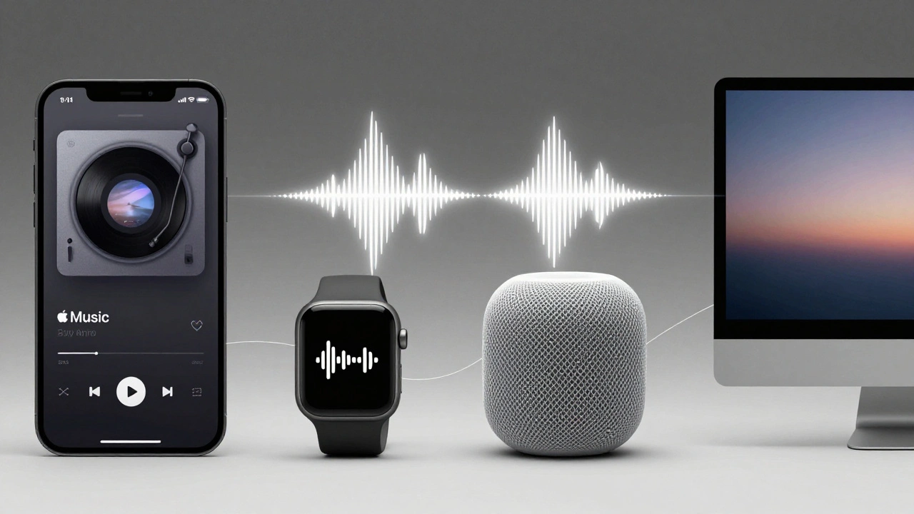
Think about Apple Music. On your iPhone, it’s a full-screen album art experience. On your Apple Watch, it’s a single play/pause button with a tiny waveform. On your HomePod, it’s voice-only control with spatial audio cues. On your Mac? A minimalist sidebar that fades into the background until you need it.
The functionality is the same. The interface adapts. The taste stays constant.
Same with Photos. On your iPhone, you can swipe to edit. On your iPad, you can drag and drop edits between albums. On your Mac, you can use keyboard shortcuts to batch-tag images. On your Apple TV? You can browse your entire library with a remote, and it still feels like you’re flipping through a physical photo album.
These aren’t different apps. They’re different expressions of the same core idea: your memories should feel alive, not stored. That’s the pattern. And Apple repeats it across every service - Apple News, Apple Podcasts, FaceTime, Safari - with surgical precision.
Refinement Over Revolution
Apple doesn’t chase trends. It chases trust.
Look at the Apple Watch. In 2026, it’s not getting a new sensor. Not a new color. Not even a new battery life. It’s getting better data. Smarter algorithms. More accurate heart rate readings over 48 hours. More reliable sleep tracking. Less noise. More signal.
That’s the Apple way. No flashy gimmicks. No “revolutionary” features that break the pattern. Just slow, steady, silent improvement. And it works because users don’t feel like they’re learning a new product every year. They feel like they’re deepening a relationship.
This is why Apple avoids radical redesigns. When iOS 7 dropped in 2013, it was a shock. But since then? Changes have been incremental. Tab bars shrink. Icons soften. Shadows deepen. Colors shift slightly. These aren’t updates - they’re refinements. And that’s what makes the ecosystem feel timeless.
Why This Works (And Why Most Companies Fail)
Most tech companies design for novelty. Apple designs for continuity.
When Samsung or Google releases a new phone, they often change the entire UI. Buttons move. Gestures reset. Menus reorganize. Users feel like they’re starting over. Apple doesn’t do that. It asks: What does the user already know? Then it builds on it.
That’s why Apple’s ecosystem feels so seamless. You don’t need to learn how to use a new device. You just need to use it. The system does the rest.
And here’s the kicker: Apple doesn’t even need to market this. People don’t say, “I love how the Liquid Glass material adapts across devices.” They say, “Everything just works.” That’s the real win.
Patterns You Can Steal
You don’t need to build a $300 billion company to apply Apple’s principles. Here’s what you can borrow:
- Design for behavior, not screens. What does the user actually do? Make that action feel the same everywhere.
- Let context shape form. Don’t force the same UI on every device. Let it adapt - but keep the core rhythm.
- Refine, don’t reinvent. Small, thoughtful changes build trust faster than big, flashy ones.
- Connect hardware and software like twins. If one changes, the other must follow - or you’ll break the feeling.
- Use services to unify. Even if your product is fragmented, your service layer should feel like one thing.
It’s not about copying Apple’s UI. It’s about copying its mindset. Taste at scale isn’t about having a perfect design. It’s about having a consistent one.
What Happens When You Break the Pattern?
Look at Microsoft’s Windows 11 rollout. Or Google’s Material You on Pixel phones. Or even Amazon’s Alexa interface across devices. The inconsistency is jarring. One app has rounded corners. Another has sharp edges. One uses a dark theme. Another uses a light one. The animations don’t match. The icons look like they came from different designers.
It feels broken. Not because it’s ugly. But because it’s confusing.
Apple’s genius isn’t that everything looks beautiful. It’s that nothing feels like it was designed by accident.
Why does Apple avoid major UI redesigns?
Apple avoids major redesigns because they prioritize user familiarity over novelty. A radical change forces users to relearn how to use their devices, which breaks trust. Instead, Apple makes small, iterative improvements - like adjusting shadow depth, refining corner radii, or tightening spacing - that feel natural over time. This slow evolution keeps the experience cohesive without overwhelming users.
How does Liquid Glass differ from traditional design systems?
Traditional design systems use fixed rules - colors, fonts, spacing. Liquid Glass is a dynamic material that responds to content, lighting, and user interaction. It doesn’t just look a certain way - it behaves differently depending on context. For example, it becomes more translucent when scrolling, reflects wallpaper on Mac, and sharpens focus on Apple Watch. It’s not a static style - it’s an adaptive experience.
Can other companies replicate Apple’s ecosystem cohesion?
Yes - but only if they control both hardware and software. Apple’s tight integration lets them align every pixel, every haptic pulse, and every animation across devices. Companies that rely on third-party hardware or fragmented platforms struggle to maintain this level of consistency. However, even without full control, teams can mimic Apple’s mindset: design for behavior, refine slowly, and unify through services.
What role do services like Apple Music or Photos play in Apple’s design strategy?
Services are the invisible thread that ties Apple’s devices together. Whether you’re using Apple Music on your iPhone, iPad, or HomePod, the core experience - browsing, playing, discovering - stays the same. The interface adapts to the device, but the emotional intent doesn’t change. This consistency builds familiarity, making users more likely to stay within the ecosystem.
Why does Apple focus on refinement instead of new features?
Apple knows that users value reliability more than novelty. A new sensor or camera mode might grab headlines, but if it breaks existing workflows or adds complexity, it hurts trust. By focusing on refinement - better battery life, smoother transitions, more accurate health data - Apple deepens user loyalty. It’s not about being the most advanced. It’s about being the most dependable.
Final Thought
Taste isn’t something you design. It’s something you protect. Apple doesn’t have a design team that says, “This looks good.” They have a culture that asks, “Does this feel right?” And they’ll delay a product for months if the answer is no.
That’s the real lesson. Not the curves. Not the glass. Not even the ecosystem. It’s the discipline to say no - again and again - so the one thing you say yes to feels unmistakably, beautifully, unmistakably Apple.
Categories
Popular Articles