
When you open an app on your iPhone or MacBook, the text you read doesn’t just appear - it’s engineered. Apple doesn’t leave text to chance. Every letter, every space, every contrast ratio is carefully tested across dozens of devices, lighting conditions, and user settings. If text looks blurry on your iPad or feels too light on your Apple Watch, it’s not a bug - it’s a failure in typography testing. And the stakes are higher than you think: Apple typography directly impacts readability, accessibility, and even how long users stay in your app.
Why San Francisco Isn’t Just Another Font
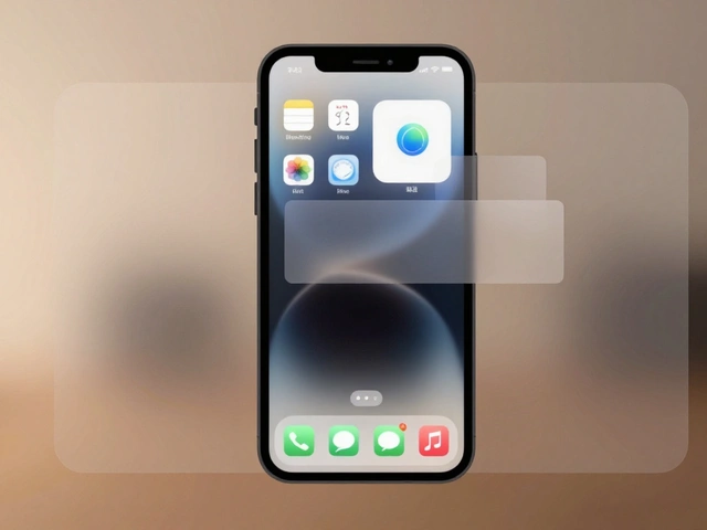
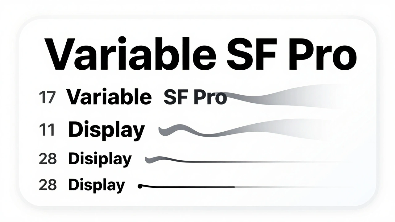
Apple’s San Francisco font family isn’t just the default system font - it’s the backbone of how text behaves across every Apple device. Introduced in iOS 9, SF replaced Myriad Pro and was built from the ground up for digital screens. It has two main variants: SF Text for small sizes (11-19 points) and SF Display for larger text (34 points and up). The difference isn’t just style - it’s structure. SF Text has slightly taller x-heights and wider letterforms to keep small text legible. SF Display has looser spacing to prevent crowding when text is large.
Before WWDC 2020, Apple switched between these two fonts at fixed sizes. Now, SF Pro is a variable font. That means it smoothly transitions from Text to Display between 17 and 28 points without a jarring jump. This isn’t a cosmetic upgrade - it’s a rendering breakthrough. When you scale text dynamically, the font adjusts spacing, stroke weight, and counter size in real time. No more fuzzy edges or uneven weight changes. It’s like having a custom font for every size, all in one file.
Contrast Isn’t Just About Dark and Light
Contrast isn’t just “black on white.” Apple’s Human Interface Guidelines require a minimum contrast ratio of 4.5:1 for normal text and 3:1 for large text (18pt or 14pt bold) to meet WCAG 2.1 AA standards. But testing contrast on a MacBook screen doesn’t tell you what it looks like under direct sunlight on an iPhone 15 Pro.
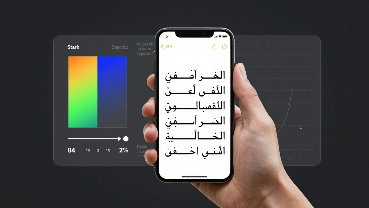
Use tools like Stark (for Figma, Sketch, or Adobe XD) to check contrast ratios, but never stop there. Test on real devices in different lighting - a dim room, a sunny porch, a fluorescent-lit office. Text that passes contrast checks on your design tool might vanish on an OLED screen at full brightness. Why? Because OLED blacks aren’t just dark - they’re true black. White text on a black background can appear too harsh, while light gray text on a dark background can disappear entirely.
Also test with languages that have tall ascenders or long diacritics - like French, Vietnamese, or Arabic. A text box that works for English might clip the top of an “é” or the bottom of a “g” in another language. Apple requires apps to support at least 20 languages, and your typography must hold up in all of them.
Crispness Only Shows Up on Real Hardware
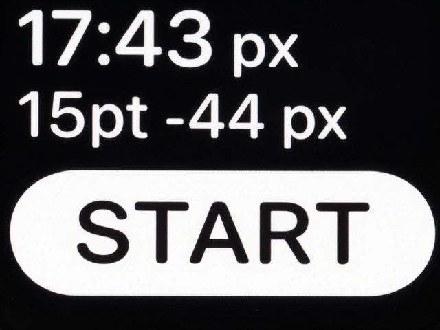
Simulators lie. Your Mac’s 5K display renders text with perfect subpixel anti-aliasing. Your iPhone 14’s Super Retina XDR screen uses a different pixel grid. And your Apple Watch uses a monochrome OLED panel with no subpixel rendering at all.
What looks crisp on your laptop? It might look smeared on a smaller screen. What looks sharp on your iPad? It could look too thin on an older iPhone with a non-Retina display. Apple’s own designers test on every device they support - from the 4-inch iPhone SE to the 14-inch MacBook Pro. If you’re not testing on real hardware, you’re guessing.
Pay attention to how text behaves at different viewing distances. On a phone held close, fine details matter. On a TV screen viewed from across the room, bold strokes matter more than fine serifs. The same font at the same point size can look completely different depending on screen size and resolution.
Dynamic Type and Font Scaling
Apple users change their text size. A lot of them. In iOS Settings, users can adjust text size from “XS” to “XXXL.” Your app must adapt. That’s where Dynamic Type comes in. System fonts automatically scale based on user preference. But if you’re using a custom font, you’re on your own.
Use UIFontMetrics to scale custom fonts proportionally. Don’t just set a fixed size. Use text styles like .body, .headline, or .caption2 - they’re designed to scale with user preferences. If you hardcode a 16pt font, you’re ignoring users who need larger text for accessibility. And Apple’s App Store review team checks for this. Apps that don’t support Dynamic Type get rejected.
Test your app with the largest text setting. Does your UI break? Do buttons overlap? Does text get cut off? These aren’t edge cases - they’re everyday use cases for millions of users.
Kerning vs. Tracking - What Actually Matters
Many designers tweak letter spacing to make text “look better.” But Apple’s guidelines warn against it. If you use the kerning API to adjust spacing between specific letter pairs, you might accidentally keep ligatures (like “fi” or “fl”) in place. That breaks the rhythm of the word.
Instead, use tracking. Tracking adjusts spacing uniformly across all characters. And here’s the key: when you use tracking, the system automatically disables ligatures and other typographic features that clash with even spacing. This keeps words readable and visually balanced.
For constrained layouts - like a button with limited width - use the tight tracking table. It intelligently reduces spacing just enough to fit the text without making it unreadable. Manual tracking adjustments? They’re risky. Apple’s system knows what works best. Trust it.
Accessibility Isn’t an Add-On - It’s a Requirement
Text that’s hard to read isn’t just ugly - it’s exclusionary. Apple’s VoiceOver screen reader depends on clear contrast and proper text hierarchy. If your text is too light or has low contrast, VoiceOver might misread it. Or worse - users might skip your app entirely.
Use Xcode’s Accessibility Inspector to check:
- Contrast ratios between text and background
- Whether text scales properly with Dynamic Type
- If text is readable when inverted or viewed in grayscale
Also test with users who rely on larger text. Don’t assume they’ll just turn on “Bold Text” in Settings. Many users need both larger size and higher contrast. Your app should support both.
Testing Tools You Actually Need
You don’t need fancy software. You need real devices and real testing methods:
- Font Tester - Test how your font renders at different sizes on real screens
- Fonts Ninja - Identify fonts used in any app or website
- Typetester - Compare multiple fonts side by side under real conditions
- Stark - Check contrast ratios directly in your design tool
- UserTesting.com - Get feedback from real users on readability
And always test on devices you don’t own. Borrow an iPhone 13 mini. Try your app on an iPad Air 2. See how it looks on an older MacBook with a non-Retina screen. If it works there, it’ll work everywhere.
Best Practices That Actually Work
- Use system fonts (SF Pro) by default. They’re optimized for every Apple device.
- If you must use a custom font, use one for body text and one for headings - no more.
- Never use font weights lighter than “Medium.” Light and Regular are too thin on small screens.
- Test on real devices, not just simulators.
- Always test with Dynamic Type turned to the largest setting.
- Check contrast in multiple lighting conditions.
- Test with non-English text - especially languages with accents or right-to-left scripts.
Typography on Apple devices isn’t about making text look pretty. It’s about making sure every user - no matter their vision, their device, or their language - can read it easily. That’s the standard Apple set. And if you’re building for Apple, that’s the standard you have to meet.
Why does text look blurry on my iPhone but sharp on my Mac?
Screen technology and pixel density differ. Macs often use high-resolution Retina displays with subpixel rendering, while iPhones use OLED or Super Retina panels with different pixel arrangements. Anti-aliasing and font hinting behave differently across these systems. What looks crisp on a 27-inch monitor may appear soft or smeared on a smaller screen held close to the eye. Always test on the actual devices your users have.
Can I use custom fonts in my iOS app?
Yes, but with limits. Apple recommends using SF Pro as the default system font because it’s optimized for all screen sizes and lighting conditions. If you use a custom font, stick to one for body text and one for headings. Avoid decorative or overly thin fonts. Always implement Dynamic Type using UIFontMetrics so your font scales properly when users change text size in Settings.
What’s the minimum contrast ratio Apple requires?
Apple follows WCAG 2.1 AA standards: 4.5:1 for normal text (under 18pt) and 3:1 for large text (18pt or larger, or 14pt bold). Apps that fail this test may be rejected during App Store review. Use tools like Stark or the Accessibility Inspector in Xcode to verify contrast before submission.
Does font size matter more than font weight?
Yes. A 16pt Medium font is often more legible than a 14pt Regular. Apple’s own design guidelines discourage using Light or Regular weights on small screens because they lack visual weight. Even if the font is well-designed, thin strokes can disappear on low-contrast backgrounds or under bright sunlight. Prioritize size over weight - and always test on real devices.
How do I test typography for right-to-left languages like Arabic?
Enable right-to-left layout in Xcode’s simulator or on a real device by changing the language to Arabic, Hebrew, or Persian. Then test how text flows, how punctuation aligns, and whether characters are clipped. Pay attention to diacritics - they often extend beyond standard line heights. Use dynamic text containers that expand to accommodate taller glyphs. Apple requires full RTL support for apps distributed globally.
Should I use SF Mono for code in my app?
Yes. SF Mono is Apple’s monospaced font designed specifically for code, terminals, and technical text. It has clear distinctions between similar characters like 0, O, l, and 1. It’s also optimized for Retina displays and scales cleanly with Dynamic Type. Avoid third-party monospace fonts unless absolutely necessary - they often lack proper spacing or hinting for Apple’s screens.
Is SF Pro Rounded a good choice for apps?
SF Pro Rounded is designed for playful, friendly interfaces - think fitness apps, children’s tools, or casual games. It’s not ideal for productivity or enterprise apps where clarity matters more than style. Use it sparingly and always test it at small sizes. The rounded corners can blur on low-resolution screens. Stick to SF Pro for most apps unless your brand identity demands otherwise.
Next Steps for Designers and Developers
Start by auditing your app’s typography on five real devices: an iPhone 15, iPhone SE, iPad Air, Apple Watch, and MacBook. Use the Accessibility Inspector. Test with Dynamic Type turned up. Check contrast in daylight. Switch the language to Arabic or Vietnamese. If anything looks off - fix it. Typography isn’t a one-time setup. It’s an ongoing test. Apple’s devices evolve. Your text must evolve too.