
When you open an app on your iPhone or Mac, the text you see isn’t just there for looks-it’s doing real work. It needs to be readable when you’re rushing through your morning notifications, squinting in bright sunlight, or zoomed in because you’re holding your device close. Apple’s approach to typography isn’t about making things look fancy. It’s about making sure every word, no matter where or how it’s viewed, stays clear and usable. This is accessible typography-designed to work legible at a glance and up close.
Why Apple’s Typography Rules Matter
Apple doesn’t leave text design to chance. If your app’s text is too small, too thin, or uses a font that’s hard to read, it won’t get approved for the App Store. That’s not a suggestion-it’s a hard requirement. Apple’s Human Interface Guidelines (HIG) make it clear: accessibility isn’t an add-on. It’s the foundation. And typography is one of the first things they check.
Think about it: if someone can’t read your app’s buttons, labels, or instructions, they can’t use it. That’s not just bad design-it’s exclusion. Apple’s system ensures that apps work for everyone, whether they’re using default settings or have turned on larger text through Accessibility preferences. This isn’t about catering to a niche group. It’s about building for real human behavior.
The Two System Fonts You Need to Know
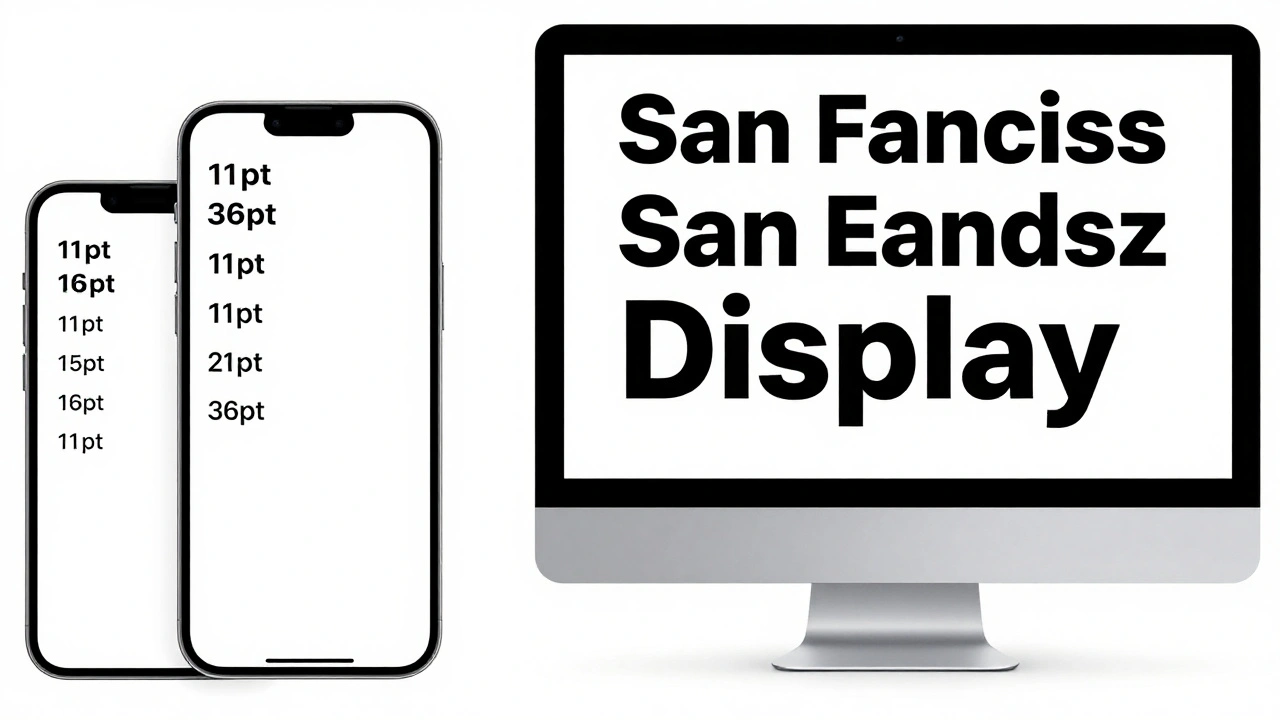
Apple gives developers two system fonts: San Francisco (SF) and New York (NY). These aren’t just default choices-they’re engineered for screen readability. SF is the workhorse for most apps. It’s clean, balanced, and built with subtle variations so that text at 11 pt looks just as clear as text at 36 pt. NY is designed for long-form reading, like articles or books, where extended text needs more breathing room.
Both fonts come with multiple weights: Ultralight, Thin, Light, Regular, Medium, Semibold, Bold, and Black. But here’s the catch-Apple doesn’t recommend using the extremes. Too light (Ultralight) becomes blurry on lower-resolution screens. Too heavy (Black) can feel overwhelming in body text. The sweet spot? Regular and Medium. They’re what books have used for centuries, and Apple knows why.
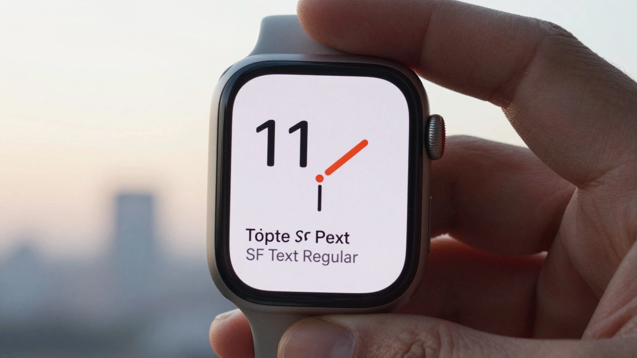
There’s also SF Text and SF Display. They’re not different fonts-they’re the same font family, but with different proportions. SF Text is slightly taller and wider at small sizes to trick your eye into reading it easier. SF Display is more open and spacious for larger headlines. At 11-19 pt, use SF Text Regular. At 20-34 pt, switch to SF Display Medium. At 34 pt and up, go with SF Display Bold. This isn’t arbitrary. It’s based on optical sizing, a design principle that adjusts letterforms so they look right at every size.
Dynamic Type: The Heart of Accessibility
Dynamic Type is Apple’s secret weapon. When a user goes to Settings > Accessibility > Display & Text Size and turns up the text size, your app should respond automatically. That’s not magic-it’s code. If you use Apple’s built-in text styles like Body, Headline, or Footnote, the system scales everything for you. No extra work needed.
But if you’re using a custom font? You’re on the hook. You have to make sure it supports Dynamic Type. That means you can’t just hardcode a font size like 16 pt. You need to link your font to a text style. In SwiftUI, you do this with Font.system(.body). In UIKit, you use UIFont.preferredFont(forTextStyle: .body). The system handles the rest.
And here’s a pro tip: if you’re using custom fonts, don’t forget to test them at the largest accessibility setting. Some fonts get squished or lose their shape when scaled up. Apple’s review team checks this. If your font becomes unreadable at 3x size, your app gets rejected.
Font Selection: What Works and What Doesn’t
Not all fonts are created equal. Apple gives clear rules for picking typefaces that work on screens:
- Avoid extremes. No ultra-condensed, ultra-extended, or super-slab fonts for body text. They look cool in posters-but not on a 4-inch screen.
- Watch the x-height. The taller the lowercase letters (like ‘a’, ‘e’, ‘x’), the more readable the font. A tall x-height means more space inside letters (counters), which helps your brain recognize shapes faster.
- Pass the IL1 test. Can you tell the difference between a lowercase ‘l’, a capital ‘I’, and the number ‘1’? If they all look the same, the font fails. This is one of the first checks Apple’s designers do.
- Use names that tell the truth. If a font is meant for body text, its name should include words like ‘Text’, ‘Book’, ‘Regular’, or ‘Normal’. If it’s called ‘Bamboo Sans’ or ‘Neon Display’, it’s probably meant for headlines.
Apple recommends San Francisco and New York as the safest bets. But if you need something else, they list alternatives: Helvetica Neue, Open Sans, Roboto, Proxima Nova, Inter, and Museo Sans. All of these have been tested on real devices, at real sizes, under real conditions.
Line Spacing and Letter Spacing: The Tiny Details That Make a Big Difference
Legibility isn’t just about size and weight. It’s also about space. Too tight, and letters blur together. Too loose, and your eye loses the flow.
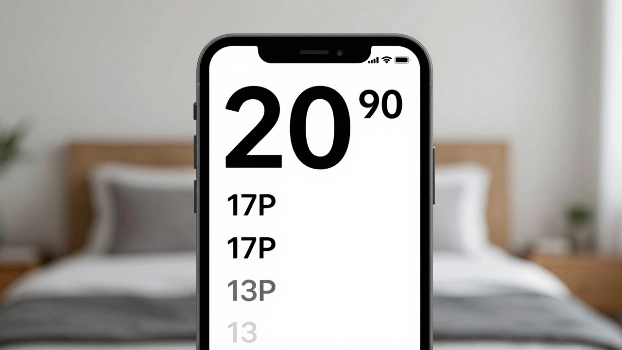
Apple uses two terms: tight leading and loose leading. Tight leading reduces line height by 2 points on iOS and macOS (1 point on watchOS). Loose leading adds 2 points. These aren’t just tweaks-they’re corrections for how fonts behave at different sizes. For example, a headline at 48 pt might need loose leading to prevent the lines from feeling cramped. Body text at 17 pt might benefit from tight leading to keep it compact on small screens.
In SwiftUI, you control this with Font.body.leading(.tight) or Font.body.leading(.loose). In UIKit, you use UIFontDescriptor with symbolic traits like .traitTightLeading. But again-don’t guess. Test it. Read your text out loud. If you’re stumbling over words, the spacing is off.
Contrast: Text Can’t Be Invisible
Even the most perfectly sized font fails if it blends into the background. Apple requires a minimum contrast ratio of 4.5:1 between text and its background. For larger text (18 pt or above), 3:1 is acceptable. This isn’t just for colorblind users-it’s for anyone reading in glare, under dim lighting, or on a tired screen.
Use Apple’s Contrast Checker in Xcode to test your colors. Don’t rely on your monitor. Test on real devices. A color that looks fine on your MacBook Pro might vanish on an iPhone in direct sunlight.
And don’t forget icons. If your icon is next to text, it needs enough contrast too. A gray ‘+’ on a white background? That’s a no-go. Apple’s guidelines say every visual element that carries meaning must be perceivable without color.

What Not to Do
Here are the most common mistakes developers make-and why Apple rejects apps for them:
- Using all caps for long text. All caps removes the shape of words. Your brain reads by recognizing word shapes, not individual letters. A paragraph in ALL CAPS becomes a blurry rectangle.
- Using more than two typefaces. One for headings, one for body. That’s it. More than that creates visual noise. Apple’s own apps use one or two fonts. Yours should too.
- Hardcoding font sizes. If you write
Text("Hello").font(.system(size: 16))in SwiftUI, you’re ignoring Dynamic Type. Users who need larger text won’t be able to read your app. Always use text styles. - Ignoring watchOS. Watch faces are tiny. Text that looks fine on iPhone might be unreadable on Apple Watch. Test your font at 11 pt on watchOS. If it’s hard to read, shrink it or change it.
Testing Like a Pro
Don’t assume your font works. Test it. Here’s how:
- Turn on Accessibility > Display & Text Size > Larger Text on your device.
- Set it to the maximum size.
- Open your app. Can you read every word without zooming?
- Use your app in bright sunlight. Is the text still legible?
- Check contrast with the built-in iOS color contrast tool or a free app like Stark.
- Print a screenshot and squint at it. If it blurs, the font or spacing is too thin.
Apple’s own apps pass these tests. So should yours.
Final Rule: Let the System Do the Work
Apple doesn’t want you to reinvent typography. They’ve built a system that’s been tested across millions of devices, under every lighting condition, for every user. Your job isn’t to make it look unique. It’s to make it work.
Use SF or NY. Use text styles. Enable Dynamic Type. Test contrast. Avoid extremes. Don’t override defaults unless you have a real reason.
When you do that, your text doesn’t just look good. It’s usable. And that’s what matters.
What’s the minimum font size for Apple apps?
Apple recommends a minimum font size of 11 pt for default text. This ensures legibility across all devices and accessibility settings. Text smaller than 11 pt is likely to be rejected during App Store review.
Can I use custom fonts in my Apple app?
Yes, but only if they meet accessibility standards. Custom fonts must be legible at all Dynamic Type sizes, pass the IL1 test, have sufficient contrast, and not use extreme weights or widths. Apple’s App Review team will reject fonts that are hard to read, especially at larger sizes.
What’s the difference between SF Text and SF Display?
SF Text is optimized for smaller sizes (11-19 pt) and has slightly taller letterforms to improve legibility. SF Display is designed for larger text (20 pt and up) with more open spacing and refined proportions. They’re the same font family, but engineered differently for size-specific clarity.
Why does Apple discourage all caps text?
All caps removes the unique shapes of words, making them harder to recognize quickly. Your brain reads faster when letters have varying heights (like lowercase ‘g’ or ‘y’). All caps turns text into uniform blocks, slowing down reading. Apple allows all caps only for short headings or labels.
How do I test if my font works with Dynamic Type?
Go to Settings > Accessibility > Display & Text Size > Larger Text, then turn the slider all the way up. Open your app and check if text scales properly. If text overflows, gets cut off, or becomes unreadable, you’ve hardcoded sizes instead of using text styles like Body or Headline.
Categories
Popular Articles