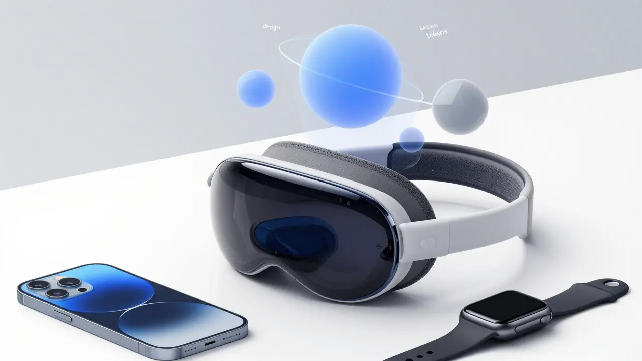

Ever tried to keep your app’s look consistent across iPhone, iPad, and Mac only to find the spacing is off by two pixels on one device? Or maybe you switched to dark mode and suddenly your brand color looks muddy. That’s where design tokens come in. They are the single source of truth for your visual style, translating design decisions into code-ready values. For Apple platforms, this means aligning with Human Interface Guidelines (HIG) while keeping your unique identity intact.
This guide breaks down how to structure tokens for colors, typography, and materials specifically for iOS, macOS, and watchOS. We’ll skip the generic theory and focus on what actually works when you’re shipping apps that need to feel native yet distinct.
Why Design Tokens Matter More on Apple Platforms
Apple’s ecosystem is fragmented in a specific way. You aren’t just designing for one screen size; you’re designing for Dynamic Type, Dark Mode, Accessibility settings, and multiple OS versions simultaneously. Hardcoding values like "#007AFF" or "16pt font" creates technical debt fast. When Apple updates their system palette or introduces new accessibility features, hardcoded values break consistency.
Design tokens solve this by abstracting the value from the implementation. Instead of saying "use blue," you say "use primary-action-color." The token then maps to the correct hex code based on context. This approach ensures that when you update a token in your design file, it propagates to Figma variables, Swift UI code, and React Native components without manual syncing.
| Feature | Hardcoded Values | Design Tokens |
|---|---|---|
| Dark Mode Support | Manual override required per component | Automatic via semantic mapping |
| Dynamic Type Scaling | Fixed sizes, breaks accessibility | Scales with user preference automatically |
| Cross-Platform Consistency | High risk of drift between iOS/macOS | Single source of truth ensures parity |
| Maintenance Effort | High (search and replace) | Low (update once, deploy everywhere) |
Mastering System Colors and Semantic Naming
Apple provides a robust set of system colors that adapt to light and dark modes automatically. However, relying solely on raw system colors can make your app look generic. The trick is to create semantic tokens that wrap these system colors or define custom ones that respect the same adaptive behavior.
System Colors are predefined color values in UIKit and SwiftUI that adjust automatically based on appearance settings. Common examples include .systemBlue, .systemBackground, and .label. When creating tokens, avoid naming them after the color itself (e.g., "blue-500"). Instead, name them by their function (e.g., "action-primary", "surface-elevated").
- Brand Primary: Maps to your main brand color. Ensure contrast ratios meet WCAG AA standards (4.5:1 for normal text) in both light and dark modes.
- Surface Backgrounds: Use
.systemBackgroundfor base levels and.secondarySystemBackgroundfor cards or modals. Create tokens like "bg-base" and "bg-card" to keep naming consistent. - Text Colors: Never hardcode black or white. Use
.labelfor primary text and.secondaryLabelfor captions. These tokens handle opacity adjustments in dark mode automatically.
A pro tip: Test your custom brand colors in Dark Mode early. A vibrant orange that pops on white might look harsh on black. Adjust the saturation or brightness slightly for the dark variant within your token definition.
Typography Tokens and Dynamic Type Integration
Typography is where most Apple apps fail at accessibility. If you use fixed point sizes, you ignore Dynamic Type. Users who increase their text size expect every element to scale proportionally. Design tokens allow you to define type scales that map to Apple’s built-in text styles.
SF Pro is the default system font family used across all Apple platforms, optimized for legibility at various sizes. It includes weights like Regular, Medium, Semibold, and Bold. Your typography tokens should reference these weights alongside specific sizes or, better yet, specific text styles like .headline or .body.
- Define Base Sizes: Start with the standard Apple sizes (e.g., Body = 17pt, Caption = 12pt). These are your baseline values.
- Create Scale Tokens: Name tokens by hierarchy, not size. Examples: "text-display-large", "text-body", "text-caption-small".
- Map to Dynamic Type: In code, ensure each token maps to a corresponding UIFont.TextStyle. This allows the system to scale fonts automatically when users change accessibility settings.
- Line Height Matters: Don’t forget line spacing. Apple recommends specific line heights for readability. Include "line-height" as an attribute in your typography tokens (e.g., 1.3x for body text).
If you’re using SwiftUI, leverage Font.system(.body) directly in your view modifiers, but keep the token layer in your design system for documentation and cross-platform consistency. For UIKit, create a helper function that returns the appropriate UIFont based on your token string.
Material Parameters and Depth Systems
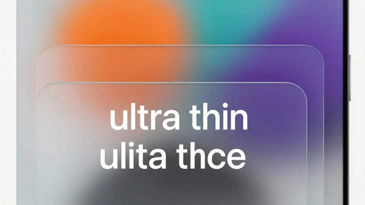
Materials are Apple’s way of handling depth and translucency. They blur the background behind them, creating a frosted glass effect. Unlike solid colors, materials don’t have a fixed hex code; they have parameters like blur radius and saturation.
UIVisualEffectView is a UIKit component that renders blurred and desaturated backgrounds, forming the basis of Apple's material effects. In SwiftUI, this translates to .background(.ultraThinMaterial). When tokenizing materials, you aren't defining colors; you're defining effect intensity.
Common material types include:
- Ultra Thin: Highest transparency, lowest blur. Best for subtle overlays.
- Thin: Slightly more opaque than ultra thin.
- Regular: Balanced blur and opacity. Good for toolbars and sidebars.
- Thick: Higher opacity, less blur. Useful for ensuring content readability over busy backgrounds.
- Chrome: Adds a metallic tint, often used in media players.
Your token strategy here should be simple. Create tokens like "material-toolbar" or "material-sheet" that map to specific material types. Avoid mixing materials arbitrarily. Stick to one material per interface level to maintain visual coherence. For example, if your navigation bar uses "regular material," your tab bar should likely match it unless there’s a strong reason to differ.
Implementing Tokens in Figma and Code
The bridge between design and development is where tokens live or die. In Figma, use Variables (formerly Local Styles) to manage your tokens. Group them logically: Colors > Semantic, Typography > Scale, Effects > Materials.
For code generation, consider using a tool like Style Dictionary or a custom script that exports your Figma variables to JSON. This JSON file becomes the single source of truth for your developers. Here’s a simplified example of what that JSON might look like:
{
  "color": {
    "primary": {
      "value": { "light": "#007AFF", "dark": "#0A84FF" },
      "type": "color"
    },
    "background": {
      "value": { "light": "#FFFFFF", "dark": "#000000" },
      "type": "color"
    }
  },
  "typography": {
    "body": {
      "fontFamily": "SF Pro",
      "fontWeight": "Regular",
      "fontSize": "17",
      "lineHeight": "22",
      "dynamicTypeStyle": "body"
    }
  }
}
In Swift, you can load this JSON at runtime or, preferably, generate Swift constants during the build process. This ensures that if a designer changes a token in Figma, the next build reflects that change without any manual coding effort.
Common Pitfalls to Avoid
Even with a solid token strategy, teams often stumble on a few recurring issues. First, over-tokenization. You don’t need a token for every single shade of gray. Keep your palette tight. Second, ignoring edge cases. What happens when a user has high contrast enabled? Your tokens should account for this by adjusting opacity or border widths where necessary.
Third, inconsistent naming conventions. If one developer calls it "btn-bg" and another calls it "button-background," you’ve lost the benefit of automation. Agree on a naming convention upfront (e.g., BEM-style or camelCase) and enforce it through linting rules in your CI/CD pipeline.
Finally, don’t forget watchOS and visionOS. While the principles are similar, the constraints differ. Watch faces have limited space, so your typography tokens might need smaller minimum sizes. VisionOS introduces spatial computing, where materials interact with real-world lighting. Test your tokens on these platforms early to avoid costly rework later.
Frequently Asked Questions
Do I need separate tokens for iOS and macOS?
Ideally, no. Use a unified set of semantic tokens that map to platform-specific values. For example, a "spacing-medium" token might be 16px on iOS and 20px on macOS if your design system dictates different densities. The token name stays the same; the value adapts based on the target platform configuration.
How do I handle brand colors that don’t exist in Apple’s system palette?
Create custom semantic tokens for your brand colors. Define both light and dark mode variants manually. Ensure these custom colors pass contrast checks against your surface backgrounds. You can still use system colors for non-brand elements like secondary labels or disabled states to maintain native feel.
What is the best way to document design tokens for my team?
Use an automated documentation generator. Tools like Zeroheight or Storybook can pull your token definitions and render live previews. This keeps documentation up-to-date automatically whenever tokens change, reducing the risk of developers using outdated values.
Can I use design tokens for animations and motion?
Yes. Motion tokens define duration and easing curves. For example, "motion-fast" could be 150ms with an ease-out curve. This ensures consistent interaction feedback across buttons, sheets, and transitions. Apple’s HIG provides recommended durations, which you can encode into your motion tokens.
How do design tokens help with accessibility compliance?
Tokens centralize accessibility-critical values like contrast ratios, touch target sizes, and font scaling factors. By testing tokens once rather than individual components, you reduce the chance of missing an accessibility requirement. For instance, a "touch-target-min" token ensures every interactive element meets the 44x44 pt minimum guideline.