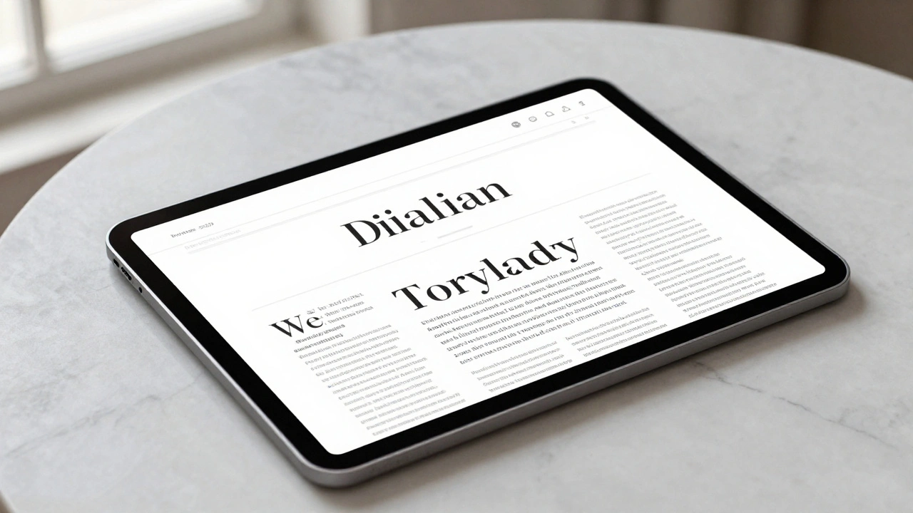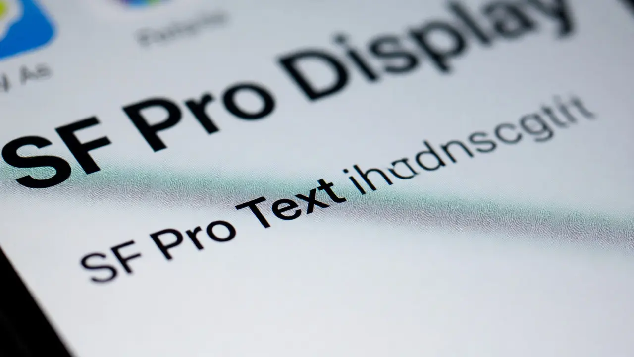

You’ve probably seen it a thousand times without realizing it. That crisp, neutral, yet incredibly legible text on your iPhone or Mac? It’s not just "Arial" or "Helvetica" trying hard to look modern. It is San Francisco, also known as SF Pro, the proprietary typeface family developed by Apple. But here is the catch that trips up even experienced designers: SF Pro isn’t one single font file you can just drop into any project. It is a complex system split into two distinct optical sizes-SF Pro Text and SF Pro Display. Using them interchangeably is like wearing hiking boots to a black-tie gala; technically they are both shoes, but one looks ridiculous in the wrong context.
If you are building an interface for iOS, macOS, or tvOS, understanding when to switch between these two variants is the difference between a polished app and one that feels slightly "off." This guide breaks down exactly how to pair them for maximum clarity, why Apple made this distinction, and the specific rules you need to follow to respect the platform's design language.
Why One Font Isn't Enough
Typography has a physical limitation: screen resolution and viewing distance change how our eyes perceive letterforms. At small sizes, letters need open apertures (the gaps in letters like 'c' or 'e') and wider spacing to remain readable. At large sizes, those same wide openings look clumsy and loose. Apple solved this by engineering two separate versions of the same character set.
SF Pro Text is optimized for small sizes, typically below 20 points. It features tighter tracking, larger x-heights, and more generous spacing between characters. Think of it as the workhorse-it handles body copy, labels, and buttons where readability is king. On the other hand, SF Pro Display is designed for large headings, usually 20 points and above. Here, the spacing tightens up because large letters don't need extra room to be distinguished. The curves become smoother, and the details are refined for impact rather than pure density.
| Feature | SF Pro Text | SF Pro Display |
|---|---|---|
| Optimal Size Range | < 20 pt | ≥ 20 pt |
| Letter Spacing | Wider (for clarity) | Tighter (for cohesion) |
| X-Height | Larger | Standard |
| Best Use Case | Body text, captions, menus | Headlines, hero sections, logos |
The Automatic Switch: How Apple Handles It
Here is good news if you are using standard development tools: you often don’t have to do anything manually. When you use the default system fonts in SwiftUI, UIKit, or AppKit, the operating system automatically swaps between Text and Display based on the point size you specify. If you set a label to 17 points, the OS loads SF Pro Text. If you bump that label to 34 points for a title, it seamlessly switches to SF Pro Display.
This dynamic switching is powered by the variable font technology introduced in recent years. Instead of loading two separate files, the system interpolates the weight and optical size. However, relying entirely on automation can be risky if you are doing custom layout work or exporting designs from Figma or Sketch. In those static environments, you must manually select the correct variant. Forgetting this step is the most common reason exported assets look blurry or poorly spaced when viewed on high-resolution Retina displays.

Pairing Weights and Styles Correctly
Clarity isn’t just about choosing Text or Display; it’s about pairing weights correctly. Apple provides nine weights for each variant: Ultralight, Thin, Light, Regular, Medium, Semibold, Bold, Heavy, and Black. A common mistake is using "Regular" for everything. It makes interfaces feel flat and unengaging.
Instead, follow the hierarchy rule. Use Bold or Semibold for primary actions and headlines to create visual anchors. Use Regular for body content to ensure long-form reading doesn’t fatigue the eye. Reserve Light or Thin for secondary information or decorative elements, but never for essential instructions at small sizes. If you use Thin for a 12-point caption, it will vanish against a light background.
Consider this practical example: You are designing a settings menu. The section header "General" should likely be SF Pro Display (if large) or SF Pro Text (if compact), using the Semibold weight. The individual rows like "About" or "Software Update" should use SF Pro Text with the Regular weight. This contrast guides the user’s eye naturally through the hierarchy without needing borders or colors to do the heavy lifting.
Pitfalls to Avoid When Using SF Pro
Even with the right font, bad implementation kills clarity. First, watch out for line height. Apple recommends specific leading values relative to font size. For SF Pro Text, a line height of roughly 1.5x the font size works well for paragraphs. For SF Pro Display, especially in headlines, you might tighten this to 1.1x or 1.2x to keep lines cohesive. Too much space between headline lines makes them feel disconnected; too little makes them crash into each other.
Another trap is kerning adjustments. Because SF Pro is engineered for digital screens, manual kerning tweaks are rarely needed. If you find yourself adjusting spaces between specific pairs of letters (like "A" and "V") in SF Pro Display, you are likely fighting the font’s natural rhythm. Trust the design. The only time you should adjust spacing is when aligning text with icons or images, where optical alignment trumps mathematical centering.
Finally, remember licensing. SF Pro is licensed specifically for use within Apple platforms. You cannot legally use it for a website hosted on non-Apple servers unless you have a special license, nor can you use it in print materials outside of Apple-related contexts. For web projects, Inter or Roboto are often used as close alternatives, though neither perfectly replicates the optical sizing logic of SF Pro.
Practical Checklist for Designers
- Check Point Size: Is your text under 20pt? Use SF Pro Text. Over 20pt? Use SF Pro Display.
- Verify Weight Hierarchy: Ensure headers are heavier than body text. Avoid using Thin for critical info.
- Respect Leading: Tighten line spacing for Display, loosen it for Text.
- Test on Devices: Always preview on actual iPhones and iPads. Simulators lie about anti-aliasing.
- Use System Fonts: Prefer `systemFont(ofSize:)` over hardcoded names to let the OS handle the switching.
Frequently Asked Questions
Can I use SF Pro on Android?
No, not legally for commercial apps. While the file exists, Apple restricts its use to Apple devices. Developers often use Inter or Roboto as substitutes that mimic the geometric sans-serif style.
What is the exact cutoff size for switching fonts?
The general rule is 20 points. Below 20pt, use SF Pro Text. At 20pt and above, use SF Pro Display. However, some designers prefer switching at 19pt or 21pt depending on the specific visual balance of their layout.
Does SF Pro support dark mode automatically?
Yes. When you use system fonts in iOS/macOS development, the color adapts to Dark Mode automatically. You generally don't need to swap fonts, but you may want to adjust opacity levels for secondary text to maintain contrast ratios.
Is SF Pro available for free download?
You can download it from the Apple Developer site, but the license strictly limits usage to applications running on Apple platforms. It is not a general-purpose desktop font for Word or Photoshop projects intended for print.
Why does my text look blurry?
This often happens if you use SF Pro Display at very small sizes (under 16pt). The tighter spacing causes characters to bleed into each other visually. Switch to SF Pro Text for better legibility.