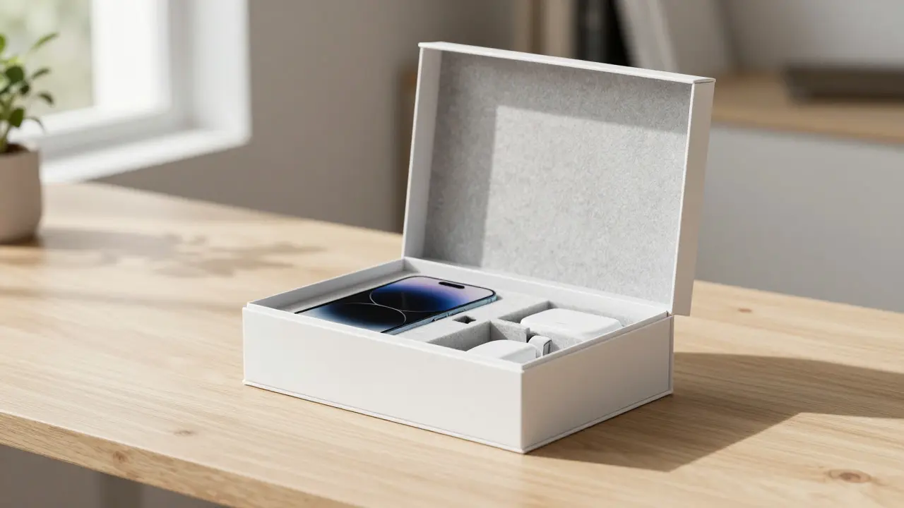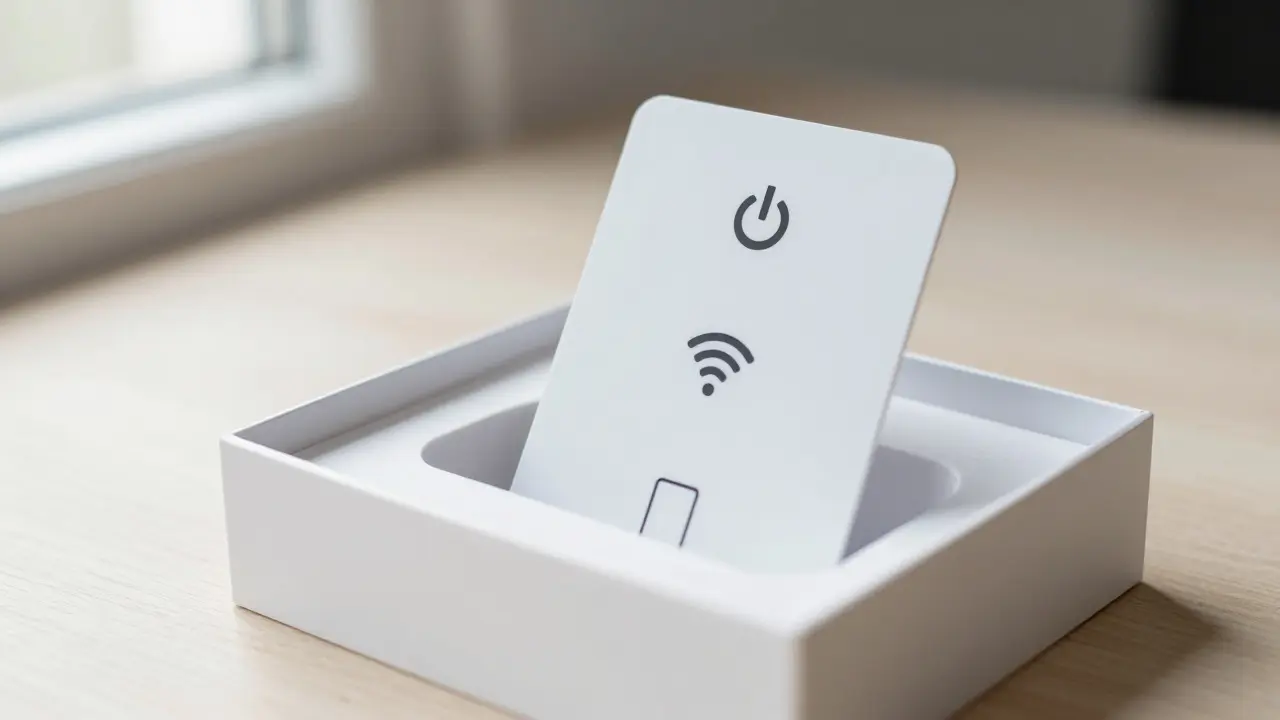

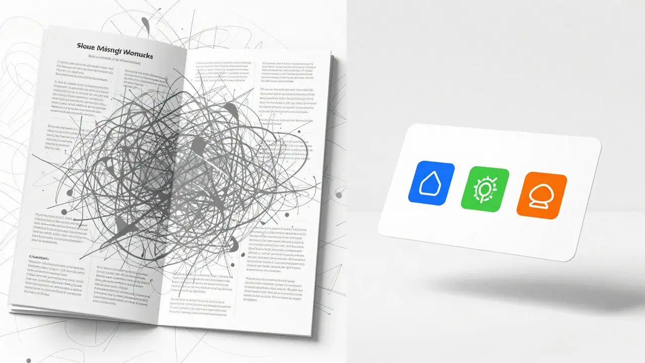
Open a new iPhone box. You’ll find a thin card with a few icons and no more than three lines of text. No dense paragraphs. No legal jargon buried in footnotes. Just enough to get you from unboxing to using the device within minutes. This is instruction simplicity in action, and it’s a masterclass in packaging design that most brands overlook.
We often assume that more information equals better customer experience. But in reality, cognitive load is the enemy. When users are overwhelmed by text, they stop reading. They skip. They call support. Apple understood this decades ago. By stripping away the noise, their leaflets don’t just look clean; they actually work harder for the user.
The Psychology of Less: Why Minimalism Works
Cognitive Load Theory suggests that our working memory has a limited capacity. When you present a user with a wall of text, their brain struggles to process the sequence of actions required. The result? Frustration. Or worse, confusion that leads to product returns.
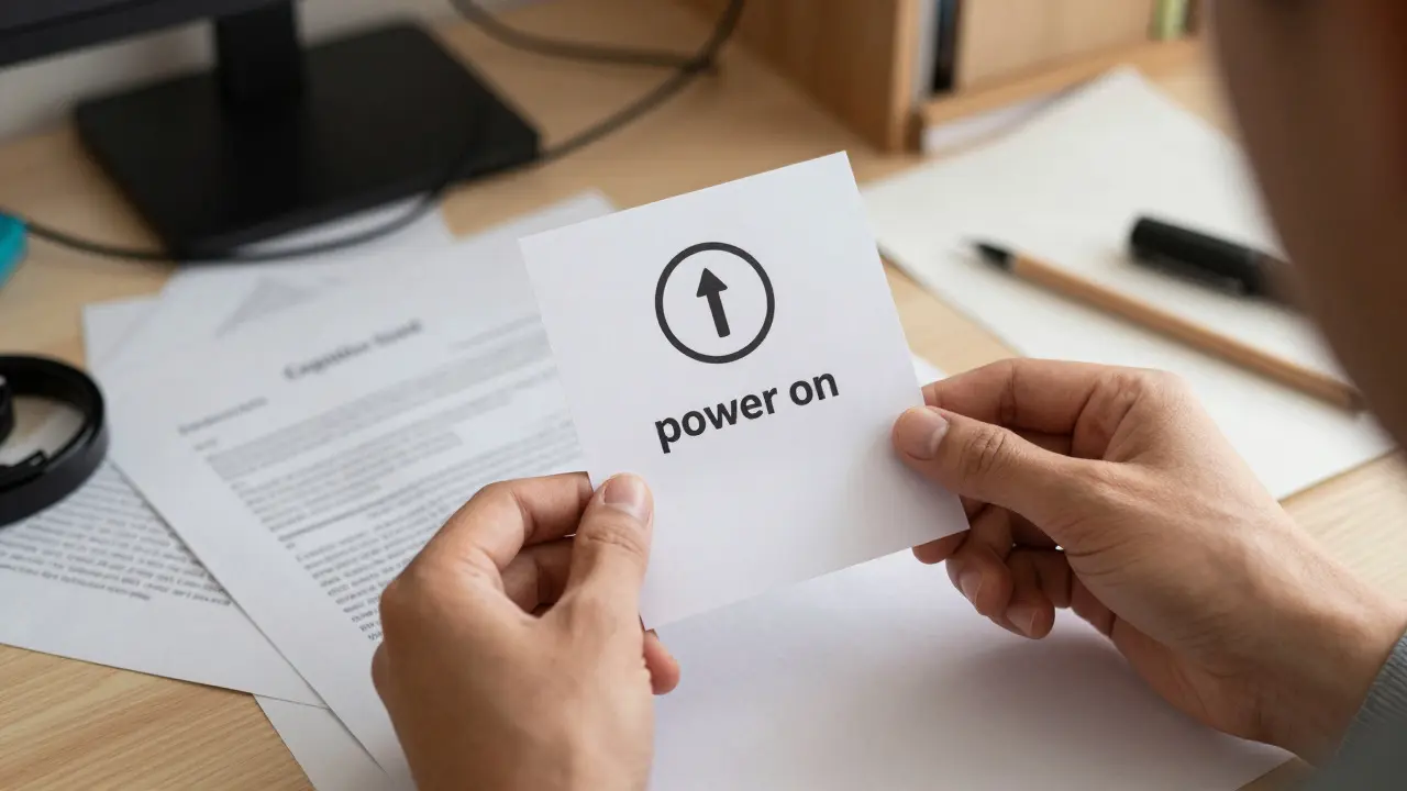
Apple’s approach relies on Visual Hierarchy, a design principle that guides the eye through content in order of importance. Instead of telling you everything, the leaflet tells you what matters *right now*. If you’re holding an iPad, the first thing you see is how to power it on. Not the warranty terms. Not the recycling instructions. Just the next step.
This isn’t about hiding information; it’s about sequencing it. Think of it like a GPS navigation system. It doesn’t print out the entire map of the country. It highlights the next turn. That’s the core of effective instructional design.
Anatomy of an Apple Leaflet
If you’ve ever disassembled an Apple package (and if you’re into packaging design, you have), you know these leaflets are engineered down to the millimeter. Let’s break down the components that make them so effective.
- Iconography over Text: Icons are universal. A battery icon means "charge." A Wi-Fi symbol means "connect." These symbols bypass language barriers and reduce reading time by up to 40% compared to text-only instructions, according to usability studies from Nielsen Norman Group.
- Single-Column Layouts: Multi-column text forces the eye to jump back and forth, increasing error rates. Single-column flows guide the gaze naturally from top to bottom.
- Negative Space: Empty space isn’t wasted space. It creates breathing room that reduces anxiety. In high-stakes moments (like setting up a new security system or medical device), calmness is a feature, not a bug.
- Call-to-Action Clarity: Every leaflet ends with one clear next step. Usually, it’s a URL or a QR code leading to deeper resources. The physical object handles the immediate need; the digital layer handles the complex ones.
Comparing Approaches: Apple vs. Traditional Packaging
To understand why this works, let’s compare it to the typical consumer electronics manual found in a standard retail box.
| Feature | Apple Minimalist Approach | Traditional Dense Manual |
|---|---|---|
| Word Count | 50-150 words | 1,000+ words |
| Primary Medium | Icons + Short Phrases | Dense Paragraphs |
| Time to Comprehend | < 30 seconds | 5-10 minutes |
| Error Rate (Setup) | Low (Guided Flow) | High (Information Overload) |
| Perceived Value | Premium / Confident | Complex / Technical |
Notice the shift in perceived value. When a brand provides a simple, elegant instruction sheet, users subconsciously associate that clarity with the quality of the product itself. It signals confidence. We trust companies that aren’t afraid to simplify.
How to Apply This to Your Own Packaging
You don’t need to be Apple to benefit from this. Whether you’re selling skincare, software, or smart home devices, here’s how to implement instruction simplicity.
- Audit Your Current Copy: Take your existing manual. Highlight only the steps needed for the *first use*. Delete everything else. Move the rest to a website or app.
- Replace Verbs with Icons: Can you show "shake well" with an icon? Can you show "insert SIM card" with a diagram? Visuals are processed faster than text.
- Use Progressive Disclosure: Don’t give all info at once. Give Step 1. Then, after Step 1 is done, reveal Step 2. On paper, this can be achieved by folding the leaflet or using perforations.
- Test with Real Users: Watch someone use your product without help. Where do they hesitate? That’s where your instruction fails. Simplify that specific moment.
The goal isn’t to make the user feel dumb. It’s to make the user feel empowered. When instructions are simple, the user feels competent. And competent users become loyal customers.
Common Pitfalls to Avoid
Even with good intentions, designers often fall into traps that undermine simplicity.
- The Legal Trap: Marketing teams often want to add disclaimers to every line. Find a balance. Put the critical safety warnings prominently, but move the fine print to a secondary section or digital format.
- Assuming Tech Savviness: Just because *you* know how to pair Bluetooth headphones doesn’t mean your grandmother does. Test with non-technical users.
- Ignoring Context: People open boxes in living rooms, not labs. Lighting varies. Hands might be full. Design for the messy reality of human life, not the idealized lab environment.
The Future of Physical Instructions
With the rise of AR apps and voice assistants, some argue physical leaflets are obsolete. They’re not. They serve as the bridge between the physical object and the digital ecosystem. A QR code is useless if the user doesn’t know where to point their phone. A simple printed guide ensures that bridge holds.
As we move toward 2026 and beyond, sustainability is also playing a role. Smaller leaflets mean less paper waste. Less ink usage. Fewer shipping costs. Instruction simplicity isn’t just a UX win; it’s an environmental and financial one too.
Frequently Asked Questions
Is minimal instruction design suitable for complex products?
Yes, but it requires progressive disclosure. For complex products like industrial machinery or advanced cameras, the initial leaflet should cover only setup and basic operation. Advanced features should be directed to a companion app or online manual. The key is separating "need to know" from "nice to know."
How do I handle multilingual requirements without cluttering the design?
Use icon-first design. Icons transcend language. For text, use short phrases that are easy to translate. Alternatively, provide a single-language base card with a QR code that leads to a localized digital manual. This keeps the physical footprint small while ensuring global accessibility.
Does removing text reduce the perceived value of a product?
Usually, the opposite happens. Clean, minimalist design is associated with premium brands. It suggests the company is confident in its product and respects the user's time. However, this depends on the target audience. For highly technical buyers who expect detailed specs, a balance may be needed.
What is the best paper stock for minimal leaflets?
Uncoated recycled paper is becoming the standard for eco-conscious brands. It has a natural texture that complements minimalist design and reinforces sustainability messages. Weight-wise, 80gsm to 120gsm offers a good balance between durability and flexibility for folding.
How can I measure the success of my simplified instructions?
Track customer support tickets related to setup. If you simplify instructions correctly, setup-related calls should drop significantly. Also, monitor return rates due to "user error." A/B testing different versions of the leaflet can provide direct data on comprehension speed and accuracy.