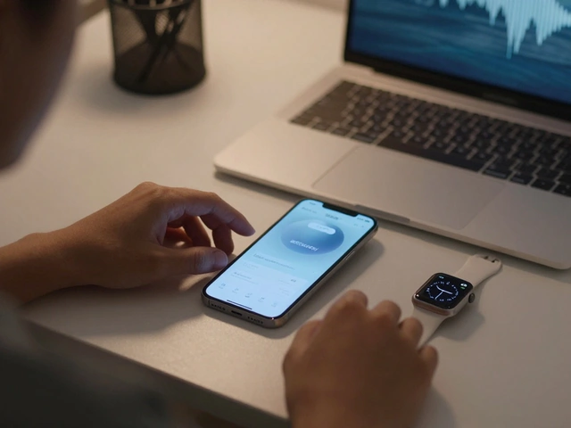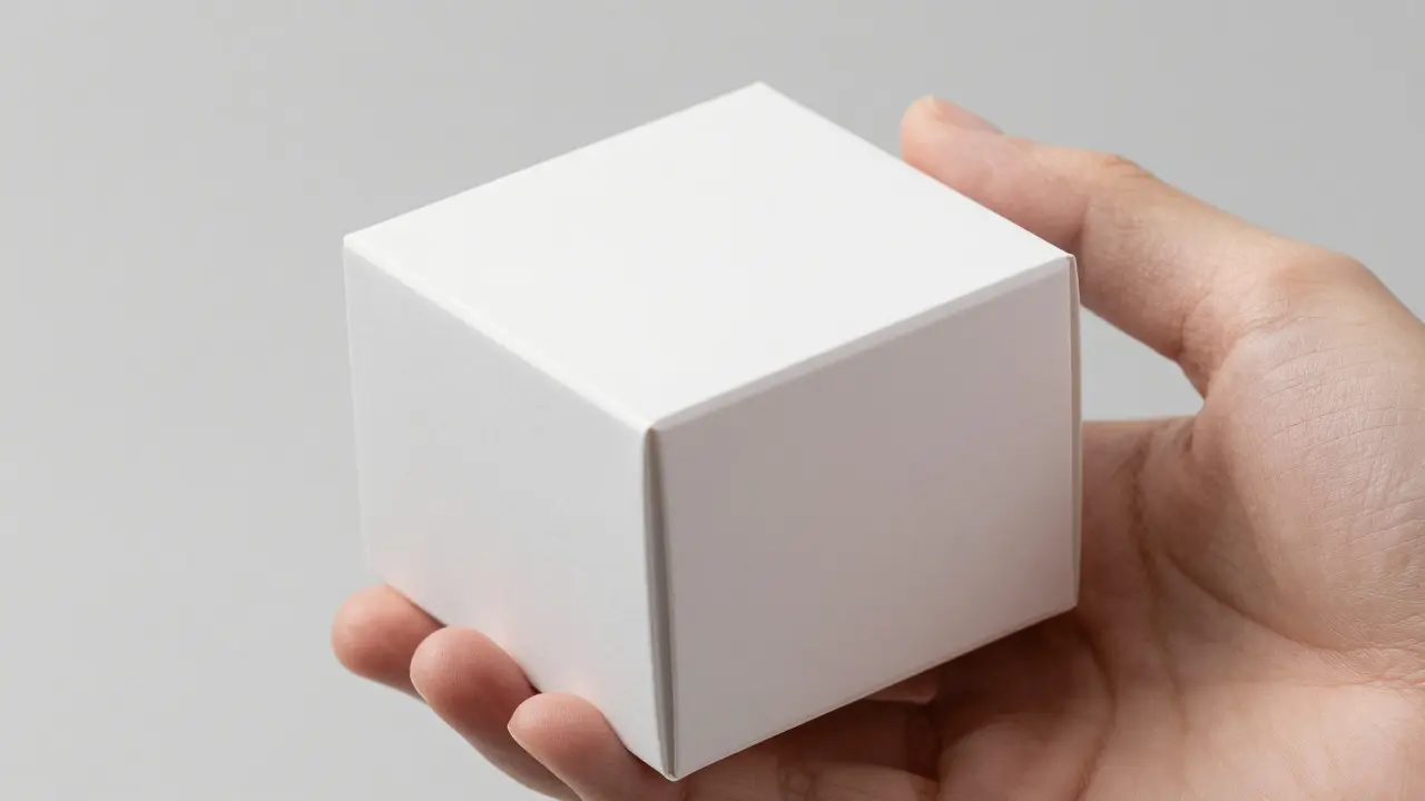

Ever opened an iPhone box and felt that satisfying, heavy thud before you even saw the device? That’s not just weight; it’s a calculated sensory experience. Apple doesn’t just sell electronics; they sell a feeling of precision and premium quality. For brands looking to compete in high-end tech or lifestyle markets, replicating this tactile experience is crucial. It’s about more than just putting a product in a box. It’s about ensuring every material choice-from the cardboard texture to the magnetic closure-echoes the device itself.
This guide breaks down how to align your packaging Color, Material, and Finish (CMF) with high-tech aesthetics. We’ll look at specific paper stocks, coating techniques, and structural elements that create that signature "Apple-like" feel without necessarily using their exact suppliers. The goal is to make your customer pause, touch, and appreciate the package as much as the product inside.
Why Tactile Consistency Matters in Tech Packaging
In the digital age, physical touch is rare. When a customer holds a package, it’s one of the few moments where brand identity is tangible. If your device has a cool, matte aluminum finish but your box feels like flimsy, glossy magazine paper, there’s a disconnect. This mismatch can subconsciously lower the perceived value of the product.
Color, Material, and Finish (CMF) is the discipline of designing the visual and tactile aspects of a product, including its color palette, material selection, and surface treatment. In packaging, CMF alignment means the exterior container should act as a mirror for the interior product. If the phone is sleek and minimalist, the box shouldn’t be loud or textured in a way that contradicts that simplicity. Think of it as a handshake: if one hand is smooth and the other is rough, the interaction feels awkward.
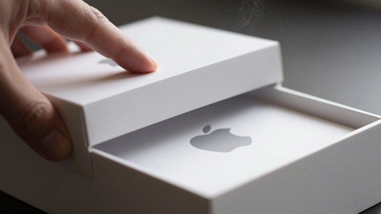
Consider the standard white Apple box. It’s not just white; it’s a specific shade of off-white or pure white depending on the era, with a very tight tolerance for ink coverage. The material is usually a rigid board, often made from recycled fibers, giving it a slight tooth rather than a slick plastic feel. This subtle texture prevents fingerprints and adds a layer of warmth to the cold technology inside.
Choosing the Right Paper Stock and Board
The foundation of any premium box is the substrate. You don’t need exotic materials to achieve a high-end look; you need the right density and finish. Here are the three main categories to consider when aiming for that polished tech aesthetic:
- Rigid Board (Grayboard): This is the gold standard for luxury and high-tech packaging. It’s thick, dense, and holds its shape perfectly. When wrapped in paper, it creates sharp, crisp edges. Look for boards with a grammage of at least 1.5mm thickness for a substantial feel. The rigidity ensures the box closes with a satisfying click or slide, mimicking the precision of a laptop lid.
- High-Weight Cardstock (300gsm+): For slightly less expensive options, heavy cardstock works well. However, it lacks the depth of rigid board. To compensate, use double-wall construction or add internal supports. This option is great for smaller accessories like earbuds or cables where the "thud" factor is less critical.
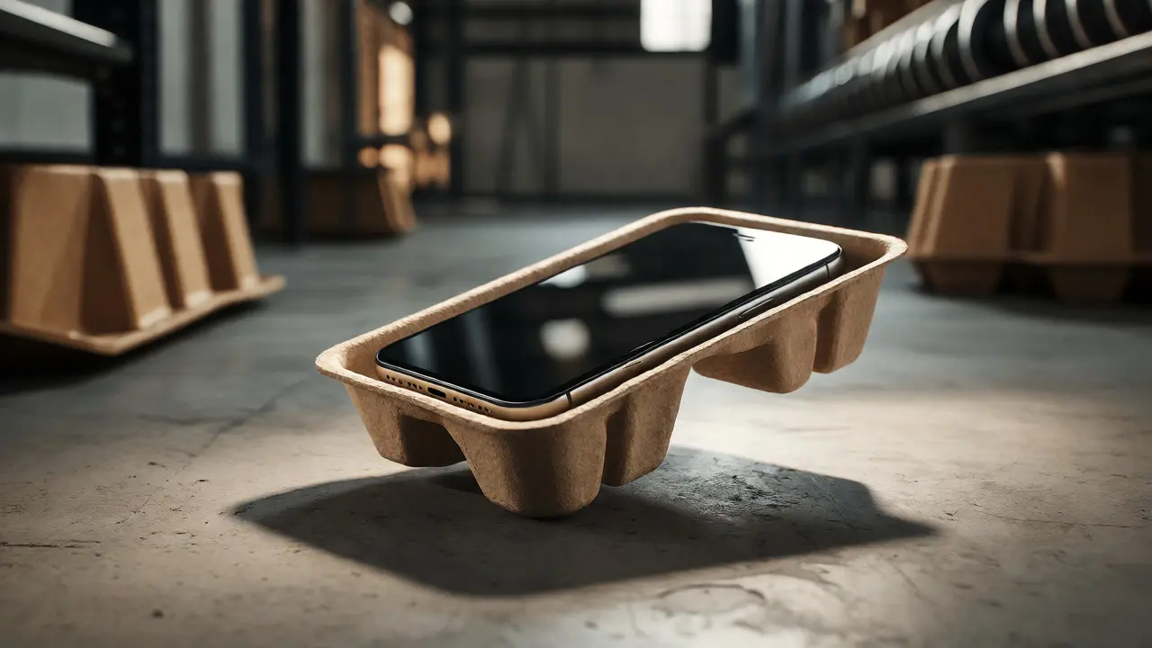
- Recycled Kraft Paper: Apple has moved heavily toward sustainability, using kraft paper for many of its boxes. This brown, fibrous paper is strong and inherently eco-friendly. It pairs beautifully with black or dark gray typography. The key here is consistency; ensure the pulp source is uniform so the color doesn't vary batch to batch.
A common mistake is choosing a stock that is too thin. If the box bends when you squeeze it, the premium illusion shatters. Test your samples by applying pressure. Does it hold its geometry? If yes, you’re on the right track.
Surface Finishes: Matte vs. Glossy vs. Soft-Touch
Once you have the structure, the surface finish defines the tactile response. This is where the magic happens. Most tech devices today feature matte or satin finishes to reduce glare and fingerprints. Your packaging should follow suit.
| Finish Type | Tactile Feel | Visual Impact | Best For |
|---|---|---|---|
| Matte Lamination | Dry, slightly textured | Low glare, modern | Standard consumer electronics |
| Soft-Touch Lamination | Velvety, warm, grippy | Deep blacks, rich colors | Premium headphones, smartwatches |
| Glossy Lamination | Slick, smooth | High contrast, vibrant | Accessories, colorful products |
| Uncoated/Kraft | Natural, fibrous | Organic, earthy | Eco-focused tech brands |
Soft-Touch Lamination is a specialized coating that gives packaging a velvety, suede-like texture, enhancing grip and perceived luxury. This finish is incredibly popular in the tech space because it mimics the feel of high-end fabrics or leather cases. It also hides fingerprints better than gloss. If your product is a black smartphone, a soft-touch black box creates a monochromatic, seamless look that feels cohesive.
On the other hand, avoid high-gloss finishes unless your product is brightly colored or playful. Gloss reflects light sharply, which can look cheap if the printing isn't perfect. Any slight misalignment in the print will be glaringly obvious under store lighting. Matte finishes are forgiving and convey a sense of quiet confidence.
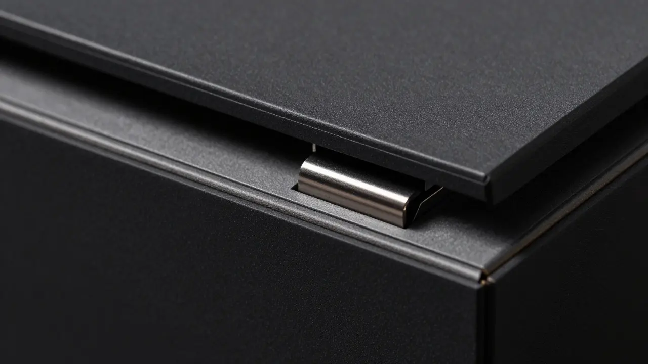
Structural Details: The Unboxing Ritual
Materials matter, but how they interact matters more. The unboxing process is a choreography. Every flap, drawer, or magnet should move with intention. Apple boxes are famous for their friction-fit designs. There are no screws, no staples visible, and no glue blobs. The parts fit together so tightly that they stay closed until you deliberately pull them apart.
To replicate this, focus on these structural elements:
- Magnetic Closures: Instead of a simple tuck-in lid, use a magnetic strip embedded in the board. The snap should be firm but not forceful. It signals security and quality. The sound of the magnet engaging is part of the audio experience.
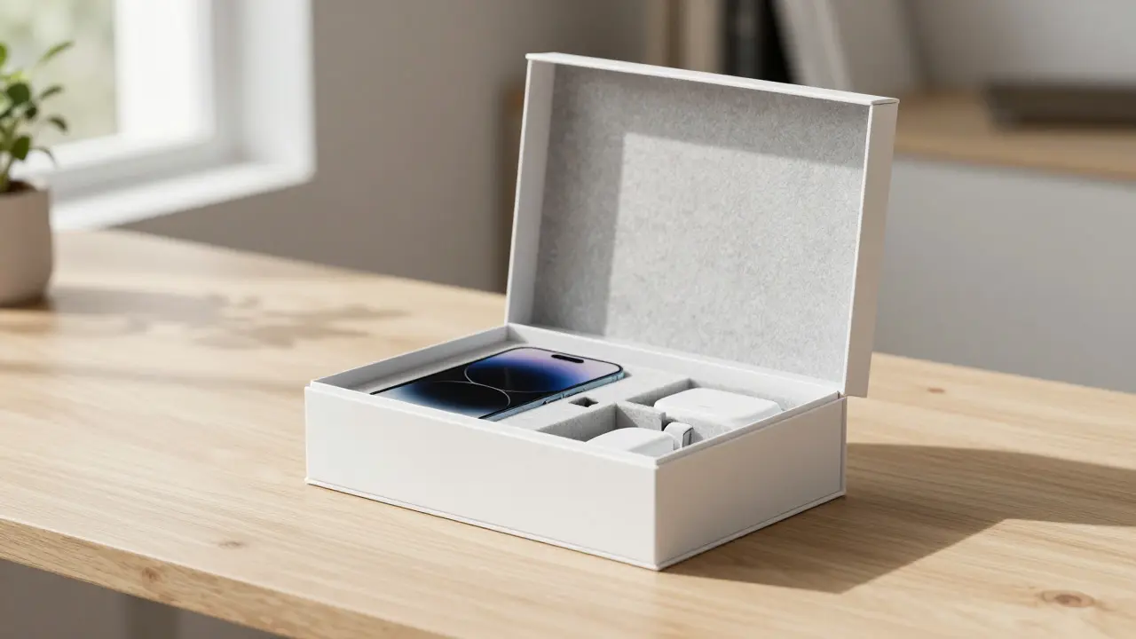
- Friction-Fit Drawers: Many accessory boxes use a two-part drawer system. The inner tray slides out smoothly. Ensure the gap between the outer sleeve and inner tray is consistent (usually 0.5mm to 1mm). Too tight, and it sticks; too loose, and it falls out prematurely.
- Minimal Fasteners: Avoid visible tape or staples. If you need reinforcement, hide it inside. The exterior should look clean and uninterrupted. This minimalism directs the eye to the logo or the product silhouette printed on the box.
Think about the weight distribution. If the product is heavy, place it low in the box. This lowers the center of gravity, making the box easier to handle and less likely to tip over during the reveal. Stability is a subtle sign of engineering care.
Sustainability as a Design Feature
You can’t talk about modern tech packaging without talking about sustainability. Consumers are savvy; they know that a lot of tech waste ends up in landfills. Using sustainable materials isn’t just good for the planet; it’s a marketing tool. It tells the customer that your brand cares about the lifecycle of the product, not just the sale.
FSC-Certified Paper is paper sourced from responsibly managed forests that provide environmental, social, and economic benefits. Look for FSC (Forest Stewardship Council) certification on your paper stock. It’s a recognized standard that builds trust. Additionally, consider water-based inks instead of solvent-based ones. They dry faster, emit fewer VOCs (volatile organic compounds), and are safer for workers.
Another trend is mono-material packaging. This means using only one type of material for the entire box, making it easier to recycle. Plastic windows or mixed-paper constructions complicate recycling efforts. If you can design a box that is 100% paperboard, you’ve already won points with eco-conscious buyers. Print the recycling symbol clearly on the bottom, not hidden on the side. Transparency in sustainability is key.

Common Pitfalls to Avoid
Even with the best intentions, things can go wrong. Here are a few traps that break the CMF alignment:
- Color Mismatch: Your box might be "white," but your product is "off-white." Under bright retail lights, this difference becomes jarring. Always match the Pantone codes of your packaging to the actual color of the device. Bring physical samples of both to compare side-by-side.
- Over-Packaging: Don’t add layers just for the sake of it. If a single rigid box does the job, don’t add a shrink wrap and a secondary mailer. Excess packaging creates waste and frustrates customers who want to get to the product quickly.
- Inconsistent Texture: If the top of the box is soft-touch but the sides are matte lamination, it feels uneven. Stick to one primary finish across all visible surfaces. Consistency breeds familiarity.
Also, watch out for edge wear. Rigid boxes are prone to chipping if handled roughly. Ask your supplier to apply a protective edge band or ensure the wrapping paper extends slightly over the edges to seal them. A chipped corner ruins the pristine look instantly.
Testing Your CMF Strategy
Before you commit to a full production run, test your prototypes. But don’t just look at them; use them. Send samples to five different people with varying backgrounds. Ask them to open the box without instructions. Watch their hands. Do they hesitate? Do they struggle with the closure? Do they smile when they touch the surface?
Record the audio of the unboxing. Listen for rustling paper, snapping magnets, or sliding trays. Is the sound pleasing? Or is it noisy and chaotic? Adjust the materials based on this feedback. Maybe the paper is too thin and crinkles loudly. Swap it for a thicker, stiffer stock. Maybe the magnet is too weak. Add a stronger one.
Finally, check the durability. Drop the box from knee height onto a hard floor. Does it dent? Does the lid pop off? Premium packaging needs to survive shipping. If it fails the drop test, it’s not ready for prime time.
What is the most cost-effective way to achieve a premium feel?
Use high-weight cardstock (300gsm+) with a matte lamination and precise die-cutting. While rigid board is superior, a well-made cardstock box with clean lines and a quality finish can still convey high value without the higher material costs.
Should I use glossy or matte packaging for tech products?
Generally, matte or soft-touch finishes are preferred for tech products as they mimic the anti-glare screens and metal casings of devices. Glossy finishes can look dated or cheap unless used for colorful, playful accessories.
How important is the sound of the unboxing?
Surprisingly important. A crisp, solid sound signals quality and sturdiness. A flimsy, rustling sound suggests poor material quality. Aim for a muted, confident sound when opening the box.
Can I use recycled materials for high-end tech packaging?
Yes, absolutely. Brands like Apple and Dell use significant amounts of recycled content. As long as the paper stock is high-quality and consistent, recycled materials can look and feel just as premium as virgin fiber, often adding an extra layer of brand story.
What is the ideal thickness for a rigid tech box?
For most consumer electronics, a board thickness of 1.5mm to 2mm is ideal. Thinner boards may feel flimsy, while thicker boards can make the box difficult to close and increase shipping weight unnecessarily.