
Ever wonder why an iPhone feels different from an Android phone even when they do the same job? It’s not just the hardware. It’s the way the software talks to you. Apple has built a massive empire on a simple idea: if you know exactly what will happen next, you trust the device. This article breaks down how Apple design philosophy uses specific cues, immediate feedback, and strict predictability to make users feel safe and in control across every screen.
The Core of Apple’s Design Trust Model
At its heart, Apple Human Interface Guidelines is a comprehensive set of standards that dictate how interfaces should look and behave to ensure consistency and ease of use. These guidelines aren't just aesthetic rules; they are behavioral contracts. When you tap a button on an iPad, it should feel exactly like tapping a button on a Mac. This consistency reduces cognitive load. Your brain doesn’t have to relearn how the world works every time you switch devices. That reduction in mental effort is where trust begins. If the system behaves as expected, you stop worrying about the machine and start focusing on your task.
This approach relies heavily on the concept of Predictable Interaction Patterns is the consistent repetition of specific user actions leading to identical outcomes across different applications and platforms. For example, swiping right from the left edge always takes you back. Dragging a file to the trash always deletes it. There are no surprises. In design terms, this is about minimizing ambiguity. Ambiguity creates anxiety. Predictability creates confidence. Apple designs for the lowest common denominator of confusion, ensuring that even a first-time user can navigate complex systems without a manual.
Cues: The Silent Language of the Interface
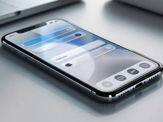
Before you touch a screen, your eyes scan for clues. These are called visual cues. Apple uses subtle shadows, gradients, and elevation changes to tell you what is clickable and what is static. A button that looks raised is meant to be pressed. Text that is flat and gray is likely informational. This is part of Gestalt Principles is a set of psychological theories explaining how humans perceive patterns and group visual elements based on proximity, similarity, and continuity. By leveraging these principles, Apple ensures that the interface communicates its structure before you even interact with it. You don’t need labels to know where to click; the shape and position tell you everything.
Another critical cue is typography. Apple’s use of San Francisco font isn’t just a branding choice. It’s a readability tool designed specifically for screens. At small sizes, it remains legible. At large sizes, it stays elegant. This consistency in typeface across iOS, macOS, and watchOS reinforces the idea that all these devices belong to one cohesive family. When the text looks the same everywhere, the platform feels unified. That unity is a powerful trust signal. It tells the user, “We are one system, and we have your back.”
Feedback: The Immediate Response Loop
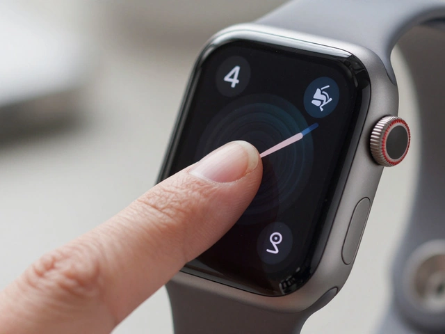
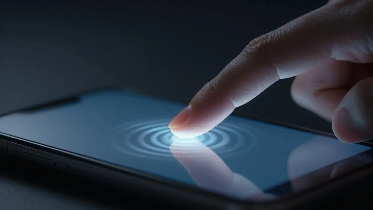
Trust dies when you act and nothing happens. Have you ever tapped a link and waited two seconds wondering if it registered? That hesitation breeds doubt. Apple combats this with instant feedback. Every tap generates a response. The button might dim slightly, vibrate through haptic engines, or animate into a new state. This is known as Haptic Feedback is tactile vibrations generated by electronic actuators to provide sensory confirmation of user interactions. On modern iPhones, the Taptic Engine provides precise, localized vibrations that mimic physical clicks. This tactile confirmation bridges the gap between digital and physical worlds. You feel the action, so you believe it happened.
Visual feedback is equally important. When you swipe to delete a message, the red icon appears immediately. When you pull to refresh, the spinner starts instantly. There is no lag between intent and execution. This speed is engineered. Apple optimizes its operating systems to ensure that input latency is measured in milliseconds, not seconds. To the user, this feels like magic. But it’s actually rigorous engineering. The faster the feedback loop, the more responsive the system feels, and the more trustworthy it becomes. You learn that the device listens to you immediately.
Predictability Across Platforms: The Ecosystem Effect
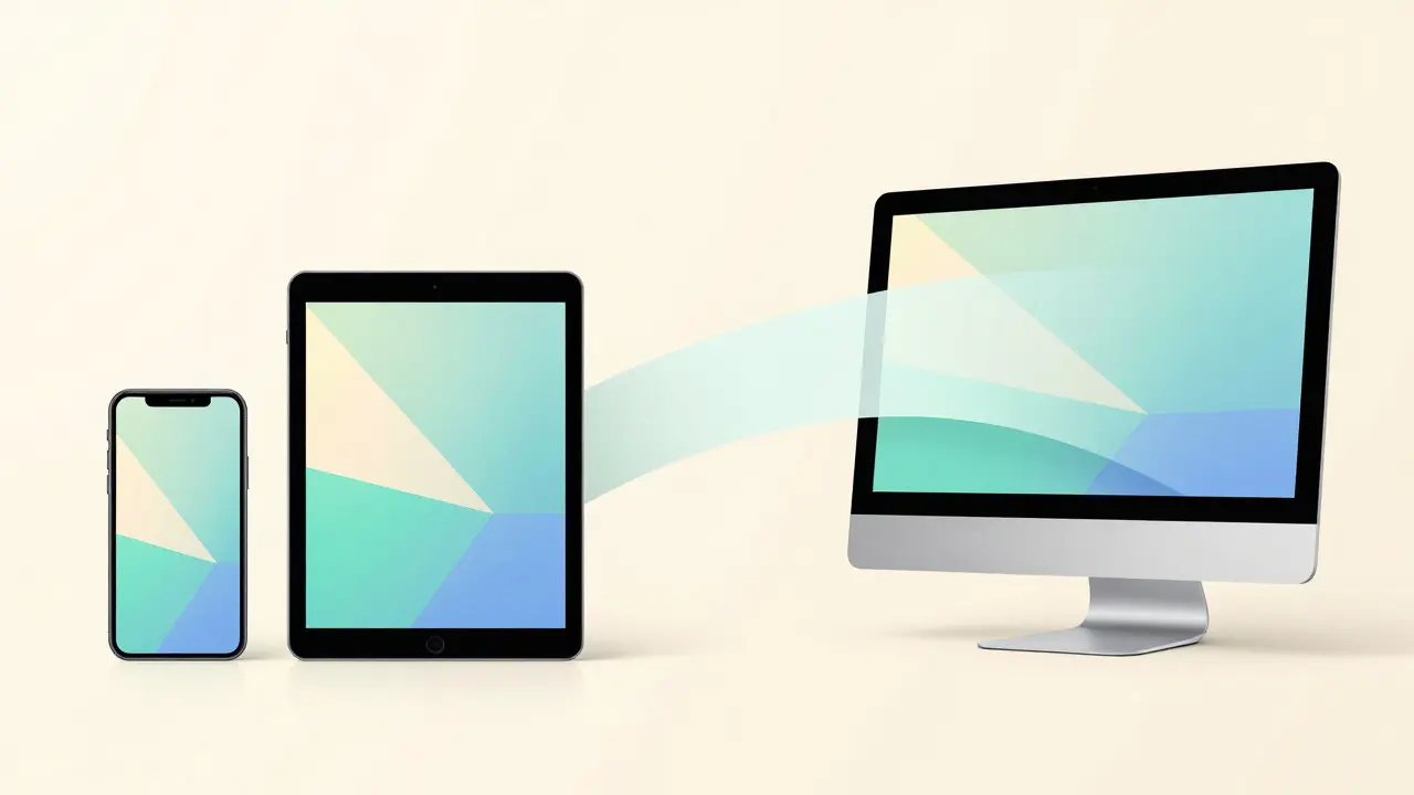
Apple doesn’t just sell phones; it sells an ecosystem. The power of this ecosystem lies in cross-platform predictability. If you know how to manage files on a Mac, you already know how to do it on an iPad. If you understand notifications on an iPhone, you understand them on an Apple Watch. This is the essence of Cross-Platform Consistency is the strategy of maintaining uniform design languages and interaction models across multiple devices to reduce learning curves. It turns individual products into a single, seamless experience. Users don’t switch contexts; they flow between devices. This fluidity is rare in tech. Most companies treat each OS as a separate product. Apple treats them as chapters of the same book.
This predictability extends to third-party apps. Because the Human Interface Guidelines are so strict, most developers follow them closely. This means that even non-Apple apps feel native. They use standard navigation bars, standard buttons, and standard gestures. This homogeneity might seem boring to some, but it’s a feature, not a bug. It means that once you master the platform, you master every app on it. The learning curve flattens out quickly. You spend less time figuring out the tool and more time using it. That efficiency is the ultimate form of respect for the user’s time.
The Psychology Behind the Calm
Why does this matter so much? Because technology is often stressful. We rely on our devices for work, communication, and entertainment. When a device is unpredictable, it adds to our stress. When it’s predictable, it acts as a calm anchor. Apple designs for calm. The interfaces are clean, uncluttered, and quiet. Notifications are managed intelligently. Background processes run silently. The goal is to let the technology disappear into the background so you can focus on what matters. This is a shift from showing off features to hiding complexity. The best design is invisible. You don’t notice it because it just works.
This approach also builds long-term loyalty. People tend to stick with systems they understand. Switching to a new platform requires relearning basic skills. It’s a hassle. By making their system so intuitive and consistent, Apple raises the barrier to entry for competitors. It’s not just about better specs; it’s about lower friction. Friction kills adoption. Smoothness drives retention. Apple understands that trust is earned through thousands of small, correct interactions over years of use. Each successful tap, each smooth scroll, each accurate prediction reinforces the bond between user and device.
| Element | Apple Approach | Generic Mobile Approach | Impact on User Trust |
|---|---|---|---|
| Visual Cues | Strict adherence to elevation and shadow standards | Inconsistent styling across apps | Higher confidence in identifying interactive elements |
| Input Latency | Optimized for sub-50ms response times | Variable, often higher due to fragmented optimization | Perception of responsiveness and reliability |
| Cross-Device Behavior | Identical gestures and logic across iOS/macOS/watchOS | Often differs significantly between phone and tablet | Reduced cognitive load when switching devices |
| Third-Party Apps | High compliance with Human Interface Guidelines | Low compliance, leading to inconsistent UX | Uniform experience regardless of developer |
Common Pitfalls and How Apple Avoids Them
Many designers fall into the trap of novelty. They want to show off cool animations or unique gestures. But if a gesture is unique, it’s confusing. Apple avoids this by sticking to established patterns. They innovate within constraints. For instance, they introduced the home indicator bar on newer iPhones, but it didn’t break existing muscle memory. It adapted to it. This is careful evolution, not revolution. Revolution scares users. Evolution comforts them. By respecting user habits, Apple ensures that updates feel like improvements, not disruptions. You never feel like you’re starting over. You feel like you’re leveling up.
Another pitfall is information overload. Too many options paralyze decision-making. Apple simplifies choices. The Control Center is streamlined. Settings are categorized logically. There are fewer knobs to turn, but the ones that exist are powerful. This restraint is key. It forces the company to prioritize what truly matters to the user. If a feature isn’t essential, it gets cut or hidden. This curation creates a sense of quality. Everything that is there has a reason to be there. Nothing is clutter. That clarity is a major contributor to the feeling of trust. You know the designer cared enough to remove the noise.
FAQ
What is the main reason Apple users trust their devices?
The primary reason is predictability. Apple ensures that actions produce consistent results across all devices and apps, reducing uncertainty and cognitive load for the user.
How does haptic feedback contribute to user trust?
Haptic feedback provides tactile confirmation that an action was registered. This physical sensation bridges the gap between digital input and real-world perception, making the interaction feel tangible and reliable.
Why is cross-platform consistency important for trust?
Consistency allows users to transfer skills from one device to another without relearning basics. This seamless transition reduces frustration and reinforces the idea that the entire ecosystem operates as a single, coherent system.
Does Apple limit innovation to maintain predictability?
Not exactly. Apple innovates within established patterns. New features are introduced in ways that align with existing mental models, ensuring that advancements enhance rather than disrupt the user's understanding of the interface.
How do third-party apps fit into Apple's trust model?
Third-party apps must adhere to strict Human Interface Guidelines. This ensures that even external software feels native and predictable, maintaining the uniform experience that users expect from the platform.