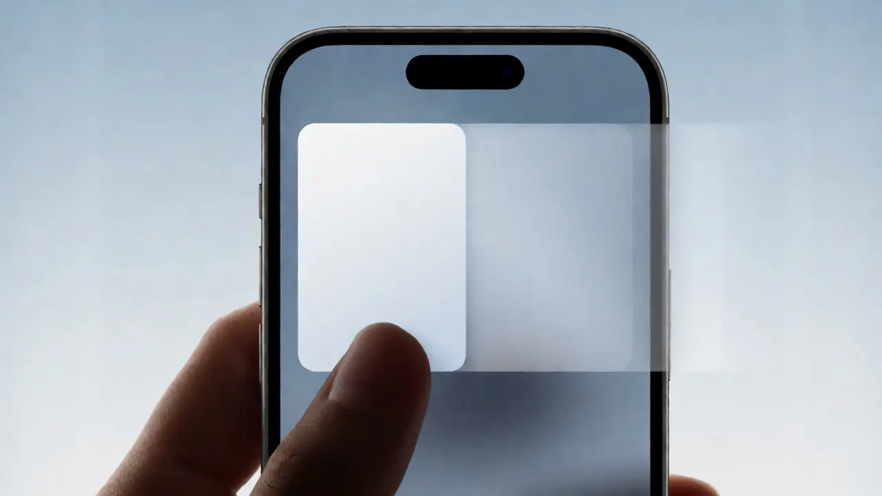

You know that feeling when you swipe to dismiss a card in an app, and it just... snaps? Or worse, it floats away like it’s on the moon, leaving you wondering if your phone froze? That disconnect between your finger and the screen is where bad design lives. Good motion design in Apple apps isn't about making things look cool; it's about maintaining the illusion of physical reality. It’s about telling the user exactly where they are, where they came from, and where they’re going, all without them thinking about it.
If you’re building for iOS or macOS, you’re not just designing pixels; you’re choreographing interactions. The Human Interface Guidelines (HIG) provide the blueprint, but knowing the theory doesn’t mean you’ll nail the feel. You need to understand the three pillars that make or break your app’s fluidity: duration, easing, and directional cues. Get these wrong, and your app feels sluggish or jarring. Get them right, and users won’t even notice the interface-they’ll just feel like they’re manipulating objects directly.
Why Motion Matters More Than You Think
Static screens are dead. Even if your app is mostly content, transitions happen every time a view changes, a modal pops up, or a button is pressed. Motion serves three critical jobs: feedback, continuity, and hierarchy. Without feedback, users doubt their actions. Did I tap that? Did it register? Without continuity, the spatial relationship between screens breaks down. Where did this list come from? And without hierarchy, everything looks flat, making it hard to distinguish primary actions from secondary ones.
Think of SwiftUI’s default animations. They aren’t arbitrary. When you use `.animation(.default)`, you’re leveraging years of research into how humans perceive speed and acceleration. But defaults are just starting points. To create a premium experience, you need to tweak these parameters with intent.
Duration: Finding the Sweet Spot
How long should an animation last? Too short, and the user misses the transition entirely, losing context. Too long, and the app feels slow, forcing the user to wait for the UI to catch up with their brain. There’s no single magic number, but there are proven ranges based on the complexity of the change.
For simple state changes-like toggling a switch or highlighting a button-aim for 100ms to 200ms. This is fast enough to feel instantaneous but visible enough to confirm the action. For standard view transitions, such as pushing a new screen onto a navigation stack, 300ms to 400ms is the industry standard. This gives the eye enough time to track the movement and understand the spatial shift. Complex animations involving multiple elements moving simultaneously might stretch to 500ms, but rarely beyond that unless you’re doing something cinematic, which is rare in utility apps.
| Interaction Type | Recommended Duration | User Perception Goal |
|---|---|---|
| Micro-interactions (Toggles, Hovers) | 100-200 ms | Immediate Feedback |
| Standard Transitions (Push, Present) | 300-400 ms | Spatial Continuity |
| Complex Layout Changes | 400-500 ms | Contextual Understanding |
| Cinematic/Intro Animations | 600+ ms | Engagement/Storytelling |
A common mistake is using the same duration for everything. A button press shouldn’t take as long as opening a full-screen modal. If you treat all transitions equally, you flatten the perceived depth of your app. Match the duration to the distance traveled and the amount of information being revealed.
Easing: The Secret Sauce of Natural Motion
If duration is the "how long," easing is the "how." Linear motion-where an object moves at a constant speed-is robotic. Real-world objects don’t start or stop instantly; they accelerate and decelerate due to inertia. In digital interfaces, we simulate this physics using easing curves.
The most common curve in modern iOS development is ease-in-out. This curve starts slowly, speeds up in the middle, and slows down at the end. It mimics natural acceleration and deceleration, making movements feel smooth and organic. However, blindly applying ease-in-out to everything can make your app feel floaty or unresponsive.
Consider different scenarios:
- Entrance Animations: Use ease-out. Elements should enter quickly and settle gently. This draws attention to the new content immediately.
- Exit Animations: Use ease-in. Elements should start slowly and accelerate away. This suggests the object is gaining momentum and leaving the scene.
- Interactive Gestures: Follow the finger. If the user drags a sheet, the motion should be linear relative to their touch until they release it. Upon release, apply spring physics or ease-out to snap it into place.
In Core Animation and SwiftUI, you can define custom timing curves using control points. A popular choice for high-end apps is a subtle spring animation. Springs add a slight overshoot and bounce, giving the interface a tactile, playful quality. But be careful: too much bounce looks cheap, while none looks sterile. Find the balance that matches your brand voice.

Directional Cues: Guiding the User’s Eye
Motion isn’t just about aesthetics; it’s a language. Direction tells the user where to look and what happened. If a menu slides in from the left, it implies it came from behind the current view or off-screen left. If a modal scales up from the center, it implies importance and focus. Changing these directions arbitrarily confuses users.
Adhere to consistent metaphors. In iOS, horizontal swipes typically navigate back and forth in a hierarchy (push/pop). Vertical gestures often reveal additional details or dismiss modals. If you break these conventions, you force the user to relearn your app’s logic every time.
Use parallax effects sparingly to reinforce depth. When scrolling a list, having the background move slower than the foreground creates a sense of layering. This helps users understand that the list is floating above the background, not part of it. Similarly, when dismissing a card, ensure it moves in the direction of the gesture. If the user swipes right, the card must exit right. If it fades out instead, you’ve broken the causal link between action and result.
Performance: The Silent Killer of Good Motion
You can have perfect durations and beautiful easing curves, but if your frame rate drops, the illusion shatters. Dropped frames make animations look stuttery and unprofessional. On older devices, complex shadows, blurs, and large image resizes during animations can tank performance.
Optimize your assets before animating them. Pre-render static elements where possible. Avoid animating properties that trigger layout recalculations, such as width, height, or padding. Instead, animate transforms (scale, translate, rotate) and opacity. These properties are handled by the GPU, allowing for smoother 60fps (or 120fps on ProMotion displays) animations. Always test on the lowest-spec device you support. If it runs smoothly there, it will fly on newer hardware.
Putting It All Together: A Practical Example
Let’s say you’re designing a "Like" button. Here’s how you apply the principles:
- Trigger: User taps the heart icon.
- Feedback (Duration): The heart scales up slightly (1.2x) over 150ms. This immediate response confirms the tap.
- State Change (Easing): The color shifts from gray to red using an ease-out curve over 200ms. The quick start grabs attention; the gentle finish settles the state.
- Delight (Direction/Cue): Small particles burst outward radially. They follow an ease-out path, simulating energy dispersing. This adds weight to the action, making it feel satisfying.
- Reset: The heart returns to normal scale over 300ms with a spring effect, adding a playful bounce.
Notice how each step uses specific tools. Short duration for feedback, distinct easing for state change, and directional cues for delight. No single principle does all the work; they collaborate.
Common Pitfalls to Avoid
One major trap is over-animating. Just because you can animate something doesn’t mean you should. Text changing shouldn’t slide around wildly. Background colors shouldn’t fade in over two seconds. Reserve motion for significant changes that require cognitive processing.
Another issue is ignoring accessibility. Some users suffer from vestibular disorders or motion sensitivity. Always respect the "Reduce Motion" setting in iOS. When enabled, replace sliding transitions with crossfades or instant changes. Your app should remain usable and pleasant even without elaborate motion.
Finally, don’t forget consistency across platforms. While iOS and macOS share DNA, their interaction models differ slightly. Mouse hover states allow for more subtle previews than touch interfaces. Adjust your timings accordingly. What feels snappy on a trackpad might feel laggy on a touchscreen.
What is the ideal animation duration for iOS push transitions?
The standard duration for push and pop transitions in iOS is typically between 300ms and 400ms. This allows enough time for the user to perceive the spatial movement from one screen to another without feeling like the app is lagging. Using significantly shorter durations can disorient users, while longer ones feel sluggish.
Should I use linear easing for all animations?
No, linear easing often feels robotic and unnatural because real-world objects do not start or stop abruptly. It is best reserved for interactive gestures where the element must follow the user's finger precisely. For autonomous animations, ease-in, ease-out, or ease-in-out curves provide a more organic and pleasing experience.
How do directional cues improve user experience?
Directional cues establish spatial relationships and mental models. For example, sliding a view from right to left indicates forward navigation, while sliding from left to right indicates returning backward. Consistent directional motion helps users build a map of the application structure in their minds, reducing cognitive load and confusion.
What is the impact of dropped frames on animation quality?
Dropped frames cause stuttering, breaking the illusion of smooth physical movement. Even brief stutters can make an app feel buggy or low-quality. To prevent this, optimize assets, avoid animating layout-affecting properties, and prefer GPU-accelerated transformations like scale and translation over width or height changes.
How should I handle animations for users with motion sensitivity?
Always check the system's "Reduce Motion" accessibility setting. When active, disable complex parallax effects and sliding transitions. Replace them with simple crossfades or instant state changes. This ensures your app remains accessible and comfortable for users with vestibular disorders or motion sickness triggers.