
You know that feeling when you unlock your phone, stare at a grid of icons, and realize you have to tap three times just to check the weather? It’s friction. It’s bad design. iPhone Widgets exist to kill that friction. They turn your home screen into a dashboard, delivering critical data without forcing you to launch an app. But here’s the trap: most people treat them like tiny billboards for ads or useless decorative elements. If you’re a designer or a developer, your job isn’t just to make something fit in a box; it’s to respect the user’s attention span.
The Core Philosophy: Glanceability Over Interactivity
Let’s get one thing straight immediately: iOS Widgets are not mini-apps. They are informational surfaces. The primary metric for success is "glanceability"-how quickly can a user extract value? If it takes more than two seconds to understand what your widget is showing, you’ve failed. Apple’s Human Interface Guidelines emphasize this heavily. You aren’t building a complex interface with buttons and dropdowns (though interactive widgets changed the game slightly in iOS 17). You are designing a snapshot. Think about a calendar widget. Its job is to answer "What’s next?" instantly. A stock market widget answers "How am I doing?" instantly. If you clutter these spaces with too many data points, you force the user’s eye to scan rather than recognize. Recognition beats recall every single time in mobile UX. Keep it simple. One key metric. One clear visual hierarchy. That’s it.
Understanding the Grid System and Sizes
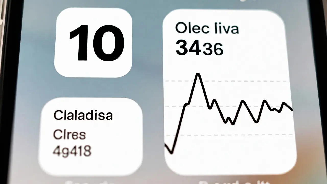
You can’t design well if you don’t understand the canvas. Apple enforces a strict grid system. There are three standard sizes: Small, Medium, and Large. Each has specific dimensions and aspect ratios that dictate how much content fits.
| Size | Approximate Dimensions (Points) | Best For | Common Pitfall |
|---|---|---|---|
| Small | 158 x 158 | Single metric (Weather temp, Battery %) | Trying to fit text paragraphs |
| Medium | 338 x 158 | Lists, Charts, Two-column layouts | Cramming too many list items |
| Large | 338 x 338 | Detailed views, Maps, Complex stats | Leaving too much empty whitespace |
Visual Hierarchy and Typography Rules
Typography in widgets is different from typography in apps. Why? Because users view widgets from a distance, often while walking or holding the phone loosely. Your font weights need to be heavier. Your letter spacing needs to be tighter. And your color palette needs to account for dynamic backgrounds.
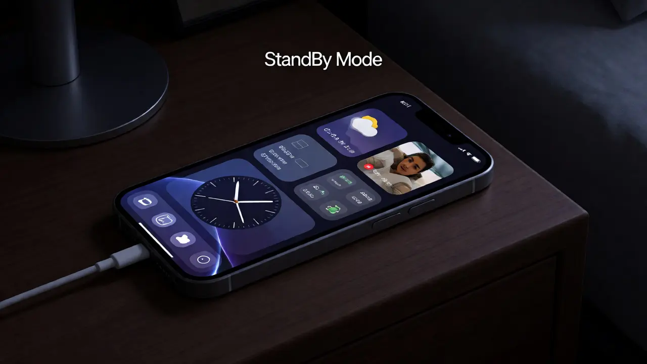
Apple introduced the StandBy Mode and lock screen widgets, which added another layer of complexity. Now, your design must look good on a black OLED background, a white light mode background, and potentially behind a translucent glass effect. Always test your designs against both Light and Dark modes. If you hardcode colors, you’re asking for trouble. Use semantic colors provided by SwiftUI, like `.primary`, `.secondary`, and `.accentColor`. These adapt automatically.
Contrast is non-negotiable. WCAG guidelines suggest a minimum contrast ratio of 4.5:1 for normal text, but for widgets, aim higher. 7:1 is safer because sunlight washes out screens. If you’re using a background image, overlay a gradient scrim to ensure text remains readable. Never let text float over a busy photo without protection.
Handling Data Updates and Latency
Nothing kills trust faster than stale data. If your fitness widget says you ran 0 miles but you just finished a 5k, the user feels lied to. Timeline Providers are the technical backbone of widget updates. You need to define refresh intervals carefully. Don’t request updates every minute. That drains battery. For news apps, hourly might suffice. For stock tickers during trading hours, 15 minutes is reasonable. For weather, 30-60 minutes is standard. But here’s the pro tip: implement placeholder content. When the timeline is loading, show skeleton screens or previous data, not blank boxes. Blank boxes look broken. Previous data looks functional. Also, consider the "cold start." What does your widget show before any data has ever been fetched? Design an empty state that is inviting, not confusing. A generic "No Data" message is lazy. Show an illustration or a prompt that explains what *will* appear once data loads.
Interactive Elements: The New Frontier
With iOS 17, Apple allowed limited interactivity within widgets. You can now toggle switches, press buttons, and select segments directly on the home screen. This changes the design paradigm. Suddenly, your widget isn’t just passive; it’s actionable.
However, caution is required. Interactive widgets must still feel lightweight. Toggling a smart light switch should happen instantly. If there’s a lag, the illusion breaks. Use optimistic UI patterns. Assume the action succeeded, update the visual state immediately, and then sync with the backend. If the sync fails, revert the change with a subtle animation. Do not block the UI waiting for a server response.
Keep interactions simple. Avoid multi-step flows inside a widget. If a button click requires opening a sheet or navigating away, you might as well have made it a regular app icon. The goal is to reduce taps, not add complexity.
Accessibility: Designing for Everyone
Accessibility isn’t a checklist item; it’s a core component of good design. Widgets must support Dynamic Type. If a user increases their system font size, your widget layout must adjust. Text shouldn’t truncate awkwardly or overlap other elements. Test your layouts with the largest accessibility font sizes available in iOS settings. VoiceOver support is equally critical. Screen readers need to announce the widget’s content clearly. Instead of reading raw numbers, provide descriptive labels. If you have a progress bar, VoiceOver should say "Task completion: 75%," not just "75%." Use `accessibilityLabel` modifiers in SwiftUI to provide context. Remember, millions of users rely on these features daily. Ignoring them excludes a significant portion of your audience.
Practical Checklist for Widget Launch
- Test in StandBy Mode: Ensure the widget looks correct when the phone is charging horizontally.
- Check Contrast Ratios: Verify readability in both Light and Dark modes with various wallpapers.
- Validate Timeline Refresh Rates: Balance data freshness with battery consumption.
- Review Empty States: Ensure the widget looks useful even when no data exists.
- Verify Accessibility Labels: Run VoiceOver through the widget to ensure logical flow.
- Optimize Images: Compress assets to keep the extension binary size small.
Can I put multiple widgets of the same type on my home screen?
Yes, you can stack multiple widgets from the same app on your home screen. However, iOS limits the total number of widgets based on screen size. On larger iPhones, you can typically fit four medium-sized widgets or two large ones alongside smaller ones. Be mindful that stacking too many widgets reduces the space available for app icons, which might frustrate users who prefer traditional navigation.
Why does my widget show outdated information?
Widgets do not update in real-time. They operate on a timeline system managed by the operating system to preserve battery life. The OS decides when to refresh the widget based on usage patterns and resource availability. To minimize staleness, set appropriate refresh intervals in your code and ensure your app provides accurate timestamps for data validity. If data is critical, encourage users to open the full app for live updates.
Do interactive widgets drain more battery?
Interactive widgets themselves don’t inherently drain more battery than static ones, but the actions they trigger might. For example, toggling a smart home device sends a network request. If you have many interactive widgets performing frequent background checks or animations, the cumulative effect can impact battery life. Keep interactions efficient and avoid heavy processing loops within the widget extension.
How do I handle different screen sizes for widgets?
Use SwiftUI’s flexible layout containers like VStack, HStack, and ZStack combined with GeometryReader or adaptive padding. Avoid fixed frame sizes where possible. Let the content dictate the layout within the constraints of the widget family (Small, Medium, Large). Test your designs on all current iPhone models, including SE and Pro Max variants, to ensure consistent rendering.
Should widgets match my app’s branding exactly?
Not necessarily. While brand consistency is important, usability should take precedence. If your app uses dark, moody colors that make text hard to read on a bright wallpaper, lighten the widget palette. Widgets are utility tools first and brand ambassadors second. Prioritize legibility and quick information retrieval over strict adherence to a style guide that wasn’t designed for glanceable contexts.