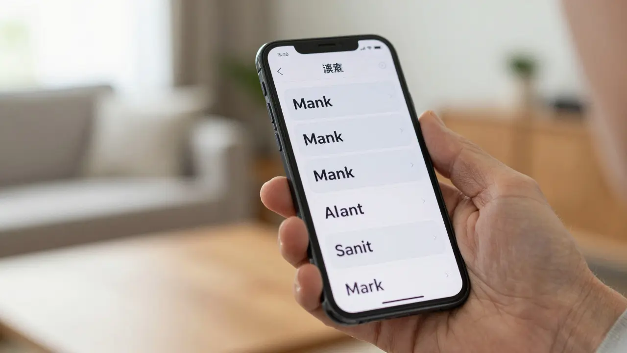

Imagine trying to read a novel on your iPhone with the text set to the smallest possible size. Your eyes strain, you squint, and eventually, you give up. Now imagine that same user can tap a single button in their settings, and every piece of text on the screen grows larger, clearer, and more comfortable to read. That is the power of Dynamic Type, a system-level feature in Apple’s operating systems that allows users to adjust the base font size across all apps. It is not just a nice-to-have; it is a fundamental requirement for inclusive design.
For designers and developers, Dynamic Type represents a shift from static layouts to fluid, responsive typography. If you build for iOS or macOS, you cannot simply hardcode font sizes anymore. You must design interfaces that breathe, expand, and contract based on user preference. This guide breaks down how Dynamic Type works, why it matters, and how to implement it without breaking your layout.
Key Takeaways
- Dynamic Type scales text relative to the user's selected size setting, not absolute pixel values.
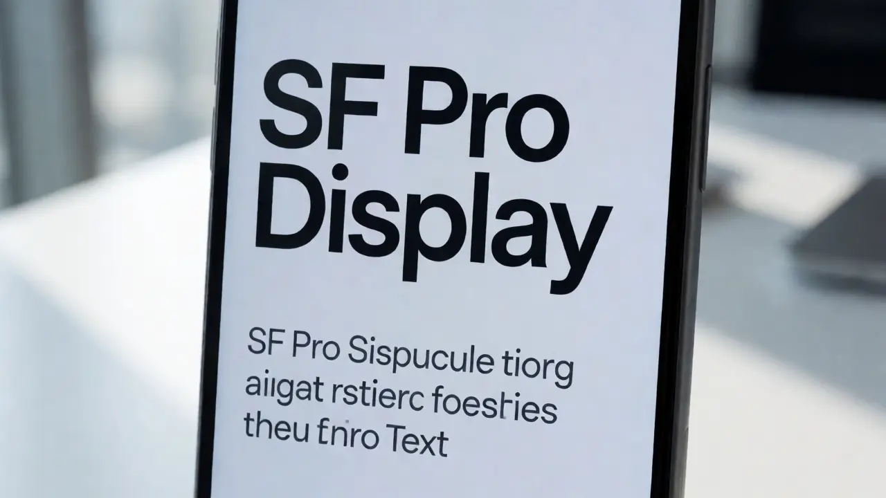
- The default font, SF Pro, is optimized for readability at various sizes due to its variable weight and width characteristics.
- Using semantic text styles (like
.bodyor.headline) ensures automatic scaling, whereas fixed point sizes do not scale. - Layouts must be flexible; use Auto Layout constraints to prevent text truncation or overlap when fonts grow.
- Test your designs at the largest accessibility sizes (AX5) to ensure critical information remains accessible.
How Dynamic Type Actually Works
At its core, Dynamic Type is a mapping system. When a user changes their text size in Settings > Display & Brightness > Text Size, they are selecting one of several predefined levels. These levels range from 'Small' to 'Extra Large,' with even finer granularity in the 'Accessibility Sizes' section.
Instead of assigning a specific point size like 17pt to a label, you assign a text style. Think of text styles as categories rather than specific measurements. The most common styles include:
- Large Title: Typically used for navigation bar titles. Scales significantly to remain prominent.
- Title 1, 2, 3: Used for section headers within content. They scale but less aggressively than Large Title.
- Body: The standard reading size. This is what most users interact with daily.
- Callout, Subhead, Footnote, Caption: Smaller supporting text. These also scale, ensuring that secondary information doesn't become invisible.
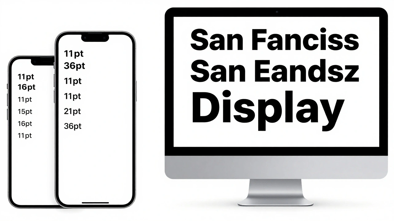
When you apply a text style, the system calculates the appropriate point size based on the current user setting. For example, if the user selects 'Large,' the Body text might render at 19pt instead of the default 17pt. If they select 'Accessibility 5,' it could jump to over 30pt. The key insight here is that the *ratio* between different text styles is maintained. A headline will always be noticeably larger than body text, regardless of the base size.
Why SF Pro is the Backbone
You might wonder why Apple chose SF Pro as the default system font. It wasn’t just an aesthetic choice. SF Pro is designed with specific optical sizes in mind. At small sizes, it uses tighter spacing and heavier weights to maintain legibility. At large sizes, it opens up with wider tracking and lighter weights to avoid looking clunky.
This variable nature means that SF Pro handles Dynamic Type gracefully out of the box. If you switch to a third-party font, you lose this optimization unless that font has similar variable axes. While custom fonts are allowed in iOS, they require careful testing to ensure they don’t break at extreme sizes. Most designers stick to SF Pro for body copy and only use custom fonts for branding elements that don’t need to scale extensively.

Designing Flexible Layouts
The biggest challenge with Dynamic Type isn’t the text itself-it’s the space around it. If you have a two-line button with fixed height, increasing the font size will either truncate the text or push it outside the bounds. To solve this, you need to embrace flexibility in your UI framework, whether that’s SwiftUI or UIKit.
In SwiftUI, this is relatively straightforward because views naturally resize to fit their content. However, you still need to manage spacing. Use padding that adjusts or remains consistent enough to accommodate growth. In UIKit, you rely heavily on Auto Layout. Avoid fixed heights for text containers. Instead, let the intrinsic content size drive the height, and use compression resistance priorities to determine which element should shrink if space is tight.
| Attribute | Fixed Point Size | Dynamic Type (Semantic Styles) |
|---|---|---|
| Scaling Behavior | No change regardless of user setting | Adjusts proportionally to user setting |
| Accessibility Compliance | Often fails WCAG contrast/size requirements | Meets most accessibility guidelines by default |
| Layout Complexity | Simple, but brittle | Requires flexible constraints/padding |
| User Experience | One-size-fits-all | Personalized to individual needs |
A practical tip: never assume that "Body" text will always fit in one line. Design for multi-line scenarios. If a card contains a title and a subtitle, ensure the card’s height can expand vertically. If you have a grid of items, consider switching to a list view when the font size exceeds a certain threshold. Many native Apple apps do this automatically-think of the Photos app, where thumbnails stay the same size but captions wrap or hide depending on the text size.
Testing Across All Sizes
It is easy to test Dynamic Type at the default size and call it done. But that misses the point. You need to test at the extremes. Here is a quick checklist for your QA process:
- Default Size: Does the hierarchy look correct? Is the distinction between headlines and body clear?
- Largest Standard Size: Do buttons still look clickable? Is any text truncated unexpectedly?
- Accessibility Sizes (AX1-AX5): This is where layouts often break. Check for overlapping elements, clipped icons, and broken alignment. Ensure that essential actions (like a "Submit" button) remain visible and tappable.
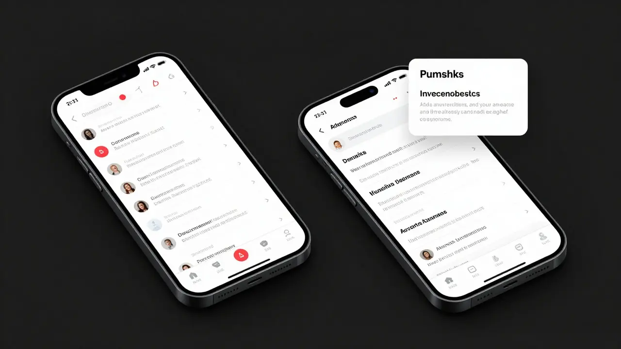
Use Xcode’s Preview Canvas to simulate different text sizes quickly. You can toggle between sizes without rebuilding the app. Pay special attention to components like tab bars, navigation bars, and alert dialogs. These system-provided components handle Dynamic Type well, but custom implementations often fail. If you build a custom header, make sure it expands vertically when the font grows, rather than cutting off the second line.
Common Pitfalls to Avoid
Even experienced developers stumble over a few recurring issues. First, mixing fixed and dynamic text. If you have a label with a fixed size next to a dynamic label, they will diverge as the user increases the font size, creating visual inconsistency. Stick to semantic styles throughout a component.
Second, ignoring line height. As fonts get larger, the default line spacing may feel cramped. In some cases, you might need to manually adjust the line spacing multiplier to improve readability, especially for long-form content. Test with paragraphs of real text, not just single words.
Third, assuming all users want large text. Some users increase font size for temporary reasons, like viewing their phone in bright sunlight. Others do it permanently due to vision impairment. Your design should support both use cases seamlessly without requiring a reload or complex reflow.
FAQ
Does Dynamic Type work in all iOS apps?
No. It only works in apps that explicitly support it by using semantic text styles. Apps that hardcode font sizes will ignore the user’s setting. Most modern apps built with SwiftUI or updated UIKit code support it fully.
Can I disable Dynamic Type for specific elements?
Yes, but sparingly. You can use a fixed font size for logos, badges, or decorative elements that don’t contain readable content. However, for any informational text, it is best practice to keep Dynamic Type enabled to maintain consistency.
What is the difference between 'Large' and 'Accessibility' sizes?
'Large' is part of the standard slider and offers moderate scaling. 'Accessibility' sizes go beyond the standard maximum, offering much larger text for users with significant vision needs. Designs must be robust enough to handle these extreme expansions.
How does Dynamic Type affect web views in iOS?
In WKWebView, Dynamic Type affects HTML text if the CSS uses relative units like 'rem' or 'em'. If your website uses fixed pixel sizes, the text will not scale with the iOS setting. Using viewport-relative units helps bridge this gap.
Is Dynamic Type available on macOS?
Yes, though it is less commonly adjusted. Mac users can change text size in System Settings. Apps using AppKit or SwiftUI should respect these settings by using scalable text styles, ensuring a consistent experience across Apple devices.