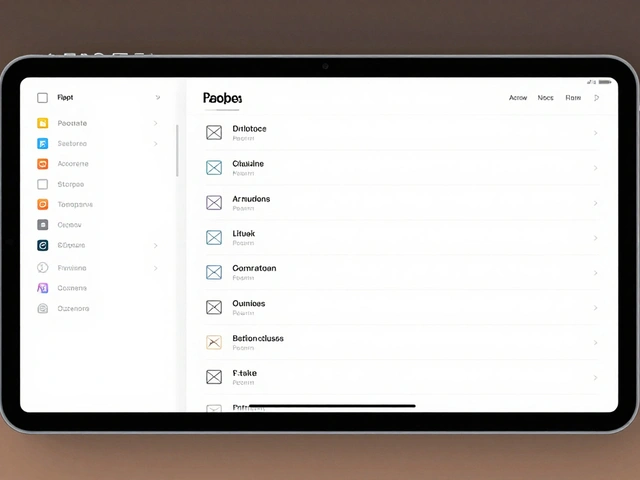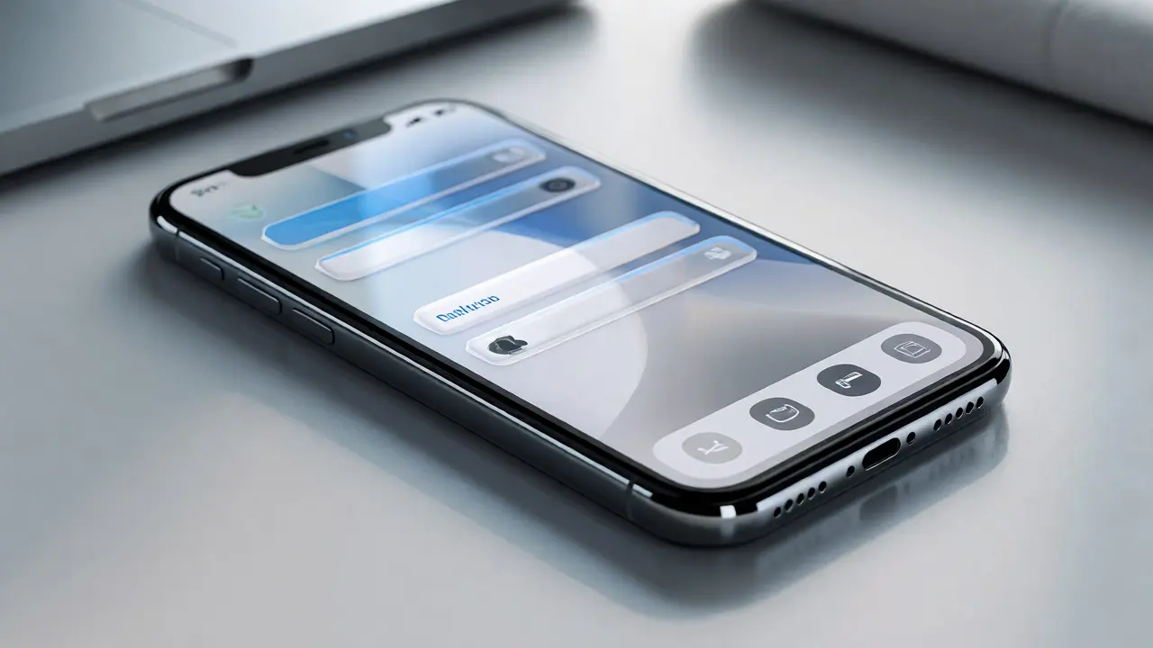

You’ve spent hours nudging pixels to match the exact corner radius of an iOS button. You’ve tried to replicate the subtle blur of a navigation bar, only to find it looks slightly off in your prototype. Sound familiar? This is where Apple Design Resources saves your sanity. These aren’t just random files; they are the official source of truth for interface elements across Apple’s ecosystem.
Whether you’re designing for iPhone, iPad, Mac, or even visionOS, using these resources ensures your work aligns with what users already expect. But here’s the catch: keeping them updated and organized can be tricky if you don’t know how they’re structured. Let’s break down exactly what’s inside these kits, how to use them in Figma and Sketch, and why they matter more than ever in 2026.
What Exactly Are Apple Design Resources?
Think of Apple Design Resources as a comprehensive library of pre-built UI components that adhere strictly to Apple’s Human Interface Guidelines (HIG). They provide vector shapes, icons, fonts, and interactive prototypes that mirror the native look and feel of Apple operating systems. Instead of drawing every toggle switch from scratch, you drag and drop a component that already has the correct padding, typography, and behavior baked in.
The core value here isn’t just speed-it’s consistency. When you use an official Apple template, you’re speaking the same visual language as the App Store, Settings, and Mail apps. This reduces cognitive load for users because they don’t have to relearn how to interact with your app. It also streamlines handoff to developers, who can inspect the layers and see exact measurements that match their code implementation.
Figma vs. Sketch: Which Format Should You Choose?
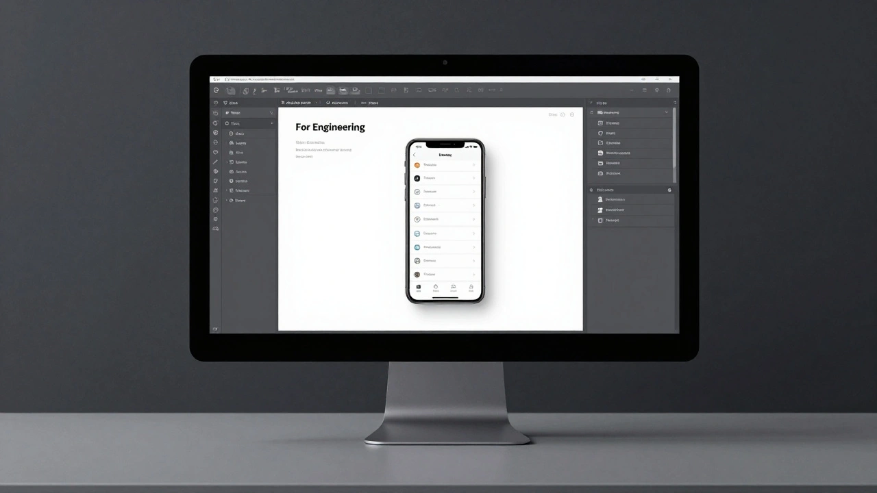
For years, Sketch was the undisputed king of UI design on macOS. However, Figma has taken over the industry due to its collaborative features and cross-platform compatibility. Apple acknowledges this shift by providing high-fidelity files for both tools, but the experience differs significantly.
| Feature | Figma File | Sketch File |
|---|---|---|
| Collaboration | Real-time multiplayer editing, comments, and version history built-in. | Requires third-party plugins like Abstract or Git integration for team sync. |
| Component System | Uses Variants and Auto Layout extensively for responsive states. | Relies on Symbols and Overrides; less flexible for complex state changes. |
| Platform Access | Works on Windows, Mac, Linux, and web browsers. | Mac-only application. |
| Update Frequency | Updated rapidly after each OS beta release. | Updates may lag slightly behind Figma versions. |
| Developer Handoff | Inspect mode provides CSS/iOS/SwiftUI snippets directly. | Requires exporting assets or using Zeplin for detailed specs. |
If your team works remotely or includes non-Mac users, Figma is the obvious choice. The file structure in Figma is cleaner, utilizing nested instances that make global updates effortless. If you’re a solo designer deeply embedded in the macOS ecosystem and prefer local file management, Sketch still holds up well, especially for static mockups.
Inside the Kits: What’s Included?
When you download the Apple UI Kit, you get more than just buttons. Each kit is segmented by platform and device size, ensuring you’re working with the right context. Here’s what you’ll typically find:
- System Icons: Thousands of SF Symbols rendered as vectors. These aren’t static images; in Figma, many are set up as components so you can swap glyphs without breaking layout.
- Navigation Elements: Tab bars, navigation bars, toolbars, and sidebars for iPad and Mac. These include light and dark mode variants.
- Controls: Sliders, switches, steppers, pickers, and checkboxes. Each control comes with all possible states: default, active, disabled, and pressed.
- Typography Styles: Pre-configured text styles matching San Francisco (SF Pro) weights and sizes for Headlines, Body, Caption, and Footnotes.
- Device Frames: Accurate bezels and screen dimensions for iPhone 15 through iPhone 17 series, iPads, and MacBooks.
A standout feature in recent updates is the inclusion of visionOS components. As spatial computing grows, having ready-made windows, depth effects, and gaze-based cursors helps designers prototype for Apple Vision Pro without guessing at spacing.
How to Install and Organize Your Files
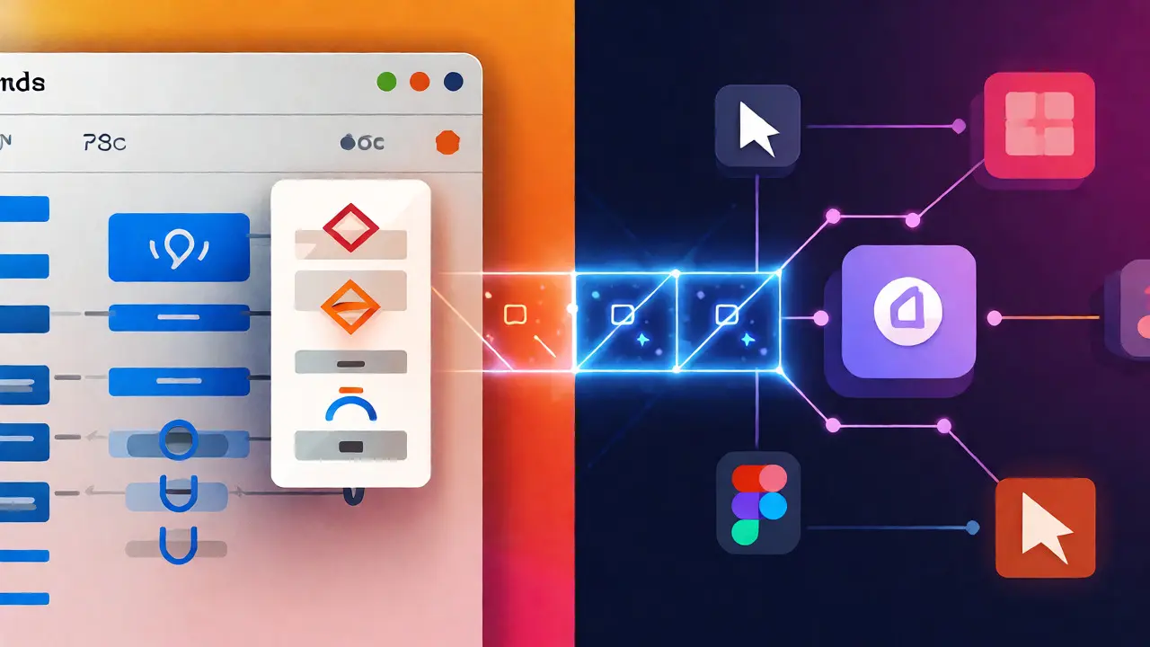
Downloading the file is step one. Step two is making sure it doesn’t become a digital junk drawer. Apple releases separate files for each major OS version (e.g., iOS 18, macOS Sequoia). Don’t try to cram everything into one file unless you have a very small team.
- Create a Team Library: In Figma, publish the Apple Design Resources as a Team Library. This allows other projects to access the components without copying the entire file.
- Name Convention Matters: Stick to Apple’s naming scheme. For example, "Button/Primary/Large" tells you exactly what the component is. Changing these names breaks instance links when you update the library later.
- Use Pages Wisely: Separate pages for "Components," "Templates," and "Playground." Keep the playground page for quick experiments so you don’t clutter the main workspace.
- Check for Updates Quarterly: Apple tweaks HIG details frequently. Check the developer portal every quarter to ensure you’re not using deprecated icons or outdated spacing rules.
One common mistake is detaching components immediately. Resist the urge. Detached components lose their connection to the master style. If Apple updates the primary color token, detached elements won’t reflect that change, leading to inconsistency across your designs.
Leveraging Auto Layout and Variables
The real power of modern Apple Design Resources lies in their use of Auto Layout and Variables. Static designs are dead. Today’s interfaces must adapt to different screen sizes, dynamic type settings, and accessibility preferences.
In the Figma kit, buttons are built with Auto Layout constraints. This means if you change the label text from "Save" to "Save Changes," the button expands horizontally to fit the content while maintaining internal padding. Similarly, color variables allow you to switch between Light and Dark modes instantly. By linking fills to semantic tokens (like `systemBlue` or `labelColor`), you ensure your design respects system-wide appearance settings.
Try this workflow: duplicate a standard card component. Change its variable reference from "Light Mode" to "Dark Mode." Watch the background, text, and borders adjust automatically. This saves dozens of clicks per screen and ensures pixel-perfect accuracy in both themes.

Common Pitfalls and How to Avoid Them
Even with official resources, mistakes happen. Here are three frequent issues designers face:
- Ignoring Safe Areas: On iPhones with notches or Dynamic Islands, content must respect safe area insets. The templates include guides for this, but beginners often place critical CTAs too close to the bottom home indicator, risking accidental swipes.
- Mixing Icon Sets: Never mix SF Symbols with custom icons unless necessary. SF Symbols have specific optical alignment rules. Placing a custom icon next to an SF Symbol often requires manual nudging to look balanced.
- Over-Customizing Typography: Stick to the provided text styles. Using arbitrary font sizes disrupts the vertical rhythm defined by Apple’s baseline grid. If you need emphasis, use weight variations (Bold/Semibold) rather than changing size.
Another trap is assuming all platforms share identical components. While iOS and iPadOS share DNA, macOS uses distinct window controls and menu structures. Always verify you’re pulling from the correct section of the library.
Beyond iOS: Exploring Other Platforms
While iOS gets the most attention, the Apple Design Resources cover a broader spectrum. The watchOS kit focuses on circular layouts and glanceable information density. tvOS emphasizes large touch targets and focus states for remote control navigation. CarPlay kits simplify interfaces for driving contexts, prioritizing legibility at a glance.
For developers using SwiftUI, these design files map closely to native view modifiers. Understanding how a `List` row is constructed in Figma helps you visualize how `.listStyle(.insetGrouped)` behaves in code. This bridge between design and development reduces friction during the build phase.
Final Thoughts on Efficiency
Using Apple Design Resources isn’t about limiting creativity; it’s about freeing up mental energy. When you don’t worry about whether a toggle should be 51x31 points or 49x29 points, you can focus on user flow, content strategy, and problem-solving. These templates act as guardrails, keeping your design grounded in usability standards that millions of users trust.
Start small. Pick one project and commit to using the official kit exclusively. Notice how much faster you move once you stop reinventing the wheel. Then, expand to other platforms as needed. Your future self-and your developers-will thank you.
Are Apple Design Resources free to use?
Yes, they are completely free for anyone registered as an Apple Developer. You do not need to pay for an account to download the Figma or Sketch files, though an account is required to access the download portal.
Can I modify the components in the Apple Design Resources?
You can modify instances locally, but avoid detaching them unless absolutely necessary. It’s better to create new variants within the component set if you need unique styling, so you maintain the benefits of the master component’s logic.
How often are the Apple Design Resources updated?
Apple typically updates these resources alongside major OS releases (iOS 18, macOS 15, etc.) and sometimes with minor point updates. Beta versions are released shortly after WWDC announcements, allowing designers to prepare early.
Do I need a paid Figma plan to use these resources?
No, you can use them in a free Figma account. However, publishing them as a Team Library for shared access across multiple projects requires a Professional plan or higher.
What is the difference between SF Symbols and the icons in the kit?
SF Symbols are the underlying icon library used by Apple. The Design Resources kit contains these symbols exported as vector shapes or components. In newer Figma versions, some kits link directly to SF Symbols via plugins for easier swapping.