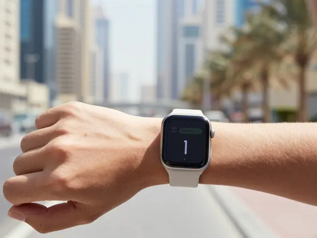

You have exactly 42 millimeters of real estate to communicate a complex idea. If you’re designing Apple Watch complications, you aren’t just shrinking an app; you’re distilling information until it’s barely there but still meaningful. Most designers fail here because they try to cram too much data into a space smaller than a postage stamp. The result? A cluttered mess that users glance at and ignore.
The secret isn’t adding more pixels-it’s removing everything that doesn’t scream "urgent" or "useful." Visual hierarchy on a smartwatch is brutal. You don’t have the luxury of subtle cues. If the user can’t understand your complication in under half a second while jogging or checking their pulse, it’s dead weight. Let’s break down how to build complications that actually get looked at, not just glanced over.
Why Standard UI Rules Break on Your Wrist
Think about your phone. When you look at a notification, you might spend two seconds reading it. On an Apple Watch, you have maybe 0.5 seconds. This constraint changes everything about visual hierarchy. On larger screens, you use spacing, font weights, and color gradients to guide the eye. On a 1.9-inch OLED display, those tools are weak. Contrast and size are your only weapons.
Consider the Infograph Modular watch face versus the Utility face. The Infograph allows six complications, but each is tiny. If you put a weather icon next to a temperature number, do you need both? Probably not. If the temperature is 72°F, the sun icon adds zero value unless it’s raining. Every pixel must justify its existence. This is where most amateur designs fail-they prioritize aesthetics over utility. A pretty gradient background means nothing if the text behind it is unreadable against sunlight.
Your audience is moving. They’re typing on keyboards, driving cars, or running trails. Static design principles from web development don’t apply directly. You need dynamic hierarchy. The most important data point should always be the largest, boldest element, regardless of whether it’s a time, a heart rate, or a calendar event title. If you’re showing a stock ticker, the percentage change matters more than the company name. Flip the script. Make the red or green arrow huge. Shrink the ticker symbol to a footnote size. That’s hierarchy done right for wearables.
Anatomy of a High-Performing Complication
Let’s dissect what makes a complication work. It’s not just about the icon; it’s about the relationship between three elements: the label, the value, and the unit. In traditional UI, these are often equal in weight. On the watch, they must be unequal.
Take a fitness tracking complication as an example. If the goal is to show step count, the number (e.g., "8,432") should dominate the space. The word "Steps" is secondary. The unit "steps" is tertiary-often unnecessary if the context is obvious. Compare this to a battery level complication. Here, the percentage ("85%") is primary, but the icon shape (battery outline) provides immediate context without text. This mix of symbolic and numeric data reduces cognitive load. Users process icons faster than text, especially when peripheral vision is involved.
| Data Type | Primary Element | Secondary Element | Tertiary Element |
|---|---|---|---|
| Numeric (Steps, Calories) | Large Bold Number | Unit Abbreviation (kcal) | Label (Hidden) |
| Status (Battery, Weather) | Icon/Symbol | Percentage/Temp | None |
| Text (Calendar, Messages) | First 3-5 Characters | Time Indicator | Full Title (Truncated) |
| Action (Music, Timer) | Play/Pause Icon | Song Title (Marquee) | Artist Name |
Notice the pattern? Text-heavy data gets truncated aggressively. Numeric data gets scaled up. Status data relies on symbols. If you’re designing a custom complication for a third-party app, stick to one dominant message. Don’t try to show the song title, artist, album art, and playback status all at once. Pick the one thing the user needs to know *right now*. Usually, that’s "Is it playing?" or "What is playing?" Not both.
Color and Contrast: Fighting the Sun
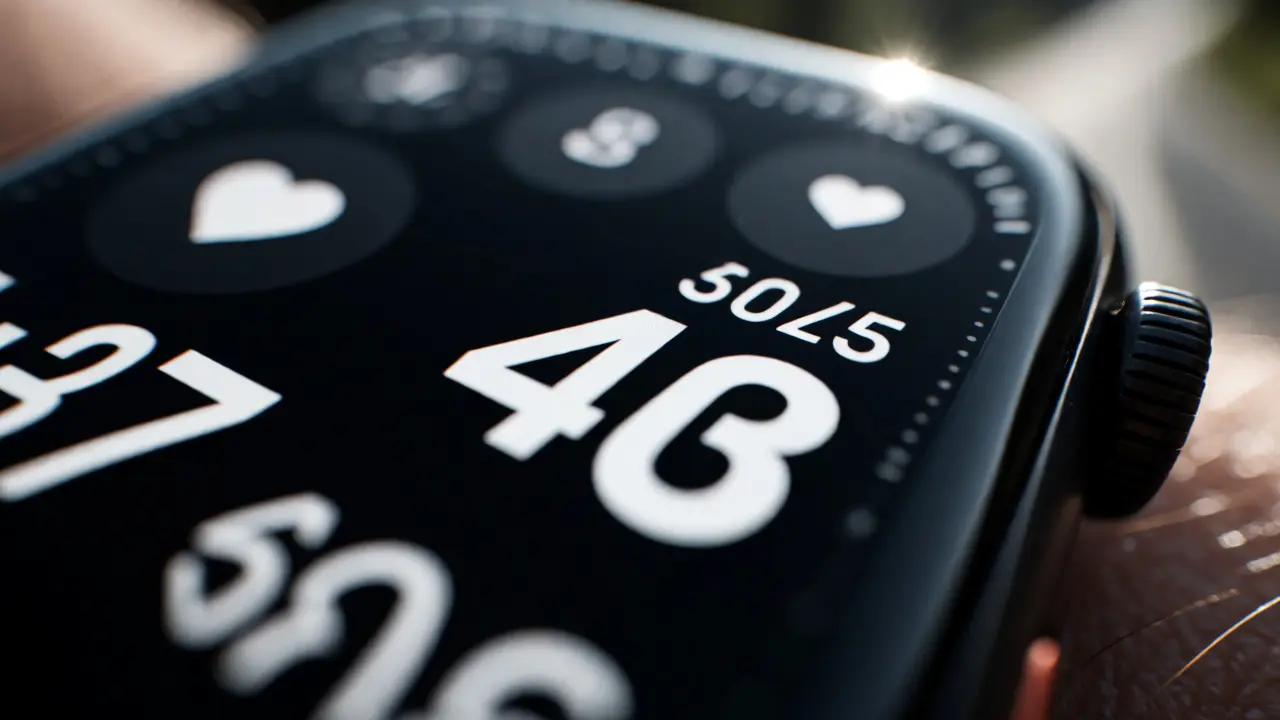
OLED screens are amazing for battery life because black pixels are off. But they’re terrible for readability in direct sunlight if you rely on low-contrast colors. Designers often make the mistake of using dark grays on black backgrounds to create a "sleek" look. On a desktop monitor, this looks sophisticated. On a wrist outdoors at noon, it’s invisible.
Rule of thumb: If you can’t read it while squinting, redesign it. Use pure white (#FFFFFF) for primary text and bright accent colors for highlights. Avoid pastels. Pastels disappear. If you’re using a colored complication, like a red heart rate zone indicator, ensure the background is either pure black or high-contrast white. Never put red text on a blue background. It vibrates visually and causes eye strain.
Also, consider accessibility. About 8% of men have some form of color blindness. Relying solely on color to convey meaning (like red for bad, green for good) is risky. Always pair color with shape or text. A red circle with a downward arrow is clearer than just a red number. This dual-coding ensures your complication works for everyone, not just people with perfect vision.
Dynamic Layouts vs. Static Templates
One of the biggest headaches in watch design is handling variable content lengths. A calendar event titled "Team Sync" fits easily. An event titled "Quarterly Financial Review with External Stakeholders" does not. You have two choices: truncate with ellipses (...) or use a marquee scroll. Both have downsides.
Ellipses hide critical info. If the key detail is at the end of the string, the user misses it. Marquee scrolling requires movement, which distracts from other glanceable data. The best approach? Smart truncation. Prioritize keywords. If you control the data source, strip out common words like "the," "a," or "with" before sending it to the watch. Show "Fin Rev - Ext Stakeholders" instead of the full sentence. This keeps the hierarchy intact-the core topic remains visible.
For timers and countdowns, static layouts work best. The numbers change, but the structure stays fixed. This predictability helps muscle memory. Users learn where to look. If your layout jumps around every time the data updates, you force the user to re-scan the entire complication every time. That breaks the flow. Keep the anchor points stable. If the timer hits zero, switch the state clearly-maybe turn the whole complication red or flash it once. Don’t subtly change the font size. Be loud with state changes.
Testing in the Real World
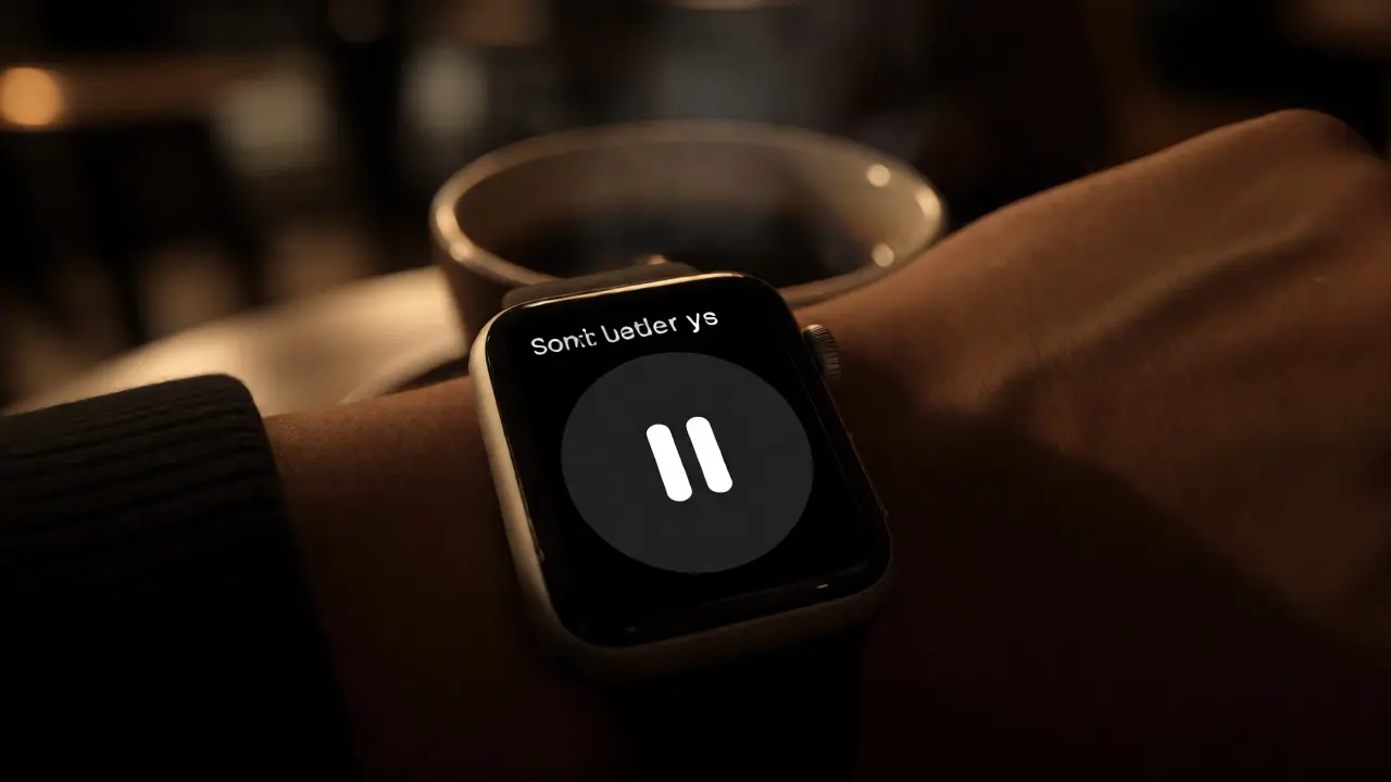
You cannot design effective complications purely in Xcode or Figma. The simulator lies. It shows crisp, high-resolution images on a large retina display. It doesn’t simulate glare, motion blur, or the fact that you’re looking at it sideways while holding a coffee cup.
Here’s a practical test: Print your complication design at actual size (or close to it) on paper. Stick it on your wrist. Walk outside. Look at it while walking fast. Can you read it? Now, dim the lights. Does it still pop? Then, try the "Glance Test." Set the complication on a real device. Glance at it for 0.5 seconds. Look away. What did you see? If you remembered the wrong number or missed the icon entirely, your hierarchy is broken.
Iterate based on failure. Did you miss the alert icon? Make it bigger. Did you confuse the AM/PM indicator? Add a clear separator. Real-world testing reveals flaws that digital previews hide. Remember, your user isn’t sitting still analyzing your design. They’re living their life, and your complication is just a fleeting whisper in their peripheral vision. Make sure it speaks clearly.
How many complications should I display on a single watch face?
It depends on the watch face template, but generally, fewer is better. For modular faces, stick to 2-3 high-value complications. For infographic faces, you can go up to 6, but only if each serves a distinct purpose. Overloading the screen creates visual noise, making it harder for the brain to isolate specific data points quickly. Always prioritize quality of information over quantity.
What is the ideal font size for Apple Watch complications?
There is no single pixel-perfect answer because it depends on the complication slot size (small, medium, large). However, a general rule is to use the largest legible font possible. For small slots, aim for a minimum of 10-12pt equivalent for body text, but keep labels even larger if possible. Always test against the system default fonts (San Francisco) to ensure consistency with the OS aesthetic.
Can I use custom animations in complications?
Yes, but sparingly. Complex animations drain battery and distract from glanceability. Simple transitions, like a fade-in for new messages or a progress bar fill for timers, are acceptable. Avoid looping animations unless necessary (like a spinning loader). The goal is to inform, not entertain. If the animation requires the user to stare at the watch to understand it, it’s failed.
How do I handle long text strings in small complication spaces?
Use smart truncation strategies. Instead of simple character limits, implement logic that prioritizes keywords. Strip non-essential words (articles, prepositions) before rendering. If the text is still too long, use a marquee scroll effect only if the content is critical and time-sensitive. Otherwise, abbreviate aggressively or use icons to replace words.
Does dark mode affect complication visibility?
Dark mode is the default and preferred state for most watch faces due to OLED efficiency. However, visibility issues arise with low-contrast dark grays. Always ensure your text is pure white or high-brightness colors against the black background. Avoid using dark blues or purples as primary text colors in dark mode, as they lack sufficient contrast against the deep blacks of the OLED panel.