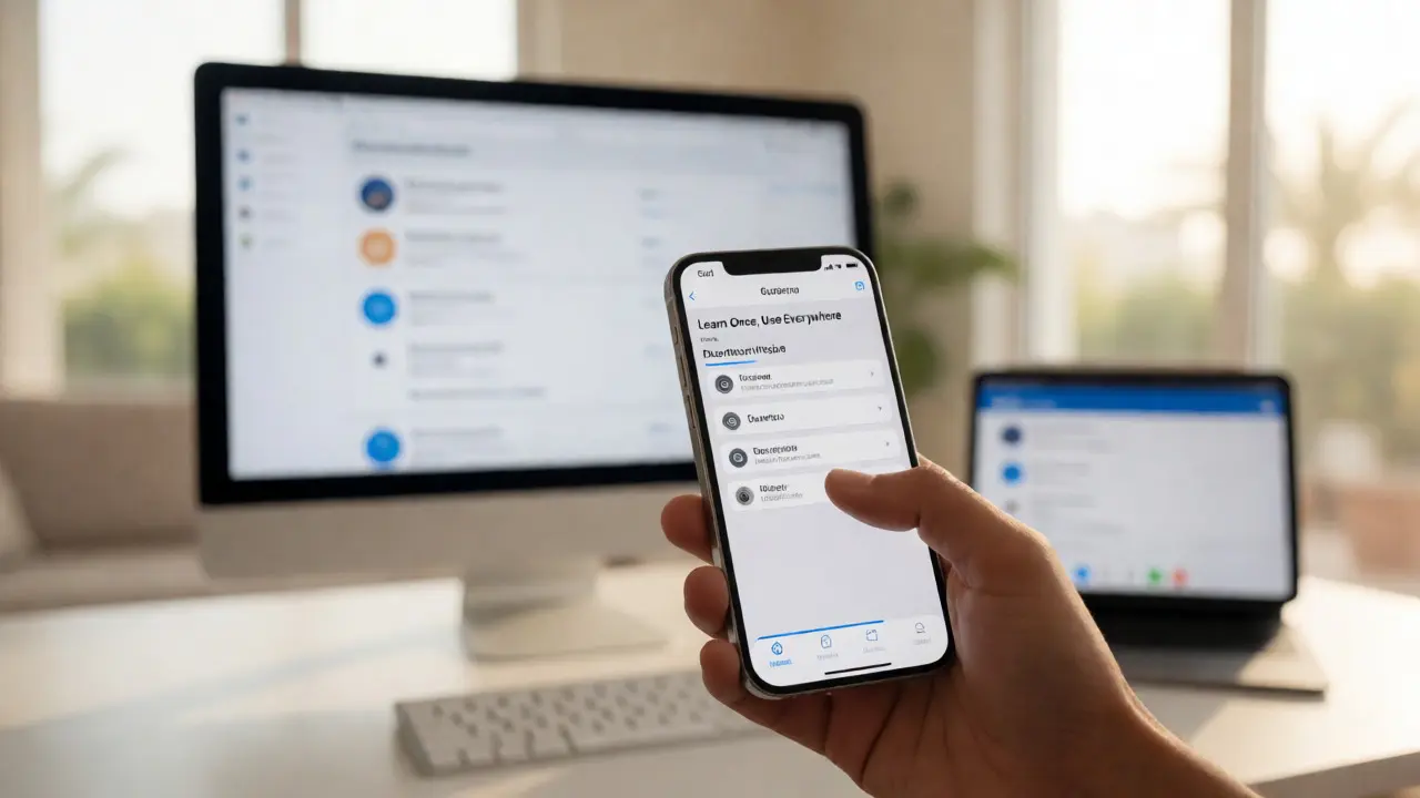

You spent hours tweaking margins in Figma. You exported assets. You handed off to developers. Then you open the app on your iPhone 15 Pro, and something feels... off. The button is two pixels too low. The font weight looks heavier than intended. The shadow doesn't match the spec. This isn't just bad luck; it's a failure of Design QA the process of verifying that the implemented user interface matches the original design specifications across different devices and platforms.
Here’s the hard truth: designing for Apple devices is harder than it looks because of how tightly integrated their hardware and software are. A design that looks crisp on a Retina display might look blurry on an older iPad. A layout that fits perfectly on a standard Mac screen breaks when someone plugs in a 5K external monitor. If you’re shipping apps or websites in 2026, skipping rigorous QA on actual Apple hardware is like building a house without checking if the doors actually close.
Why Apple Hardware Breaks Standard Assumptions
Most designers work on Windows machines or generic web browsers during the creation phase. But Apple’s ecosystem has specific quirks that only reveal themselves on real devices. Take iOS Apple's mobile operating system for iPhones and iPads. It uses dynamic type scaling, which means users can change text size globally. Your carefully crafted 14px label might turn into a 20px monster if the user has accessibility settings enabled. On macOS Apple's desktop operating system, window resizing behavior differs significantly from Windows. Developers often assume fixed widths, but macOS users expect fluid interfaces that adapt to split-screen views.
Then there’s the rendering engine. Safari on iOS and macOS uses WebKit. Chrome uses Blink. While they are similar, they handle CSS properties like `backdrop-filter` or complex SVG animations differently. I’ve seen cases where a blur effect works flawlessly in Chrome DevTools but renders as a solid gray box on an iPhone SE. That’s not a bug in your design; it’s a compatibility issue you missed because you didn’t test on the target hardware.
The Pixel-Perfect Myth vs. Reality
"Pixel-perfect" is a dangerous term. In the early days of web design, it meant matching a JPEG mockup down to the single pixel. Today, with responsive layouts and variable screen densities, it means something else. It means visual consistency. Does the hierarchy read the same way? Is the touch target large enough for a thumb? Does the dark mode toggle switch colors correctly?
When we talk about pixel-perfect checks, we aren't asking for identical coordinates. We are asking for intent preservation. For example, if your design calls for a subtle drop shadow to create depth, does that shadow still convey depth on a high-DPI Retina display? Or does it disappear because the contrast ratio was too low? Testing this requires looking at the output, not just the code.
Essential Tools for Apple-Specific QA
You don’t need a lab full of every device ever made by Apple. You need a strategic selection. Here is what actually works in 2026:
- Xcode Simulator A tool included with Xcode that allows developers to run iOS and macOS applications on a Mac computer: Great for quick layout checks and testing different screen sizes (iPhone 15, iPad Pro, etc.). However, it doesn't simulate performance issues or true touch interactions.
- Safari Technology Preview A version of Safari that includes new features and fixes before they are released to the general public: Essential for catching future compatibility issues. If you use experimental CSS, test it here first.
- Figma Mirror An app that lets you view Figma designs on your mobile device in real-time: Use this to compare the live implementation against the source of truth side-by-side on the same physical screen.
- BrowserStack A cloud-based service that provides access to real browsers and devices for cross-browser testing: If you don't own an iPhone 13 mini, rent one. Real devices catch hardware-specific rendering bugs that simulators miss.

A Step-by-Step QA Workflow for iOS and macOS
Don't just click around randomly. Follow a structured path to ensure nothing slips through the cracks.
- Start with the Source of Truth: Open your design file (Figma, Sketch, or Adobe XD) on your Mac. Note the exact hex codes, font weights, and spacing values. Keep this tab open.
- Test on the Smallest Screen First: Launch your app on an iPhone SE or the smallest supported iOS device. Why? Because if it breaks here, it will break everywhere. Check for text truncation. Ensure buttons don't overlap. Verify that critical actions are reachable with one hand.
- Check Dynamic Type and Accessibility: Go to Settings > Display & Brightness > Text Size. Crank it up. Does your layout expand gracefully, or does content get cut off? Turn on VoiceOver. Can you navigate the entire flow using only gestures? If a blind user can't buy your product, your design failed.
- Validate Dark Mode: Toggle system-wide Dark Mode. Don't just check if the background turns black. Check contrast ratios. Do icons remain visible? Are shadows still effective, or do they need to be replaced with borders? Apple’s Human Interface Guidelines recommend specific opacity levels for dark mode elements-verify these.
- Move to macOS Window Management: Open your desktop app or website in Safari. Resize the window to minimum width. Drag it to the left half of the screen for Split View. Does the sidebar collapse? Does the main content reflow? Test with an external 4K monitor attached. Does the UI scale correctly, or does it look tiny?
- Performance Spot-Check: Scroll rapidly through long lists. Tap between tabs quickly. Watch for jank. On older devices like the iPhone 12, heavy animations might drop frames. If it stutters, simplify the transition.
| Pitfall | Platform Impact | How to Fix |
|---|---|---|
| Fixed Height Containers | iOS/macOS | Use flexible constraints (Auto Layout) instead of fixed pixels. |
| Low Contrast Shadows | Dark Mode | Switch to outlines or increase shadow opacity in dark themes. |
| Touch Targets < 44pt | iOS | Increase padding around buttons to meet Apple HIG standards. |
| Unsupported CSS Features | Safari | Add fallback styles or polyfills for WebKit-specific gaps. |
| Hardcoded Font Sizes | All | Use relative units (rem/em) to respect user text preferences. |
Handling Edge Cases: Notch, Dynamic Island, and Safe Areas
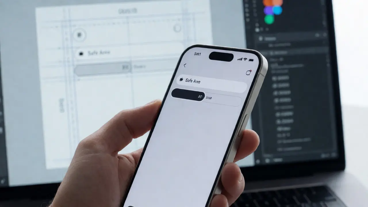
Modern iPhones have hardware intrusions-the notch or the Dynamic Island-that eat into your screen space. Your header might look fine in the simulator, but on a real iPhone 15 Pro Max, the title text could collide with the camera housing. Always respect "Safe Area" guides provided by iOS. These invisible boundaries ensure your content stays within the usable part of the screen.
On macOS, the equivalent is the traffic light buttons (close, minimize, maximize). If you build a custom title bar, ensure you leave enough space for these controls. Users hate clicking near the edge only to accidentally quit the app. Also, consider the menu bar height. It changes depending on whether the user is using full-screen mode or a standard window. Your top navigation needs to account for this shift.
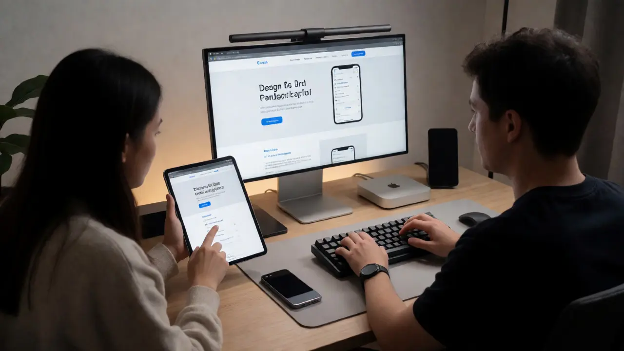
Collaborating with Developers During QA
QA isn't a solo act. You need to speak the developer's language. Instead of saying "It looks wrong," say "The margin-bottom on the primary button should be 16pt, but it appears to be 8pt." Provide screenshots with measurements. Use tools like Zeplin or Avocode to generate precise specs automatically.
Create a shared checklist. Before a release, both designer and developer sign off on key flows. This reduces back-and-forth. When a bug is reported, categorize it immediately: is it a visual polish issue, a functional blocker, or an accessibility failure? Prioritize accordingly. Visual tweaks can wait for the next sprint; broken checkout flows cannot.
The Cost of Skipping QA
I once worked with a startup that skipped device testing to save time. They launched a banking app. On day one, users with larger hands couldn't tap the "Confirm Transfer" button because it was placed too low on the screen, behind the home indicator gesture area. Support tickets flooded in. Sales dropped 15% in the first week. The cost of fixing those bugs post-launch was ten times higher than doing proper QA beforehand.
Remember, users don't see your code. They see the result. If the result feels clunky, unpolished, or inaccessible, they won't care that you used the latest React framework. They’ll just uninstall the app. Invest the time in checking your work on the actual devices your users hold in their hands.
Do I need every iPhone model for QA?
No. Focus on three categories: the newest flagship (e.g., iPhone 15 Pro), the most popular current model (e.g., iPhone 13/14), and the oldest supported model (e.g., iPhone SE or iPhone 12). This covers the range of screen sizes and processing powers effectively.
Is Safari on iOS different from Safari on macOS?
Yes. While both use WebKit, the rendering engines differ slightly due to OS-level optimizations. Additionally, touch events behave differently than mouse events. Always test interactive elements separately on each platform.
What is the minimum touch target size for iOS?
Apple’s Human Interface Guidelines recommend a minimum tappable area of 44x44 points. Even if the visual icon is smaller, the hit area must meet this threshold to prevent accidental taps.
Can I rely solely on browser dev tools for QA?
No. Dev tools simulate screens but cannot replicate real-world conditions like network latency, battery saver modes, or hardware-accelerated rendering glitches. Physical device testing is non-negotiable for final QA.
How do I test Dark Mode effectively?
Toggle system settings rather than just changing the website theme manually. Ensure all images, icons, and charts adjust appropriately. Check contrast ratios using WCAG guidelines to ensure readability for all users.