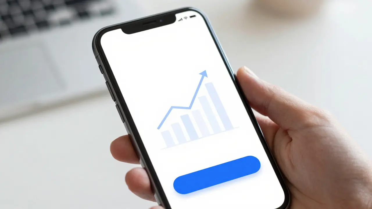

Imagine you just installed a new fitness tracker app. You open it, expecting to see your heart rate or step count. Instead, you’re staring at a blank white screen with the word "No Data" in small gray text. Frustrating, right? That’s an empty state, and if it’s not designed well, it can kill user retention before they even get started.
In the world of mobile development, particularly within the Apple ecosystem, empty states are far more than just placeholders. They are critical touchpoints that define how users perceive your product’s intelligence and ease of use. According to recent UX surveys, nearly 40% of users abandon an app after a confusing first interaction. The empty state is often that first interaction. Getting this right isn’t just about aesthetics; it’s about reducing cognitive load and guiding the user toward their first "aha!" moment.
What Defines a Good Empty State?
An empty state occurs when there is no data to display in a specific view. This could be a shopping cart with zero items, a messaging app with no conversations, or a photo gallery with no images. In iOS Design the design discipline focused on creating intuitive, accessible, and aesthetically pleasing interfaces for Apple devices, these moments require special attention because the platform expects high polish and seamless transitions.
A well-crafted empty state serves three primary functions:
- Clarity: It tells the user exactly where they are and what is missing.
- Motivation: It encourages the user to take action to populate the space.
- Guidance: It provides a clear next step, removing ambiguity.
If you miss any of these, you risk leaving the user stranded. For example, showing a generic error icon without explaining *why* the list is empty creates confusion. Is the server down? Did I forget to log in? A good design answers these questions silently through visual hierarchy and concise copy.
The Role of Human Interface Guidelines
Apple’s Human Interface Guidelines (HIG) a comprehensive set of design principles and best practices for building apps on Apple platforms provide a solid foundation for handling these scenarios. While HIG doesn’t prescribe exact pixel-perfect templates for every empty state, it emphasizes consistency, clarity, and accessibility.
Key principles from HIG that apply directly to empty states include:
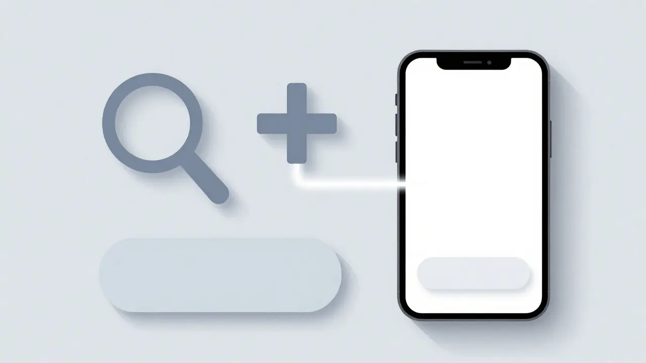
- Consistency: Use system-standard components like SF Symbols for icons. Users recognize the magnifying glass for search or the plus sign for adding items instantly.
- Simplicity: Avoid clutter. An empty state should feel light, not heavy. If the screen is already empty, don’t add complex graphics that distract from the core message.
- Accessibility: Ensure text contrast meets WCAG standards. If you use an illustration, make sure it has alternative text or is decorative enough not to break screen reader flow.
Ignoring these guidelines can lead to a disjointed experience. For instance, using custom, non-standard icons for actions in an empty state forces users to relearn basic interactions, which contradicts the native feel of iOS applications.
Strategies for Clarity and Motivation
How do you turn a dead-end screen into a launchpad? The answer lies in combining visual cues with persuasive microcopy. Let’s look at two common scenarios: a new user onboarding flow and a post-action result.
Scenario 1: The First Launch
When a user opens your app for the first time, the home screen is empty. This is your highest-leverage moment. You have the chance to educate them on value proposition immediately.
- Visuals: Use a subtle, brand-aligned illustration that hints at the app's purpose. For a finance app, maybe a simple graph going up. Keep it monochromatic or low-opacity to avoid overwhelming the user.
- Copy: Be direct. Instead of "Welcome," try "Track your spending effortlessly." Follow with a single call-to-action (CTA) button like "Add First Expense."
- Action: The CTA should lead directly to the creation flow, skipping unnecessary menus.
Scenario 2: No Search Results
This is a frequent source of user frustration. If a user searches for "Blue Shoes" and finds nothing, a blank screen feels like a failure. But a well-designed empty state turns this into an opportunity to refine the query.
- Visuals: Use a neutral icon, like a magnifying glass with a question mark, to indicate "no matches found."
- Copy: Acknowledge the search term. "No results for 'Blue Shoes'. Try checking your spelling or browsing categories."
- Action: Provide secondary options. A "Browse All Shoes" link or a suggestion list like "Did you mean Blue Sneakers?" keeps the user engaged rather than stuck.
Common Pitfalls to Avoid
Even experienced designers stumble here. Here are the most frequent mistakes that undermine empty states:
| Element | Ineffective Approach | Effective Approach |
|---|---|---|
| Text Length | Long paragraphs explaining technical errors | One sentence stating the status + one sentence offering help |
| Call-to-Action | Multiple buttons competing for attention | Single, prominent primary action button |
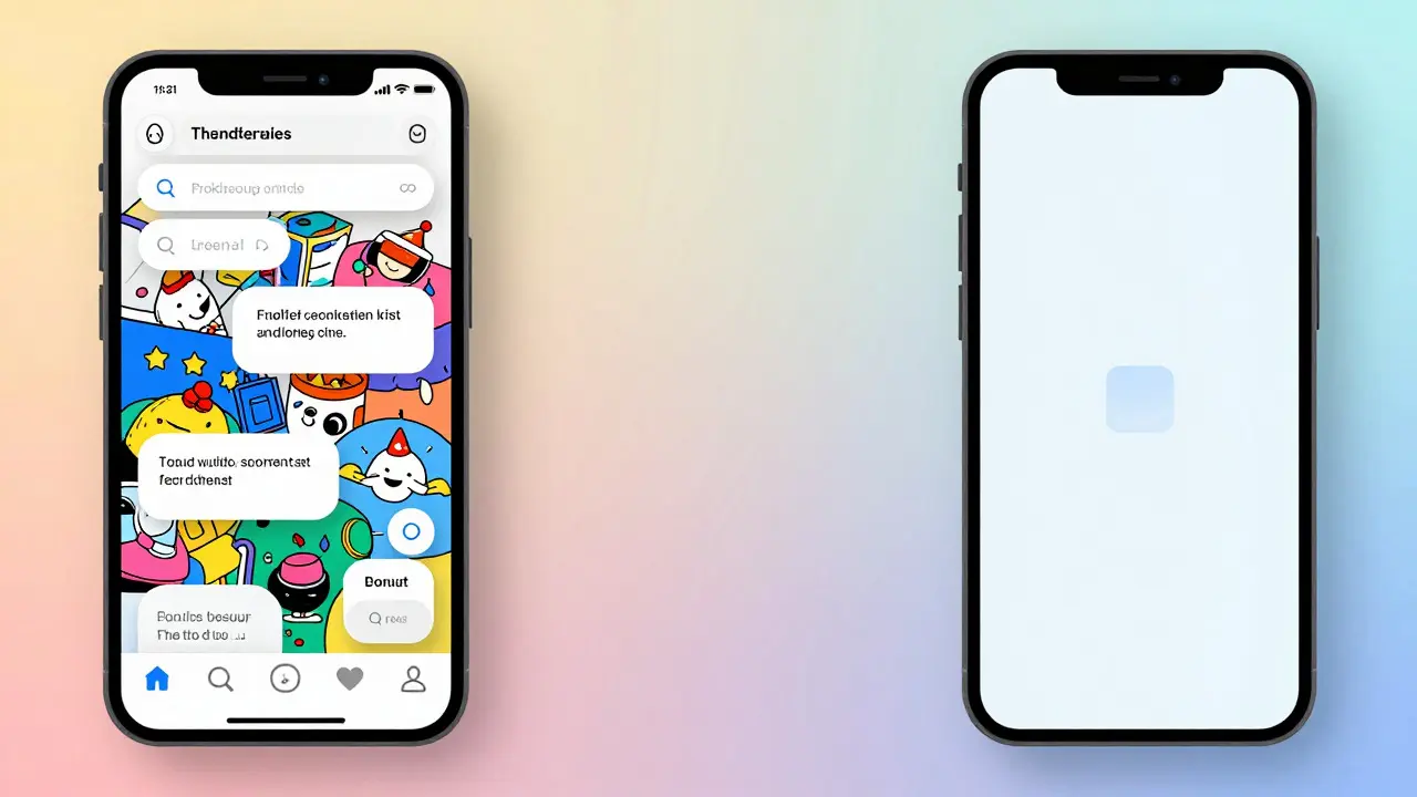
| Imagery | Highly detailed, colorful illustrations | Simple, abstract shapes or standard SF Symbols |
| Tone | Blaming the user ("You haven't added anything") | Neutral and helpful ("Ready to add your first item?") |
Notice how the effective approach reduces decision fatigue. When a user sees multiple options in an empty state, they hesitate. Hesitation leads to drop-off. One clear path forward is always better than five ambiguous ones.
Technical Implementation Tips
Designing the state is only half the battle; implementing it correctly in code ensures performance and maintainability. In SwiftUI a modern framework for building user interfaces across all Apple platforms, handling empty states is straightforward but requires careful state management.
Consider using the .overlay modifier to conditionally show content based on data availability. For example, if your array of items is empty, overlay the empty state view on top of the list container. This ensures the layout remains stable and prevents jumping animations when data loads later.
Also, keep in mind loading states. There is a distinct difference between "loading" and "empty." If the network is slow, show a skeleton screen or spinner. Only switch to the empty state once the request completes and confirms zero results. Confusing these two states is a major usability error that makes apps feel broken.
Measuring Success
How do you know if your empty state design is working? Look at behavioral analytics. Track the conversion rate from the empty state screen to the next meaningful action. If 80% of users who see your "Add First Item" empty state actually tap the button, you’re on track. If only 20% do, something is off-maybe the copy is unclear, or the button is too hard to find.
A/B testing different variations of copy and imagery can yield surprising insights. Sometimes, changing the verb from "Create" to "Start" increases engagement by double digits. These small tweaks compound over time, significantly impacting overall user retention.
Frequently Asked Questions
Should every empty state have a call-to-action button?
Not necessarily. If the empty state is due to a filter being applied (e.g., "No red shirts in size M"), the best action might be to remove the filter. In this case, a text link saying "Clear Filters" is sufficient and less intrusive than a large button. Reserve primary buttons for states where user input is required to proceed.
How much whitespace is appropriate in an empty state?
Use generous whitespace. Since there is no data to anchor the layout, centering the content vertically and horizontally helps balance the screen. However, ensure the content block doesn’t become too small; aim for a comfortable reading width of about 60-70% of the screen width for text-heavy states.
Do empty states need to be localized differently?
Yes. Language expansion varies significantly. German and Russian, for example, can be 30-50% longer than English. Design your layouts to accommodate dynamic text heights so that longer translations don’t clip or overflow the UI elements. Always test with actual translated strings, not just placeholder text.
Is it okay to use humor in empty states?
It depends on your brand voice. For consumer-facing apps with a casual tone, light humor can build rapport (e.g., "Nothing here yet... let's fix that!"). For enterprise or financial apps, stick to professional and reassuring language. Humor can backfire if the user is frustrated by a bug or lack of data.
How does dark mode affect empty state design?
In dark mode, avoid pure black backgrounds with pure white text, as it causes eye strain. Use semantic colors defined in your asset catalog. Illustrations should also be adapted; bright, saturated colors can vibrate against dark backgrounds. Desaturate or adjust opacity of graphical elements to ensure they remain visible but not glaring.