
The bottom tab bar on your iPhone has changed. It doesn’t sit there like it always has - fixed, wide, unshakable. In iOS 26, it shinks when you scroll, expands when you stop, and looks like it’s made of glass that’s melting and reforming as you use it. This isn’t just a visual tweak. It’s a full rewrite of how navigation works on iPhone - and it’s already causing headaches for users and developers alike.
What’s Actually Happening with the Tab Bar?
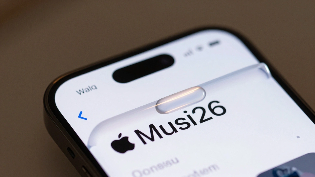
Before iOS 26, your tab bar was always there. Five icons. Always visible. Always the same size. You tapped them. You knew where they were. Simple.
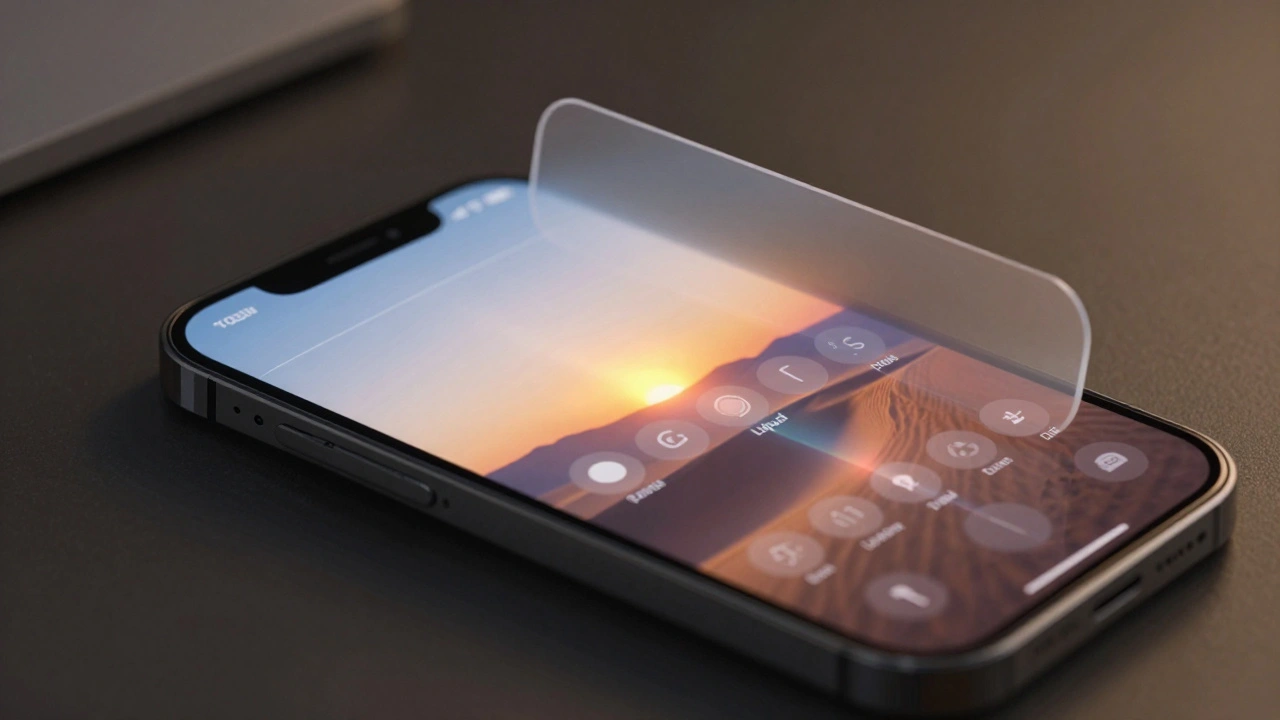
Now? The tab bar turns into a thin, rounded capsule that hugs the bottom edge. When you scroll down through a feed in Apple Music or News, it slowly disappears - not with a snap, but with a soft fade, like it’s sinking into the background. The moment you scroll back up, or tap anywhere on the screen, it springs back into full view. Apple calls this motion "Liquid Glass" - and it’s not just about looks. It’s about space.
On a 6.7-inch iPhone, that’s nearly 2 inches of screen real estate you get back while reading, watching, or scrolling. That’s not small. But here’s the catch: you can’t always predict when it will come back. If you’re trying to switch tabs quickly, and the bar vanishes just as you reach for it, you’re left tapping air. That’s not fluid - it’s frustrating.
Liquid Glass Isn’t Just About the Tab Bar
The tab bar is just the tip of the iceberg. Apple didn’t just update one element - they rebuilt the entire interface language.
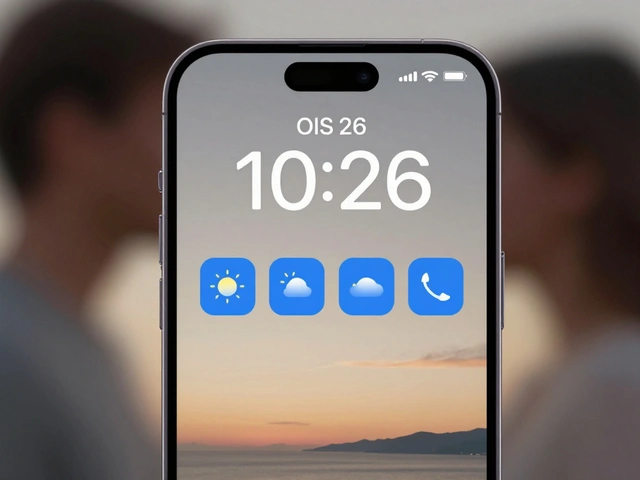
Lock screen time? Now it grows and shrinks based on what’s behind your wallpaper. If your photo has a dark sky, the time gets brighter. If there’s a bright cloud, it dims. You can even drag the corners to resize it manually - but only if you’re using the first font in your font list. That’s oddly specific.
Home screen icons? They’re layered. Not flat. Not simple. You can see depth now - like each icon is made of three translucent glass sheets stacked on top of each other. The effect is beautiful, but it’s also distracting. It makes your home screen feel less like a tool and more like a screensaver.
And then there’s Safari. The URL bar is now so narrow it cuts off website names. You can’t tell if you’re on "nytimes.com" or "nyt.com" without tapping it. Tabs? You used to tap the number in the corner to see all open tabs. Now, they’re hidden behind a tiny "..." menu. That’s not a convenience - it’s a barrier. Millions of people switch tabs dozens of times a day. Making that harder doesn’t make the phone smarter. It makes it slower.
The Search Tab That Shouldn’t Be a Button
One of the most confusing changes is the search tab. In iOS 26, Apple gave it a circular shape - like a floating button. It’s centered at the bottom, right where your thumb naturally lands. It looks like a primary action button. So you tap it expecting to search.
But here’s the problem: it’s not a button. It’s a tab. It’s supposed to be a navigation item, not a function trigger. And that’s causing chaos.
Third-party apps are now copying this design. Apps like Craft and Structured are putting their own "add" or "create" buttons in that exact spot - not because it’s good design, but because users expect it now. Apple didn’t ask for this. They didn’t design it for third-party apps. But users are training themselves to look for actions there. So developers have no choice but to mimic it.
That’s not innovation. That’s a design failure. Apple created a visual cue that users now associate with "do something important," and then didn’t provide a way for developers to use it properly. Now, every app feels like it’s trying to be Apple’s app. And that’s not a feature - it’s a mess.
Why This Matters for Developers
Developers are stuck between a rock and a hard place.
Before iOS 26, if you wanted a big "+" button to add something in your app, you used a floating action button (FAB). It wasn’t perfect, but it worked. It was predictable. It didn’t vanish. It didn’t change size.
Now? Apple’s new search tab looks like a FAB. So developers are either:
- Copying it exactly - which means they’re violating Apple’s own design rules
- Putting their button at the top - where no one looks
- Or burying it inside a menu - which defeats the whole point of quick access
Designer Ryan Ashcraft put it bluntly: "It’s not officially recommended, it’s never felt like a first-class citizen on iOS, and with the new centered tab bar layout in iOS 26, it sits awkwardly above empty space when you have three tabs."
Apple’s solution to a problem they created is to make developers hack their way around it. That’s not a platform - it’s a puzzle.
The Bigger Picture: Apple’s Shift in Design Philosophy
Apple used to pride itself on consistency. You learned how to use one app, and you knew how to use all of them. That’s what made iOS feel intuitive.
Now? The interface feels like it’s changing every time you look away. Buttons appear. Buttons vanish. Menus morph. Tabs shrink. The system is trying to be smart - but it’s not being reliable.
And it’s not just iOS. On iPadOS 26, the tab bar turns into a floating sidebar that shifts with your content. On macOS 26, the menu bar blends into your wallpaper. Apple is pushing a unified "Liquid Glass" experience across all devices.
That sounds cool - until you realize what’s being sacrificed: predictability.
Nielsen Norman Group (NN/G) calls this a "hide-and-seek" interface. Users aren’t learning how to use the system - they’re learning how to guess when controls will show up. That’s not usability. That’s guesswork.
And the worst part? Apple borrowed this "search-first" design from Google. Not from their own history. Not from their own design language. From their biggest competitor.
Who’s Winning? Who’s Losing?
Apple says this is about focus. More screen space. Less clutter. And yes - when you’re reading a long article or scrolling through photos, having the tab bar disappear does feel freeing.
But when you’re trying to switch from Music to Podcasts to Messages - all within 10 seconds - the constant vanishing act makes it harder. You’re not saving time. You’re adding friction.
Developers are losing too. They’re forced to mimic Apple’s design to meet user expectations, even if it breaks their own app’s flow. Users are losing because they can’t trust the interface anymore. If the tab bar disappears every time you scroll, how do you know it’s still there?
And Apple? They’re winning in one way: their apps look stunning. The glass effects are gorgeous. The animations are smooth. The visuals are award-worthy.
But design isn’t just about beauty. It’s about function. And right now, function is taking a back seat.
Is This the Future? Or a Mistake?
Adaptive tab bars in iOS 26 are a bold experiment. And bold experiments often fail.
Apple has always been a company that leads - not follows. But this feels like they’re following trends instead of setting them. The search tab’s button-like design? That’s Android. The disappearing controls? That’s Google’s Material You. The layered glass? That’s every design trend from the last three years.
What’s missing is Apple’s signature: clarity. Simplicity. Consistency.
If you want more screen space, make the tab bar smaller - permanently. Don’t make it dance. If you want to reduce clutter, simplify the interface - don’t hide essential controls behind menus. If you want to innovate, build a better system for primary actions - don’t trick users into thinking a navigation tab is a button.
Right now, iOS 26 feels like Apple got distracted by the shimmer of glass and forgot to check if the door still opens.