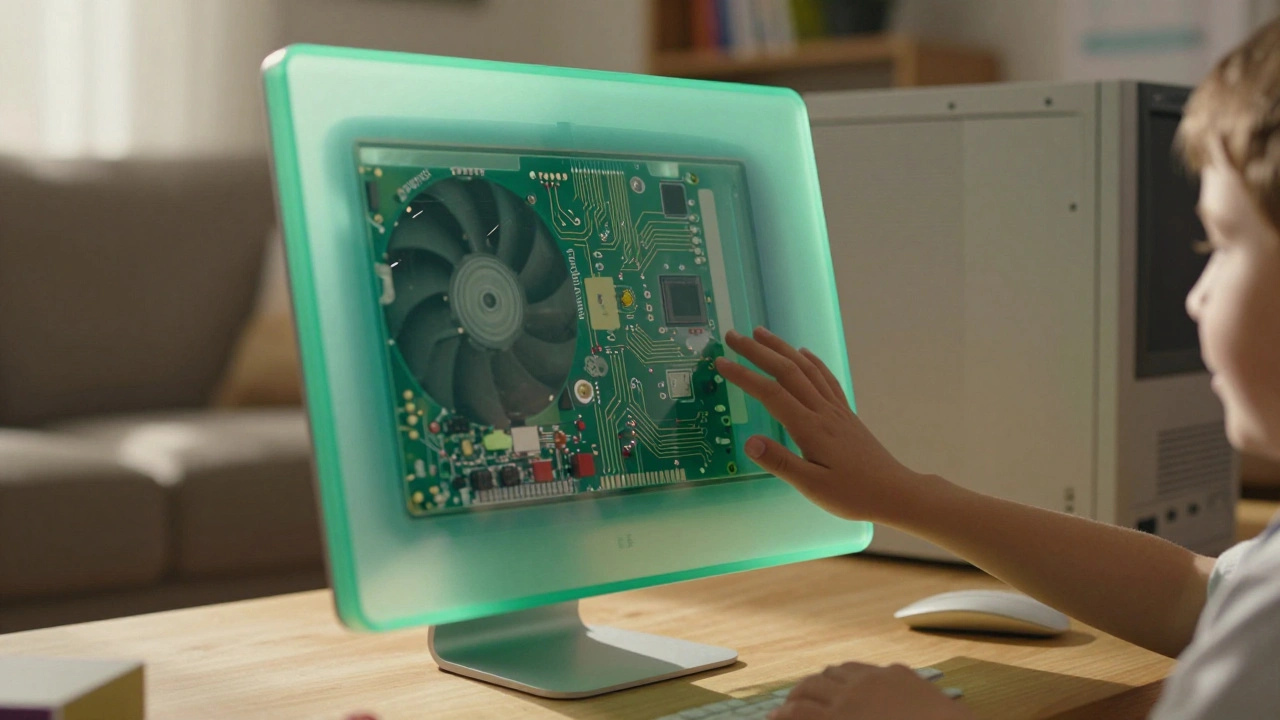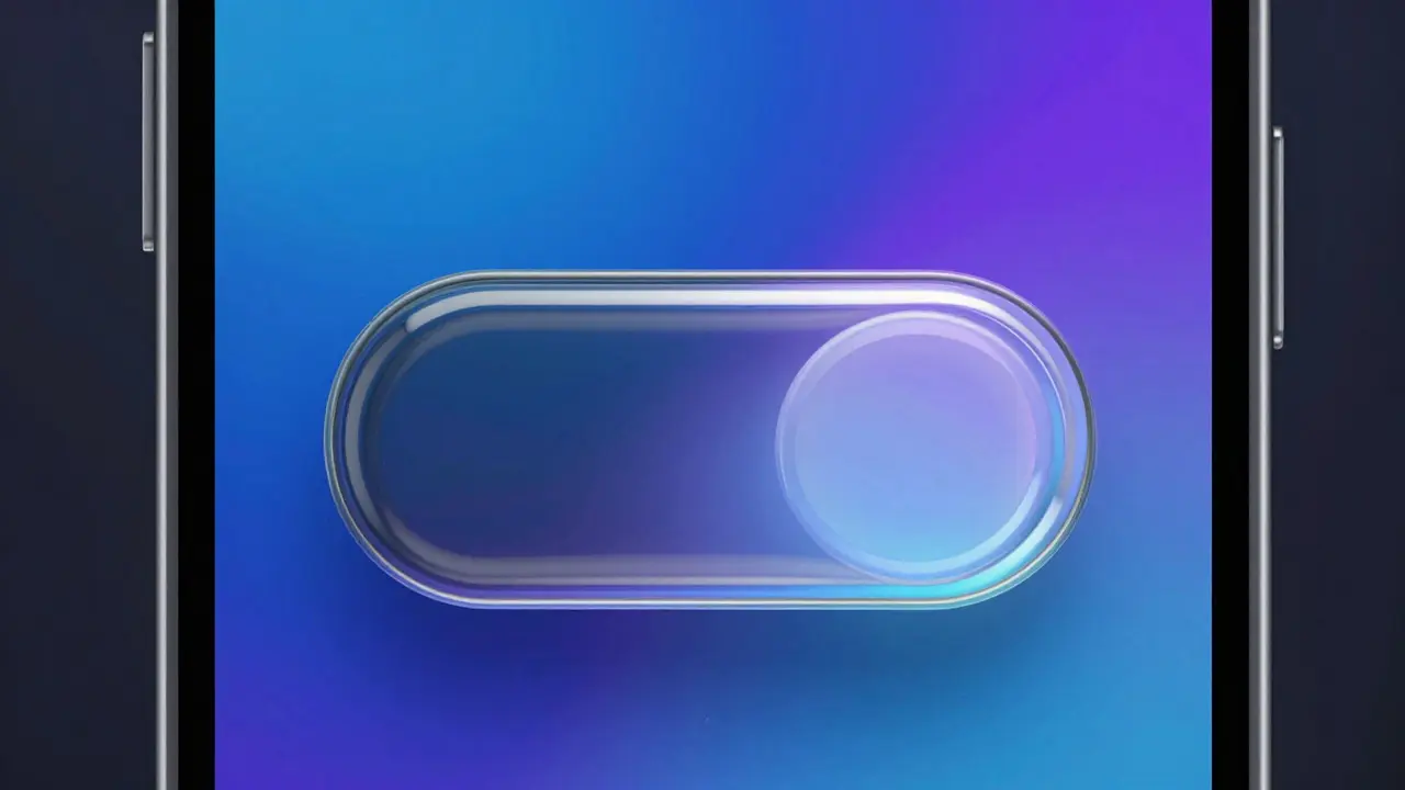

Walk into an Apple Store or open the latest iOS interface, and you feel a specific vibe. It’s not just clean; it feels inviting. You don’t have to think hard about how to use it. That feeling isn’t accidental. It is the result of decades of refining two specific visual concepts: transparency and translucency. While they sound similar, they do different jobs in user experience design. One shows you the truth; the other softens the edges. When Apple combines them, the result is a brand that feels less like a corporation and more like a helpful friend.
The Core Difference: Seeing Through vs. Blurring Out
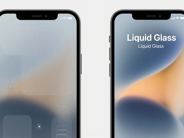
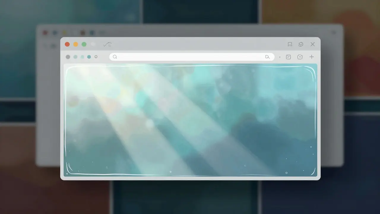
To understand why this works, we need to separate the two terms. In design, transparency means seeing clearly through something. Think of glass. You can see the objects behind it without distortion. Translucency, on the other hand, is like frosted glass. You know there is something behind it, but the details are softened and blurred. This distinction matters because each serves a different psychological purpose for the user.
Transparency builds confidence. When you can see what is happening behind the current action, you feel in control. If you drop a file into a folder and see the folder contents shift slightly, you trust that the system is responding accurately. Translucency creates comfort. It reduces visual noise. By blurring the background, the interface tells your brain, "Focus here, the rest is safe." Together, they create a layering effect that makes complex digital environments feel manageable.
The History of Glassmorphism in Tech
You might think this style is new, born out of modern trends. Actually, it has roots going back to the late 1980s. The Macintosh System 7 introduced the concept of overlapping windows with subtle shadows. But the real breakthrough came with the introduction of the Aqua interface in macOS X in 2001. That was when Apple started using water-like reflections and clear layers to make the operating system feel liquid and alive.
Before Aqua, computer interfaces were flat and gray. They looked like office paperwork. Aqua changed that. It made the screen feel like a physical object you could touch. The buttons had gloss. The windows had depth. This wasn't just aesthetics; it was a way to reduce the intimidation factor of technology. If the computer looks like a toy or a piece of jewelry, it feels safer to play with than if it looks like a server room.
How Layering Creates Approachability
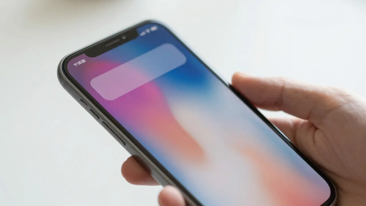
Approachability in design means removing barriers between the user and the task. Complexity is the biggest barrier. When an interface has too many distinct sections, menus, and borders, the user’s eye gets tired. Apple uses translucency to merge these sections. Instead of hard lines separating the navigation bar from the content, the navigation bar floats above the content with a slight blur.
This technique, often called "materiality," suggests that the interface is made of physical materials that interact with light. When you scroll, the header stays fixed but becomes more opaque as it overlaps content. This subtle change signals state changes without needing text labels. Your eyes track the change in density rather than reading instructions. This lowers the cognitive load significantly. You spend less energy understanding where you are and more energy doing what you came to do.
| Strategy | Visual Effect | Psychological Impact | Best Use Case |
|---|---|---|---|
| Flat Design | Solid colors, no shadows | Clarity, minimalism | Simple data entry forms |
| Transparency | Clear view of underlying layers | Trust, context awareness | Drag-and-drop interactions |
| Translucency | Blurred background elements | Comfort, reduced noise | Navigational overlays |
The Role of Light and Shadow
You cannot talk about translucency without talking about light. In the physical world, translucent objects scatter light. In digital design, this is simulated using Gaussian blur and opacity adjustments. Apple’s engineers pay close attention to how these effects behave at different scales. A large translucent panel needs a stronger blur to hide the chaotic details of the wallpaper or photos underneath. A small button needs only a slight tint to remain readable against any background.
Shadows also play a crucial role here. They define the distance between layers. A heavy shadow implies the element is floating high above the surface. A light shadow suggests it is resting on the surface. By manipulating these values dynamically, the interface guides your attention. When you open a menu, it casts a shadow, lifting it off the page. When you close it, the shadow fades, and the menu settles back down. This physical metaphor makes the digital space feel intuitive.
Consistency Across Devices
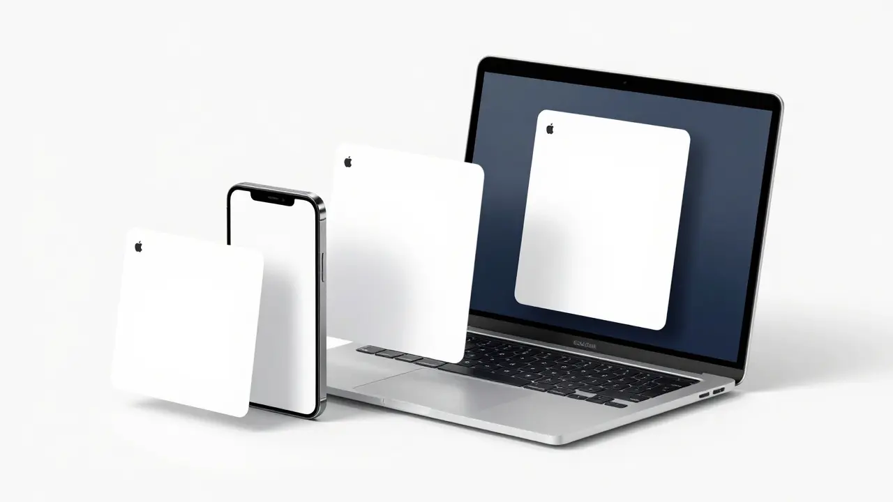
One reason this strategy works so well is consistency. Whether you are using an iPhone, an iPad, or a Mac, the language of light and layer remains the same. This creates a seamless transition. If you learn how to interpret the blur on your phone, you already know how to read the blur on your laptop. This cross-device fluency reduces the learning curve for new users. It turns a fragmented tech ecosystem into a unified experience.
For brands outside of tech, this offers a lesson. Consistency in visual cues builds trust faster than innovation in features. If your website, your app, and your packaging all use the same logic for highlighting important information, customers feel confident. They know where to look. They know what to expect. That confidence is the essence of approachability.
Common Pitfalls to Avoid
While effective, this style is easy to mess up. The most common mistake is over-blurring. If the background is too obscured, users lose context. They forget what they were looking at before opening the overlay. Another error is poor contrast. Translucent elements rely on the background color to provide readability. If the background is white and the text is light gray, the interface becomes unreadable. Always test your designs against extreme backgrounds: pure black, pure white, and vibrant patterns.
Performance is another hidden pitfall. Real-time blurring is computationally expensive. On older devices, it can cause lag or battery drain. If your target audience includes users with mid-range hardware, consider static gradients instead of dynamic translucency. The goal is approachability, not frustration. If the interface stutters, the friendly vibe disappears instantly.
Applying These Principles Today
You don’t need to build an operating system to use these techniques. Start by identifying the most distracting parts of your interface. Are there too many borders? Too many solid blocks? Try replacing some solid containers with semi-transparent ones. Add a subtle blur to your navigation bars. Watch how the user’s eye moves. Does it glide smoothly from section to section, or does it stop and hesitate?
Use transparency when you want to show connection. For example, when a user selects an item, keep the original list visible but dimmed. This shows that the selection is part of the whole, not a separate entity. Use translucency when you want to isolate focus. When a modal window opens, blur the background heavily. This tells the user, "The world outside is paused. Focus on this." These small shifts in visual weight guide behavior without words.
Frequently Asked Questions
What is the difference between transparency and translucency in UI design?
Transparency allows you to see the background clearly without distortion, while translucency blurs the background to soften details. Transparency builds trust by showing context, whereas translucency reduces visual noise to improve focus.
When did Apple start using glass-like effects in its interfaces?
Apple began experimenting with these effects in the late 1980s, but the major shift happened with the release of macOS X and the Aqua interface in 2001. This update introduced water-like reflections and clear layers that defined the modern look.
Does using translucency slow down mobile apps?
Yes, real-time blurring requires significant processing power. On older or mid-range devices, it can cause frame drops and increased battery usage. Developers should test performance carefully and consider static alternatives for lower-end hardware.
How can I make my website feel more approachable without changing the layout?
Replace hard borders with soft shadows and semi-transparent overlays. Use consistent spacing and ensure that interactive elements have clear visual states. Small changes in opacity and blur can make a rigid layout feel fluid and inviting.
Is glassmorphism still relevant in 2026?
Yes, it remains a core part of major operating systems and popular design frameworks. However, the trend has evolved from heavy, glossy effects to subtler, more functional uses of depth and layering that prioritize usability over decoration.