
Imagine trying to pick the right file folder on your Mac, but every tab looks like a muddy shade of beige. For the roughly 300 million people worldwide with color vision deficiency (CVD), this isn't a hypothetical annoyance-it's their daily digital reality. When you build or use Apple apps, you're often relying on color as a primary signal for status, hierarchy, or action. But if that signal fails for one in twelve men and one in two hundred women, your interface breaks.
The solution isn't just "add more contrast." That’s old advice. The modern approach, championed by Apple’s Human Interface Guidelines, leans into semantic tints and non-color redundant cues like patterns and icons. This article unpacks how developers and designers can leverage these tools to create interfaces that don’t just look pretty for those with typical trichromatic vision, but actually work for everyone.
Why Color Alone Fails in Modern Interfaces
We tend to think of color as an aesthetic choice first and a functional one second. In iOS and macOS, however, color is data. A red badge means "error" or "unread." Green means "success" or "online." Blue often means "link" or "selected." If you have deuteranopia (red-green confusion), that red badge might look brownish-gray, indistinguishable from a neutral gray badge indicating "no activity."
This failure mode is dangerous because it creates ambiguity. Users shouldn't have to guess whether a button is disabled or active based on a subtle hue shift they can barely perceive. Relying solely on color forces users to rely on memory or trial-and-error, increasing cognitive load. Inclusive design demands redundancy. If color conveys meaning, another sensory channel-like shape, texture, or text-must convey the same meaning independently.
Understanding Semantic Tints in Apple Ecosystems
You’ve probably noticed that colors in Apple apps aren’t just hex codes hardcoded into the CSS or Swift files. They are semantic colors (or semantic tints). Instead of asking for "RGB(255, 0, 0)," you ask for systemRed. Why does this matter for accessibility?
Semantic colors adapt. They change based on:
- Light/Dark Mode: Red in dark mode is brighter and less saturated than red in light mode to maintain legibility against black backgrounds.
- Accessibility Settings: If a user enables "Increase Contrast," system colors shift to meet higher contrast ratios automatically.
- Focus States: Colors dim when a window loses focus, providing visual feedback without manual coding.
By using semantic tints, you ensure that your app respects the user’s system-wide accessibility preferences out of the box. Hardcoding colors bypasses these safeguards, potentially rendering your app unusable for someone who has customized their display for better visibility.
Patterns as Functional Elements, Not Just Decoration
If color is unreliable, what do we replace it with? Patterns. In the context of UI design, a pattern is a repeating visual motif-stripes, dots, cross-hatches-that distinguishes elements beyond their fill color. This concept isn't new; cartographers have used hatching on maps for centuries to differentiate terrain types regardless of ink quality.
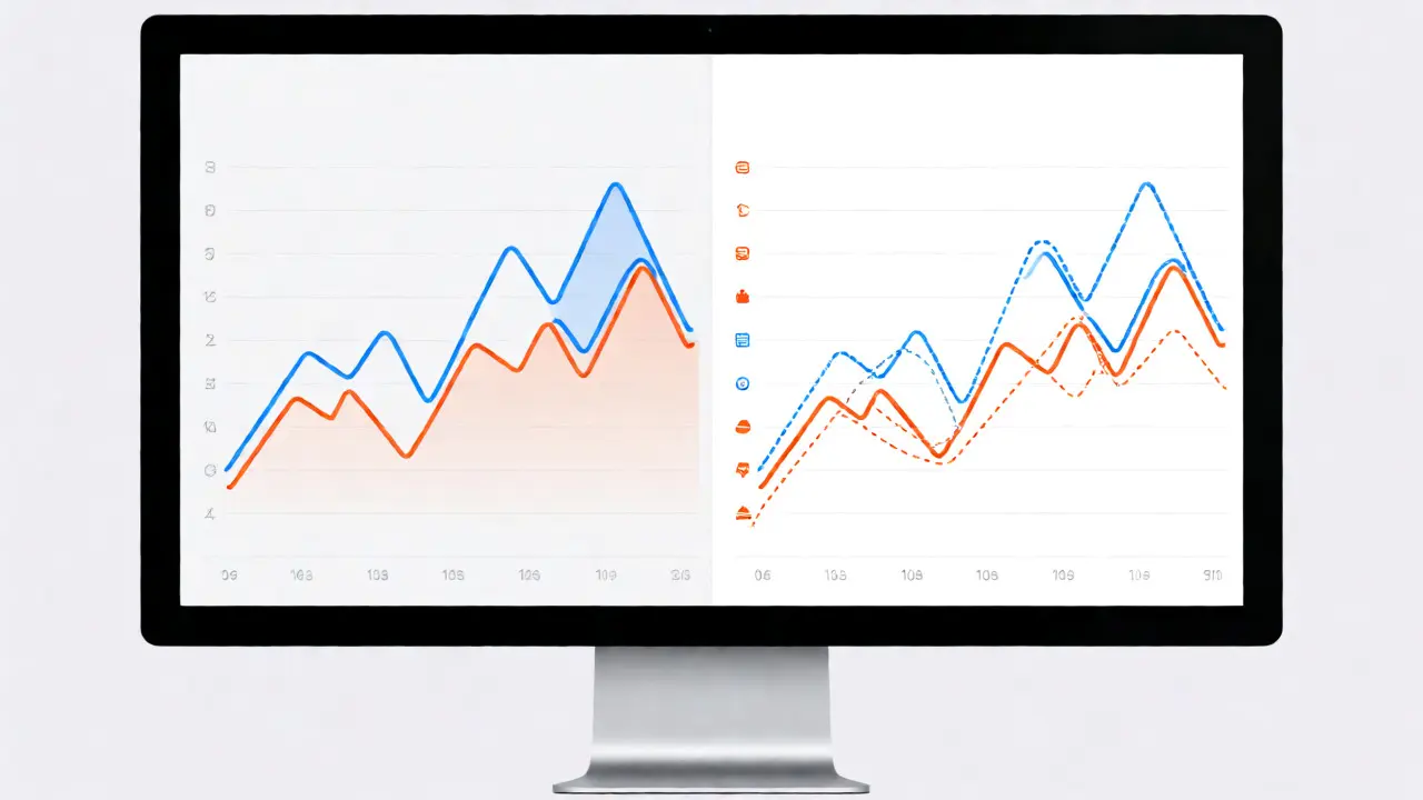
In Apple’s ecosystem, patterns are gaining traction in data visualization and complex controls. Consider the Charts framework in SwiftUI. It allows you to assign specific stroke styles and dash patterns to different data series. If you’re plotting sales vs. expenses, don’t just make one line blue and one line orange. Make one solid and one dashed. Now, even if both lines appear as similar shades of gray to a color-blind user, the distinction remains clear.
This principle extends to buttons and toggles. A toggle switch usually relies on green (on) and gray (off). Add a checkmark icon or a distinct position indicator. For segmented controls, consider adding subtle background textures or borders that differ between selected and unselected states, ensuring the state is obvious without color interpretation.
Implementing Accessibility Features in Development
How do you actually implement this? You don't need to reinvent the wheel. Apple provides robust APIs to test and apply these considerations during development.
First, use Xcode’s Accessibility Inspector. It simulates various types of color blindness directly in your simulator. You can view your app through the lens of protanopia, deuteranopia, and tritanopia instantly. If your critical information disappears or becomes ambiguous in these modes, your design needs work.
Second, leverage Dynamic Type and VoiceOver together. While not strictly about color, larger text often requires layout adjustments that also accommodate pattern-based indicators. Ensure that any pattern you add doesn’t interfere with screen reader announcements. For example, if a chart bar has a stripe pattern, VoiceOver should still read the value clearly, perhaps mentioning the category name explicitly rather than relying on a legend that requires visual scanning.
| Cue Type | Effectiveness for CVD | Implementation Effort | Example in Apple Apps |
|---|---|---|---|
| Color Only | Low | Minimal | Standard Map Pins (can be confusing) |
| Icon + Color | High | Moderate | App Icons, Tab Bar Items |
| Pattern + Color | Very High | High | SwiftUI Charts, Grid Layouts |
| Text Label | Highest | Variable (Space) | Settings Toggles, Form Fields |
Case Study: Maps and Data Visualization
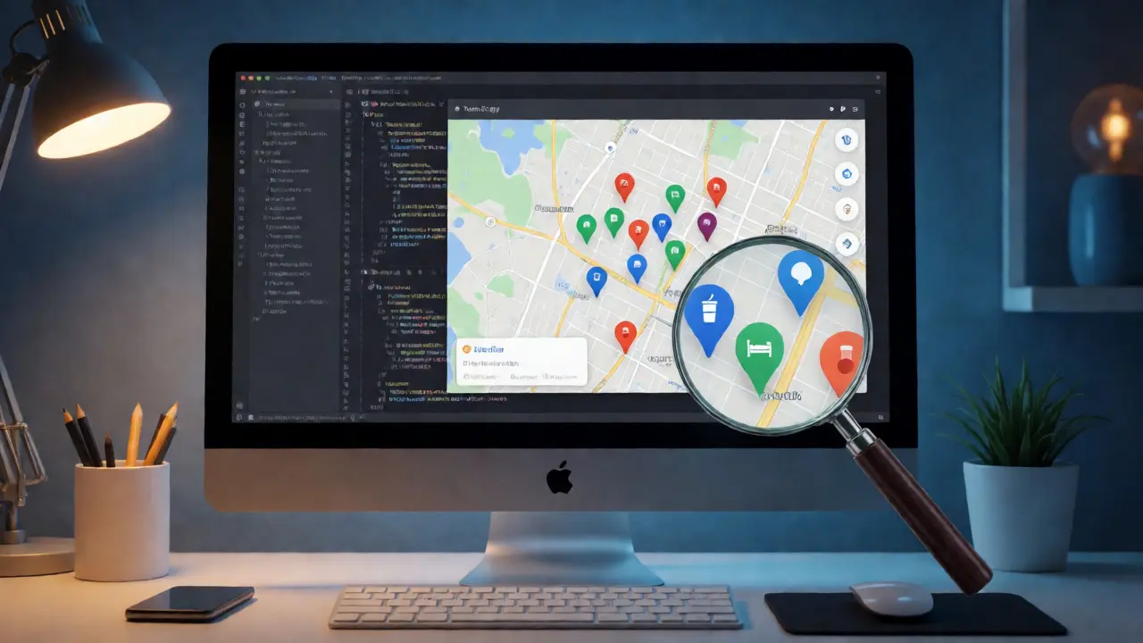
Let’s look at Apple Maps. Early versions relied heavily on colored pins for points of interest. Today, pins include icons-a coffee cup for cafes, a bed for hotels. This is a classic "icon + color" strategy. Even if the pin is red, the shape tells you it’s a hotel. If the pin is blue, the shape tells you it’s a park.
Data visualization is where patterns shine brightest. Imagine a pie chart showing market share. If you use six slices with distinct colors, a user with severe CVD might see only two distinguishable groups. By applying unique hatch patterns to each slice, you restore individuality to each segment. Apple’s SwiftUI Chart API makes this surprisingly easy. You can define a ChartStyle that applies different dash lengths or widths to different categories, ensuring that the legend corresponds not just to color swatches, but to pattern samples.
Testing Your App for Color Independence
Don’t wait until beta testing to check for color dependency. Here is a quick checklist for designers and developers:
- The Squint Test: Step back from your monitor and squint until details blur. Can you still tell which element is selected? If not, your contrast or weight differentiation is too low.
- Grayscale Simulation: View your app in grayscale. All information must remain accessible. If a button changes from blue to gray when clicked, but looks identical to a disabled button in grayscale, you have a problem.
- Check System Settings: Go to Settings > Accessibility > Display > Color Filters on an iPhone or Mac. Turn on "Deuteranomaly" and navigate your app. Does the flow break?
- Review Legends: In charts, ensure legends describe the pattern, not just the color. "Blue line" is bad. "Dashed line" is good.
Remember, accessibility isn't a feature you bolt on at the end. It's a constraint that drives better design. When you design for color blindness, you often improve clarity for everyone, including users looking at screens in bright sunlight or on older displays with poor color accuracy.
Frequently Asked Questions
What are semantic tints in iOS development?
Semantic tints are named colors provided by the operating system (like UIColor.systemBlue) that automatically adjust their appearance based on context. Unlike static hex codes, semantic tints respond to Light/Dark mode, high contrast settings, and other accessibility features, ensuring consistent usability across different user configurations.
Do I need to remove all color from my app for accessibility?
No, you do not need to remove color. Color is powerful for branding and emotional impact. The goal is to ensure color is never the only method of conveying information. Always pair color with secondary cues like icons, text labels, shapes, or patterns so that the information remains accessible if the color perception fails.
How can I test my app for color blindness without special hardware?
You can use Xcode’s built-in Accessibility Inspector to simulate various forms of color vision deficiency directly in the simulator. On physical devices, you can enable Color Filters in the Accessibility settings under Display. Additionally, many browser extensions and online tools allow you to upload screenshots of your UI to preview them through different color-blindness filters.
Are patterns effective in small UI elements?
Yes, but scale matters. Fine patterns like dense cross-hatching may disappear at small sizes or on lower-resolution screens. For small buttons or icons, simple shape variations (e.g., a circle vs. a square) or distinct icons are often more effective than intricate patterns. Reserve complex patterns for larger areas like charts, cards, or headers.
Does Dark Mode affect color blindness accessibility?
Dark Mode changes the luminance and saturation of colors, which can help some users reduce glare but might confuse others if contrast levels drop too low. Using semantic colors ensures that your app maintains appropriate contrast ratios in both modes. However, always verify that your non-color cues (icons, patterns) remain visible against dark backgrounds, as thin strokes can sometimes vanish in low-light conditions.