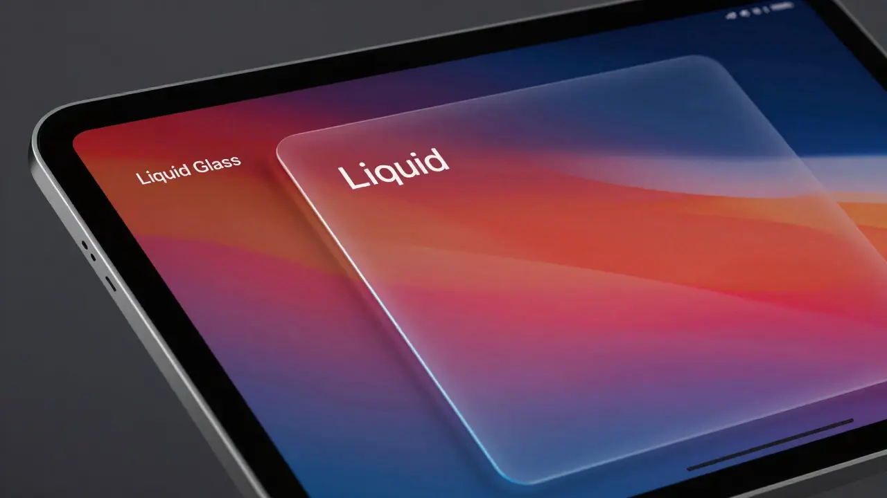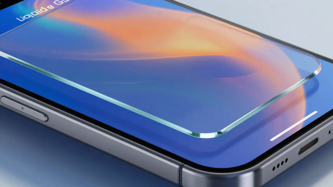

Imagine opening an app on your iPhone and feeling like you’re looking through a sheet of thick, high-quality glass. That’s the core promise of Liquid Glass, Apple’s latest visual design language introduced in iOS 19, which replaces flat surfaces with dynamic, refractive materials that respond to light and depth. For developers building third-party applications, this isn’t just a cosmetic update; it’s a fundamental shift in how users perceive hierarchy, interaction, and content focus.
If you’ve spent the last decade designing for the "flat" era of iOS, Liquid Glass might feel disorienting at first. It demands a different approach to contrast, spacing, and asset creation. But get it right, and your app will feel like it belongs on the device rather than being pasted onto it. Get it wrong, and your interface will look muddy, unreadable, or strangely out of place against the new system backdrop.
Understanding the Physics of Liquid Glass
To design effectively for this aesthetic, you have to stop thinking about colors as solid blocks and start thinking about them as materials. Liquid Glass is not a simple blur effect applied over content. It is a complex rendering technique that simulates refraction, reflection, and absorption of light.
The system uses three primary layers to achieve this effect:
- Refraction: The way light bends as it passes through the material. This creates subtle distortions in the background elements visible behind the glass surface.
- Reflection: Specular highlights that move dynamically based on the device’s orientation and the user’s touch point.
- Transmission: The amount of light that passes through the material, determining the opacity and clarity of the underlying content.
Unlike the previous "vibrancy" effects in iOS, which simply desaturated and blurred the background, Liquid Glass preserves color fidelity while adding depth. This means your text and icons need to be designed with higher precision because they are now floating above a live, moving canvas rather than sitting on a static gray background.
Key Design Principles for Third-Party Developers
When adapting your existing app to support Liquid Glass, you don’t necessarily need to redesign every screen from scratch. However, you do need to adjust your adherence to specific principles to ensure readability and consistency.
1. Embrace Dynamic Contrast
In flat design, you picked a white text color and used it everywhere. In Liquid Glass, contrast is relative. If your glass panel is placed over a dark part of the wallpaper, the text inside needs to be brighter. If it’s over a bright area, the text might need to be darker or have a stronger drop shadow. Use the built-in UIVisualEffectView variants specifically tuned for Liquid Glass, which automatically adjust their tint based on the underlying content.
2. Reduce Visual Noise Because the glass itself adds texture and movement, adding too many decorative elements inside the app can make the interface feel cluttered. Strip away unnecessary borders, heavy shadows, and redundant dividers. Let the glass material do the work of separating sections. If you find yourself using a thin line to separate two lists, ask if the change in glass intensity is enough to create that boundary.
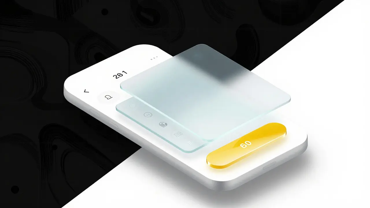
3. Prioritize Content Hierarchy Through Depth Instead of using size alone to indicate importance, use layering. Primary actions should sit on the most prominent glass layer, often with a higher saturation or brightness. Secondary information can recede into a more transparent, muted glass layer. This creates a natural z-axis that guides the user’s eye without relying on rigid grid lines.
Technical Implementation: Assets and Code
From a development standpoint, Liquid Glass changes how you prepare your assets. Vector assets (PDFs and SVGs) are now non-negotiable for icons and small UI elements. Raster images (PNGs) will look pixelated when scaled up by the refraction engine, especially on ProMotion displays with higher pixel densities.
Here is a practical checklist for updating your asset pipeline:
- Convert all icon sets to vector formats. Ensure your PDFs contain no embedded raster data.
- Update your color palettes. Avoid pure black (#000000) and pure white (#FFFFFF). Instead, use near-black and near-white values that allow the glass tint to show through slightly. This prevents harsh edges that break the illusion of transparency.
- Test on both Light and Dark Mode wallpapers. Liquid Glass behaves differently depending on the ambient light simulation. A design that looks crisp on a dark abstract wallpaper might become washed out on a bright photo-based wallpaper.
- Use the new SF Symbols variants. Apple has released updated symbol weights that are optimized for the thicker strokes required by the glass refraction effect. These symbols maintain legibility even when distorted by the lens effect.
In code, you’ll likely interact with the new UISystemMaterial enums. The old .thin and .regular materials are still present, but the new .liquidGlassLight and .liquidGlassDark variants offer better performance and accuracy. Always prefer these system-provided materials over custom blur implementations, as they are optimized for the GPU and handle edge cases like scrolling and animation much more smoothly.
Common Pitfalls and How to Avoid Them
Even experienced designers stumble when transitioning to this new paradigm. Here are the most frequent mistakes we see in early beta builds of third-party apps:
| Mistake | Why It Fails | Best Practice |
|---|---|---|
| Using solid backgrounds for modals | Breaks immersion; feels like a sticker on top of the glass world | Use a semi-transparent liquid glass layer for all modal sheets and popovers |
| High-saturation accent colors | Colors bleed through the glass and cause visual vibration | Desaturate brand colors by 10-15% when used inside glass containers |
| Heavy drop shadows | Conflicts with the inherent depth cues of the glass material | Rely on the material’s natural shading; use only subtle inner shadows if necessary |
| Static blur values | Looks fake and doesn't respond to user interaction | Let the system handle dynamic blur adjustments based on scroll velocity |
One particularly tricky issue is the "halo effect." When you place text directly on a highly refractive glass surface, the edges of the letters can appear to glow or vibrate due to the chromatic aberration simulated by the renderer. To fix this, increase the font weight slightly or add a very faint, tight stroke around the text. This anchors the typography to the surface without killing the transparency.
Accessibility Considerations
Transparency is beautiful, but it can be a nightmare for accessibility if not handled correctly. Users with low vision may struggle to distinguish between the foreground content and the background wallpaper, especially if the wallpaper has high-frequency patterns.
Always provide a fallback mode. If a user increases the text size to "Largest," the system automatically reduces the transparency of Liquid Glass panels to improve contrast. Your app should respect this behavior and not override it with fixed opacity values. Additionally, test your app with VoiceOver enabled. The glass effects are purely visual, but the hit targets for buttons must remain consistent. Don’t let the visual expansion of a button due to the glass effect confuse the accessible frame.
Finally, consider users with motion sensitivity. While Liquid Glass involves subtle parallax movements, some users find any movement distracting. Ensure that animations associated with the glass material (like the sliding highlight) can be disabled via the standard "Reduce Motion" setting in iOS Accessibility preferences.
Frequently Asked Questions
Does Liquid Glass require a specific chip?
Yes, the full visual fidelity of Liquid Glass relies on the Neural Engine and GPU improvements found in the A17 Pro and later chips. On older devices, the system falls back to a simplified blur effect that lacks real-time refraction calculations. Your app should degrade gracefully, ensuring that the simplified version remains readable.
Can I customize the glass thickness?
Not directly. Apple controls the base material properties to ensure consistency across the OS. However, you can influence the perceived thickness by adjusting the saturation and opacity of the content behind the glass. Higher saturation in the background makes the glass appear thinner and clearer, while lower saturation makes it appear thicker and more frosted.
How does Liquid Glass affect battery life?
The impact is minimal on modern hardware. The refraction calculations are offloaded to the GPU, which is highly efficient at parallel processing. However, if you implement custom shader effects on top of the system glass, you may see a slight increase in power consumption. Stick to system-provided materials to keep battery drain negligible.
Do I need to redesign my entire app?
No. Most apps can adopt Liquid Glass by swapping out their background views for the new system materials and adjusting their color palettes. Major structural changes are rarely needed. Focus on refining the details-contrast, spacing, and asset quality-rather than rebuilding the layout architecture.
Is Liquid Glass available on iPadOS and macOS?
Yes, the design language is unified across Apple platforms. However, the implementation differs slightly. On iPadOS, the glass effects are more pronounced due to the larger screen real estate. On macOS, the effects are subtler to accommodate window management and multitasking. Your app should adapt its glass intensity based on the platform it is running on.