
Imagine you are having a heart attack. Your hands are shaking, your vision is blurring, and you can barely lift your arm. Now imagine trying to navigate a complex menu on a tiny screen while this is happening. If the interface requires three taps and a scroll, it fails. This is the core tension in designing Apple Watch as a medical-grade health device: balancing rich data with extreme simplicity under stress.
For years, we treated wearables as fitness trackers-counting steps and calories. But since the FDA cleared the Apple Heart Study and subsequent irregular rhythm notifications, the watch has shifted roles. It is now a diagnostic tool. This shift demands a complete overhaul of UI patterns. We aren't just displaying numbers; we are guiding behavior during critical moments. Let's look at how current design choices handle safety and insight, and where they still fall short.
The Physics of Panic: Why Standard UI Fails
Standard mobile interfaces assume a calm user. You have time to read, decide, and tap. In a medical event, that assumption breaks. The Digital Crown and side button are physical anchors, but touch targets become impossible when fingers are cold or trembling. Designers must prioritize recognition over recall. You shouldn't have to remember which icon means "Emergency SOS." It should be obvious.
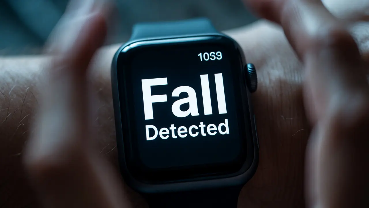
Consider the Fall Detection feature. When triggered, the watch doesn't just show a notification. It starts a countdown. This is a brilliant UI pattern because it removes decision fatigue. You don't need to figure out if you should call 911; the system asks you to confirm or cancel. If you do nothing, it calls. This passive interaction model is crucial for safety. It respects the user's potential inability to act actively.
Haptics as the Primary Language
Vision is often compromised during health events. Haptics-the vibration engine inside the watch-are not just alerts; they are information carriers. Apple uses distinct haptic patterns to differentiate between types of warnings. A gentle tap might mean "stand up," while a sharp, repeated buzz signals an abnormal heart rate. This differentiation relies on muscle memory. Users learn what each vibration means without looking at the screen.
However, there is a risk of alarm fatigue. If every health metric triggers a vibration, users start ignoring them. Effective design here requires context awareness. Does the watch know you are sleeping? Is your heart rate elevated because you are exercising or resting? The UI must suppress non-critical alerts during high-activity states to preserve trust. When the alert finally comes, it needs to feel significant. That significance is built through restraint.
| Interaction Type | Use Case | Cognitive Load | Safety Priority |
|---|---|---|---|
| Passive Monitoring | Fall Detection, AFib Notifications | Low (System initiates) | High (Automatic escalation) |
| Active Confirmation | Medication Reminders, Water Intake | Medium (User taps) | Medium (Preventative) |
| Data Exploration | Trends View, ECG PDF Export | High (Scrolling, Reading) | Low (Post-event analysis) |
Visualizing Complexity Without Clutter
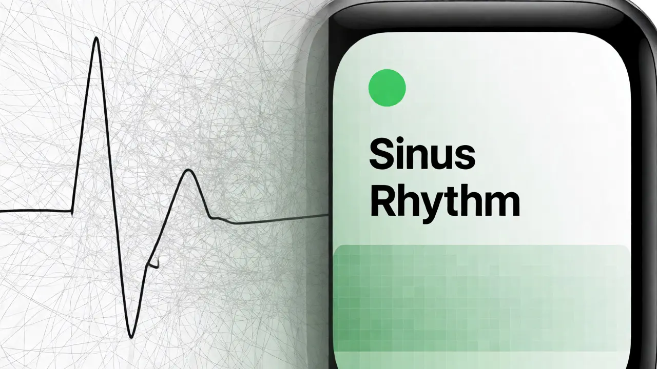
Medical data is dense. An electrocardiogram (ECG) waveform looks like a scribble to the untrained eye. Showing raw data on a 40mm screen is useless. Instead, Apple uses abstraction. They convert complex waveforms into simple status labels: "Sinus Rhythm" or "High Heart Rate." This translation layer is the most important part of the UI. It acts as a filter, removing noise so the user sees only what matters.
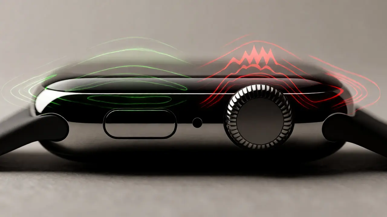
Color plays a massive role here. Red isn't just for errors; it's reserved for immediate threats. Green indicates stability. Yellow suggests caution. But color blindness affects about 8% of men. Good design doesn't rely on color alone. Icons and text labels must reinforce the message. If a graph turns red, it should also display an exclamation point or change shape. Redundancy saves lives in interface design.
The Trust Gap: False Positives and Anxiety
Here is the uncomfortable truth: no sensor is perfect. Optical heart rate sensors struggle with dark skin tones and tattoos. Wrist movement creates artifacts that mimic arrhythmias. These false positives create anxiety. A user might rush to the ER only to find their heart was fine. Over time, this erodes trust in the device.
To mitigate this, the UI must communicate uncertainty. Instead of saying "You have AFib," it should say "Irregular Rhythm Detected." This subtle wording change shifts the burden from diagnosis to detection. It tells the user, "Something is off, check with a doctor," rather than "You are sick." Clear disclaimers within the app help manage expectations. Transparency about limitations builds long-term credibility better than pretending to be infallible.
Integration with Healthcare Systems
A health device is useless if the data stays on the wrist. The real value lies in sharing insights with doctors. Currently, exporting data via PDF is clunky. Doctors prefer structured digital records. Future UI improvements will likely focus on seamless integration with Electronic Health Records (EHR). Imagine tapping a button to send last week's sleep and heart rate data directly to your cardiologist's portal.
This requires standardization. Formats like HL7 FHIR are becoming common, but the consumer-facing UI hasn't caught up yet. We need interfaces that simplify consent management. Who gets to see my heart data? My spouse? My doctor? Insurance company? Toggling these permissions should be intuitive, not buried in five layers of menus.
Designing for Aging Populations
Most early adopters were young tech enthusiasts. But the primary users of health monitoring are older adults. Their visual acuity and motor skills differ significantly. Small fonts and thin lines fail this demographic. High contrast modes exist, but they aren't always default. Designers must consider larger touch targets and clearer typography as baseline requirements, not accessibility add-ons.
Voice control offers another path. For someone with arthritis, speaking "Start ECG" is easier than pinching and zooming. Siri integration needs to be robust in noisy environments. Context-aware voice commands could allow users to query their health history verbally. "What was my heart rate yesterday?" provides instant answers without navigating charts.
Future Patterns: Predictive vs. Reactive
Current health UIs are mostly reactive. They tell you what happened. The next frontier is predictive. Algorithms are getting better at spotting trends before symptoms appear. Imagine a notification that says, "Your resting heart rate has risen 15% over three days. Consider resting." This proactive approach changes the relationship from surveillance to partnership.
But prediction brings new ethical questions. Who owns the algorithm? What happens if the AI misses a sign? The UI must remain transparent about its confidence levels. A percentage score next to a warning helps users gauge reliability. As these systems mature, the design challenge shifts from displaying data to interpreting probability.
Why does my Apple Watch give false heart rate readings?
Optical sensors use light to detect blood flow. Factors like loose straps, dark skin pigmentation, tattoos, and excessive arm movement can interfere with light reflection. Tightening the strap and keeping the wrist steady during measurement usually improves accuracy. The device may also flag low-confidence readings in the Health app.
How does Fall Detection work without internet?
Fall Detection relies on the accelerometer and gyroscope inside the watch, which work offline. However, to automatically call emergency services, the watch needs connectivity. If you have a cellular model, it can make calls independently. GPS models require a paired iPhone nearby to initiate the call.
Can I share my health data with multiple doctors?
Yes, using the Health app on iOS, you can export specific datasets as PDFs or CSV files to share manually. Some healthcare providers integrate directly with Apple HealthKit, allowing secure, automatic syncing of approved metrics like heart rate, steps, and medication logs. Always review privacy settings before enabling third-party access.
Does wearing a watch constantly affect skin health?
Continuous wear can cause contact dermatitis or irritation due to sweat and friction. Apple recommends cleaning the band regularly and letting the skin breathe occasionally. Newer bands made from breathable materials help reduce moisture buildup. If irritation persists, consult a dermatologist.
Is the ECG feature accurate enough for medical diagnosis?
The single-lead ECG is FDA-cleared for detecting atrial fibrillation (AFib) but cannot detect heart attacks. It is a screening tool, not a diagnostic one. Physicians use it as supplementary data alongside clinical exams. Always consult a healthcare professional for definitive medical advice.