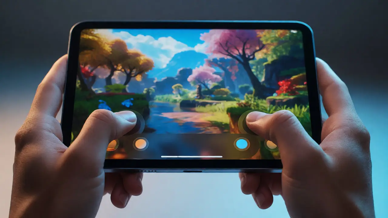

You’ve probably played a mobile game where you couldn’t see the character because your thumbs were covering half the screen. It’s frustrating, right? That is exactly what happens when designers treat an iPad like a giant iPhone or a shrunken console controller. The iPad game interface isn’t just about scaling up graphics; it’s about rethinking how humans interact with digital spaces using their hands.
Here is the core problem: iPads have massive screens, but our fingers haven’t grown. If you slap on-screen buttons everywhere, you create visual clutter that kills immersion. If you hide everything, players get lost. The sweet spot lies in touch-first controls that respect the device’s unique geometry and the user’s natural ergonomics. This guide breaks down how to build interfaces that feel invisible yet responsive, keeping the focus on gameplay rather than UI management.
The Geometry of the Thumb Zone
Let’s talk physics. An iPad Pro 12.9-inch has a diagonal measurement of roughly 325mm. Your thumb can comfortably reach about 70-80% of that area without shifting your grip. Everything else requires awkward stretching or two-handed operation. Most developers ignore this, placing critical "Jump" or "Fire" buttons in the top corners. Big mistake.
Research from Apple’s Human Interface Guidelines suggests that the bottom third of the screen is the primary interaction zone for single-handed use, while the middle band suits two-handed gaming. But here is the nuance: gamers often hold iPads in landscape mode. In this orientation, the left and right edges are prime real estate for movement sticks and action buttons, respectively. The center should remain clear for the game world.
- Primary Zone: Bottom 40% of the screen (high frequency actions).
- Secondary Zone: Middle vertical strips (contextual menus, pause).
- Tertiary Zone: Top 20% (rarely used info, score displays).
If you put a health bar at the very top, players will constantly look away from the action to check it. Move it closer to the player’s avatar or integrate it into the environment itself. This reduces cognitive load and keeps eyes on the battlefield.
Beyond Buttons: Gestures as Primary Input
Buttons are safe, but they take up space. Gestures are sleek, but they can be ambiguous. The best iPad games blend both. Think about Monument Valley. You don’t tap buttons to move; you drag paths. This removes the need for a virtual joystick entirely. The interface disappears because the input method is the game mechanic.
However, gestures fail when speed matters. In fast-paced shooters like PUBG Mobile, dragging takes too long. Tapping is instant. So, how do you decide? Use gestures for navigation and state changes (opening maps, switching weapons) and taps for immediate reactions (shooting, jumping). This hybrid approach prevents on-screen overload by hiding non-critical functions until needed.
Consider the "pull-to-refresh" pattern. On a web page, it’s standard. In a game, pulling down might mean crouching or looking behind. Context is king. Always provide visual feedback-a ripple effect or a subtle sound-when a gesture registers. Without it, players wonder if their swipe worked or if the game froze.
Haptics: The Silent Feedback Loop
Touchscreens lack physical resistance. When you press a plastic button on a controller, you feel a click. On glass, you feel nothing. This disconnect causes input errors. Enter Haptic Feedback via Core Haptics. Apple introduced this feature to simulate tactile sensations through vibration patterns.
Don’t just buzz the phone for every hit. That gets annoying fast. Use haptics to signal distinct events. A light tick for selecting a menu item, a heavy thud for taking damage, and a rapid pulse for low ammo. These cues allow players to keep their eyes on the screen while receiving status updates through their fingertips. It’s a subtle design choice that significantly improves accessibility and immersion.
| Event Type | Haptic Pattern | User Perception |
|---|---|---|
| Menu Selection | Light Tap | Acknowledgment |
| Weapon Fire | Medium Kick | Action Confirmation |
| Damage Taken | Heavy Thud | Urgency/Pain |
| Victory | Rhythmic Pulse | Celebration |
Visual Hierarchy and Minimalist HUDs
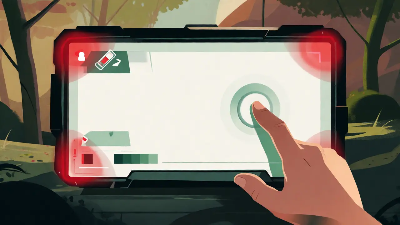
A Heads-Up Display (HUD) tells you your health, ammo, and objectives. On PC, there’s plenty of room. On iPad, space is precious. The trend is moving toward diegetic UIs-elements that exist within the game world. Instead of a mini-map in the corner, maybe your character checks a wristwatch. Instead of a health bar, the screen edges turn red when you’re hurt.
When you must use traditional overlays, stick to high-contrast icons. Avoid text-heavy instructions. Players scan, they don’t read. Use color coding consistently: green for friendly, red for enemy, yellow for neutral. If you need to show complex stats, tuck them behind a toggleable overlay. Press once to see details, press again to return to pure gameplay. This "progressive disclosure" keeps the initial view clean.
Also, consider aspect ratios. iPads come in various sizes, from the compact iPad Mini to the expansive iPad Pro. Test your layout on all of them. A button placed 10 pixels from the edge might be fine on a Mini but unreachable on a Pro held with one hand. Use relative positioning (percentages) rather than fixed pixel values to ensure consistency across devices.
Accessibility Matters More Than You Think
Touch interfaces exclude users with motor impairments if not designed carefully. Small targets are hard to hit. Accidental touches trigger wrong actions. To combat this, follow Apple’s recommendation: minimum target size of 44x44 points. But for gaming, go bigger. Make action buttons 60x60 points or larger.
Add customization options. Let players resize buttons, change opacity, or remap controls. Some players prefer a left-handed layout; others want auto-fire instead of manual tapping. By offering these settings, you widen your audience. Accessibility isn’t just a checkbox; it’s a design principle that often leads to better usability for everyone. For instance, larger buttons reduce fatigue during long sessions, benefiting able-bodied players too.
Common Pitfalls to Avoid
Even experienced designers fall into traps. Here are three common ones specific to iPad gaming:
- The Ghost Touch Problem: Placing buttons too close together causes accidental presses. Leave at least 10 points of padding between interactive elements.
- Occlusion Blindness: Designers forget their own hands block the screen. Playtest with actual devices, not just emulators. You’ll be shocked at how much of the UI your thumb covers.
- Ignoring Orientation Lock: Some games force portrait mode, which wastes horizontal space on an iPad. Allow landscape rotation unless the gameplay strictly demands vertical scrolling.
Another issue is latency. Wireless controllers pair easily, but touch inputs have inherent delay due to processing. Optimize your code to register touches instantly. Delay feels like lag, even if the network is perfect. Prioritize local input responsiveness over graphical fidelity if you have to choose.
Case Study: Why 'Sky: Children of the Light' Works
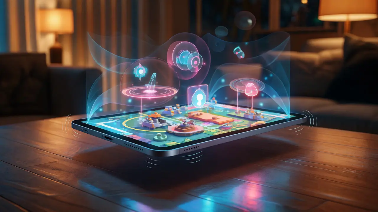
Look at Sky: Children of the Light. There are no visible buttons during flight. You tilt the device to steer and tap anywhere to flap wings. The interface is essentially zero. Yet, it’s incredibly intuitive. How? Because the controls map directly to physical movements. Tilting the tablet mimics banking an aircraft. Tapping mimics flapping arms.
This direct mapping reduces the learning curve. Players understand the controls before reading a tutorial. Contrast this with a strategy game that requires swiping, pinching, and tapping specific icons. While necessary for complexity, it demands more mental energy. The key takeaway: match the input method to the metaphor of the action. If the action is physical, make the input physical.
Future Trends: Spatial Audio and AR Integration
As iPads become more powerful, interfaces will evolve beyond flat screens. Augmented Reality (AR) uses the camera to overlay game elements on the real world. In AR games, the "interface" is often the physical space around you. You might walk around a table to find a hidden item. Here, the challenge shifts from screen layout to spatial awareness.
Spatial audio also plays a role. Sounds coming from specific directions help locate enemies without visual cues. This allows designers to remove radar circles from the screen, relying on auditory signals instead. Combining haptics, spatial audio, and minimalist visuals creates a multi-sensory experience that feels less like playing a video game and more like inhabiting a world.
Frequently Asked Questions
Do I need to support stylus input for iPad games?
It depends on the genre. For drawing apps or puzzle games like Goodnotes or Notability, yes. For action or shooter games, usually no. Most gamers prefer finger touch for speed. However, supporting Apple Pencil for menu navigation or precision aiming can add value for niche audiences.
How large should touch targets be on an iPad?
Apple recommends 44x44 points, but for gaming, aim for 60x60 points or larger. Fingers are imprecise, especially during intense gameplay. Larger targets reduce frustration and accidental inputs, improving overall user satisfaction.
Is haptic feedback essential for good iPad game design?
While not strictly essential, it greatly enhances immersion. Since touchscreens lack physical resistance, haptics provide crucial confirmation that an action registered. Properly implemented haptics can reduce the need for visual notifications, freeing up screen space.
Should I use a virtual joystick or directional pad?
Virtual joysticks offer analog control, which is better for racing or stealth games requiring precise movement. Directional pads (D-pads) are simpler and less prone to drift, making them suitable for platformers or RPGs. Test both with your target audience to see which feels more natural.
How does screen size affect UI placement?
Larger screens require careful placement of controls within the "thumb zone." On an iPad Pro, buttons placed at the extreme edges may be difficult to reach with one hand. Use relative positioning and allow users to customize control layouts to accommodate different hand sizes and holding styles.