
Sending a design to a developer isn't just about sharing a link; it's about translating a vision into a set of instructions that leave zero room for guessing. For teams building on Apple platforms, the stakes are higher because users expect that polished, native feel that comes from strict adherence to system standards. If your engineers are constantly asking "how much padding is here?" or "what font weight is this?", your handoff process is broken.
The goal here is to move from a "throw it over the wall" mentality to a shared language. When you align your specs with how Apple Human Interface Guidelines (HIG) work, you stop fighting the platform and start using it to your advantage. Whether you're building for iOS, macOS, or watchOS, the handoff should feel like a blueprint, not a puzzle.
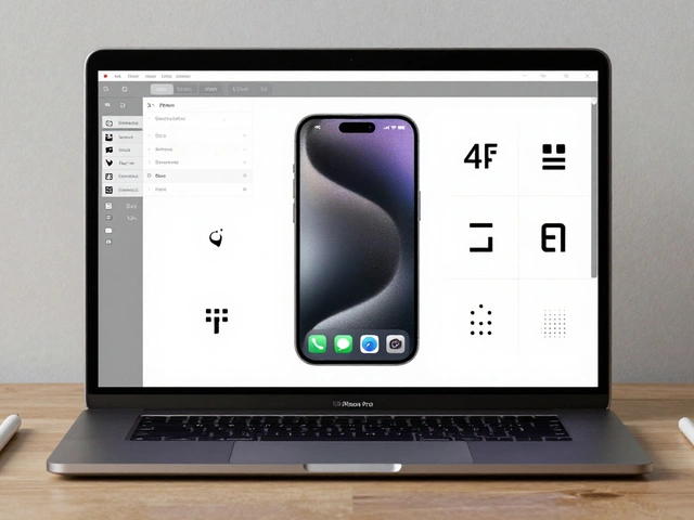
The Engineering Page Strategy
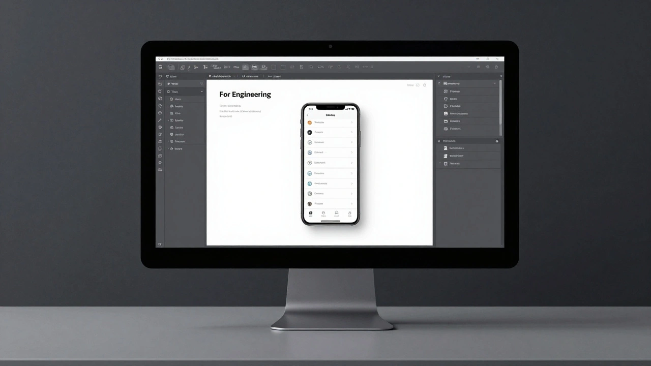
Stop letting developers hunt through your working files. Your design workspace is for experimenting; the handoff space is for truth. A proven way to handle this in Figma is to create a dedicated page labeled "🚢 For Engineering".
By isolating the final specs on their own page, you eliminate the noise of outdated iterations. This is where you place your final screens, prototypes, and detailed redlines. Instead of long email chains, encourage your developers to use Figma's comment feature directly on the visuals. This keeps the conversation tied to the specific pixel in question, making it much easier to track what was decided and why.
Perfecting Redlines and Spacing
Redlines are the signal that the design is "frozen" and ready for build. But modern redlining isn't about drawing a thousand lines and arrows; it's about providing a logic system. Start by relinking every attribute to your design system. Every text layer should point to a typography style, and every color to a design token.
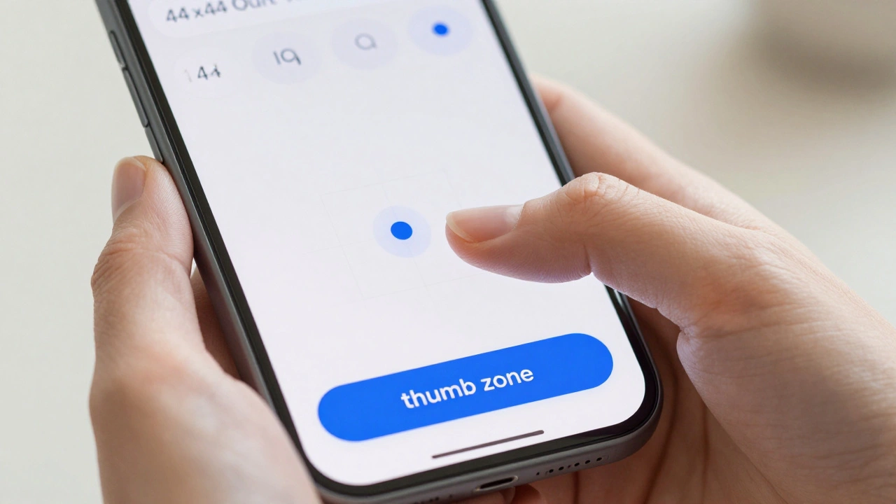
For spacing, stop relying on the developer to click around with the inspect tool. Instead, use spacer components. By placing a visible spacer on top of the design, you provide immediate visual confirmation of the gap. A smart rule of thumb is the 8px grid. For example, a "Spacer 2" equals 16px (2 × 8 = 16). This creates a mathematical predictability that developers love because it translates directly into clean code.
| Token Name | Calculation | Pixel Value | Typical Use Case |
|---|---|---|---|
| Spacer 1 | 1 × 8px | 8px | Tight grouping of related elements |
| Spacer 2 | 2 × 8px | 16px | Standard margin between blocks |
| Spacer 4 | 4 × 8px | 32px | Section separation |
| Spacer 6 | 6 × 8px | 48px | Large layout breathing room |
Handling Typography and Dynamic Type
One of the biggest pitfalls in Apple design handoff is ignoring Dynamic Type. In the iOS ecosystem, text must scale based on user accessibility settings. If you provide a static redline for every single font size, you're wasting time and confusing your team.
The best practice is to prepare your specifications at the "Large" default size. As long as you follow the established HIG principles for scalable text, you don't need separate redlines for every possible scale. If you're using custom fonts, don't just send a .ttf file. Provide the style name-such as "brandLargeTitle" or "brandTitle1"-and specify the font weights. If a specific weight isn't available in the custom font, clearly define the substitution weight to avoid unexpected rendering issues in the app.
Naming Conventions That Save Time
Messy layers and files are the fastest way to frustrate a developer. A standard naming convention is the difference between a predictable build and a day spent on Slack asking for the "latest" file. First, kill the versioning in your filenames. Never name a file "Search_screen_v2_final_FINAL.png". Simply call it "Search.png". The version control should happen in the tool (like Figma's version history), not in the filename.
Consistency in casing is just as critical. Whether you choose Sentence case, lower case, or kebab-case, pick one and stick to it across every single screen. When your layer names match the component names in the code, the friction disappears. This is similar to how the Lyft Product Language (LPL) uses nicknames for attributes that have direct code equivalents, creating a unified vocabulary between the two disciplines.
The Final Handoff Checklist
Before you notify the engineering team that the designs are ready, run through this audit. A missing piece of information during the build phase is ten times more expensive to fix than during the design phase.
- Dedicated Space: Is there a "For Engineering" page with only final, approved designs?
- Attribute Linking: Are all colors and typography linked to the design system tokens rather than hex codes?
- Spacing Logic: Are spacer components placed on the design using the 8px base?
- Platform Coverage: Have you redlined for all required sizes (iOS, Android, Web)?
- Component Audit: Have you replaced all raw shapes with actual design system components?
- Edge Cases: Are empty states, error messages, and loading views clearly defined?
- Animation Specs: Are complex transitions described with timing and easing details?
Closing the Loop with Development Partners
Even the best documentation can't replace a conversation. Schedule a formal handoff meeting. This isn't a presentation where you talk at the developers; it's a walkthrough where they poke holes in the design. Let them tell you if a certain interaction is too costly to implement or if a layout won't work with specific screen dimensions.
Once the project is in motion, distinguish between "technical changes" and "visual tweaks." If you change a screen layout but the components remain the same, the developer can usually find everything they need in Figma's Inspect mode. In these cases, a simple tag and a comment are enough. But if you change the underlying logic or the user flow, that requires a new conversation and a fresh look at the specs.
Do I need to provide redlines for every Dynamic Type size?
No. You should design and spec your typography at the default "Large" size. If you follow Apple's Human Interface Guidelines for scalable text, the system handles the scaling automatically. Creating separate redlines for every size is generally unnecessary and creates redundant work.
What is the best way to communicate spacing to engineers?
The most effective method is using spacer components placed directly on top of the UI. Base these on an 8px grid (e.g., Spacer 1 = 8px, Spacer 2 = 16px). This allows developers to see the spacing instantly without having to manually measure pixels in the Inspect panel.
How should I name my files for a clean handoff?
Avoid versioning in filenames (like "_v2" or "_final"). Use clean, descriptive names like "Search.png" and maintain consistent casing (e.g., always use Sentence case) across all files and layers to ensure predictability for the engineering team.
Where should I host my handoff specifications in Figma?
Create a separate page explicitly labeled "🚢 For Engineering". This keeps the working design area separate from the final specifications, preventing developers from accidentally implementing an outdated iteration of a screen.
What information is required for custom font handoff on iOS?
You must provide the specific style name (e.g., "brandTitle1") and the corresponding font weights. If certain weights aren't available in the custom font, you must provide the necessary substitutions so the developer knows which fallback weight to use.

Categories
Popular Articles