
There has always been this awkward middle ground in technology where devices try to be two things at once but end up being neither quite right. You’ve probably held an iPad and felt that exact tension-it’s too small to replace a laptop for complex work, yet too big to fit comfortably in a pocket like an iPhone. This isn’t just a hardware problem; it’s a design challenge. Creating an experience that balances phone simplicity with the raw capability needed for pro workflows requires a fundamental shift in how we think about screen space.
If you approach an iPad app like a zoomed-in phone app, you fail. If you copy a desktop Windows or macOS window directly, it feels stiff and unwieldy. The bridge between these extremes is built on what Apple officially calls iPad design principles. These aren't just arbitrary aesthetic choices; they are strategic decisions meant to make a slate-sized touch device feel natural whether you’re holding it with hands or resting it on a desk with a keyboard attached.
The Three Pillars of Stability
Before you touch a single line of code or draw a pixel, you have to understand the foundation. Apple’s Human Interface Guidelines rest on three core legs: hierarchy, harmony, and consistency. Think of these as the structural beams of your application. Without them, the interface collapses under its own weight when users try to navigate large amounts of data.
| Principle | Purpose | Execution Example |
|---|---|---|
| Hierarchy | Visual organization of controls | Elevated buttons distinguish themselves from background content |
| Harmony | Alignment with hardware/software concentric design | Animations flow naturally between apps and OS features |
| Consistency | Unified behavior across platforms | Gestures match system expectations regardless of device size |
Hierarchy is crucial because the iPad screen offers so much more real estate than a phone. On a small display, you hide everything behind a single menu button to save space. On an iPad, hiding primary functions creates friction. Hierarchy means arranging elements so that the most important content sits at eye level without scrolling. Controls shouldn’t just sit flatly on top of content; they need to lift visually so users know exactly what to tap. When done correctly, the structure becomes obvious immediately, preventing the user from having to hunt for basic tools.
Harmony deals with the connection between what the software does and how the physical device responds. Apple emphasizes a "concentric design" strategy. This means the interaction radius of a finger tap aligns with the animation scale of the interface. For example, if you pinch to zoom a photo, the image should move within the bounds of the screen edge, mirroring how the hardware constrains movement. It eliminates that uncanny feeling of digital interfaces floating disconnected from the glass surface beneath them.
Consistency ties everything together. If a user swipes back on one page to return to the previous view, they expect the same gesture to work in every other part of your app. Inconsistent patterns force the brain to learn a new set of rules for every screen transition, which kills productivity. By adopting platform conventions, your app feels like part of the operating system rather than a foreign object dropped onto it.
Rethinking Navigation: The Power of Sidebars
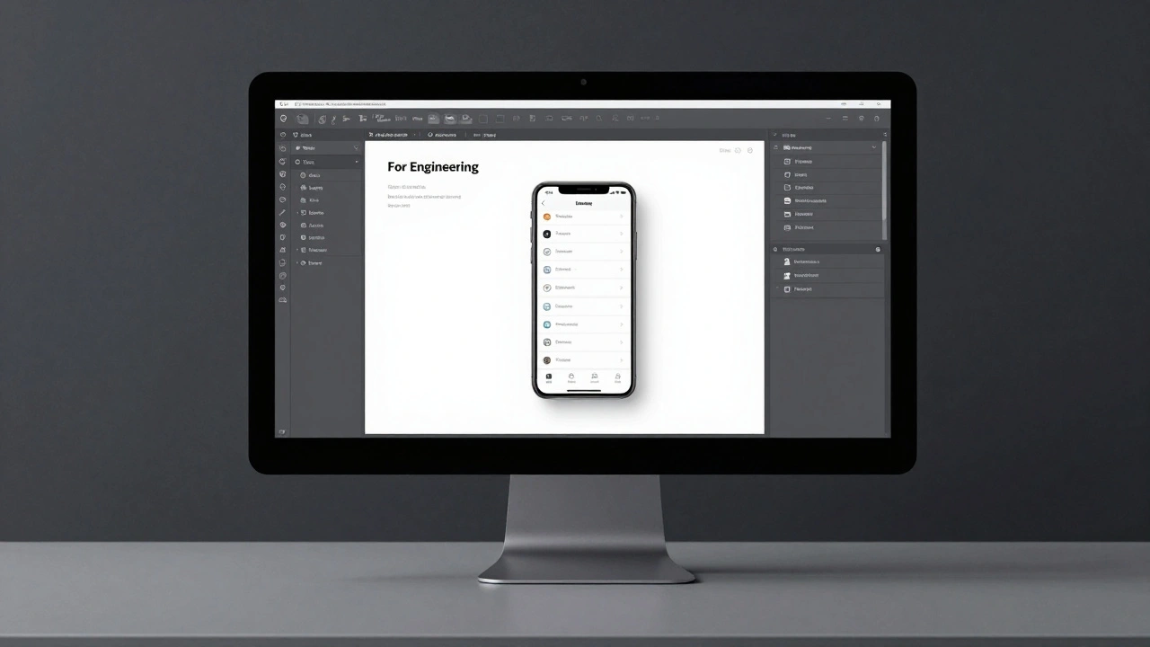
One of the biggest mistakes developers make when moving from iPhone to iPad is simply stretching the tab bar navigation. A tab bar works great for phones because the screen width forces you to choose between a few distinct modes. But on an iPad, restricting users to a bottom strip wastes the vertical space available for quick access. Instead, the design philosophy shifts heavily toward sidebars.
A sidebar acts as a fast-track navigation tool. Unlike a modal overlay that covers your work, a sidebar lives alongside the content. This allows users to switch between folders, settings, or projects without losing their place in the current document. The key here is making sure the sidebar incorporates top-level content directly. You want users to see their documents listed there, accessible with a single tap, eliminating the need to open a drawer, find a folder, then click a file.
This is not just a preference; it is a requirement for efficiency. When working with a split-screen layout, a collapsed sidebar ensures that both your workspace and your navigation remain visible. You can collapse it to focus on reading, then swipe it out instantly when you need to jump to a new topic. This flexibility is the essence of bridging the gap between a simple phone workflow (linear) and a complex computer workflow (multitasking).
Filling the Canvas: Adaptive Layouts
Screen size changes the math of design. An iPhone app might show a list of items vertically. Simply duplicating that layout on an iPad often leaves massive gaps of white space that look like unfinished design rather than intentional negative space. The rule here is simple: show more content. If the device supports it, expand the view.
Adaptive layout design isn’t just about snapping to the center of a larger monitor. It means creating layouts that respond to specific size classes and orientation changes. An app running full-screen on a 12.9-inch model behaves differently than one running in a slide-over window on the same device. You must support the fluid nature of the operating system.
This leads us to the concept of Size Classes a grid system used to define the horizontal and vertical space available to an app. Designers need to create architectures that don't break when rotated. If a user flips their device from portrait to landscape, the app should rearrange itself intelligently rather than squashing content. For instance, a chat app might move the list of contacts to the left column in landscape mode instead of hiding them behind a hamburger menu. This utilizes the extra width effectively without overwhelming the user.
Furthermore, users should be able to see primary content without needing to zoom or scroll horizontally. This principle applies to everything from email clients to video editors. Horizontal scrolling is a sign of wasted space on modern wide screens. By ensuring content fits the container, you respect the user's cognitive load and keep their attention focused on the task at hand.
Bridging Input Methods
The most confusing aspect of iPad design for newcomers is supporting multiple input types simultaneously. A phone is purely touch-first. A Mac is predominantly keyboard and mouse. The iPad demands that you support all of these states harmoniously.
You cannot treat the keyboard as an afterthought. When a Bluetooth keyboard connects, your app should immediately reveal shortcuts and enable trackpad gestures. Users shouldn't have to manually search for menus to toggle this "computer mode." The system handles the detection, but your app must expose the capabilities. This includes ensuring that cursor behaviors mimic desktop expectations-double-click to select words, dragging corners to resize panels-while remaining responsive when the user switches back to touch.
Apple Pencil a high-precision stylus that enables drawing, writing, and detailed editing on iPad introduces another layer of complexity. While standard tapping works fine for general UI, precise interactions require specific handling for the stylus. Tooltips should appear near the tip, not obscured by fingers. Gestures designed for the Pencil allow for creative workflows, such as sketching inside an app interface that also accepts typing commands. Ignoring this hybrid capability misses the point of why someone bought a premium tablet in the first place.
Multitouch remains the base layer, but it needs to coexist with these precision tools. If a user starts typing with a connected keyboard, the virtual keyboard should disappear automatically to reclaim screen space. Conversely, if the keyboard disconnects, the soft keyboard must reappear instantly. These transitions must be seamless, reinforcing the idea that the device adapts to the user, not the other way around.

Typography and Visual Clarity
It’s easy to get lost in the mechanics of buttons and windows, but readability matters immensely on larger screens. Apple updated their design system recently, refining typography to strengthen clarity and structure. This involves incorporating bolder typefaces and adjusting alignment rules.
On an iPad, you have enough room to use distinct font weights to separate headings from body text. Left-alignment often improves readability in critical moments like alerts or onboarding screens compared to centered text, which is common on phones but harder to read quickly on large displays. This refinement applies across the ecosystem, meaning the typography on your app should feel consistent whether viewed on a handheld or docked scenario.
Alert dialogs, for example, should utilize the extra vertical space to display explanatory text clearly without truncation. Users shouldn't have to squint or dismiss alerts blindly because the text is cut off. By adapting the visual language to the screen size, you ensure that information transfer remains efficient.
Practical Implementation Steps
How do you actually build this? Here is the reality of execution. You don't port an iOS app and call it a day. You need to architect the layout from the ground up with constraints in mind.
- Start by auditing your navigation. If you rely heavily on stacked views, redesign for a master-detail pattern (Sidebar + Content view) that works in landscape.
- Ensure your interface scales. Test your app in split-view mode regularly. Does the UI break when the window shrinks to half the width?
- Map your keyboard shortcuts early. Even if you plan to add them later, reserve the command structure in your architecture so you don't have to refactor later.
- Leverage dynamic colors. iPadOS uses a distinct dark mode and dynamic island integration logic. Your app should mirror these environmental cues.
- Minimize modal overlays. Use flyouts or slides instead of blocking pop-ups whenever possible to maintain context.
Remember that the goal isn't to build a mini-Mac. It is to build something better than either. By filling the screen, navigating via sidebars, and respecting multiple inputs, you create a tool that is approachable like a phone but capable like a computer.
Should iPad apps be identical to iOS apps?
No. iPad apps should leverage the larger screen real estate and multitasking capabilities. Using the exact same layout as an iPhone app on an iPad often wastes space and limits functionality.
When should I use a Sidebar versus a Tab Bar?
Use Sidebars when you need to manage lists of files, folders, or extensive content categories. Tab Bars are better reserved for switching between totally distinct modes of the app (like Home, Settings, Profile) that don't share persistent content lists.
Do I need to support the Apple Pencil separately?
Yes, while basic touches work, you should optimize for Pencil usage by enabling precision gestures and tool palettes to ensure professional workflows function correctly.
What happens if my app doesn't handle resizing well?
Users running the app in Split View or Slide Over will likely encounter broken layouts or unusable buttons. Testing with varied window sizes is essential to prevent frustration.
Is horizontal scrolling acceptable on iPad?
Generally, no. iPad screens are wide enough that you should fit content horizontally to avoid wasted space and improve usability during multitasking.