
Have you ever tapped a button on an iPhone only to feel like nothing happened? Or struggled to adjust a volume slider because the target was too small? These moments of friction usually stem from one place: ignoring the subtle rules that govern how users interact with Apple platforms is a family of operating systems including iOS, iPadOS, macOS, watchOS, and tvOS designed by Apple Inc.. Designing controls isn't just about making things look pretty; it's about respecting the physics and expectations of hundreds of millions of users. When you get it right, your app feels native. When you get it wrong, it feels broken.
The Foundation of Interaction
Controls are the bridge between user intent and system action. On Apple devices, this bridge has been refined since the first Macintosh in 1987 and the original iPhone in 2007. Today, whether you are building for iOS is the mobile operating system developed by Apple for its iPhone line of smartphones., macOS is the primary operating system for Apple's Macintosh computers., or watchOS is the operating system for the Apple Watch wearable device., the core principles remain consistent: clarity, deference, and depth. You aren't just drawing rectangles; you are defining touch targets that must account for human motor precision. The standard minimum hit target size is 44x44 points on touch screens. This isn't arbitrary. It aligns with the average width of a human fingertip, reducing error rates significantly compared to smaller targets.
In recent updates, particularly highlighted in WWDC25 sessions, Apple has moved toward a more unified visual language using "capsules" and "Liquid Glass" materials. This means buttons, sliders, and switches now share geometric DNA. Capsule shapes-rectangles with fully rounded corners-help create concentric layers of padding that guide the eye. If you are designing for edge cases, such as buttons near the screen border, remember that extra margin (often 16-20 points) prevents accidental taps during navigation gestures.
Buttons: The Primary Action Driver
Buttons are the most common control in any interface. They trigger discrete actions: saving a file, deleting an item, or starting a process. In SwiftUI is a declarative framework for building user interfaces across all Apple platforms, introduced in 2019., you use the `Button` view; in UIKit, it's `UIButton`. Regardless of the framework, the design rules are strict. Labels should be concise-typically 1 to 3 words. Why? Because screen real estate is precious, especially on smaller iPhones like the SE. Long labels truncate, confusing users.
Apple distinguishes button styles by emphasis:
- Filled buttons: High-emphasis primary actions. Use these for the main call-to-action on a screen.
- Bordered or tinted buttons: Secondary actions. They provide visual hierarchy without competing with the primary action.
- Plain text buttons: Low-emphasis actions, often used in menus or toolbars where space is tight.
A crucial detail often missed is state feedback. A button must clearly indicate when it is pressed, disabled, or selected. On macOS, pointer-based interactions allow for smaller targets (around 30x30 points), but on touch devices, sticking to the 44-point rule is non-negotiable for accessibility and usability. Also, avoid placing interactive elements flush against the very edge of the screen unless necessary, as this conflicts with system swipe gestures introduced in iOS 7.
Sliders: Managing Continuous Values
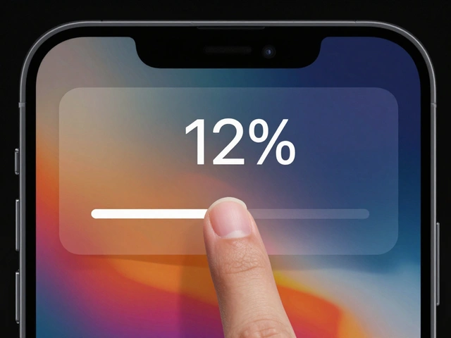
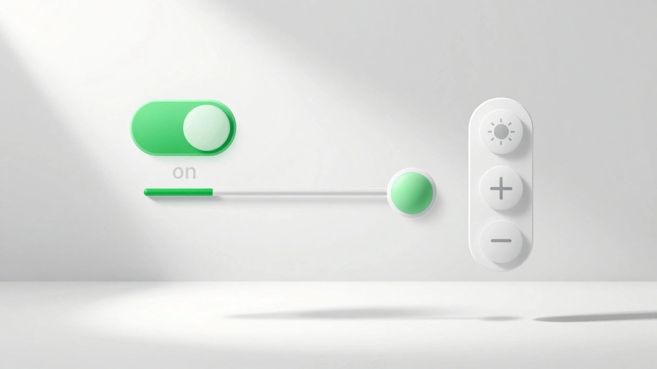
When do you use a slider? Only when you need to represent a continuous range or a large ordered set of values. Think volume, brightness, or opacity. A slider consists of a track and a thumb. The thumb is the draggable part, typically 28-32 points in diameter. The track itself should be thin, around 2-4 points, to keep the focus on the value being adjusted.
Here is a pro tip: always provide context. A bare slider is useless. Add icons-a speaker for volume, a sun for brightness-or numeric labels so users know what they are adjusting. Without context, users have to guess, which breaks flow. For discrete steps, limit the number of positions. Users cannot reliably tap more than 20-30 distinct spots on a 300-point track due to finger occlusion. If you need precise integer selection, consider a stepper instead.
Accessibility is critical here. VoiceOver users rely on rotor actions to adjust sliders. Ensure your code exposes adjustable traits with reasonable increments (e.g., 5% or 1 unit). Don't force a blind user to swipe 100 times to change a setting from 10% to 100%. Additionally, leverage haptics. Subtle vibrations when hitting min/max bounds or snapping to a step enhance the physical feeling of the interaction, a technique Apple has refined since the Taptic Engine arrived in the iPhone 7.
Switches (Toggles): Binary State Changes
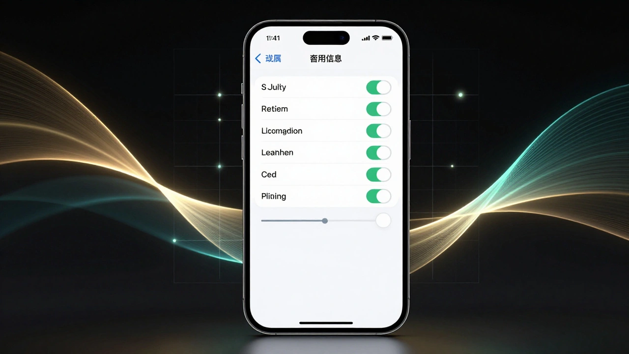
Switches, often called toggles in newer documentation, represent a binary on/off state. They are modeled after physical rocker switches. Visually, they consist of a track and a circular thumb. The standard size is approximately 51x31 points for the track and 28 points for the thumb. When off, the track is neutral gray; when on, it turns green (#34C759 in the SF Color palette).
The biggest mistake developers make is using switches for transient actions. Never use a switch to delete a photo or send an email. Switches are for persistent settings-Wi-Fi, Bluetooth, Dark Mode. The label next to the switch must clearly describe the feature being controlled. Do not put "ON" or "OFF" text inside the switch itself; the position of the thumb and the color change are sufficient indicators. In fact, putting text inside can cause layout issues on different screen sizes and violates modern HIG standards.
For accessibility, ensure your switch supports the "On/Off Labels" setting in iOS Accessibility options. This adds textual cues for users who may struggle to distinguish the thumb's position visually. Always pair the switch with a clear description of what happens when it is enabled or disabled.
Steppers: Incremental Adjustments
Steppers are less visible but vital for specific tasks. They increment or decrement a value in small steps, usually by ±1. You see them in quantity selectors for shopping carts or date pickers. In UIKit, this is `UIStepper`; in SwiftUI, it's the `Stepper` view. The default iOS stepper is about 94 points wide, containing two 44x44 point tap zones for minus and plus, separated by a thin divider.
Use steppers when the range is small (e.g., 0-10) and precision matters. Unlike sliders, steppers don't require dragging, making them easier for users with motor impairments. However, they take up more horizontal space. If you need to adjust a value quickly over a large range, a slider is better. If you need exact integers in a small range, a stepper wins. Remember, holding down the plus or minus button repeats the action at fixed intervals (typically starting after 0.5 seconds), so ensure your backend logic handles rapid updates gracefully without crashing.
| Control Type | Primary Use Case | Min Hit Target | Key Attribute |
|---|---|---|---|
| Button | Discrete actions (Save, Delete) | 44x44 points | Concise label (1-3 words) |
| Slider | Continuous ranges (Volume, Brightness) | Thumb: 28-32 pts | Contextual icons/labels |
| Switch | Persistent binary states (On/Off) | Track: 51x31 pts | Green/Gray color coding |
| Stepper | Small integer increments (Quantity) | Tap zones: 44x44 pts | Repeat rate on hold |
Visual Consistency and Materials
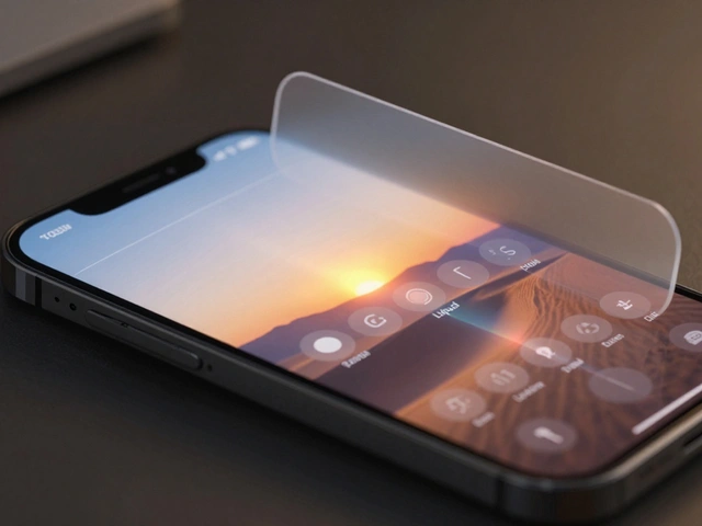
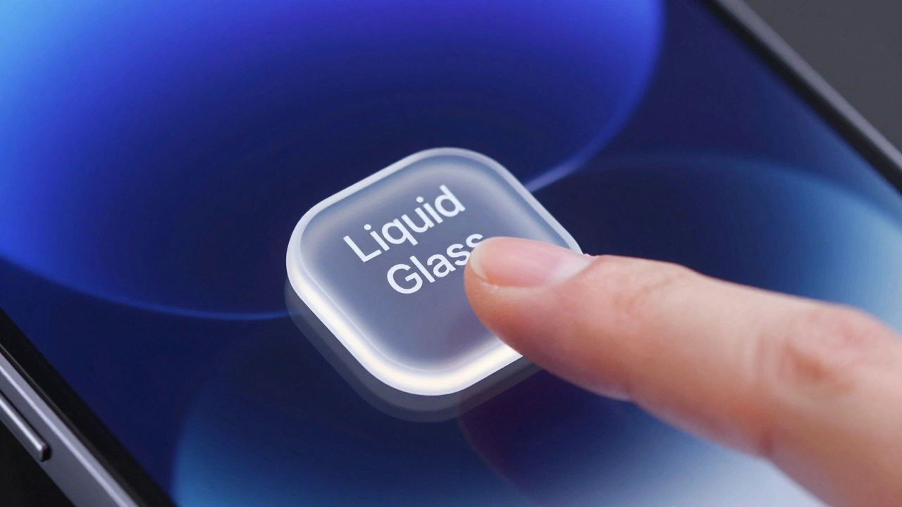
Apple’s design system relies heavily on materials to separate controls from content. This is known as "Liquid Glass" or vibrancy effects. Controls like toolbar buttons sit on top of a translucent layer, not directly on raw content. This ensures legibility regardless of the background image or video. As a designer, you shouldn't draw extra separator lines under pinned controls if the system already applies soft scroll edge effects. Mixing hard dividers with system blur creates visual clutter. Trust the system to handle the boundaries.
Furthermore, consistency across platforms builds trust. A toggle on an iPhone should behave exactly like a toggle on an iPad or Mac. Users expect this uniformity. Deviating from standard behaviors-like changing the drag direction of a slider or altering the tap response time of a button-creates cognitive load. Stick to the Human Interface Guidelines (HIG) unless you have a compelling reason to break the pattern, and even then, proceed with caution.
What is the minimum touch target size for iOS buttons?
The recommended minimum touch target size for buttons on iOS and iPadOS is 44x44 points. This size aligns with the average width of a human fingertip, ensuring ease of use and reducing tap errors. On macOS, where pointer input is used, targets can be smaller, around 30x30 points.
When should I use a slider versus a stepper?
Use a slider for continuous ranges or large sets of values, such as volume or brightness, where approximate positioning is acceptable. Use a stepper when you need precise integer adjustments within a small range, such as selecting a quantity of items from 1 to 10. Steppers offer better precision for small steps but consume more horizontal space.
Can I customize the appearance of UISwitch?
While you can customize colors and behavior programmatically, Apple strongly recommends against radically altering the visual appearance of switches. They are deeply ingrained in user mental models. Customizing them too much can confuse users and reduce accessibility. Stick to the standard green-on-gray aesthetic for maximum clarity.
How do I make my controls accessible to VoiceOver users?
Ensure all controls have clear accessibility labels. For sliders, expose the `adjustable` trait and define reasonable step increments (e.g., 5%). For switches, ensure the label describes the feature, not just the state. Test your app with VoiceOver enabled to verify that users can navigate and interact with controls efficiently without visual cues.
What is Liquid Glass in Apple's design system?
Liquid Glass refers to the translucent material effects used in Apple's UI to separate controls from underlying content. It evolved from earlier vibrancy and blur effects. This material ensures that buttons, bars, and other controls remain legible and visually distinct, regardless of the background content. It also contributes to the layered, depth-based aesthetic of modern Apple interfaces.