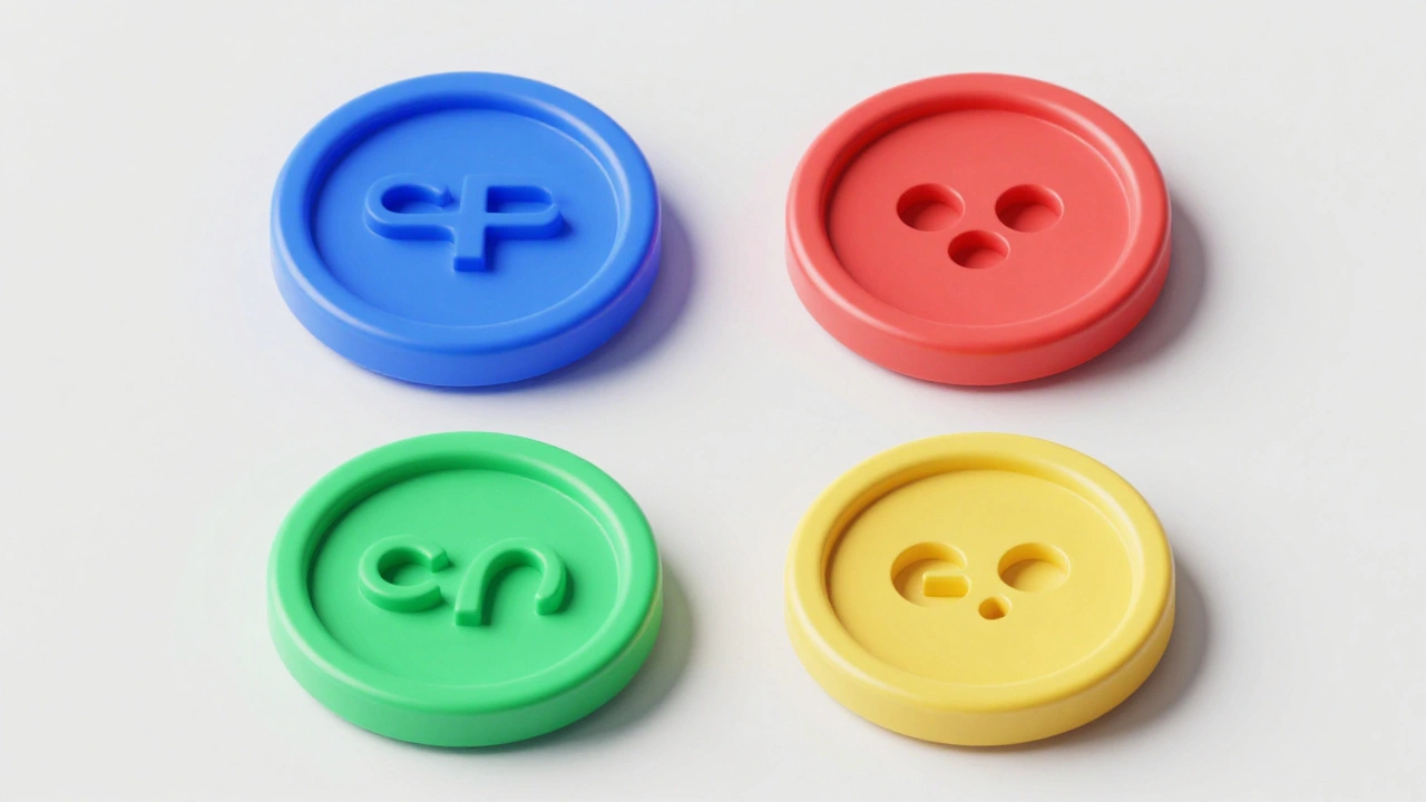

| Color | System Meaning | Typical Example |
|---|---|---|
| Blue | Primary Action / Interactive | Submit buttons, active links |
| Red | Destructive / Warning | Delete account, Remove item |
| Green | Success / Confirmation | Payment complete, Message sent |
| Yellow | Application Specific / Warning | Notes app, low battery alerts |
The Psychology of System Semantics
Apple relies on something called semantic color coding. Instead of picking colors because they look "nice," they assign specific meanings to hues. This creates a mental shortcut for the user. For instance, Apple's UI Color System is a systematized approach to visual communication that balances aesthetic consistency with functional clarity across all Apple platforms . When you see blue, your brain identifies it as "actionable." This is why buttons and icons for primary tasks are almost always blue across native apps.
Then there's the "destructive" palette. Red is strictly reserved for actions that can't easily be undone. If a button is red, it's a signal to stop and think. On the flip side, green is the universal sign for success. By sticking to these patterns, Apple ensures that a user who has never used a specific app before can still navigate it intuitively without needing a manual.
Mastering Contrast and Accessibility
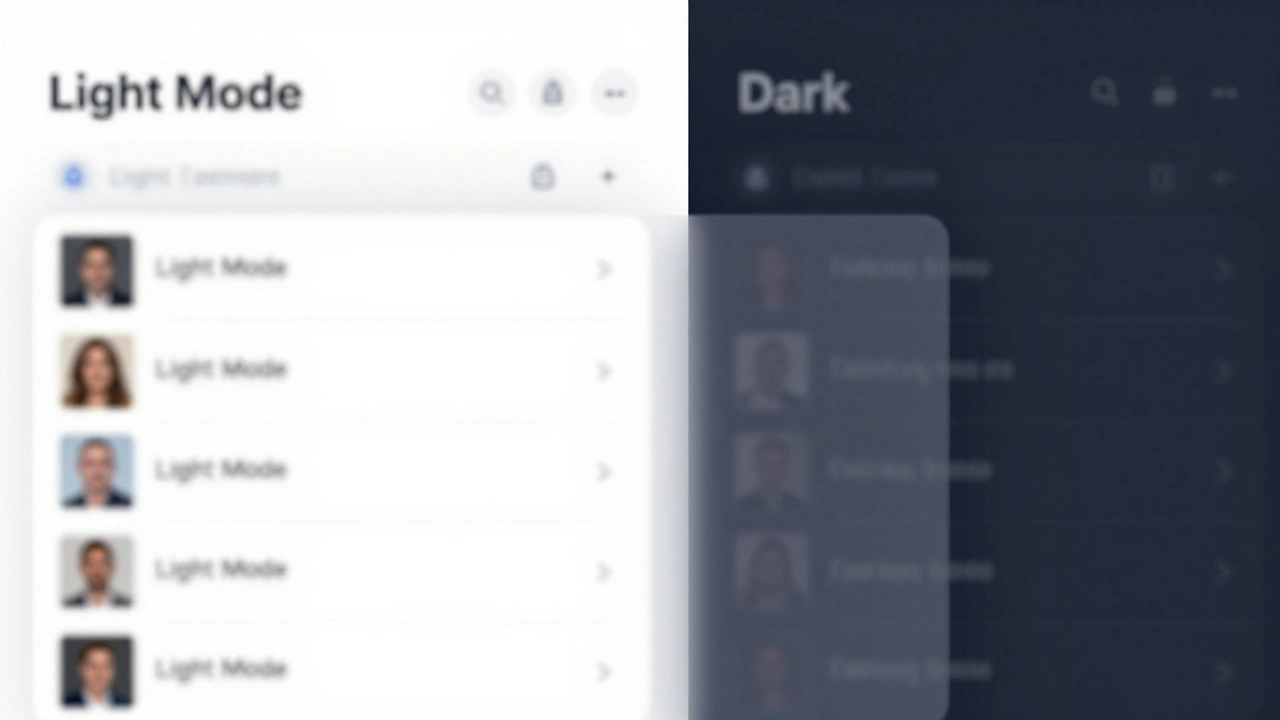
Color isn't just about meaning; it's about visibility. Apple is obsessive about contrast ratios to make sure everyone, including people with visual impairments, can use their devices. In dark mode, for example, they don't just flip white to black. They mandate a contrast ratio of 7:1 for small text elements. This ensures that the foreground content pops against the background without causing eye strain.
One of the biggest mistakes designers make is using absolute black (#000000) for dark interfaces. Apple explicitly avoids this. Pure black creates too much contrast, which can actually obscure details and make the screen feel "harsh." Instead, they use deep charcoal grays or dark blues. This subtle shift preserves the visual hierarchy and makes the transition between different layers of the UI feel smoother and more natural.
The Role of Neutral Tones and Hierarchy
If every element on a screen was a vibrant color, your eyes would tire in seconds. This is where neutral tones come in. Neutrals act as the "breathing room" of a design. They push the user's attention away from the decorative borders and toward the actual content. In a light UI, Apple suggests keeping backgrounds in the 90-100% white range. This prevents the interface from looking "muddy" or washed out, which often happens when designers use mid-range grays.
Hierarchy is established by brightness. Generally, the most important object on the screen should be the brightest or most saturated. By layering these tones, Apple creates a sense of depth. This is further enhanced by their use of Materials is a design system that allows color to transmit from background through foreground layers, creating a sense of spatial depth . Instead of flat colors, these materials use blurred transparency, allowing you to see the ghost of the previous screen, which helps you keep your bearings as you dive deeper into an app's menu.
Working with HSB vs RGB
When developers and designers build for Apple platforms, they often switch between color models. While RGB (Red, Green, Blue) is the standard for screens, HSB is a color model consisting of Hue, Saturation, and Brightness, which maps more directly to how humans perceive color . If you want to make a color "pop" more, it's much easier to increase the Saturation value in HSB than to guess which combination of Red and Blue will make it more vivid.
This approach allows for the creation of complementary palettes. By picking two colors opposite each other on the color wheel-like a deep blue and a bright orange-designers can create a high-dominance relationship. Usually, one color dominates the background, while the complementary color is used sparingly to highlight a single, critical call-to-action button.
Implementing Color in SwiftUI and UIKit
For those actually building the apps, Apple provides tools to automate these decisions. Through SwiftUI is Apple's modern declarative framework used to build user interfaces across all Apple platforms and UIKit is the legacy framework for building iOS interfaces using a programmatic approach , developers have access to predefined system colors. These aren't just static HEX codes; they are dynamic. When a user toggles Dark Mode, a system-defined "label color" automatically switches from black to white without the developer needing to write a single line of extra code.
Adding to this is the SF Symbols library, which provides thousands of consistent icons. These symbols aren't just shapes; they are designed to integrate perfectly with the San Francisco system font. Because they support full color customization and gradients, designers can tie their icons directly into the semantic color system-making a "trash" icon red or a "check-mark" icon green effortlessly.
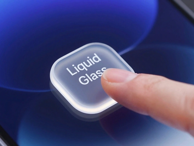
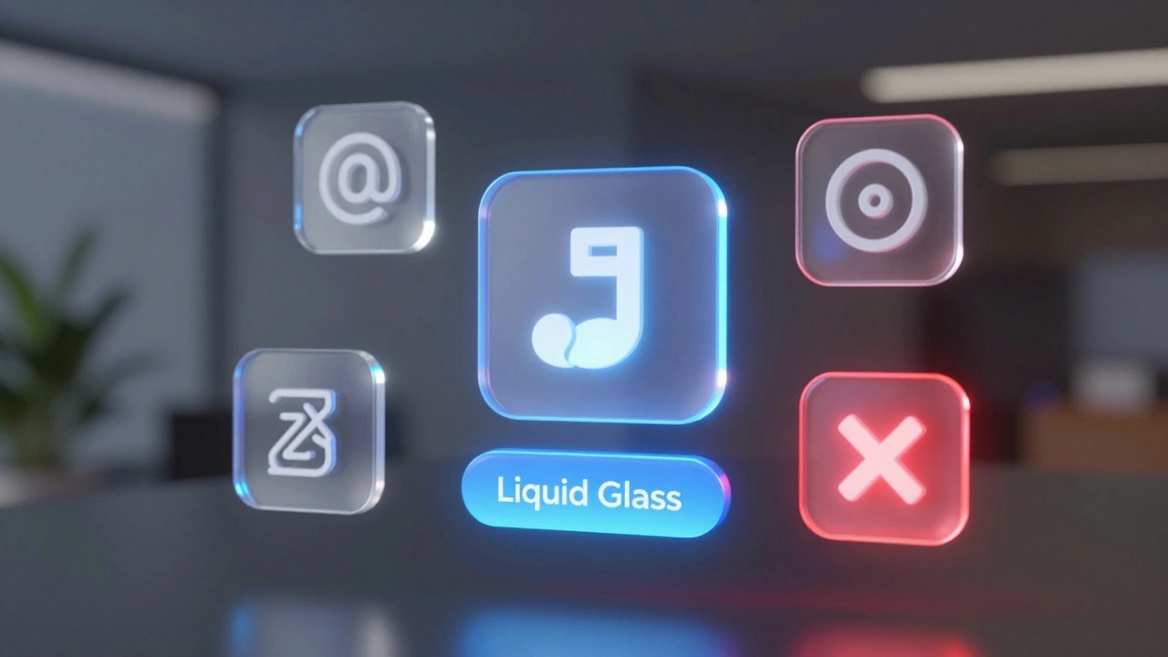
Future-Proofing with Liquid Glass and Dynamic Lighting
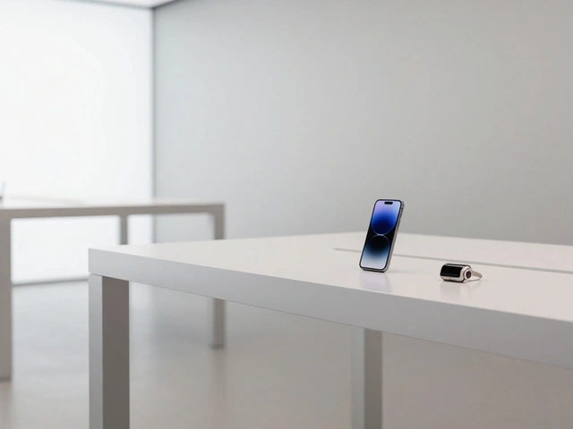
As Apple moves into spatial computing with visionOS, color is becoming even more complex. The introduction of the Icon Composer is a tool for creating layered, color-aware icons that respond to dynamic lighting and system appearance settings allows for the "Liquid Glass" aesthetic. Icons are no longer just flat images; they have depth and respond to the light in the user's actual physical environment.
This means color usage is shifting from 2D contrast to 3D lighting. A button might change its highlight color based on where the virtual light source is positioned. Despite this complexity, the core semantic rules remain: the primary action is still visually distinct, and destructive actions still carry a warning hue. The medium is changing, but the human psychology behind color remains the same.
Why does Apple avoid pure black in Dark Mode?
Pure black (#000000) creates an extreme contrast against bright text, which can lead to a "smearing" effect on OLED screens and cause significant eye strain. By using dark grays or deep blues, Apple maintains a soft but clear distinction between the background and the content, improving overall legibility.
What is the recommended contrast ratio for accessibility?
Apple suggests a contrast ratio of at least 7:1 for small text, especially when designing for dark mode. This ensures that the text is visually distinct from its background, making the app usable for people with low vision or those using their devices in high-glare environments.
What is the difference between RGB and HSB in UI design?
RGB describes color based on the intensity of Red, Green, and Blue light, which is how screens work. HSB (Hue, Saturation, Brightness) describes color based on how humans perceive it. HSB is generally preferred by designers because it's easier to adjust the "vibrancy" (saturation) or "lightness" (brightness) of a color without changing its base identity (hue).
How do semantic colors reduce cognitive load?
By assigning a consistent meaning to a color (e.g., Blue = Action, Red = Delete), users don't have to read and process every label on the screen. They can scan the interface and instantly understand the function of an element based on its color, which makes the experience feel faster and more intuitive.
What are "Materials" in the context of Apple's UI?
Materials are background effects that use blurring and transparency to create a sense of depth. Instead of a solid color, they allow the colors of the layer underneath to bleed through, which tells the user where they are in the app's hierarchy and prevents the interface from feeling like a series of flat, disconnected pages.