
When you open your iPhone and see an app with a glowing swirl or a floating brain icon, what do you really think? That it’s smart? Or that it’s trying too hard? Apple doesn’t let AI apps look like sci-fi movie posters. There’s a reason you don’t see glowing neural networks or robot hands in the App Store. Apple’s approach to AI is quiet, confident, and clear-and it starts with the icon.
Why Apple Hates Hype in AI Icons
Apple doesn’t market AI as a magic trick. It’s a tool. And tools shouldn’t look like carnival attractions. In 2025, Apple updated its Human Interface Guidelines with one clear message: clarity over spectacle. If your AI app’s icon looks like it belongs in a VR game from 2012, it won’t make the cut. The goal isn’t to show off how complex the technology is. It’s to show what the user gets out of it.Think about it: What does a user care about when they tap an AI app? Not whether it uses transformers or fine-tuned LLMs. They care about whether it writes better emails, finds their photos faster, or helps them focus. So the icon should reflect that. A writing assistant? A clean pen. A photo organizer? A subtle magnifying glass over a thumbnail. A voice assistant? A waveform, not a robot.
The Rules Apple Actually Enforces
Apple’s icon design rules haven’t changed much since 2017-but in 2025, they got stricter. Here’s what matters now:- No photos. Realistic images blur at small sizes. A photo of a person’s face? Unreadable at 29×29 pixels. A stylized silhouette? Perfect.
- No text unless it’s the brand name. The word "AI"? Gone. "Smart"? No. "Assistant"? Only if it’s part of the app’s actual name. The Calm app uses just a single letter "C"-and it’s instantly recognizable.
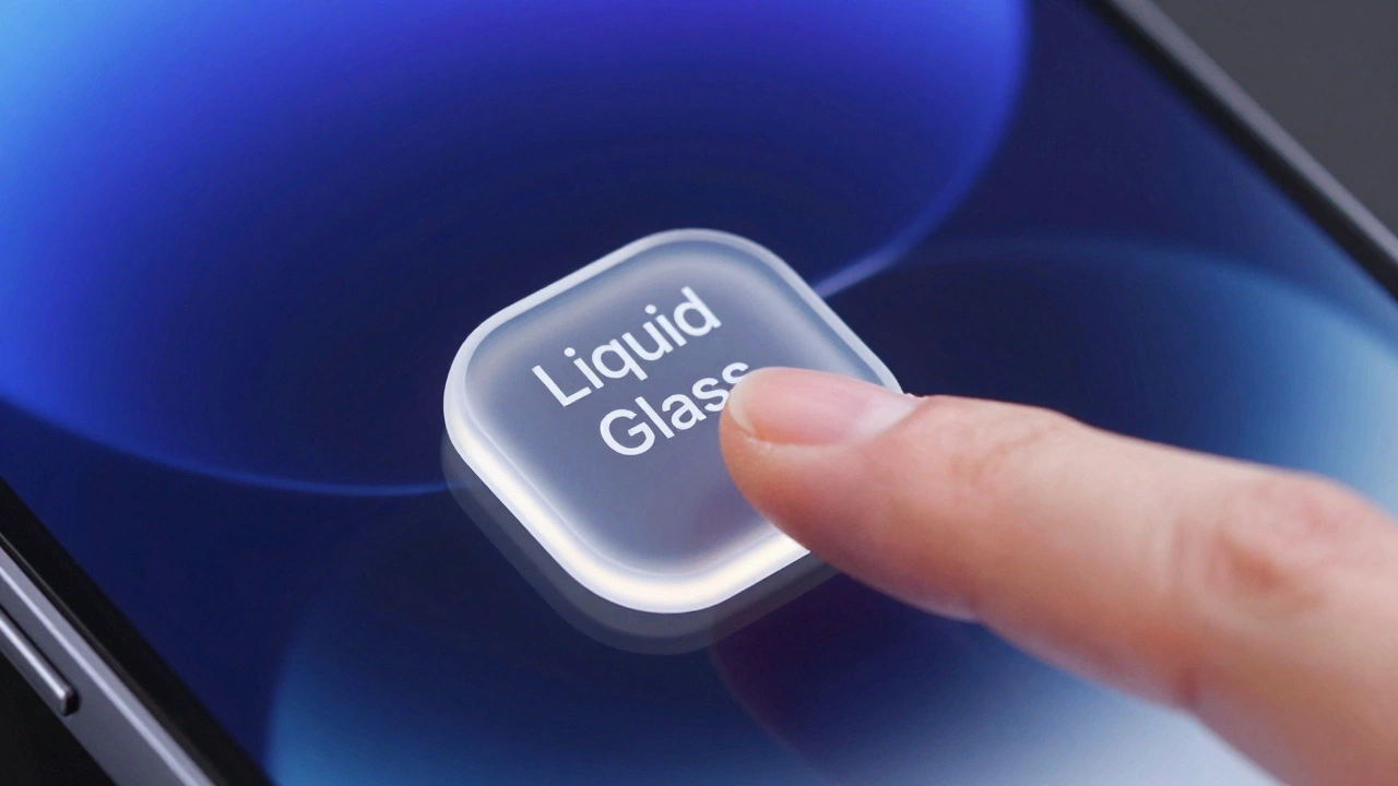
- No 3D objects. No floating cubes, no spinning gears, no glowing orbs. Apple’s icons are flat, frontal, and clean. Depth comes from translucency and shadows-not fake geometry.
- One main element. If your icon has more than one focal point, it’s cluttered. The Settings app uses a single gear. The Podcasts app layers a stencil of waves over a circle. Simple. Powerful.
- Consistent across all sizes. Your icon must look good on your Apple Watch, iPhone lock screen, and Mac menu bar. If it falls apart at 40 pixels, it’s not ready.
These aren’t suggestions. They’re requirements. Apps with icons that break these rules get rejected during App Store review. No exceptions.
How AI Icons Should Look (Real Examples)
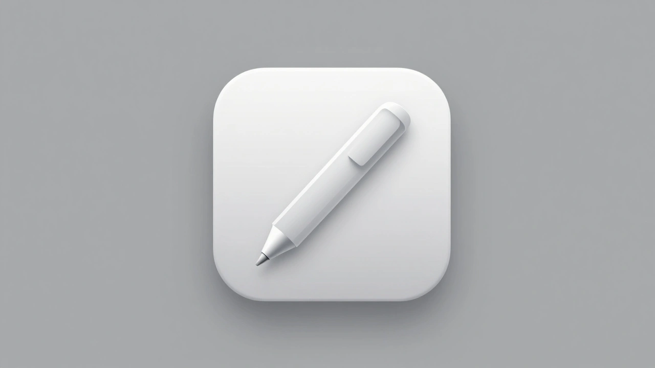
Apple doesn’t publish "AI icon guidelines," but you can see how it’s done by looking at apps that actually made it through:- WriteAI (fictional example): A stylized pen with a subtle glow along its tip. No circuits. No data streams. Just a tool that helps you write.
- PhotoScan AI: A square frame with a single diagonal line cutting through it-like a scanner beam. No camera lens. No AI brain. Just the idea of capturing and organizing.
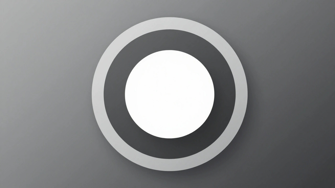
- FocusMate: A circle with two concentric rings, one slightly darker. It looks like a focus ring on a camera lens. No neurons. No waves. Just calm, intentional attention.
Notice what’s missing? No blue glowing lines. No floating dots. No robotic eyes. Apple’s AI apps look like tools, not wizards.

Color, Light, and Material
Apple’s 2025 update introduced new material effects: translucency, layered shadows, and specular highlights. These aren’t just for looks-they’re about context.Take a note-taking AI app. In light mode, its icon might use a soft gray with a faint white highlight. In dark mode, it becomes a deeper charcoal with a subtle glow. The shape stays the same. The meaning stays the same. Only the mood changes. This isn’t decoration. It’s harmony.
Color palettes must be consistent across all device sizes. If your icon is blue on your iPhone, it can’t be purple on your Mac. And if you use a gradient, it has to look just as clean at 32 pixels as it does at 1024. Most designers fail here. They create a beautiful icon on a 4K screen-then realize it’s a blob on an Apple Watch.
Labeling: The Silent Rule
Icons aren’t the only thing Apple controls. Labels matter too.Apple’s App Store now requires developers to clearly state when an app uses AI. But here’s the catch: you can’t say "Powered by AI" in the app name. You can’t say "The Smartest Assistant Ever" in the description. You can say: "Uses machine learning to summarize your notes." That’s it. No exaggeration. No promises.
Apple’s goal? Make users feel informed, not tricked. If an app transcribes voice notes, say so. Don’t say "AI-powered transcription." Say "Transcribes your voice notes." The technology is invisible. The result is clear.
What Happens If You Break the Rules?
In late 2025, Apple rejected over 200 app updates for violating icon and labeling rules. One app used a pulsing brain icon with animated neurons. Another called itself "The AI That Reads Your Mind." Both were denied. The feedback? "The icon is misleading. The label is promotional. Neither aligns with Apple’s design principles."Apple doesn’t care if your AI is the most advanced in the world. It cares if your user can understand your app in two seconds. No scrolling. No reading. Just a glance.
Designing for the Future
The future of AI on Apple isn’t about bigger, flashier icons. It’s about quieter, smarter ones. As AI becomes more common, the bar for design gets higher-not lower. The apps that stand out won’t be the ones with the most complex visuals. They’ll be the ones that feel effortless.Apple’s system is built on trust. If your app feels like it’s trying to impress, it breaks that trust. If it feels like it’s helping, it earns it.
So if you’re designing an AI app for Apple: start with the user’s task. Not the algorithm. Not the data. Not the hype. The task. Then build the icon around that. Keep it simple. Keep it clean. Keep it real.
Can I use the word "AI" in my app’s icon or name?
No. Apple prohibits using "AI" or similar terms directly in app icons or names unless it’s part of the official brand name. The App Store review guidelines require clarity without marketing language. Instead, describe the function: "Summarizes your emails" or "Organizes your photos."
What if my AI app’s function is abstract, like mood analysis?
Even abstract functions need concrete visual metaphors. For mood analysis, avoid glowing colors or floating particles. Instead, use a simple face silhouette with a subtle curve-like a smile or frown. Or use a weather icon (sun, cloud, rain) to represent emotional states. Apple prioritizes immediate recognition over artistic interpretation.
Do I need separate icons for iOS, macOS, and watchOS?
No. Apple requires the same core design across all platforms. You may crop or simplify elements for smaller sizes, but the shape, color, and central element must remain consistent. The 2025 guidelines introduced unified templates so your icon looks like part of the same family on every device.
Can I use gradients or shadows in my AI icon?
Yes-but sparingly. Apple allows subtle shadows and translucency to add depth, but not to create realism. A soft drop shadow under a pen is fine. A glowing outer ring that looks like a halo is not. The goal is elegance, not drama. Always test your icon at 29×29 pixels. If the effect disappears, it’s too heavy.
How do I know if my icon passes Apple’s review?
Test it on all device sizes before submitting. Use Apple’s official templates (available in Figma, Sketch, and Adobe apps). If your icon looks blurry, cluttered, or confusing at any size, it will be rejected. Also, avoid any visual cues that imply supernatural abilities-"predicts your future" or "reads your thoughts" are red flags. Stick to clear, functional metaphors.