
Ever notice how your thumb just finds the home button without looking? Or how you can type ‘Q’ on the keyboard blindfolded? It’s not luck. It’s design. The edges, rims, and bezels of your iPhone aren’t just leftover plastic or metal-they’re critical parts of how your fingers interact with the screen. They guide your thumb. They anchor your grip. And they help you tap the right key, every time.
What You Can’t See Is What You Feel
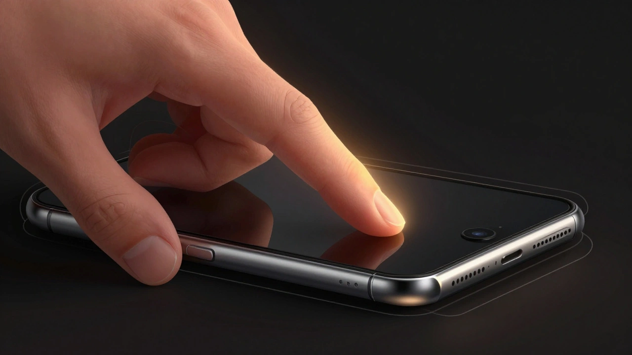
Most people think touchscreens work like magic: touch here, action there. But reality is messier. Your thumb doesn’t hover perfectly over the screen. It drags, it tilts, it slides. It doesn’t tap straight down like a robot. And that’s where the iPhone’s physical design steps in.The bezel-the thin border around the screen-gives your thumb a stopping point. It tells your hand: ‘Stop here. Now turn left.’ The edge of the phone acts like a rail. When you’re texting one-handed, your thumb naturally slides along the bottom edge until it hits the bezel. That’s when you know: ‘Okay, I’m at the edge of the keyboard. Now I can reach for Q or P.’
This isn’t theory. It’s backed by real human behavior. Studies show that people don’t tap randomly. They anchor their thumbs near the bottom of the phone, usually on the right side. The bezel becomes a reference point, like the edge of a desk when you’re writing. Without it, your thumb drifts. And when your thumb drifts, you hit the wrong key.
The 2013 Test That Changed Everything
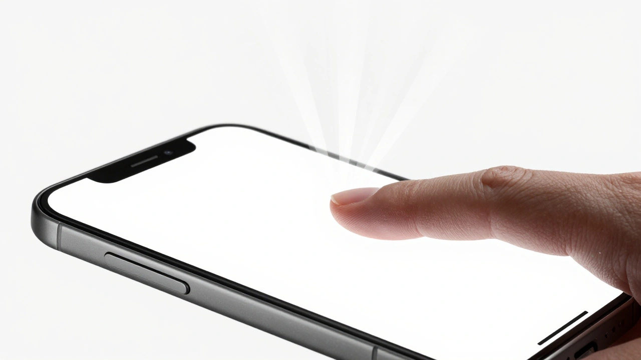
In 2013, a Finnish company called OptoFidelity ran a test that shocked the industry. They used a robotic finger to tap every single point on the iPhone 5s and 5c screens. They measured accuracy down to a millimeter. And what they found was startling: 75% of the screen had touch errors greater than 1mm.The worst spots? The corners. The edges. Keys like Q, O, and P on the keyboard were nearly impossible to hit accurately. The robot tapped exactly where it was told. But the phone thought the tap was 1mm off-sometimes even 3mm. That’s why you’d accidentally type ‘O’ when you meant ‘P’.
Compare that to the Samsung Galaxy S3 from the same year. Its touchscreen was far more consistent. Every corner, every edge, every center point responded the same way. No dead zones. No drift. So why did Apple’s phones underperform?
Some thought it was a flaw. A hardware glitch. A software bug. But others saw something else.
Was It a Bug-or a Feature?
Here’s the twist: Apple didn’t fix this in later models. In fact, they doubled down on the same design. Why?Because the robot was wrong. Not in its measurements, but in its assumptions.
The robot tapped straight down, 90 degrees to the screen. Real humans? We hold our phones at an angle. We rest our thumbs on the bottom edge. We swipe, not tap. We don’t look at the screen when we type-we look at the road, the conversation, the person in front of us.
What OptoFidelity saw as inaccuracy might have been Apple’s way of compensating for real-world use. The touch system didn’t just register where you tapped. It predicted where you meant to tap. If your thumb was sliding from the bottom right toward the left edge, the software might have shifted the input slightly to the right-so your thumb’s natural motion ended up hitting the right key.
This isn’t just guesswork. Developers have known for years that iOS adds a built-in touch offset. When you use a drawing app like Procreate, you have to turn on ‘Stylus Mode’ to disable this offset. Why? Because when you’re sketching, you want precision. You don’t want the phone guessing what you meant.
So the ‘inaccuracy’ at the edges? It might not be a bug. It might be a feature designed for typing-not drawing.
Bezels Aren’t Just Borders-They’re Guides
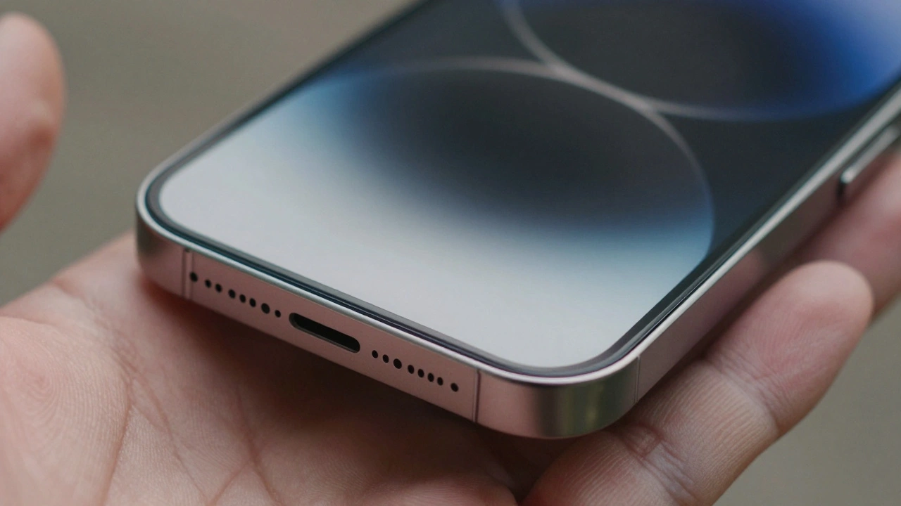
The physical rim of the iPhone isn’t there for looks. It’s there for function. Think about how you hold your phone. Your index finger rests on the top edge. Your thumb drags along the bottom. Your pinky curls around the side. Each point of contact gives your brain feedback: ‘I’m holding it this way. So I’ll tap here.’That’s why older iPhones with thicker bezels felt easier to use. The space between your fingers and the screen gave your hand a clear boundary. You didn’t have to guess where the screen ended. You felt it.
With the iPhone X and later models, Apple removed the bottom bezel. The screen stretched edge to edge. At first, people complained: ‘I keep hitting the wrong thing!’ Why? Because the tactile cue was gone. Your thumb had nothing to bump into. So it overshot. It tapped the edge of the screen when you meant to tap the home indicator.
Apple responded with haptic feedback. A tiny vibration when you swipe up. A slight resistance when you press the side. But it’s not the same. A vibration tells you something happened. A physical edge tells you where to start.
Why Size and Space Matter More Than Pixels
Research from the University of Minnesota says touch targets should be at least 1cm x 1cm-about the size of your fingertip. That’s not because screens are bad. It’s because fingers are big. Your thumb isn’t a stylus. It’s a blunt object. And if you make the keys too small or too close to the edge, you’ll miss.The iPhone keyboard has always been designed with this in mind. The keys are wide. The gaps between them are generous. But the edge of the screen? That’s where the math breaks down. The keys at the far left and right are cut off by the bezel. They’re smaller. They’re harder to hit.
And yet, people adapt. Because the edge gives them a starting point. The bezel says: ‘This is where the keyboard ends.’ So your thumb doesn’t try to hit ‘Q’ from the center of the screen. It slides along the bottom until it hits the corner. Then it lifts slightly. Then it taps.
That’s tactile guidance. It’s not magic. It’s biomechanics.
What Apple Got Right-And What It Lost
The iPhone 5s had terrible edge accuracy. The iPhone 15 has near-perfect screen response. But here’s the catch: Apple didn’t fix the edge problem by improving sensors. They fixed it by changing how you interact.With Face ID, you don’t need the home button. With gesture controls, you don’t need to tap the bottom. You swipe up from the bottom edge. And that edge? It’s still there. Still physical. Still guiding your thumb.
Even with a nearly bezel-less design, Apple kept a tiny lip on the screen’s edge. Not for looks. For feel. It’s barely noticeable. But your thumb notices. It’s the difference between a clean swipe and a misfire.
That’s why the iPhone still works so well one-handed. It’s not just the software. It’s the metal. The glass. The curve. The edge.
What Other Phones Got Wrong
Many Android phones tried to copy the iPhone’s edge-to-edge look. No bezel. No rim. Just glass.And guess what? Users reported more misclicks. More accidental swipes. More frustration.
Why? Because without a physical edge, your thumb doesn’t know where the screen ends. It drifts. It slides. It hits the edge of the screen and opens the app switcher when you meant to tap ‘Send’.
Apple didn’t ignore this. They didn’t chase aesthetics. They kept the edge-just thinner. Just smoother. Just enough to guide.
It’s Not About Tech-It’s About Touch
You don’t need a PhD to understand this. You just need to hold your phone. Feel the edge. Notice how your thumb naturally finds the corner. Notice how you don’t look at the screen to type ‘@’ or ‘.’.The iPhone’s edges aren’t a flaw. They’re a feature. They’re not just borders. They’re guides. They’re anchors. They’re the reason you can text, scroll, and swipe without thinking.
Next time you tap a key without looking, thank the rim. Thank the bezel. Thank the edge. They’re the quiet heroes of your iPhone experience.