
Apple didn’t just build computers. It built design into every product, every interaction, every detail. From the rainbow logo on the Apple II to the sleek glass of the iPhone, Apple’s design journey is a story of bold choices, bold failures, and bold reinventions. This isn’t about specs or sales numbers. It’s about how a company turned design from an afterthought into its core identity.
The Rainbow Logo and the Apple II (1977)
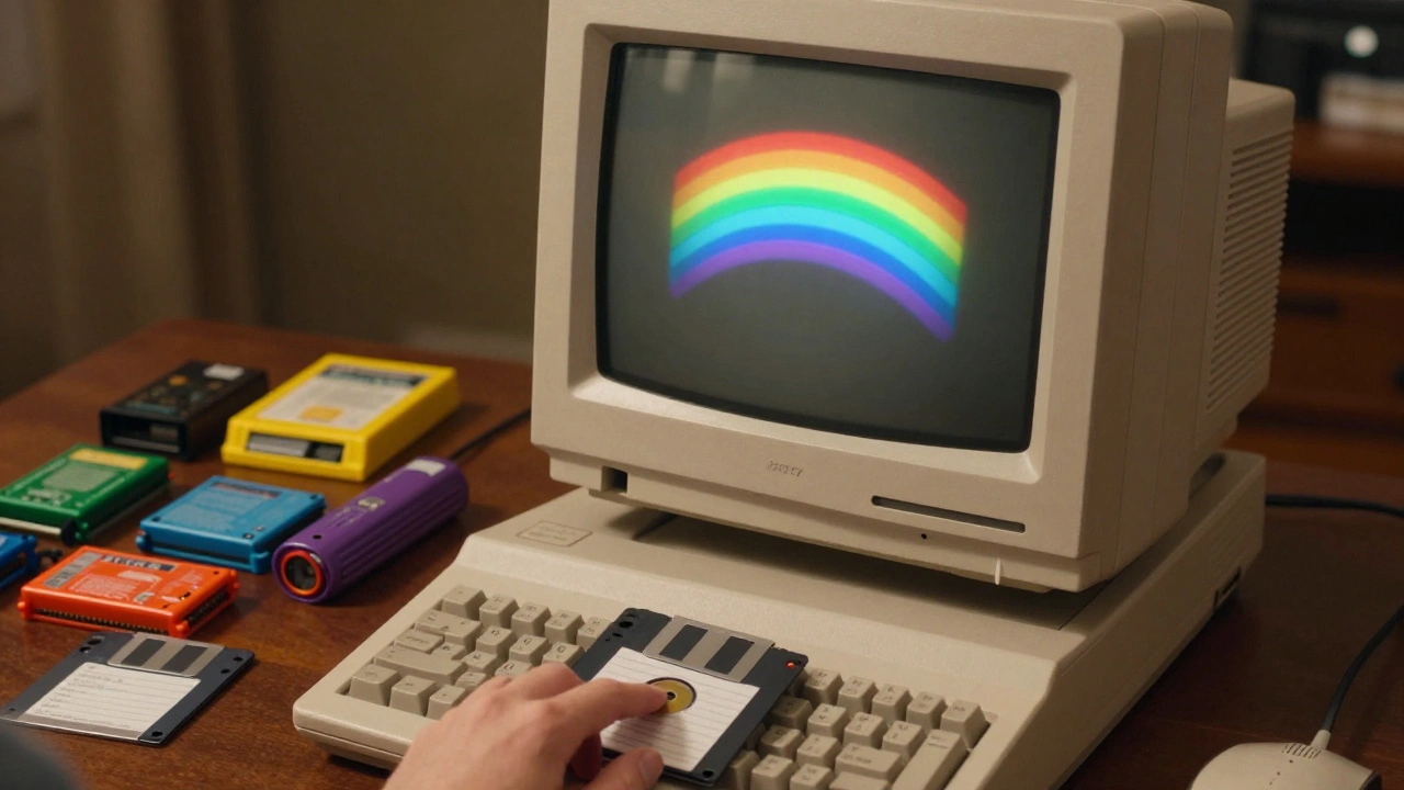
In 1977, Apple didn’t have a design team. It had Steve Wozniak, who built a computer that could display color - something no other home computer could do. And it had Rob Janoff, a graphic designer hired to create a logo. He didn’t overthink it. He drew an apple with a bite taken out - not because it was symbolic, but because people kept confusing it with a cherry. The rainbow stripes? They were there to show off the Apple II’s color display. No one knew it then, but that logo became the most recognizable symbol in tech.
The Apple II wasn’t just a machine. It was an open system. You could plug in cards, upgrade RAM, write your own programs. That openness shaped Apple’s early culture: design wasn’t about control. It was about empowerment. And it worked. By 1983, over 2 million Apple IIs had been sold. It wasn’t the most powerful machine. But it was the most human.
The Macintosh and the GUI Revolution (1984)
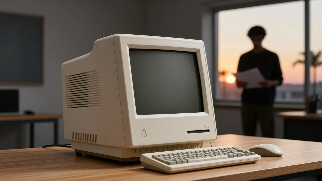
After watching Xerox PARC’s Alto in 1979, Steve Jobs became obsessed with one idea: a computer you could use without reading a manual. That obsession led to the Macintosh. It had a mouse. It had icons. It had a graphical interface. And it had a design that screamed simplicity. The original Macintosh was a single, sealed unit - no expansion slots, no user-serviceable parts. Critics called it closed. But users? They loved it. It felt like magic.
The 1984 Super Bowl ad didn’t sell a computer. It sold a new way of thinking. Apple wasn’t just competing with IBM. It was fighting conformity. The Mac’s design was a statement: technology should serve people, not the other way around. The font was clean. The interface was intuitive. Even the startup sound was designed to feel warm, not mechanical.
The All-in-One to the Modular Shift (1987)
By 1987, Apple had two Macs: the Mac SE, which kept the classic all-in-one look, and the Mac II, which broke it. The Mac II had expansion slots. It supported color monitors. It let you build your own setup. This wasn’t a step backward. It was a realization: design isn’t one shape. It’s a system. Some people want simplicity. Others want power. Apple started offering both.
That same year, Microsoft released Windows 1.0. It was clunky. But it was a warning. Apple’s design language was becoming its own language - one that others would try to copy. The Mac’s interface wasn’t just pretty. It was repeatable. Consistent. Predictable. That’s what made it stick.
The iMac and the Return to Simplicity (1998)
By the late 90s, Apple was in freefall. Its products looked like beige boxes. Its software was unstable. Then came Steve Jobs’ return. And with it, the iMac.
The iMac wasn’t just a new computer. It was a rejection of everything that came before. No floppy drive. No parallel port. Just USB. And a translucent, candy-colored plastic shell that looked like it came from a spaceship. It had no screws on the outside. No vents you could see. It was a single, seamless shape. And it sold 800,000 units in its first five months.
The iMac’s design told users: we’re not apologizing anymore. We’re not trying to be like everyone else. We’re making something that feels good to touch, to look at, to use. The rainbow logo? Gone. Replaced by a simple, monochrome apple. The message was clear: design doesn’t need color to be bold.
The iPod, the Store, and the Ecosystem (2001-2003)
The iPod didn’t have the best battery life. It wasn’t the cheapest. But it had a scroll wheel that felt like it was made for your thumb. The white earbuds? They weren’t an accessory. They were a statement. Everyone saw them. Everyone wanted them.
Then came the iTunes Store. Suddenly, buying music wasn’t about piracy or CDs. It was about clicking a button and getting a song in seconds. The design of iTunes was clean. Simple. No clutter. No confusing menus. Just your music. And your library. And your playlist.
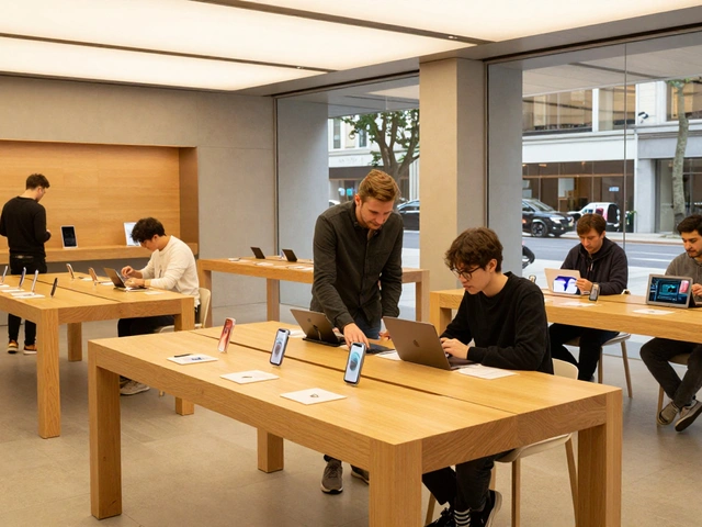
And then, in 2001, Apple opened its first retail store. No discount racks. No salespeople pushing upgrades. Just clean white tables, glass displays, and people touching the products. It was the first time tech felt like a luxury brand. And it worked. People didn’t just buy iPods. They bought into the experience.
The iPhone and the New Standard (2007)
In 2007, Apple didn’t just launch a phone. It launched a new category. The iPhone had no keypad. No stylus. No physical buttons on the screen. Just a glass slab with a single home button. And it worked - better than anything else.
The design was radical. No one had ever made a phone this thin, this smooth, this responsive. The icons were crisp. The animations were fluid. The interface responded to your touch like it knew what you wanted before you did. And the App Store? It turned the iPhone into a platform - not just a device.
The iPhone didn’t just change phones. It changed how we think about design. It proved that software and hardware could be one thing. That a button didn’t need to be physical. That a screen could be the only interface you ever needed.
The Glass Era and the Ecosystem (2007-2013)
From 2007 to 2013, Apple’s design language became more refined. The logo got a glassy sheen. The MacBook lids glowed with a backlit apple. The iPhone’s edges became curved. The iPad’s bezels shrank. Everything felt like it was carved from a single piece of material.
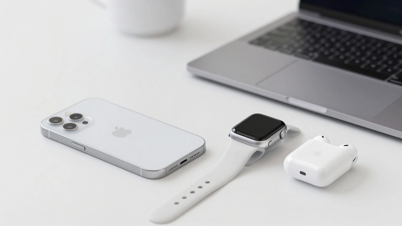
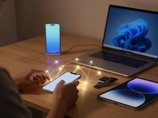
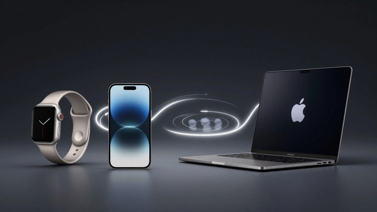
This wasn’t just aesthetics. It was strategy. Apple started designing its products to work together. Your iPhone could unlock your Mac. Your Apple Watch could answer your phone. Your AirPods could switch between devices without you lifting a finger. The design wasn’t just in the product. It was in the connection between them.
That’s when Apple stopped being a computer company. It became an ecosystem company. And design became the glue.
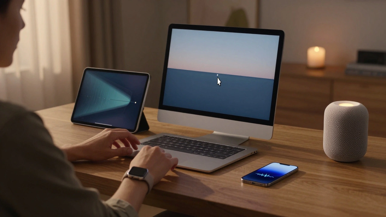
The Modern Ecosystem (2014-Present)
Today, Apple’s design isn’t about one product. It’s about a system. The Apple Watch tracks your heart rate. The HomePod listens to your voice. The AirTag finds your keys. The Vision Pro blends reality and digital. Each device feels like it was made for the others.
The materials are more advanced. Titanium in the Watch. Ceramic in the Pro. The screens are brighter. The batteries last longer. But the core idea hasn’t changed: make it simple. Make it beautiful. Make it work.
Apple doesn’t advertise specs anymore. It shows people using its products - in kitchens, on trains, in hospitals. The design isn’t about how many pixels it has. It’s about how it fits into your life. Without asking for permission. Without a manual. Without a logo you have to explain.
That’s the real milestone. Not the logo. Not the shape. Not the chip. It’s that Apple’s design is now invisible. You don’t notice it. You just use it. And that’s the highest form of design there is.
Why did Apple change its logo from rainbow to monochrome?
The rainbow logo was designed in 1977 to highlight the color capabilities of the Apple II. By 1998, Apple had moved beyond color displays as a novelty. The monochrome logo reflected a shift toward minimalism, premium materials, and a unified brand identity. It also matched the sleek, all-white design of the iMac and signaled Apple’s new focus on simplicity and sophistication.
How did the Macintosh influence modern computing?
The Macintosh introduced the graphical user interface (GUI) to mainstream users. It made computers accessible by replacing text commands with icons, windows, and a mouse. This design philosophy became the standard for all personal computers. Even Windows and Android borrowed heavily from the Mac’s layout, spacing, and interaction patterns. The Mac proved that computers could be intuitive - not just powerful.
What made the iMac design so revolutionary in 1998?
The iMac broke every rule. It removed floppy drives, serial ports, and even the keyboard’s cable. It used translucent plastic in bold colors, which was unheard of in tech. It had no visible screws or vents. It was designed to be a single, seamless object - more like a piece of art than a machine. This was a rejection of the beige-box era and a bold statement that design could drive sales.
How did the iPhone change Apple’s design direction?
The iPhone shifted Apple’s focus from hardware to integrated systems. It proved that a touchscreen could replace physical buttons. It made software and hardware design inseparable. It also introduced the concept of a mobile ecosystem - where your phone, watch, tablet, and computer all work together. This led to the seamless handoff, AirDrop, and Continuity features that define Apple today.
Why does Apple’s design feel so consistent across products?
Apple’s design language is controlled by a small, centralized team that works across hardware, software, and services. They use consistent materials, proportions, and interaction patterns. A button on an iPhone feels like a button on a Watch. A scroll on a Mac feels like a scroll on an iPad. This unity isn’t accidental. It’s intentional - and it’s why users feel comfortable switching between devices.