
When Apple brought industrial design in-house in the early 1990s, it wasn’t just changing who made the products look good - it was rewriting how the company thought about design itself. Before that, Apple relied on Frog Design, the consultancy behind the Snow White language that gave Macs their sleek, unified look. But by 1990, those designs were being copied everywhere. Generic PC makers were stealing Apple’s visual identity, and Apple’s leadership knew they couldn’t win by outsourcing their most valuable asset: design.
The Rise of the Apple Industrial Design Group
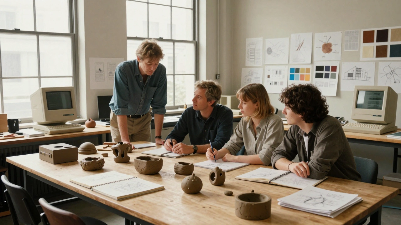
In 1990, Apple hired Robert Brunner - a former industrial designer at Frog Design - with one job: build a real design team from scratch. Not a contractor. Not a consultant. A full department, with its own studio, budget, and people. Brunner didn’t just show up with a business card. He recruited talent. He brought in Jony Ive, who had been working as a freelance designer since 1992. He hired engineers, model makers, and materials specialists. He created a space where design wasn’t an afterthought - it was the starting point.
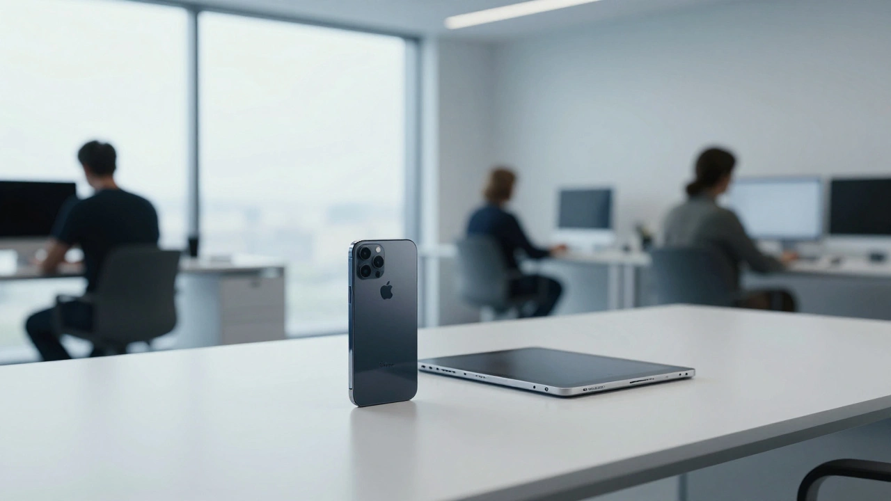
The Apple Industrial Design Group (IDg) became the heart of product form. For the first time, designers sat in the same building as engineers. They could walk over, sketch on a whiteboard, argue about curves, and tweak a prototype before lunch. That speed changed everything. Gone were the months-long back-and-forth with outside agencies. Now, ideas moved fast. The Newton PDA, despite its commercial failure, was a design triumph - a bold, ergonomic handheld that looked like nothing else on the market. It was the first major product born entirely inside Apple’s new design studio.
Kazuo Kawasaki and the Portable Design Track
While Brunner led the overall group, Kazuo Kawasaki ran a separate, specialized team focused on portable computers. He didn’t report to Brunner directly. He reported to the head of hardware. This wasn’t just organizational quirks - it reflected how Apple saw laptops differently from desktops. Laptops needed to be light, durable, and easy to carry. They had to survive backpacks, airport security, and coffee spills. The PowerBook line, especially the PowerBook 500 and 1400, carried Kawasaki’s fingerprints: slim profiles, hinge designs that didn’t wobble, and keyboards that felt solid under your fingers.
His team worked in parallel with Brunner’s, but with its own rules. While Brunner’s group was experimenting with color, material, and form for desktops and peripherals, Kawasaki’s team was solving real-world problems: battery life, heat dissipation, screen alignment. This split wasn’t a flaw - it was smart. Apple recognized that designing a laptop wasn’t the same as designing a monitor. You needed different skills, different priorities, and different testing environments.
The Espresso Design Language
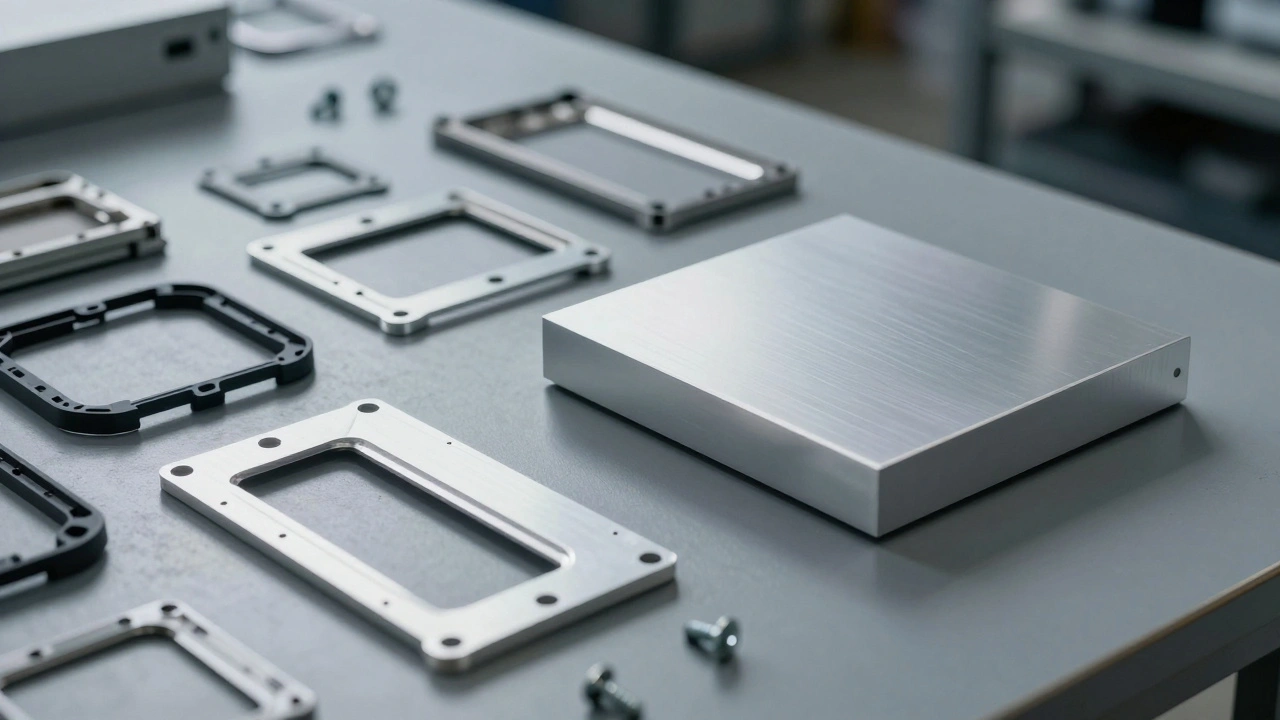
By 1993, the IDg had moved beyond Snow White. The new look didn’t have a name at first, but designers called it “Espresso” - dark, warm, grounded. It was a shift from the clean white and gray of the 80s to deeper tones, textured plastics, and softer edges. The Macintosh Color Classic was the first product to fully embrace it. The beige case wasn’t just a color choice - it was a material choice. A new type of ABS plastic that felt less like plastic and more like something you could hold for hours without it feeling cheap.
This wasn’t just aesthetics. It was strategy. Apple was trying to signal that its products weren’t just computers - they were objects you lived with. The Espresso language carried through the Power Macintosh 7100, the Performa series, and even the AppleVision monitor. It was a bridge between the past and what was coming. You could still see the ghost of Snow White in the rounded corners and symmetrical layouts, but now there was warmth. Humanity. A sense that someone had actually held this thing and thought about how it felt in your hands.
Why Brunner Left
By 1995, Apple was falling apart. Sales were dropping. Executives were fighting. The design team kept producing brilliant work - the Apple Pippin, the PowerBook 190, the iMac prototype that never saw the light - but none of it mattered because no one in leadership cared enough to protect it.
Brunner fought to keep design from being diluted. He argued against using cheaper plastics. He pushed back on cost-cutting that made products feel flimsy. He wanted the Newton to be a true breakthrough, not a compromise. But every time he won a battle, he lost the war. Engineering had more budget. Marketing had more influence. Design was treated like a service, not a strategy.
He left in 1996. Not because he was fired. Not because he got a better offer. He left because he realized that without someone at the top who believed in design as a core value, no team, no matter how talented, could change the company’s fate. His departure wasn’t a setback - it was a warning. Apple had built the engine. But it didn’t have the fuel.
The Quiet Foundation for the iMac
When Steve Jobs returned in 1997, he didn’t invent Apple’s design culture. He inherited it. He walked into a studio that already had Jony Ive, a team that had built the Newton, a language that had evolved from Snow White to Espresso, and a process that had proven it could move fast. What Jobs did was simple: he gave design a seat at the table. He made Ive a senior vice president. He stopped letting engineers dictate form. He said: “Let’s make something beautiful that people will love.”
The iMac didn’t come out of nowhere. It came from the Espresso language. From the materials tested in 1994. From the ergonomic lessons learned on the PowerBook. From the prototype designs Brunner’s team had shelved because they weren’t “market-ready.” Jobs didn’t change Apple’s design - he finally let it lead.
The Bigger Lesson
The 1990s at Apple didn’t end with a bang. It ended with silence - Brunner gone, the company bleeding money, design sidelined. But those six years weren’t wasted. They were the quiet building of a foundation. The IDg became a real team. The Espresso language became a real identity. Kawasaki’s portable work became the blueprint for future laptops. Jony Ive learned how to lead.
Design isn’t about pretty shapes. It’s about structure. It’s about who gets to speak, who gets heard, and who has the power to say no. Apple’s 1990s design story isn’t about genius products. It’s about what happens when you build a design team - and then don’t let it lead. It’s about what happens when you finally do.