
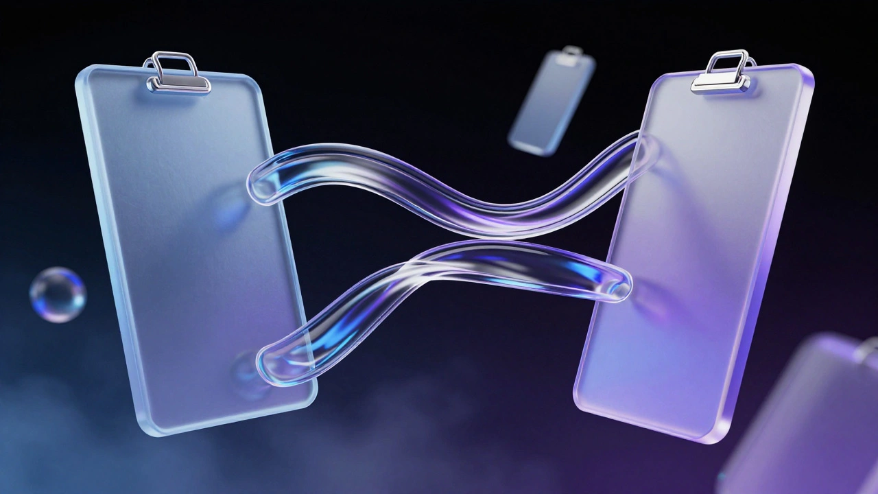
Why Your Devices Feel Like One Brain
You pick up your iPhone to draft an email. You finish it later on your MacBook without opening a file transfer dialog. This happens because Apple doesn't just sell hardware; it sells a unified way of thinking. We call this Shared Mental Models. A mental model is simply what you expect a button to do before you press it. When Apple designs for its ecosystem, it ensures that expectation remains identical whether you are touching glass, swiping a trackpad, or clicking a mouse.
This consistency reduces cognitive load. You don't have to relearn your tools every time you change screens. Instead, you operate on autopilot. This deep integration creates high switching costs, which is why users rarely leave once they own three or four devices. But how does Apple pull this off across operating systems that were historically distinct? Let's break down the mechanics of ecosystem-wide usability.
The Core Concept of Mental Models
To understand the magic, we first need to define the term. A mental model acts as an internal representation of how something works. If you pull down the corner of a physical curtain, you expect another corner to follow. In software, pulling down the screen should refresh content.
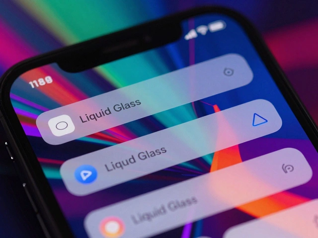
Before Apple standardized its approach, this wasn't universal. Android phones behaved differently than tablets, which often differed from Windows laptops. Apple changed the game with the introduction of Human Interface Guidelines (HIG). This document dictates how every app should look and behave. By strictly enforcing these rules across iOS, iPadOS, and macOS, Apple guarantees that a 'copy' command works exactly the same way everywhere.
Think of it like a language. If you speak Spanish in Spain, you can travel to Mexico and still communicate effectively. Apple has created a global dialect for its devices. The visual cues-the blue link, the red delete icon, the swipe-to-reply gesture-are universal constants. This predictability allows users to transition between a pocket-sized phone and a large laptop instantly. The brain stops analyzing the input method and focuses purely on the task.
Gestures and Input Universality
Touchscreens revolutionized input, but mice and keyboards never went away. Bridging these worlds requires careful design. On the iPhone, you pinch two fingers to zoom. On the Mac trackpad, you do the same with the palm. The underlying logic remains unchanged: spread = enlarge, squeeze = shrink.
However, the complexity increases when combining inputs. The iPad Pro supports both touch and a stylus (Apple Pencil). To maintain a consistent mental model, the interface adapts to the tool. When you hover with the Pencil, it feels like a mouse cursor. When you tap, it feels like a finger.
This duality extends to the macOS interface elements. For years, Mac users had to learn different menus for Finder versus Safari. Apple recently aligned these to match the simplicity found on mobile. Settings have moved to the gear icon in corners. Search is now a bar that behaves similarly across applications. Even the 'Force Quit' function follows a similar pattern: hold the power button on a phone triggers a slider, while holding the power key on a Mac triggers a shutdown countdown. These small parallels build a subconscious sense of familiarity.
Seamless Task Continuity
Nothing reinforces a shared mental model better than finishing work on one device. The feature set known as Continuity handles this heavy lifting. The most visible example is Handoff. You start writing a document on your iPad. Walk over to your Mac. The document appears in the Dock, ready to open. You didn't email it to yourself or save it to a cloud folder manually.
Another critical component is the Universal Clipboard. Copy a link on your Mac. Paste it into WhatsApp on your iPhone. This simple action relies on complex background networking, but to the user, it feels like a single clipboard. The mental model here is "My data lives in my identity, not just in the machine."
This extends further with AirDrop. Sending files via Bluetooth and Wi-Fi Direct maintains privacy while eliminating the friction of cables. Because this feature appears natively in the share sheet on all three platforms, users instinctively reach for it. There is no need to search for third-party tools like WeTransfer for local transfers. The built-in option is always there, reinforcing the idea that the devices talk to each other directly.
| Feature | iOS Support | iPadOS Support | macOS Support |
|---|---|---|---|
| Universal Clipboard | Yes | Yes | Yes |
| AirDrop | Yes | Yes | Yes |
| Handoff | Yes | Yes | Yes |
| Call Handling | Primary | Support | Support |
The Hidden Logic: Privacy and Intelligence
Usability isn't just about what you see; it's about what happens behind the scenes. Modern users expect their devices to anticipate needs. Apple achieves this through On-Device Intelligence powered by Neural Engines and Small Language Models (SLMs). Unlike cloud-only solutions, Apple processes much of this locally.
For example, Siri operates similarly across iPhone, Mac, and HomePod. Because the processing happens close to the source, the latency feels natural. If Siri felt faster on the Mac than the iPhone, it would break the illusion of a singular mind controlling the hardware.
Data privacy also plays a massive role in user trust, which is part of the mental model. With iCloud Private Relay and encryption standards, users develop a mental model of safety. They assume their photos and messages are secure regardless of the terminal used. This trust removes friction. You don't hesitate to upload sensitive docs to the cloud because the mental model says, "Apple protects this." This consistency in security perception is vital for long-term retention.
File Management Challenges
Not everything aligns perfectly, and acknowledging gaps strengthens the argument. File management remains the biggest divergence between mobile and desktop logic. The Files App unifies some of this, bridging local storage with cloud services. However, macOS utilizes a traditional folder-based hierarchy rooted in Unix, offering granular control over permissions and scripts.
In contrast, iOS treats apps as sandboxes. Accessing a file usually means asking permission to share it out of the app. While this improves security, it creates a slight disconnect for advanced users migrating workflows. The mental model shifts from "Folders of folders" to "Apps with libraries." Despite this shift, Apple tries to bridge the gap by allowing external drives to appear in the Files app on both iPad and Mac, ensuring basic operations remain intuitive even if advanced ones differ.
Design Standardization and the App Store
The final layer of cohesion comes from the distribution platform itself. The App Store forces developers to adhere to guidelines that prioritize consistency. If an app violates core behaviors-like blocking standard copy-paste functions-it risks rejection.
This enforcement ensures that third-party apps don't fracture the ecosystem experience too severely. A banking app on the iPad should look and feel like it belongs to the same family as one on the Mac. Developers use cross-platform frameworks like SwiftUI, which compiles code that runs natively on all three systems. This technical reality translates directly to the user's mind. They see the same UI elements, meaning the same things, regardless of the device manufacturer.
Impact on User Retention
All these efforts culminate in one business outcome: loyalty. Once a user understands the mental model, leaving requires abandoning it. Switching to Android means learning new gestures, a new file system, and new continuity tools. The friction is real. Studies show users with three Apple devices have significantly higher retention rates than those with just one.
For designers outside the company, the lesson is clear. Users crave consistency. If you build a suite of products, ensure they speak a common language. Whether you are designing for web or hardware, maintaining a coherent mental model reduces learning curves and builds trust. Apple proves that usability is not just about a single product, but the relationship between products.
What exactly is a shared mental model in design?
A shared mental model is when a user expects a specific result from an action based on past experiences. If your iPhone's swipe behavior matches your Mac, your mental model is shared across devices, making usage predictable.
Does macOS work differently than iPadOS for files?
Yes. macOS uses a full Unix-style folder hierarchy, while iPadOS relies more on app-specific sandboxes. However, the Files App attempts to unify the viewing experience across both.
How does Universal Clipboard improve productivity?
It allows you to copy text or images on one Apple device and paste them on another instantly without manual sharing or internet uploads, streamlining multitasking.
Is Siri's intelligence the same on all devices?
Most processing happens on-device using the Neural Engine. This ensures response times and capabilities feel consistent whether you are on an iPhone, Mac, or iPad.
Can I connect a mouse to my iPhone?
Yes, modern iOS versions allow pointer access using mice or trackpads. This helps bridge the mental gap between touch interaction and precise pointing found on computers.