
The launch of Liquid Glass, Apple’s new interface material for iOS 26, has sparked a heated debate. On one side, you have designers praising the sleek, reactive aesthetic that brings content to the foreground. On the other, accessibility advocates are sounding the alarm. For users with low vision or contrast sensitivity issues, this translucent, glass-like design isn't just pretty-it can be a barrier. The semi-transparent overlays blur visual elements, making text and icons blend into busy backgrounds. It’s not enough to say "it looks good." We need to ask if it works for everyone.
If you’re navigating iOS 26, whether as a user trying to read your screen or a developer building an app, understanding how to manage these transparency effects is critical. This guide breaks down exactly what Liquid Glass is, why it poses challenges, and how to use the built-in controls to regain clarity and control.
What Is Liquid Glass and Why Does It Matter?
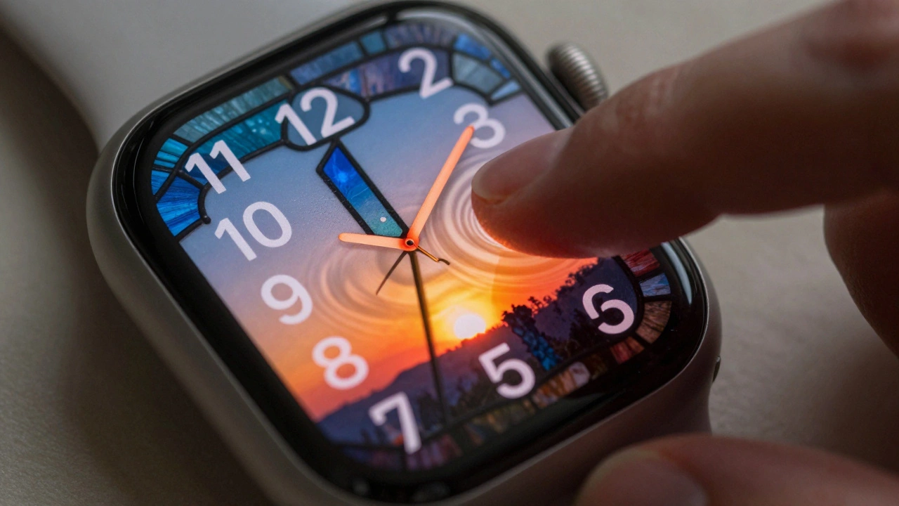
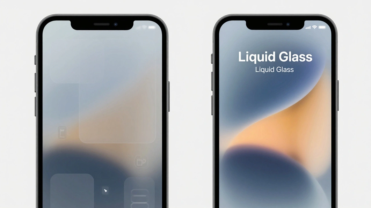
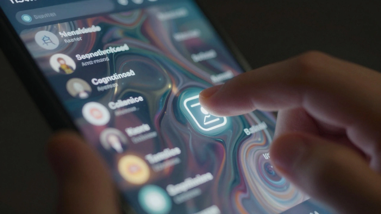
Liquid Glass is defined as a reactive, translucent design system that animates, morphs, and responds to touch in real time. Think of it as a digital material that feels slick and three-dimensional. It uses glowing highlights and light reflections to create depth. In iOS 26, this isn't just a widget feature; it’s system-wide. Menus, notifications, app backgrounds, toolbars, and tab bars all adopt this fluid look.
The goal was to make the interface feel modern and immersive. However, the cost is readability. When you place text over a blurred, moving background, the eye struggles to focus. For users with conditions like cataracts, glaucoma, or general contrast sensitivity loss, the difference between foreground and background disappears. Experts from organizations like Nel Low Vision have called this a "potential accessibility nightmare" because the very nature of the design-transparency-conflicts with the fundamental need for clear distinction between elements.
The Core Accessibility Challenge: Blurred Boundaries
The primary issue with Liquid Glass is the reduction of visual hierarchy. In traditional flat design, buttons had solid colors and clear borders. Now, they might be faintly highlighted against a see-through backdrop. This creates several specific problems:
- Text Legibility: Semi-transparent overlays can wash out text, especially if the background image behind the glass is complex or high-contrast itself.
- Icon Recognition: Icons blending into backgrounds become difficult to identify quickly. If you rely on visual scanning to find settings or apps, this slows you down significantly.
- Sensory Overload: The dynamic animations and shifting light reflections can be distracting or even trigger motion sickness for some users.
It’s not just about aesthetics; it’s about cognitive load. Your brain has to work harder to separate what’s interactive from what’s decorative. This is where the built-in accessibility controls come into play.
Three Essential System Controls for Clarity
Apple recognized these risks and included three powerful toggles in System Settings > Accessibility > Display. These aren’t minor tweaks; they fundamentally alter how Liquid Glass behaves on your device.
| Control Name | Primary Function | Impact on Liquid Glass | Best For |
|---|---|---|---|
| Reduce Transparency | Increases opacity of UI elements | Converts glass to "frosted" or solid opaque surfaces | Users needing maximum legibility and reduced visual noise |
| Increase Contrast | Enhances border visibility and text weight | Adds sharp black/white borders to key elements | Users with low contrast sensitivity or difficulty distinguishing edges |
| Reduce Motion | Minimizes animations and elastic effects | Stabilizes the interface, removing dynamic shifts | Users sensitive to motion or vestibular disorders |
Reduce Transparency is often cited as the most impactful setting. By turning this on, you strip away the see-through effect entirely. The menus become solid, the backgrounds lose their blur, and the text sits on a stable surface. It’s the single biggest step toward making Liquid Glass usable for those who find the default view overwhelming.
Increase Contrast works differently. It doesn’t necessarily remove the glass, but it forces the interface to draw hard lines around buttons, tabs, and inputs. This helps when you can see the screen but struggle to tell where one element ends and another begins. It automatically adapts the Liquid Glass design without requiring extra developer input, ensuring consistency across apps.
Reduce Motion addresses the kinetic aspect of the design. Liquid Glass reacts to tilt and touch with fluid animations. For some, this is delightful. For others, it’s disorienting. Turning this off locks the interface into a more static state, reducing the chance of motion-induced nausea or distraction.
Developer Responsibilities: Beyond the Toggle
While these system settings help, they shouldn’t be the only line of defense. Developers building for iOS 26 have a responsibility to ensure their apps are accessible by default. Relying solely on users to fix broken contrast is poor design practice.
Here are concrete steps developers should take:
- Avoid Critical Content on Blurred Backgrounds: Never place essential buttons, form fields, or error messages directly over heavily blurred or transparent areas. Use solid backing layers for interactive components.
- Test with Accessibility Settings Enabled: Don’t just test your app in the default Liquid Glass mode. Test it with Reduce Transparency and Increase Contrast turned on. Does your layout break? Do colors clash? Fix it.
- Use High-Contrast Alternatives: Build in support for high-contrast modes natively. Ensure that text meets WCAG (Web Content Accessibility Guidelines) AA standards for contrast ratios, even when overlaid on dynamic content.
- Leverage VoiceOver and Accessibility Inspector: Use Apple’s built-in tools to audit your interface. Check if labels are being read correctly and if focus order makes sense when visual cues are diminished.
The principle is simple: legibility must never be sacrificed for aesthetic appeal. If a button looks beautiful but can’t be seen by someone with mild vision impairment, it’s not a good button.
Navigating Widgets and Third-Party Apps
One persistent gap in the current implementation involves widgets. While you can adjust font sizes within many widgets, you often cannot disable the transparency effect at the widget level individually. This means that even if you’ve enabled Reduce Transparency system-wide, some third-party widgets may still render with blurry backgrounds, creating inconsistent experiences on your Home Screen.
For now, the workaround is to prioritize widgets with high-contrast backgrounds or those designed specifically with accessibility in mind. Look for widgets that offer dark mode variants or solid color options. Additionally, leveraging non-visual feedback mechanisms like haptics or voice descriptions can compensate for visual ambiguity in these smaller interface components.
Is the Default Experience Inclusive Enough?
This is the question keeping accessibility experts up at night. Just because you *can* turn off the glass effect doesn’t mean the default experience should be inaccessible. The burden shouldn’t fall entirely on the user to configure their device to make basic navigation possible.
History suggests Apple will continue refining these overrides. But the ideal future is one where the default Liquid Glass implementation respects contrast and legibility from the start. Until then, users and developers alike must remain vigilant. Active configuration is currently required to achieve optimal usability.
How do I disable Liquid Glass effects on my iPhone?
You can’t disable Liquid Glass entirely as a single toggle, but you can neutralize its effects. Go to Settings > Accessibility > Display. Turn on "Reduce Transparency" to remove the see-through look and "Increase Contrast" to add sharp borders. This effectively turns the glass into a more traditional, opaque interface.
Why does Liquid Glass cause readability issues?
Liquid Glass relies on translucency and background blurring. This reduces the contrast between text/icons and the background behind them. For users with low vision or contrast sensitivity disorders, this lack of distinction makes it difficult to identify where clickable elements begin and end, leading to eye strain and confusion.
Do these accessibility settings affect battery life?
Generally, no. In fact, reducing transparency and motion can sometimes improve performance slightly by lowering the GPU load required to render complex animations and blur effects. The impact on battery life is negligible for most users.
Can I customize transparency for individual apps?
Currently, no. The accessibility controls in iOS 26 are system-wide. You cannot set Reduce Transparency for Safari but keep it off for Messages. All apps adhere to the global display settings chosen in the Accessibility menu.
What should developers do to ensure their apps are accessible with Liquid Glass?
Developers should test their apps with Reduce Transparency and Increase Contrast enabled. They must avoid placing critical UI elements on blurred backgrounds, ensure high contrast ratios for text, and use solid backing layers for buttons and inputs to guarantee legibility regardless of the user's background wallpaper.