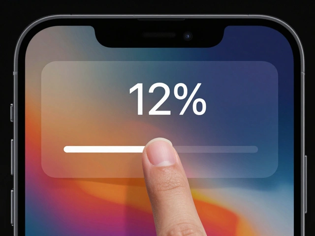

Phones keep getting bigger, but our hands aren't. If you've ever felt your thumb straining to reach a "Submit" button at the top of your iPhone screen, you've experienced the fundamental conflict of modern mobile hardware. For users, it's a physical annoyance; for designers, it's a conversion killer. When a primary action is out of reach, people don't just stretch-they hesitate, make mistakes, or simply give up and leave the app.
Designing for iPhone design in a one-handed context isn't about making things look pretty; it's about mapping the digital interface to human anatomy. Roughly 75% of all smartphone interactions are performed with the thumb. If your layout ignores this reality, you're essentially fighting against the user's biology.
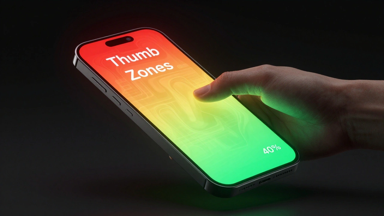
The Quick Guide to Thumb Zones
- The Green Zone: The bottom 30-40% of the screen. This is the "comfort zone" where thumbs naturally rest. Put your primary buttons and navigation here.
- The Yellow Zone: The mid-section and sides. Reachable, but requires a slight stretch. Use this for secondary actions.
- The Red Zone: The top corners and top edge. Nearly impossible to reach without shifting your grip or using two hands. Reserve this for static info or destructive actions (like "Delete") to prevent accidents.
Understanding the Thumb Zone Model
The concept of the thumb zone isn't just a guess-it's based on behavioral research. Steven Hoober is a mobile interface expert who documented how users actually hold their devices’s grip in 2013. His work proved that the way we hold a phone dictates where we can realistically interact. This created the foundation for the three-color model we use today.
It is a mistake to think of these zones as rigid templates. They are dynamic. A right-handed user's comfort zone is a mirror image of a left-handed user's. Furthermore, the zones shift entirely when a user rotates the phone into landscape mode, moving the high-comfort area toward the nearest edge. To solve for this, designers should use combined overlays in their software to ensure that critical elements are accessible regardless of which hand the user prefers.
Strategic Layout Choices for Better Reachability
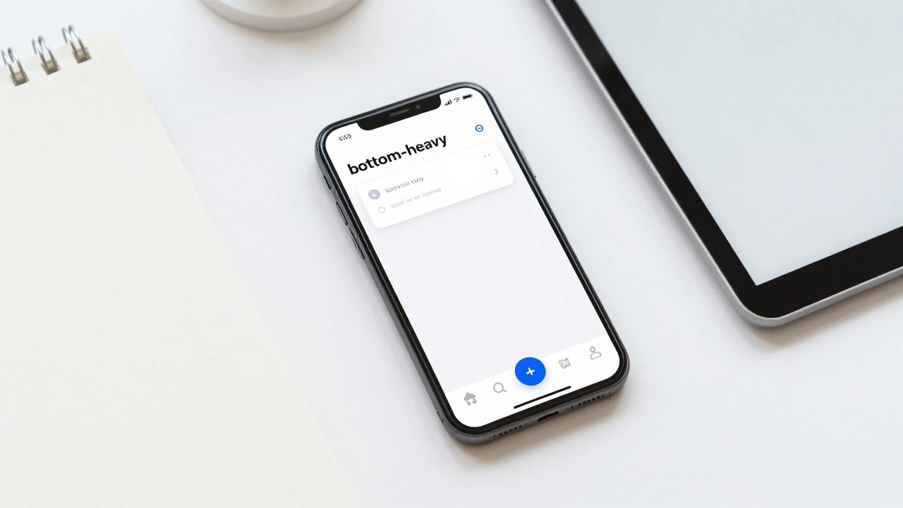
If you want to make an app "thumb-able," you have to move the brain of the app to the bottom. The old school of thought put navigation at the top (like the traditional header), but modern User Experience (UX) is the process of enhancing user satisfaction by improving the usability and accessibility of a product” now favors bottom-heavy layouts.
Start by implementing bottom navigation bars or Floating Action Buttons (FABs). By placing the most frequent tasks-like a search bar or a "Compose" button-in the green zone, you remove the friction of the reach. If a user has to shift their grip to perform a core task, you've introduced a cognitive load that slows them down.
Conversely, use the red zone to your advantage. By placing destructive actions, such as account deletion or permanent removals, in the hard-to-reach top corners, you create a physical "speed bump." This intentional friction prevents the nightmare scenario of a user accidentally deleting their data while trying to scroll.
| Zone | Reach Effort | Recommended Elements | Example |
|---|---|---|---|
| Green | Low/None | Primary CTAs, Bottom Nav | "Add to Cart" button |
| Yellow | Medium | Secondary Controls, Filters | Category dropdowns |
| Red | High | Settings, Destructive Actions | "Delete Account" |
Sizing and Spacing: The Physics of the Thumb
A thumb is significantly wider than a stylus or a finger. If your buttons are too small or too close together, users will suffer from "fat-finger syndrome," hitting the wrong target. To avoid this, follow the WCAG 2.1 is a set of accessibility guidelines that ensure web content is more accessible to people with disabilities” guidelines. They recommend a minimum touch target of 44×44 CSS pixels.
However, 44 pixels is the bare minimum. For high-frequency buttons in the green zone, aiming for 48×48 dp (density-independent pixels) provides a much more forgiving experience. Don't just size the button; size the hit area. Sometimes a button looks small, but the invisible tappable area around it is large, which is a pro move for keeping a clean UI while maintaining high usability.
Leveraging iOS Reachability
Apple recognized the "giant phone" problem and built a system-level solution called Reachability is an iOS accessibility feature that slides the top of the screen down to the bottom half for easier access’s feature. As a designer, you can't control when a user activates this, but you should understand how it works to ensure your app doesn't break when the screen shifts.
On iPhones with Face ID, users swipe down on the bottom edge to bring the top of the screen within thumb's reach. For those on older Home button models, a double-tap does the trick. If a user is utilizing VoiceOver, they use a specific swipe-up-then-down gesture. Because this feature exists, it's a signal from Apple that they know the top of the screen is a dead zone for one-handed use.
How to Validate Your One-Handed Design
You cannot validate thumb zones using a desktop simulator. A mouse click is precise; a thumb is a blunt instrument. To truly test reachability, you need to move to real hardware. Use devices of varying sizes-from a standard iPhone to the massive Pro Max models-to see where the friction points lie.
- Overlay Testing: In tools like Figma is a collaborative interface design tool used for creating wireframes and prototypes’s, create semi-transparent overlays of the green, yellow, and red zones. Drop these over your mockups to see instantly if your primary buttons are in the red.
- Heatmap Analysis: Use tools like Hotjar to generate tap heatmaps. If you see a cluster of "missed taps" or a high volume of errors in a specific area, it's usually a sign that the element is too small or poorly placed.
- Real-World Observation: Watch a user try to complete a core flow (like checking out or searching) using only one hand. Note where they struggle, where they shift their grip, and where they accidentally hit the system gesture area (the very edges of the screen).
Beyond the Zones: Gestures and Cognitive Load
While zones are great, gestures can further simplify one-handed use. Swiping to delete or pulling down to refresh are patterns users already understand. However, gestures have a discovery problem-users don't know they exist unless you tell them. Use "ghost buttons" or small visual hints (like a chevron) to nudge users toward these efficient interactions.
Also, consider the cognitive load. When a user is struggling physically to reach a button, their mental energy is spent on the physical act, not the task. By reducing the number of elements on screen and using progressive disclosure-showing only what is necessary at that moment-you make the app feel lighter and more responsive.
Does the thumb zone apply to all users?
Not exactly. The thumb zone is a model for one-handed use. Left-handed users have a mirrored comfort zone. Additionally, some users prefer two-handed use or use a stylus. However, since the vast majority of mobile interactions are thumb-driven, designing for the thumb zone ensures the most efficient experience for the largest group of users.
Where should I put the "Back" button for one-handed use?
Traditional iOS apps put the back button in the top-left (the Red Zone). For a thumb-friendly design, consider implementing a swipe-to-go-back gesture or moving primary navigation to a bottom tab bar, which allows users to jump between main sections without ever reaching for the top of the screen.
How does screen size affect these zones?
As screen size increases, the percentage of the screen that is "reachable" actually decreases. On a small iPhone, the yellow zone is quite large. On a Pro Max, the red zone expands significantly, making it even more critical to keep essential actions at the bottom.
Should I avoid the top of the screen entirely?
No, but use it for non-interactive elements. The top of the screen is perfect for status indicators, page titles, and information that needs to be seen but not touched. Avoid putting buttons there unless they are infrequent settings or destructive actions.
Is a bottom navigation bar always the best choice?
For most apps, yes. It places the most important destinations in the green zone. The only time it might not work is if your app requires a massive amount of screen real estate for a specific immersive task, but even then, a collapsible or floating menu at the bottom is better than a top-heavy burger menu.
Categories
Popular Articles