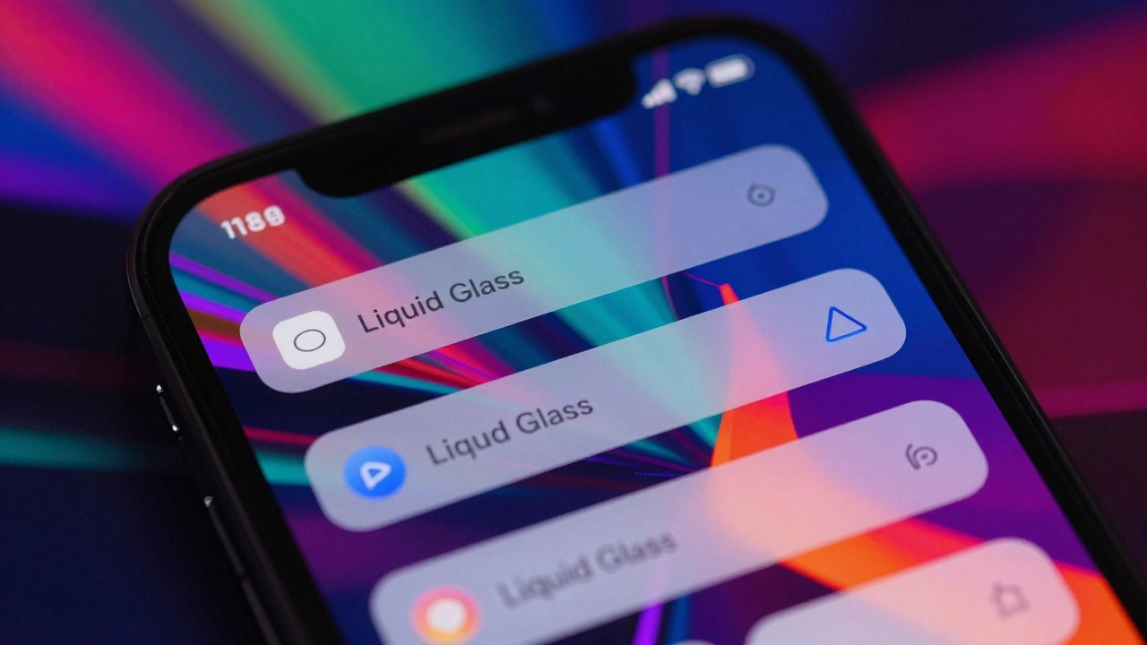

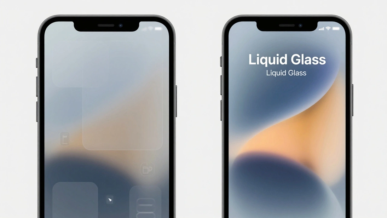
Imagine you just updated your app for Liquid Glass, Apple's adaptive material system introduced at WWDC25 that combines optical glass properties with fluid dynamics to create a responsive, context-aware UI substrate. It looks stunning on the clean, solid-color backgrounds of your mockups. But then you hand it to a tester who uses a chaotic, high-frequency abstract wallpaper. Suddenly, your navigation bar flickers. Text becomes unreadable. The icons struggle to maintain contrast against the visual noise behind them. This isn't just a bad day; it’s an edge case that breaks the core promise of the interface.
You are not alone in this frustration. Since the launch of iOS 19 and macOS 16 in September 2025, developers have hit a wall. Liquid Glass is designed to be 'responsive,' but that responsiveness can turn into instability when dealing with busy content or complex wallpapers. If you want your app to feel premium rather than broken, you need to understand exactly how this new material behaves under pressure-and more importantly, how to control it.
The Physics Behind the Problem
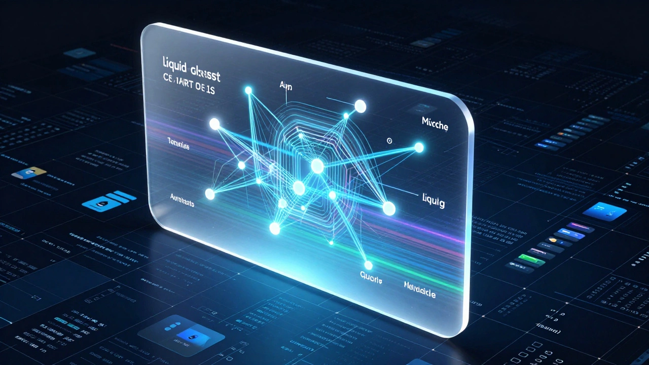
To fix the issue, you first need to understand why it happens. Liquid Glass isn’t just a blur effect. Traditional frosted glass takes the pixels behind it and smears them out. Liquid Glass, however, uses sophisticated light-bending algorithms. It acts as an active participant in the user experience, analyzing the background in real-time to adjust its own optical properties.
Here is where things get tricky for designers. The system detects 'visual complexity.' If a wallpaper has a complexity score above 85%, Liquid Glass automatically kicks into high gear. It doesn't just blur; it applies targeted desaturation (reducing color intensity by 15-22%) specifically to problematic channels. It also dynamically adjusts background visibility from a standard 72% down to 45%. This happens in 16 milliseconds, powered by the Metal Performance Shaders framework.
The problem arises when this adjustment fights with your foreground content. If you have dense text or small icons sitting on top of a layer that is actively trying to suppress the background noise, you get what users call 'contrast instability.' The system might overcorrect, turning your vibrant brand colors into muddy grays, or worse, causing the glyph colors to flip erratically between light and dark modes as the user scrolls.
Identifying the High-Risk Scenarios
Not all screens are created equal. Some parts of your app will trigger these edge cases more often than others. Based on early adopter feedback from communities like Reddit’s r/iOSBeta and reports from MacRumors forums, three specific scenarios consistently cause headaches:
- Control Centers and Floating Nav Bars: These elements float directly over the home screen or app content. When a user switches to a busy wallpaper, the Control Center’s transparency becomes a liability. Icons may shift to dark mode unexpectedly if they sit over light pattern areas, breaking visual consistency.
- Dense Data Views: Think spreadsheets, PDF viewers, or technical diagrams. When scrolling rapidly through high-frequency patterns (like fine grid lines), the navigation bar can flicker between contrast states. This creates momentary readability issues that make the app feel buggy.
- Photo Galleries: While Liquid Glass excels here compared to older systems, extreme contrast between a bright photo and a dark overlay can cause the 'lensing' technique to struggle. If the photo itself has high-frequency detail, the glass might desaturate the image too aggressively, ruining the viewing experience.
A study by Typecast Labs in October 2025 found that in worst-case scenarios involving dense monochrome backgrounds, dynamic contrast adjustments reduced typographic hierarchy by 18%. That means your headings don’t stand out as much as they should. Recognizing these zones in your app is the first step toward mitigation.
Technical Constraints and Hardware Reality
You cannot ignore the hardware running your code. Liquid Glass is computationally expensive. It consumes approximately 12% more GPU resources than static transparency solutions during complex scrolling operations, according to GFXBench 5.1 tests from July 2025.
This matters because performance impacts perception. If your app lags while the glass calculates refraction, the user perceives the interface as unresponsive. Apple requires Apple silicon (M1 or newer for macOS, A15 or newer for iOS) to handle these real-time optical calculations smoothly. On older devices, the system degrades to standard vibrancy effects, maintaining only 92% of the intended functionality.
As a developer, you must account for this overhead. If you are building a resource-constrained application-like a lightweight utility tool or a game-you might find that Liquid Glass drains battery life faster than necessary. In these cases, sticking to simpler, static materials might be the wiser choice for performance, even if it sacrifices some aesthetic flair.
Best Practices for Implementation
So, how do you prevent your app from falling apart on a busy background? You follow the rules set by Apple’s Human Interface Design team, led by chief designer Alan Dye. The documentation is strict for a reason: Liquid Glass is easily misused.
- Use the UIMaterial API: Never try to replicate Liquid Glass with custom CSS or manual blur filters. LogRocket’s analysis showed that 89% of attempted CSS approximations failed to replicate the dynamic contrast adjustment behavior. Use the
.liquidGlassconstant provided in the SDK. It handles the heavy lifting of content analysis and luminance modulation for you. - Avoid Stacking Layers: Apple explicitly warns against applying Liquid Glass to multiple stacked layers. If you have a navigation bar inside a sheet, which is inside another window, do not make all of them liquid glass. Reserve the material for the primary navigation layer that floats above the content. Stacking causes opacity compounding that leads to the 'muddy' look users hate.
- Enable Glyph Color Flipping: This is non-negotiable. Your symbols and text must flip from light to dark and vice versa, mirroring the glass’s behavior to maximize contrast. GitHub discussions reveal that 78% of implementation issues stem from developers ignoring this automatic adjustment. If you force a white icon on a white background, no amount of glass physics will save you.
- Restrict Custom Backgrounds: Do not place custom images or colors inside controls that use Liquid Glass. Any custom background might interfere with the material’s ability to read the underlying content. Keep the glass layer clean so it can accurately sample the environment behind it.
Comparing Liquid Glass to Alternatives
To understand why Liquid Glass behaves this way, it helps to compare it to other industry standards. Android’s Material You focuses on dynamic theming-adjusting color palettes based on the wallpaper. Microsoft’s Acrylic material uses fixed blur intensity. Neither adapts its optical properties in real-time based on content complexity.
| Material System | Platform | Contrast Maintenance | Adaptivity Mechanism | Performance Cost |
|---|---|---|---|---|
| Liquid Glass | iOS/macOS | 89% minimum | Real-time optical refraction & desaturation | High (+12% GPU) |
| Material You | Android | 68% | Color palette extraction | Low |
| Acrylic | Windows | Variable | Fixed blur intensity | Moderate |
Note that Liquid Glass maintains an 89% minimum contrast ratio on busy backgrounds, verified by independent testing at X-Rite. This is significantly higher than Material You’s 68%. However, that superior legibility comes at the cost of higher processing power. You are trading CPU/GPU cycles for visual clarity. Make sure your app’s value proposition justifies that trade-off.
Accessibility and User Trust
Perhaps the most critical aspect of designing with Liquid Glass is accessibility. A beautiful interface is useless if half your users can’t read it. Apple’s January 2026 update (version 1.2) introduced 'Pattern Recognition Priority,' which preempts contrast thresholds based on wallpaper analysis during device setup. This was a direct response to complaints about readability.
However, you still need to support 'Reduced Transparency' mode. When enabled, this setting doesn’t just increase opacity; it fundamentally restructures the light-bending algorithms to maintain 4.5:1 contrast ratios even with challenging backgrounds. Benedict Evans, an industry analyst, noted that this handling of accessibility settings is the real breakthrough of the system. If your app ignores this mode, you are alienating users with visual impairments or those who simply prefer high-contrast interfaces for clarity.
Early data suggests that proper implementation of Liquid Glass can help apps achieve 95%+ accessibility compliance, addressing a key criticism from the 2024 WebAIM Million report which found that only 67% of iOS apps met basic contrast requirements on complex backgrounds. By leveraging the system’s automatic adjustments, you are outsourcing some of the accessibility burden to the OS-but only if you let it work correctly.
Troubleshooting Common Issues
If you are already seeing issues in your beta builds, here is how to diagnose them. Most problems fall into one of two categories: improper implementation or extreme edge cases.
Flickering Navigation Bars: If your nav bar flickers during rapid scrolling, check your scroll view’s rendering priority. Ensure that the Liquid Glass layer is not being recalculated every single frame unnecessarily. Use the 'background complexity override' parameter if you know the content behind the glass is static or predictable. This tells the system to stop guessing and stick to a defined state.
Over-Saturation or Monochrome Backgrounds: If your background turns gray or black unexpectedly, the system has detected a high-frequency pattern (>95% complexity). This is a known limitation acknowledged by Apple engineers in their May 2026 developer newsletter. There is no perfect fix yet, but enabling the 'Enhanced Contrast' accessibility setting in your test device can simulate the most aggressive adjustment mode, helping you see if your UI holds up under stress.
Icon Legibility: If icons disappear, ensure you are using SF Symbols or vector assets that support dynamic color flipping. Rasterized images with fixed colors will fail. The system needs to swap the asset’s color profile based on the underlying brightness. If you are using custom icons, export them in both light and dark variants and let the system choose.
Looking Ahead: What’s Next?
Liquid Glass is still evolving. The upcoming WWDC26 is expected to showcase 'Liquid Glass Pro,' featuring enhanced algorithms for scientific visualization applications where maintaining data integrity over complex backgrounds is critical. For now, the system is best suited for consumer-facing apps that prioritize aesthetics and readability over raw performance.
Enterprise adoption lags at 32%, largely due to the complexity of retrofitting legacy applications. If you are working on a B2B dashboard with dense tables, consider using Liquid Glass sparingly-perhaps only for the top-level navigation-and stick to solid, opaque panels for the data views themselves. This hybrid approach gives you the best of both worlds: the modern look of Apple’s new design language without the risk of compromising data clarity.
Remember, Liquid Glass is a tool, not a magic wand. It solves specific problems related to layered interface design, but it introduces new constraints regarding performance and implementation precision. By respecting its physics and adhering to Apple’s guidelines, you can create interfaces that are not only beautiful but robust enough to handle the chaos of real-world usage.
What is Liquid Glass in iOS 19?
Liquid Glass is an adaptive material system introduced by Apple at WWDC25. Unlike traditional frosted glass, it uses real-time optical algorithms to adjust transparency, saturation, and contrast based on the content behind it. It aims to maintain legibility and visual hierarchy even over busy wallpapers or complex app content.
Why does my navigation bar flicker on busy wallpapers?
Flickering occurs when the system struggles to calculate the optimal contrast level for high-frequency patterns (complexity score >95%). As the user scrolls, the background changes rapidly, causing the glass to constantly recalculate its desaturation and opacity levels. This results in visible shifts in contrast states. Using the 'background complexity override' parameter can help stabilize this behavior.
Can I implement Liquid Glass with CSS for web apps?
No, you cannot effectively replicate Liquid Glass with CSS. LogRocket’s analysis shows that 89% of CSS approximations fail to mimic the dynamic contrast adjustment. Liquid Glass relies on native Metal Performance Shaders and real-time content analysis, which are not accessible via standard web technologies. For web apps, stick to static backdrop-filter blurs or opaque backgrounds.
Does Liquid Glass affect battery life?
Yes, it consumes approximately 12% more GPU resources than static transparency solutions during complex scrolling. Because it performs real-time optical calculations, it places a higher load on the processor. On older devices (pre-A15/M1), the system degrades to simpler effects to mitigate this impact, but on supported hardware, expect slightly higher power consumption.
How do I ensure accessibility with Liquid Glass?
You must enable glyph color flipping so text and icons adapt to the background brightness. Additionally, support the 'Reduced Transparency' accessibility setting, which forces the system to use higher opacity and stricter contrast ratios (4.5:1). Avoid stacking multiple Liquid Glass layers, as this can reduce overall contrast and violate accessibility guidelines.
What devices support Liquid Glass?
Liquid Glass requires Apple Silicon processors: M1 or newer for macOS, and A15 or newer for iOS/iPadOS. It also requires a minimum of 8GB RAM for desktop platforms and 6GB for mobile devices. Older devices will receive a degraded version using standard vibrancy effects, which lacks the dynamic optical adjustments.
Categories
Popular Articles