
When you design an iOS app, you don’t just sketch buttons and icons-you build navigation. The way users move through your app shapes their entire experience. Apple’s guidelines for tabs, sidebars, and sheets aren’t just suggestions; they’re the unspoken rules that make an app feel native, smooth, and intuitive. And Figma? It’s the only tool that lets you prototype these patterns exactly as they work on iPhone, iPad, or visionOS-no code needed.
Why Apple’s Navigation Patterns Matter
Think about the apps you use every day. Instagram’s bottom tabs. Apple Music’s side menu. Messages’ slide-up sheet for attaching photos. These aren’t random choices. They’re carefully designed behaviors that Apple has refined over a decade. Users expect them. They rely on them. Break the pattern, and your app feels broken-even if it looks great.
Apple’s Human Interface Guidelines (HIG) are clear: consistency beats creativity when it comes to navigation. A bottom tab bar on iPhone should always be at the bottom. A sidebar on iPad should slide in from the left. A modal sheet should rise from the bottom with a subtle drag gesture. Figma lets you replicate all of this-not just visually, but interactively.
Setting Up Your Figma Canvas for Apple Devices
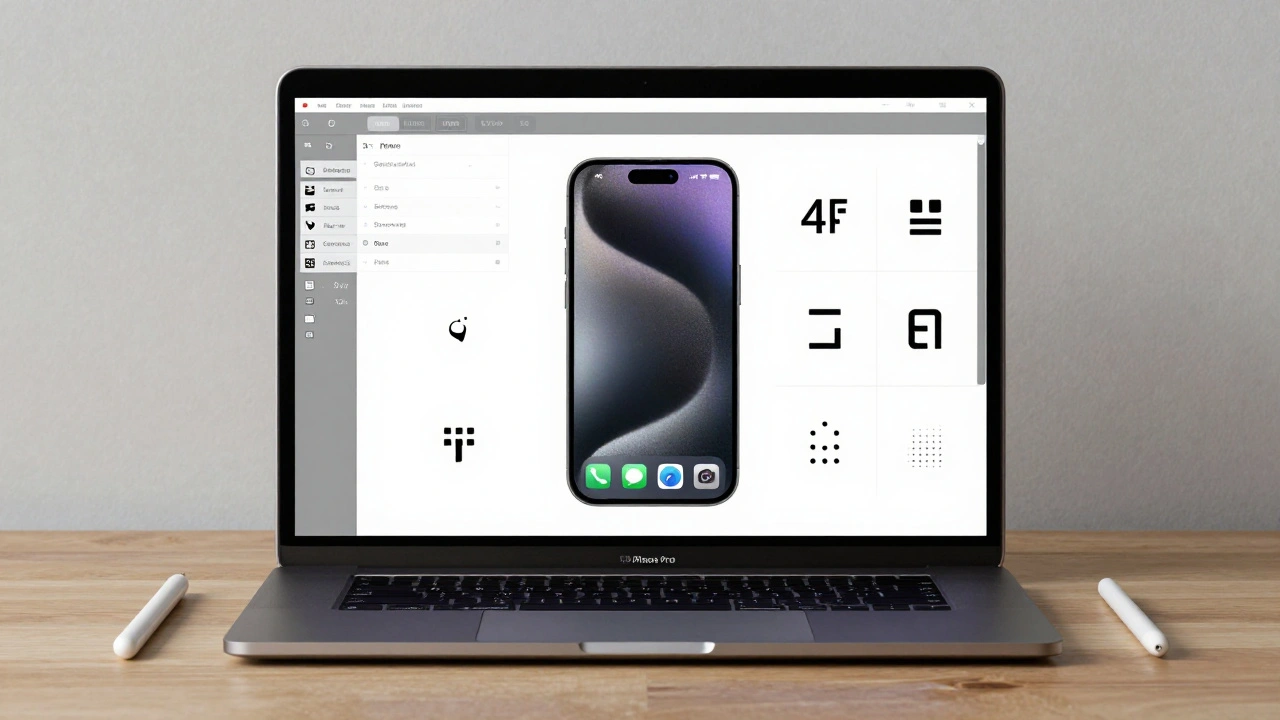
Start with the right frame. For iPhone, use 390 pixels wide. That’s the standard width for modern iPhones like the iPhone 15 Pro. Don’t guess. Use Figma’s built-in device presets. Click on the frame tool, then select “iPhone 15 Pro” from the dropdown. Figma will auto-size it to 390×844 pixels.
Next, set up a layout grid. Go to the right panel, click “Layout Grid,” and choose “Columns.” Set 4 columns with 24-pixel gutters. This matches Apple’s spacing system. Now every button, icon, and text element snaps into place with pixel-perfect alignment. No more eyeballing it.
Don’t forget the status bar. It’s 44 pixels tall on iPhone. Add a rectangle at the top, fill it with the system background color (usually transparent or a subtle blur), and place your time, battery, and signal icons using SF Symbols. Figma has a built-in SF Symbols library-search for “battery,” “wifi,” or “time” and drag them in. They scale automatically.
Building the Bottom Tab Bar
The bottom tab bar is the most common navigation pattern. Apple’s design is simple: five tabs max, 390 pixels wide, 49 pixels tall including padding. Each tab is 78 pixels wide (390 ÷ 5). The home indicator bar at the bottom is 5 pixels high and 132 pixels wide, centered.
In Figma, create a horizontal auto-layout frame. Add five buttons inside. Each button should contain an icon (like a house, search, or profile) and a label. Set the text style to SF Pro Text, 11pt, with medium weight. Use the system blue color (#007AFF) for the active tab. Make each tab a component. Right-click → “Create Component.” Now you can reuse this tab bar across every screen in your prototype.
Link the tabs. Go to Prototype mode. Click the Home tab. Drag the green arrow to the Home screen. Set the interaction to “Click.” Choose “Smart Animate” for the transition. Repeat for each tab. Now when you click “Search,” Figma smoothly shifts to the Search screen. No jumping. No lag. Just like the real thing.
Creating the Sidebar Navigation
On iPad, Apple uses a persistent sidebar. Think Apple Mail or Files. It slides in from the left and stays open. In Figma, create a frame that’s 320 pixels wide. Inside, list your navigation items: Inbox, Sent, Archive, Settings. Use the same text style as the tab bar.
Now, make it interactive. Place your main content on a separate frame to the right. In Prototype mode, add a button labeled “Menu” (usually a hamburger icon) on the top-left corner of the main screen. Link it to the sidebar frame. Set the interaction to “On Click” → “Show Overlay.” Choose “Slide from Left.” Set the animation duration to 0.3 seconds. That’s Apple’s default.
For closing, link the sidebar’s background (the semi-transparent overlay) back to the main screen. Set the interaction to “On Click” → “Hide Overlay.” Now users can tap outside the sidebar to close it-exactly like iOS.
Modal Sheets: The Hidden Gem
Modal sheets are everywhere. When you tap “Share” in Photos, the sheet slides up. When you add a payment method in Apple Wallet, it pops in from the bottom. This isn’t a full screen change-it’s a layer on top.
In Figma, create a new frame for your sheet. Set it to 390 pixels wide and 500 pixels tall. Round the top corners with a 24-pixel radius. Add a subtle shadow. Place your content inside: buttons, forms, sliders.
Now, link it. On the main screen, click a button like “Add Payment.” Set the interaction to “On Click” → “Show Overlay.” Choose “Slide from Bottom.” Set the animation to “Smart Animate.” Add a backdrop overlay-a black rectangle with 60% opacity. Link the backdrop to hide the sheet on click. That’s it. You’ve replicated the iOS sheet behavior perfectly.
Using Apple’s Official Design Kit
Apple doesn’t make you start from scratch. Go to developer.apple.com/design/resources and download the iOS 18 UI Kit for Figma. It’s free. Import it into your Figma file. Now you have every component you need: tab bars, navigation bars, buttons, sliders, alert dialogs-all pre-styled with Apple’s exact colors, fonts, and spacing.
The kit includes SF Symbols, dynamic type styles, and even color themes for dark mode. Use the “Text Style” section to apply SF Pro Text at 17pt for body text. Use the “Color” section to apply system blue, system gray, or dynamic background colors. These aren’t just presets-they’re Apple’s live design tokens.
Prototyping Gestures: Swipes, Drags, and More
Navigation isn’t just taps. Swipe left to go back. Drag down to dismiss a sheet. Swipe up to reveal more content. Figma supports all of this.
To simulate a swipe-back gesture, create a drag trigger. Click on the screen. Set the interaction to “On Drag” → “Move.” Set the direction to “Horizontal.” Limit the movement to 100 pixels. Then, link it to the previous screen. Set the animation to “Smart Animate.” Now drag your finger left on the prototype-and the screen follows.
For a pull-down sheet, create a drag handle at the top of the modal. Link it to “On Drag” → “Move.” Set the Y-axis movement to match the sheet’s height. Add a spring animation (Figma’s “Ease In Out” curve) so it snaps back when released. This mimics the physics of iOS sheets.
Exporting to SwiftUI: The Final Step
Once your prototype works, you can export it directly to SwiftUI code. Install the “Figma to SwiftUI” plugin from the Figma Community. Select your entire screen. Click the plugin. It generates clean Swift code with VStacks, HStacks, NavigationView, and Modal presentations.
The exported code isn’t production-ready out of the box, but it’s 80% there. It includes correct frame sizes, color values, and even gesture recognizers. Developers can take this and plug it into Xcode. No more guessing what “a tab bar should look like.” The design is the code.
Why This Workflow Beats the Old Way
Before Figma, designers handed off static PNGs. Developers had to guess spacing, timing, and behavior. “Is the shadow 8px or 12px?” “Does the sheet slide or fade?” Now, you don’t guess. You prototype. You test. You iterate.
Teams using this method cut redesign cycles by 60%. Developers report fewer questions. Product managers see real interactions, not mockups. And users? They get apps that feel like they were built by Apple.
Common Mistakes to Avoid
- Don’t use 48-pixel tab heights. Apple uses 49. It matters.
- Don’t forget the home indicator. It’s not decoration-it’s part of the interaction.
- Don’t use random fonts. Use SF Pro Text. Always.
- Don’t link tabs to new frames. Use “Smart Animate” to transition between states. It’s smoother.
- Don’t ignore iPad. Design for both iPhone and iPad. The sidebar behavior changes completely.
What’s Next? VisionOS and Beyond
Apple just released its visionOS design kit in January 2025. It includes spatial navigation patterns: gaze-based menus, depth-aware sheets, and floating tabs. Figma now supports these too. The same workflow applies. Set your frame to “visionOS,” use the new UI kit, and prototype how users navigate in 3D space.
This isn’t just about iOS anymore. It’s about the future of interfaces. And Figma is the only tool that lets you build it before it’s built.
Can I prototype Apple navigation without downloading the official UI kit?
Yes, you can. But you’ll spend way more time matching colors, fonts, and spacing. The official Apple UI kit includes pre-built components with correct SF Symbols, text styles, and color values. Using it saves hours and ensures your design matches Apple’s standards exactly. If you’re serious about iOS design, download it.
Why does my tab bar look different on iPhone 14 vs iPhone 15?
It shouldn’t. Both use the same 390-pixel width. If your design looks off, check your frame size. Some Figma templates still use 375px (iPhone 8 size). Update to iPhone 15 Pro or manually set width to 390px. Also, make sure your tab icons are centered vertically. Apple’s tab bar has 49px total height-don’t shrink it.
How do I simulate a swipe-to-go-back gesture in Figma?
Select the screen you want to swipe from. In Prototype mode, click “+” to add an interaction. Choose “On Drag” as the trigger. Set direction to “Horizontal.” Link it to the previous screen. Set animation to “Smart Animate.” Then, set the drag distance to 100px and enable “Snap to position.” Now dragging left 100px will trigger the transition, just like iOS.
Can I prototype Apple navigation on Android in Figma?
You can, but you shouldn’t. Apple’s navigation patterns are designed for iOS. Android uses different gestures, placement, and behaviors. If you’re designing for both, create separate Figma files. Use the iOS kit for Apple apps and the Material Design kit for Android. Mixing them leads to confusing prototypes.
Do I need to know SwiftUI to use Figma’s export feature?
No. The Figma to SwiftUI plugin generates code automatically. You don’t need to write Swift. But you should understand basic SwiftUI structure-like VStack, HStack, and NavigationView-so you can review the output. The plugin doesn’t replace developers. It gives them a head start. Think of it as a design-to-code translator.