
When you’re designing for Apple devices - whether it’s an iPhone, iPad, Mac, or Apple Watch - your assets need to look sharp on every screen, no matter the size. That means vector files aren’t just nice to have; they’re required. Pixel-based images blow up, blur, or look grainy when scaled. But vector files? They scale perfectly. And if you’re not exporting them the right way, you’re making extra work for developers - and risking a clunky, inconsistent app.
Apple doesn’t just accept any SVG or PDF. It has strict rules for how assets should be structured, named, and delivered. Skip the basics, and your design won’t translate cleanly into Xcode. Here’s how to get it right.
Why Vector Matters for Apple Platforms
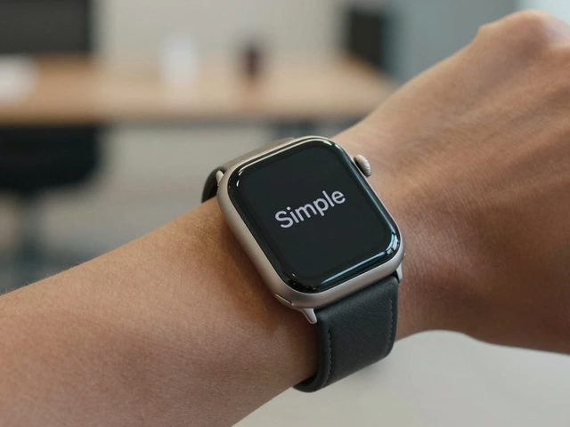
Apple devices come in dozens of screen sizes and resolutions. An iPhone 15 Pro Max has over 2500 pixels across. An Apple Watch Series 9? Less than 400. Your icon needs to look crisp on both. Raster files (like PNGs) force you to create separate versions for every size: 1x, 2x, 3x, even 4x for the new Pro displays. That’s 10+ files just for one icon.
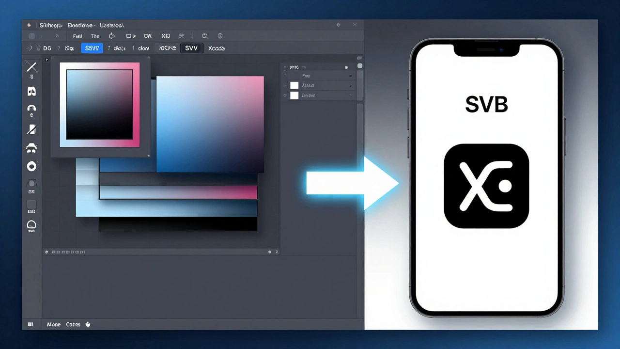
Vector files - like SVG, PDF, or AI - contain math, not pixels. They tell the system: "Draw this shape at whatever size you need." Apple’s system reads these instructions and renders them perfectly on the fly. That’s why Xcode accepts SVG and PDF files directly in asset catalogs. No more manual scaling. No more blurry icons.
But here’s the catch: not all vector files are created equal. A PDF exported from Word? Useless. An SVG with embedded raster layers? Broken. You need clean, native vectors.
Exporting from Adobe Illustrator
If you’re using Illustrator, you’re probably familiar with artboards. Use them. Every icon, symbol, or UI element should live on its own artboard. Name them clearly: home-icon, settings-gear, search-magnifier. No spaces. No symbols. Just lowercase letters and hyphens.
To export for Apple:
- Go to File > Export > Export for Screens
- Select all artboards
- Choose SVG as the format
- Under Options, turn off Minify - you want readable, editable code
- Check Preserve Illustrator Editing Capabilities - this keeps layers intact
- Click Export All
Why SVG? Because Apple’s Xcode 15+ imports SVG natively. No conversion needed. The system reads the paths, strokes, and fills exactly as you drew them. But avoid complex effects. No gradients with more than two stops. No opacity masks. Stick to solid fills and simple strokes.
Also, never export as PDF from Illustrator unless you’re handing it off to a print shop. PDFs from Illustrator often include hidden layers, metadata, and embedded fonts that break when imported into Xcode. SVG is cleaner, lighter, and more predictable.
Exporting from Sketch
Sketch is built for digital design - and Apple loves it. But Sketch doesn’t export SVG perfectly by default. It often adds unnecessary groups, names layers poorly, or includes pixel-based effects.
Here’s how to fix that:
- Organize your design into pages: one for icons, one for symbols, one for illustrations
- For each asset, create a single artboard sized exactly to the element - no padding
- Select the artboard, then click Export in the right panel
- Choose SVG as the format
- Check Use Artboard Bounds - this removes invisible margins
- Uncheck Include in Export for any layers that aren’t part of the icon
- Click Export
After export, open the SVG in a text editor. Look for <defs> or <style> blocks. If you see CSS classes or inline styles, delete them. Apple’s renderer ignores them. Clean SVGs use only fill and stroke attributes directly on shapes.
Pro tip: Use Sketch’s Symbol feature for reusable UI elements. When you update a symbol, every instance updates. Export the symbol as SVG, and Xcode will treat it as a single asset - not 50 separate files.
PDF: The Hidden Trap
You might think: "PDF is vector. It should work." But Apple’s asset catalog doesn’t treat PDFs the same way as SVG. A PDF exported from Illustrator might have embedded raster previews. A PDF from Word? It’s probably a raster image in disguise.
Apple only accepts PDFs if they’re:
- Created in vector tools (Illustrator or Sketch)
- Exported with no raster effects
- Single-page
- Under 50KB in size
Even then, Xcode sometimes converts them to raster anyway. Why? Because PDFs can contain fonts, transparency, and complex layers that slow down rendering. SVG is faster, smaller, and more reliable.
If you must use PDF (say, for a logo that needs to be printed), export it at 300dpi, with no compression. But for app assets? Stick to SVG.
Symbol Libraries: The Apple Way
Apple’s Human Interface Guidelines don’t just say "use consistent icons." They demand system consistency. That means your icons should behave like native iOS icons - same weight, same corner radius, same stroke width.
That’s where symbol libraries come in. Instead of exporting 50 individual icons, create one master symbol set.
In Sketch or Figma:
- Create a page called "Symbols"
- Place each icon in its own artboard
- Convert each to a symbol (right-click > Make Symbol)
- Use consistent spacing - 24x24px for most icons, 32x32px for toolbar items
- Set fill to black or white - no colors. Apple tint them automatically
Export the entire set as one SVG file per icon. Then, in Xcode, drag them into an Asset Catalog. Xcode will auto-generate all required sizes: 1x, 2x, 3x. No manual work.
And here’s the secret: Apple’s system can tint SVGs on the fly. So if your icon is black, the system can turn it blue for selected states, gray for disabled, or white for dark mode - without you lifting a finger.

What Not to Do
Here are the top 5 mistakes designers make:
- Exporting PNGs instead of SVG - You’re forcing developers to manage 5 versions of the same icon.
- Using color in icons - Apple controls color. Your icon should be monochrome.
- Leaving extra layers or hidden artboards - Xcode ignores them, but they bloat the file.
- Exporting from Figma without cleaning SVG code - Figma adds useless metadata. Clean it with an online SVG optimizer.
- Not testing on real devices - What looks fine on your Mac might be too thin on an iPhone 15.
Final Checklist
Before you hand off your assets:
- Are all icons exported as SVG? ✅
- Are file names lowercase with hyphens? ✅
- Is each icon on its own artboard? ✅
- Are there no gradients, shadows, or effects? ✅
- Is the fill set to black or white? ✅
- Did you test one icon in Xcode? ✅
If you answered yes to all, you’re done. The developer will thank you. The app will look flawless. And users won’t even notice - because everything just works.
What Comes Next
Once your assets are in Xcode, the next step is testing them across all device sizes. Use the iOS Simulator to check how your icons look on an iPhone SE, iPad Pro, and Apple Watch. Don’t assume they’ll scale perfectly - always verify.
Also, keep your SVG files in a version-controlled folder. Name it something like /assets/icons/. Update them with git commits. That way, if a developer needs to tweak a stroke width, they can see exactly when and why it changed.
And if you’re working on a large team? Share a Figma library or Sketch Cloud file. Link it in your project docs. Make sure everyone uses the same symbol set. Consistency isn’t just design - it’s discipline.
Categories
Popular Articles