Tag: iOS design
Accessibility Consistency in the Apple Ecosystem: Learn Once, Use Everywhere


Discover how Apple's unified accessibility features like VoiceOver and Dynamic Type reduce cognitive load. Learn why consistency across iOS and macOS empowers users and improves app design.
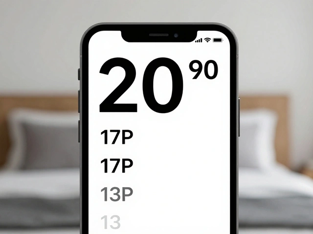
Mastering SF Pro: A Guide to Pairing Text and Display Fonts on Apple Devices

Learn how to correctly pair SF Pro Text and Display fonts on Apple devices. Discover the 20pt rule, weight strategies, and common pitfalls for better UI readability.
Design QA on Apple Devices: Pixel-Perfect Checks Across iOS and macOS
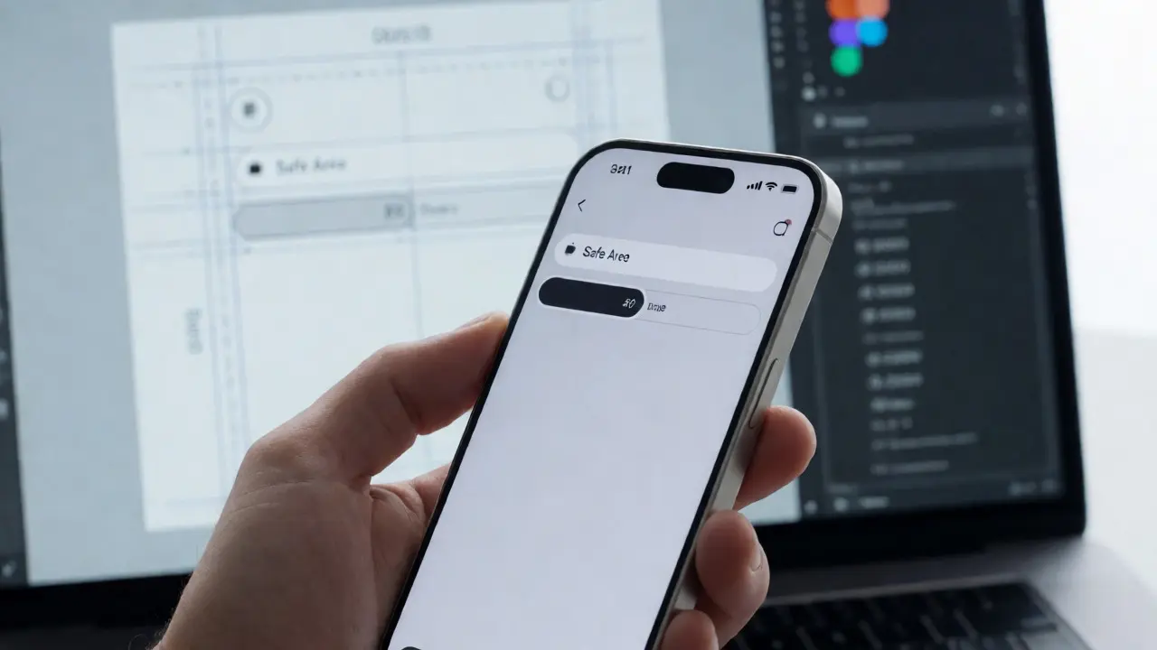
Ensure your UI matches design specs on iOS and macOS. Learn practical steps for pixel-perfect checks, handling safe areas, and testing accessibility.
Dynamic Type on Apple Platforms: Scaling Text Without Breaking Layouts
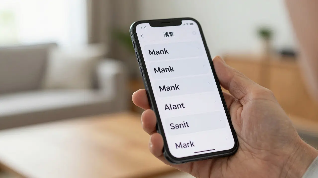
Learn how to implement Dynamic Type on Apple platforms effectively. Discover strategies to scale text without breaking layouts, ensuring accessibility and usability for all users.
Designing Empty States for Apple Apps: Clarity, Motivation, and Guidance

Learn how to design effective empty states for iOS apps. Discover strategies for clarity, motivation, and guidance that align with Apple's Human Interface Guidelines.
Apple Human Interface Guidelines: Mastering Hierarchy, Harmony, and Consistency

Learn how Apple's HIG uses hierarchy, harmony, and consistency to create intuitive interfaces. Discover practical tips for applying these principles to your next project.
Mastering Liquid Glass: Solving Busy Wallpaper & Content Edge Cases
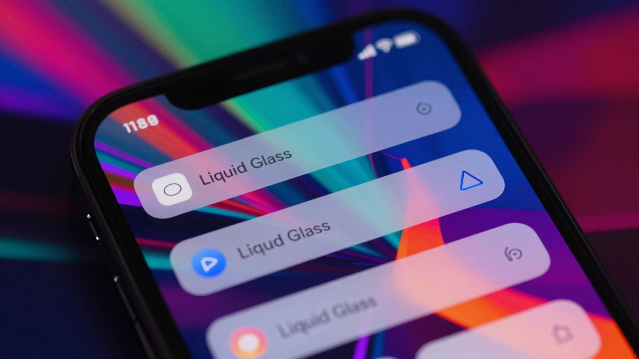
Struggling with Liquid Glass on busy wallpapers? Learn how to fix flickering, contrast issues, and performance hits in iOS 19 apps with expert tips and best practices.
Third-Party Ecosystem Fit: Making Apple Apps Feel Native with HIG
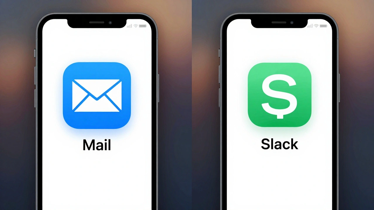
Third-party apps on Apple devices must align with Human Interface Guidelines to feel native, intuitive, and trustworthy. Learn why HIG isn’t about copying Apple-but about respecting user expectations across iOS, iPadOS, and macOS.
Decision-Making in Apple’s Design: When to Show, Hide, or Remove Interface Controls
Apple's approach to showing, hiding, or removing interface controls is guided by clarity, deference, and consistency. Learn how design principles like Liquid Glass, accessibility, and screen context shape every visible element in iOS, macOS, and beyond.